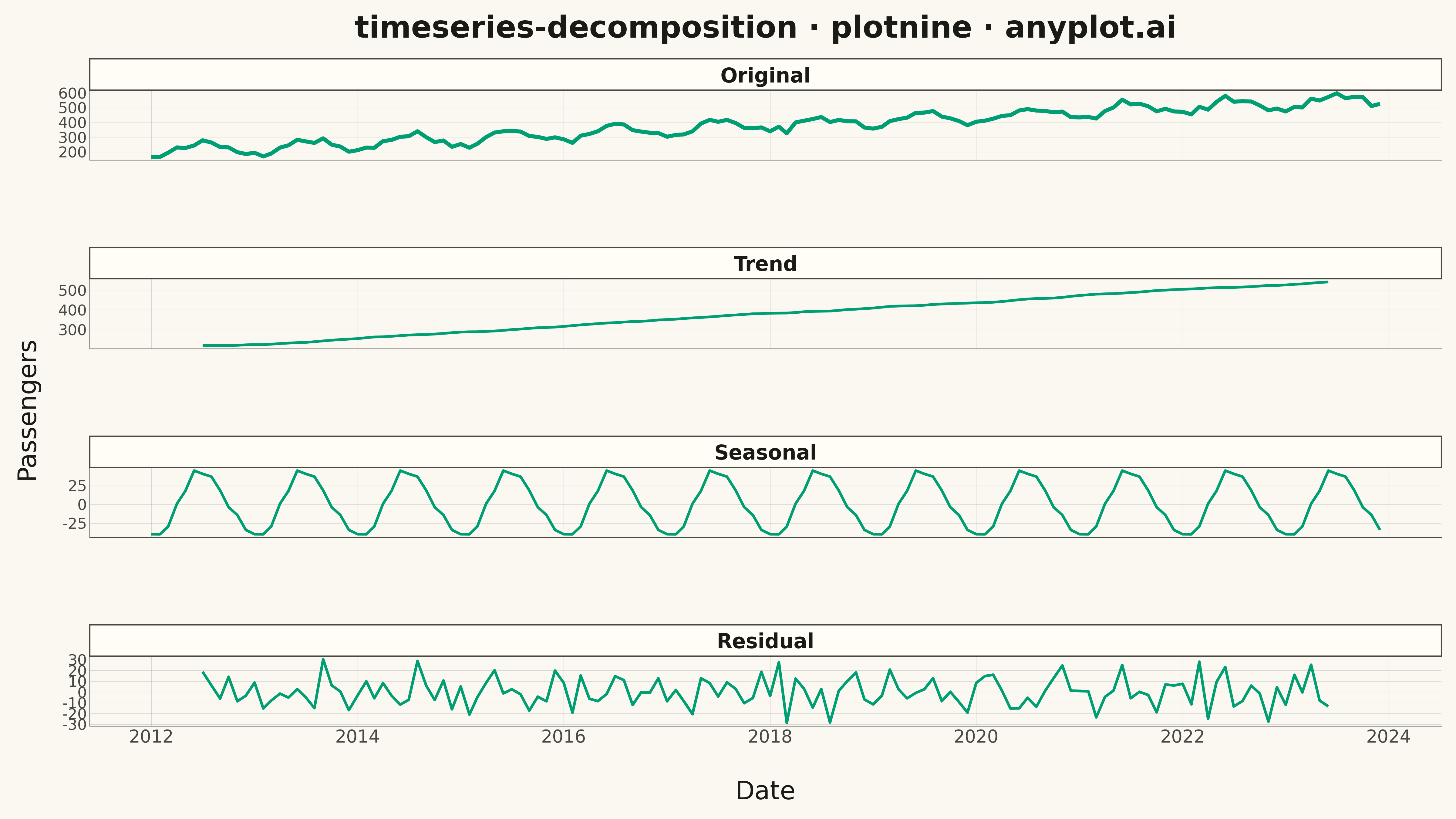
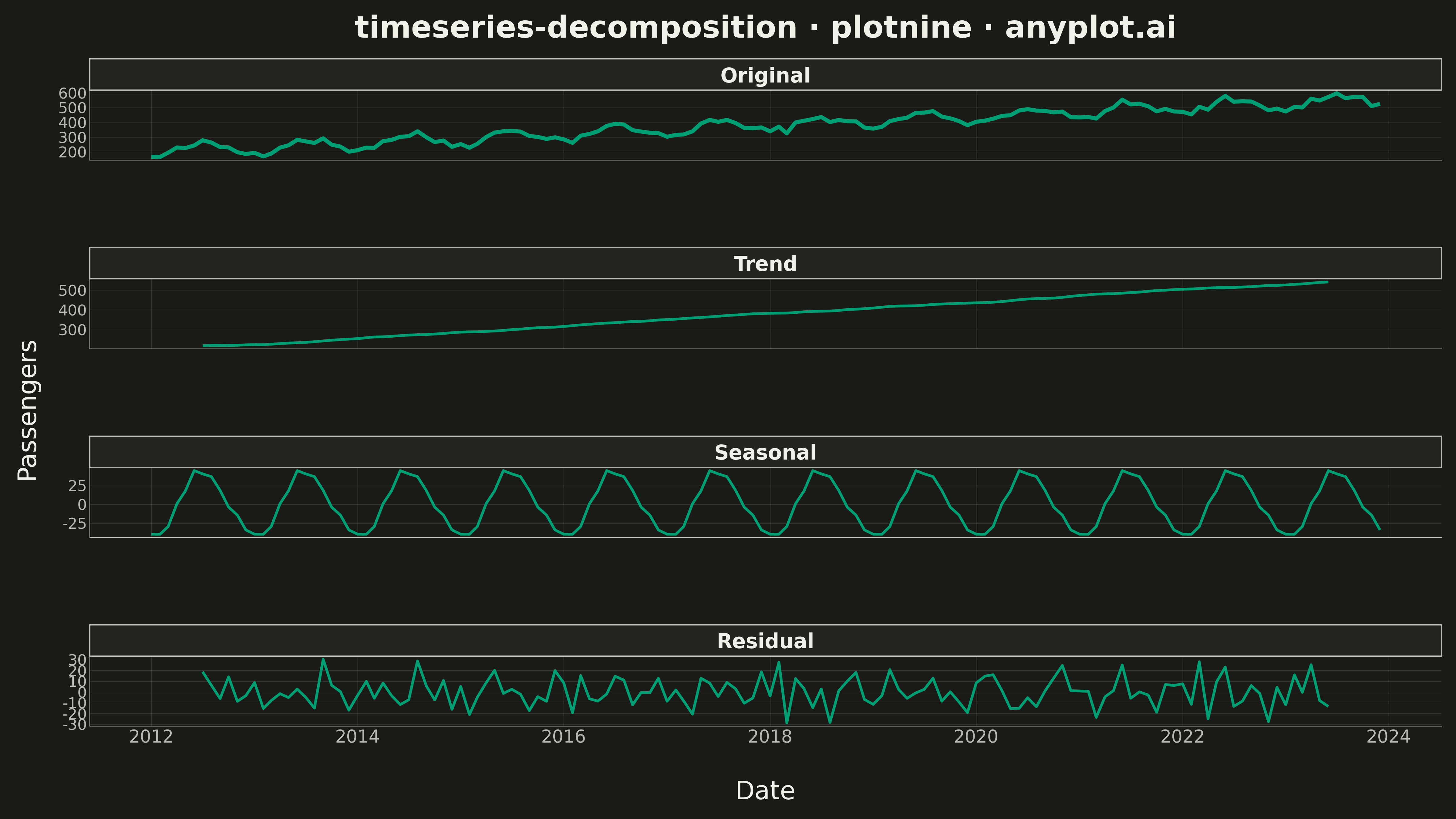
A time series decomposition plot displays a time series broken down into its constituent components: the original series, trend, seasonal pattern, and residual noise. Each component is shown as a separate subplot stacked vertically, sharing a common time axis. This visualization is essential for understanding the underlying structure of time series data and identifying patterns that may not be visible in the raw series.
""" anyplot.ai
timeseries-decomposition: Time Series Decomposition Plot
Library: plotnine 0.15.4 | Python 3.13.13
Quality: 88/100 | Updated: 2026-05-14
"""

import os

import numpy as np
import pandas as pd
from plotnine import (
    aes,
    element_blank,
    element_line,
    element_rect,
    element_text,
    facet_wrap,
    geom_line,
    ggplot,
    labs,
    scale_size_manual,
    scale_x_datetime,
    theme,
    theme_minimal,
)
from statsmodels.tsa.seasonal import seasonal_decompose


# Theme tokens
THEME = os.getenv("ANYPLOT_THEME", "light")
PAGE_BG = "#FAF8F1" if THEME == "light" else "#1A1A17"
ELEVATED_BG = "#FFFDF6" if THEME == "light" else "#242420"
INK = "#1A1A17" if THEME == "light" else "#F0EFE8"
INK_SOFT = "#4A4A44" if THEME == "light" else "#B8B7B0"
BRAND = "#009E73"

# Data - Monthly airline passengers with trend and seasonality
np.random.seed(42)
n_months = 144  # 12 years of monthly data

# Create date range
dates = pd.date_range(start="2012-01-01", periods=n_months, freq="MS")

# Generate synthetic airline passenger data with:
# - Upward trend
# - Strong yearly seasonality (peak in summer)
# - Random noise
t = np.arange(n_months)
trend = 200 + t * 2.5  # Growing trend
seasonal = 40 * np.sin(2 * np.pi * t / 12 - np.pi / 2)  # Peak in summer (month 7)
residual = np.random.normal(0, 15, n_months)
value = trend + seasonal + residual

# Create DataFrame
df = pd.DataFrame({"date": dates, "value": value})

# Perform seasonal decomposition using statsmodels
decomposition = seasonal_decompose(df["value"], model="additive", period=12)

# Prepare data for plotnine with all components
df_plot = pd.DataFrame(
    {
        "date": np.tile(dates, 4),
        "value": np.concatenate(
            [df["value"].values, decomposition.trend.values, decomposition.seasonal.values, decomposition.resid.values]
        ),
        "component": np.repeat(["Original", "Trend", "Seasonal", "Residual"], n_months),
    }
)

# Remove NaN values (decomposition creates NaNs at edges)
df_plot = df_plot.dropna()

# Make component a categorical with correct order
df_plot["component"] = pd.Categorical(
    df_plot["component"], categories=["Original", "Trend", "Seasonal", "Residual"], ordered=True
)

# Create faceted plot with four components
# Emphasize original series with thicker line
plot = (
    ggplot(df_plot, aes(x="date", y="value", size="component"))
    + geom_line(color=BRAND)
    + facet_wrap("~component", ncol=1, scales="free_y", dir="v")
    + scale_x_datetime(date_labels="%Y", date_breaks="2 years")
    + scale_size_manual(values={"Original": 1.8, "Trend": 1.2, "Seasonal": 1.2, "Residual": 1.2}, guide=None)
    + labs(title="timeseries-decomposition · plotnine · anyplot.ai", x="Date", y="Passengers")
    + theme_minimal()
    + theme(
        figure_size=(16, 9),
        plot_background=element_rect(fill=PAGE_BG, color=PAGE_BG),
        panel_background=element_rect(fill=PAGE_BG),
        plot_title=element_text(size=24, ha="center", weight="bold", color=INK),
        axis_title_x=element_text(size=20, margin={"t": 15}, color=INK),
        axis_title_y=element_text(size=20, margin={"r": 15}, color=INK),
        axis_text_x=element_text(size=14, color=INK_SOFT),
        axis_text_y=element_text(size=12, color=INK_SOFT),
        axis_line=element_line(color=INK_SOFT, size=0.5),
        strip_text=element_text(size=16, weight="bold", color=INK),
        strip_background=element_rect(fill=ELEVATED_BG, color=INK_SOFT),
        panel_spacing_y=0.06,
        panel_grid_major=element_line(color=INK, size=0.3, alpha=0.15),
        panel_grid_minor=element_blank(),
    )
)

# Save
plot.save(f"plot-{THEME}.png", dpi=300, width=16, height=9)
Runnable source as JSON, for any HTTP client: https://api.anyplot.ai/specs/timeseries-decomposition/plotnine/code. Any spec id and library id listed in llms-full.txt fit the same URL shape; every URL below is complete and callable.
{
  "spec_id": "timeseries-decomposition",
  "language": "python",
  "library": "plotnine",
  "page": "https://anyplot.ai/timeseries-decomposition/python/plotnine",
  "hub": "https://anyplot.ai/timeseries-decomposition",
  "code_json": "https://api.anyplot.ai/specs/timeseries-decomposition/plotnine/code",
  "spec_json": "https://api.anyplot.ai/specs/timeseries-decomposition",
  "render_light_png": "https://storage.googleapis.com/anyplot-images/plots/timeseries-decomposition/python/plotnine/plot-light.png",
  "render_dark_png": "https://storage.googleapis.com/anyplot-images/plots/timeseries-decomposition/python/plotnine/plot-dark.png",
  "quality_score": 88.0,
  "license": "MIT",
  "guide": "https://anyplot.ai/llms.txt"
}
Part of Time Series Decomposition Plot on anyplot.ai.