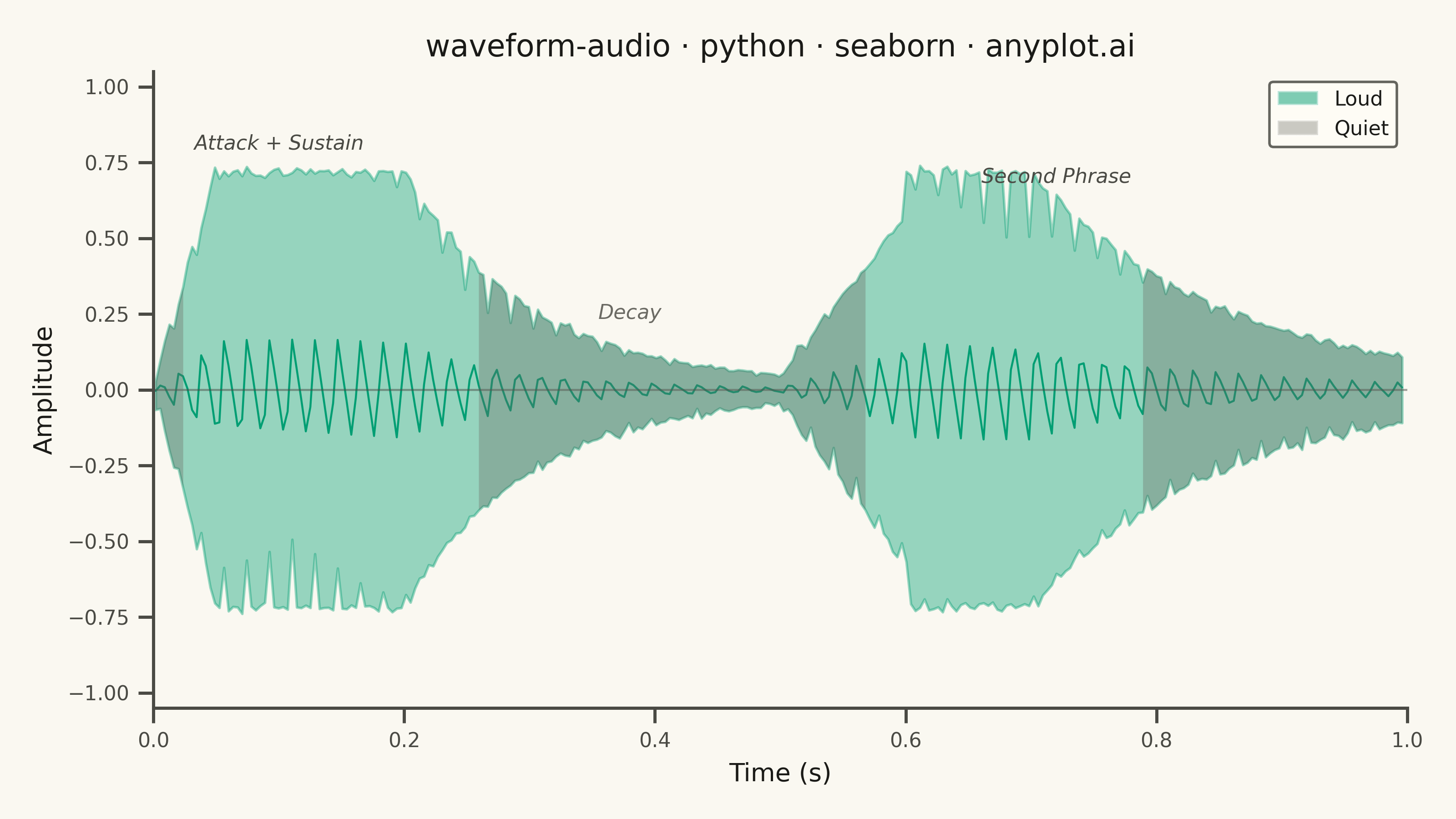
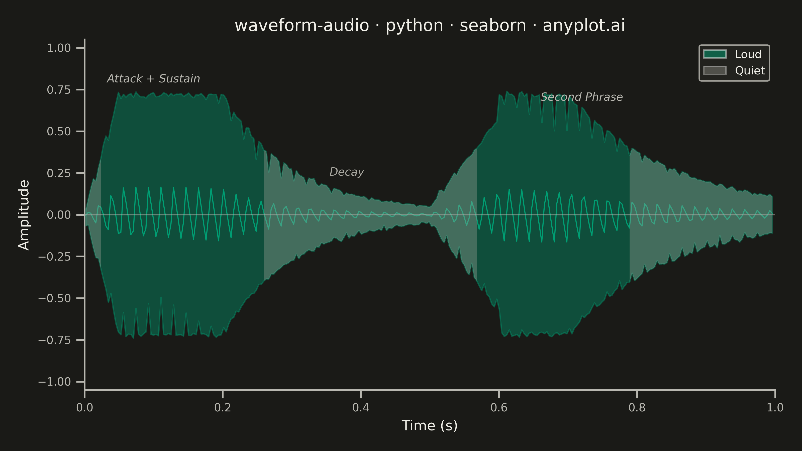
A time-domain visualization of audio amplitude that displays the raw waveform shape as seen in digital audio workstations (DAWs). The plot shows positive and negative amplitude symmetrically around a zero baseline, with time on the x-axis and normalized amplitude (-1 to +1) on the y-axis. This is the fundamental representation for inspecting audio signals, revealing dynamics, clipping, silence, and transient characteristics at a glance.
""" anyplot.ai
waveform-audio: Audio Waveform Plot
Library: seaborn 0.13.2 | Python 3.13.13
Quality: 92/100 | Updated: 2026-06-03
"""

import os

import matplotlib.pyplot as plt
import numpy as np
import pandas as pd
import seaborn as sns
from matplotlib.patches import Patch


# Theme tokens — Imprint palette + theme-adaptive chrome
THEME = os.getenv("ANYPLOT_THEME", "light")
PAGE_BG = "#FAF8F1" if THEME == "light" else "#1A1A17"
ELEVATED_BG = "#FFFDF6" if THEME == "light" else "#242420"
INK = "#1A1A17" if THEME == "light" else "#F0EFE8"
INK_SOFT = "#4A4A44" if THEME == "light" else "#B8B7B0"
INK_MUTED = "#6B6A63" if THEME == "light" else "#A8A79F"
BRAND = "#009E73"  # Imprint palette position 1 — ALWAYS first series

sns.set_theme(
    style="ticks",
    rc={
        "figure.facecolor": PAGE_BG,
        "axes.facecolor": PAGE_BG,
        "axes.edgecolor": INK_SOFT,
        "axes.labelcolor": INK,
        "text.color": INK,
        "xtick.color": INK_SOFT,
        "ytick.color": INK_SOFT,
        "grid.color": INK,
        "grid.alpha": 0.15,
        "grid.linewidth": 0.8,
        "legend.facecolor": ELEVATED_BG,
        "legend.edgecolor": INK_SOFT,
    },
)

# Data
np.random.seed(42)
sample_rate = 22050
duration = 1.0
num_samples = int(sample_rate * duration)
time = np.linspace(0, duration, num_samples)

base_freq = 220
segments = [
    np.linspace(0, 1, int(num_samples * 0.05)),
    np.ones(int(num_samples * 0.15)),
    np.exp(-3 * np.linspace(0, 1, int(num_samples * 0.3))),
    np.linspace(0.05, 0.8, int(num_samples * 0.1)),
    np.ones(int(num_samples * 0.1)),
    np.exp(-2 * np.linspace(0, 1, int(num_samples * 0.3))),
]
amplitude_envelope = np.concatenate(segments)
if len(amplitude_envelope) < num_samples:
    amplitude_envelope = np.pad(
        amplitude_envelope, (0, num_samples - len(amplitude_envelope)), constant_values=amplitude_envelope[-1]
    )
amplitude_envelope = amplitude_envelope[:num_samples]

signal = (
    0.6 * np.sin(2 * np.pi * base_freq * time)
    + 0.25 * np.sin(2 * np.pi * base_freq * 2 * time)
    + 0.1 * np.sin(2 * np.pi * base_freq * 3 * time)
    + 0.05 * np.sin(2 * np.pi * base_freq * 5 * time)
)
signal *= amplitude_envelope
signal += np.random.normal(0, 0.01, num_samples)
signal = np.clip(signal, -1.0, 1.0)

# Bin samples for seaborn's percentile-band rendering
# Each chunk covers ~3.6 ms; seaborn computes min-to-max range at each bin natively
chunk_size = 80
num_chunks = num_samples // chunk_size
time_chunked = time[: num_chunks * chunk_size].reshape(num_chunks, chunk_size)
signal_chunked = signal[: num_chunks * chunk_size].reshape(num_chunks, chunk_size)

env_time = time_chunked.mean(axis=1)
env_max = signal_chunked.max(axis=1)
env_min = signal_chunked.min(axis=1)

# Classify bins as Loud vs Quiet via smoothed RMS
kernel = np.ones(5) / 5
env_max_smooth = np.convolve(env_max, kernel, mode="same")
env_min_smooth = np.convolve(env_min, kernel, mode="same")
smooth_kernel = np.ones(15) / 15
rms = np.sqrt(np.convolve((env_max_smooth - env_min_smooth) ** 2, smooth_kernel, mode="same"))
rms_threshold = np.median(rms) * 1.1
segment_label = np.where(rms > rms_threshold, "Loud", "Quiet")

# Long-form DataFrame: every sample labeled with its time-bin center
# seaborn lineplot errorbar=('pi', 100) => 0th–100th percentile = envelope min/max
df_long = pd.DataFrame({"Time (s)": np.repeat(env_time, chunk_size), "Amplitude": signal_chunked.flatten()})

# Plot
fig, ax = plt.subplots(figsize=(8, 4.5), dpi=400)

# Primary waveform: seaborn-native percentile band renders the full amplitude range at each
# time bin — mean line sits near zero (oscillating signal) with the envelope as fill width
sns.lineplot(
    data=df_long,
    x="Time (s)",
    y="Amplitude",
    color=BRAND,
    errorbar=("pi", 100),
    linewidth=0.8,
    err_kws={"alpha": 0.4},
    ax=ax,
)

# Quiet regions: secondary matplotlib overlay with muted tone to distinguish dynamics
quiet_mask = segment_label == "Quiet"
quiet_sections = np.ma.clump_unmasked(np.ma.masked_where(~quiet_mask, quiet_mask))
for sl in quiet_sections:
    start = max(0, sl.start - 1)
    stop = min(len(env_time), sl.stop + 1)
    ax.fill_between(
        env_time[start:stop],
        env_max[start:stop],
        env_min[start:stop],
        color=INK_MUTED,
        alpha=0.35,
        linewidth=0,
        zorder=3,
    )

# Zero-line reference
ax.axhline(y=0, color=INK_SOFT, linewidth=0.8, alpha=0.5, zorder=2)

# Annotations for musical dynamics — kept as storytelling (reviewed strength)
ax.annotate(
    "Attack + Sustain", xy=(0.10, 0.78), fontsize=8, color=INK_SOFT, fontstyle="italic", ha="center", va="bottom"
)
ax.annotate("Decay", xy=(0.38, 0.22), fontsize=8, color=INK_MUTED, fontstyle="italic", ha="center", va="bottom")
ax.annotate("Second Phrase", xy=(0.72, 0.67), fontsize=8, color=INK_SOFT, fontstyle="italic", ha="center", va="bottom")

# Legend
legend_elements = [
    Patch(facecolor=BRAND, alpha=0.5, label="Loud"),
    Patch(facecolor=INK_MUTED, alpha=0.35, label="Quiet"),
]
ax.legend(
    handles=legend_elements, loc="upper right", fontsize=8, framealpha=0.85, facecolor=ELEVATED_BG, edgecolor=INK_SOFT
)

# Style
title = "waveform-audio · python · seaborn · anyplot.ai"
ax.set_xlabel("Time (s)", fontsize=10, color=INK)
ax.set_ylabel("Amplitude", fontsize=10, color=INK)
ax.set_title(title, fontsize=12, fontweight="medium", color=INK)
ax.tick_params(axis="both", labelsize=8, colors=INK_SOFT)
ax.set_ylim(-1.05, 1.05)
ax.set_xlim(0, duration)
sns.despine(ax=ax)

# Save — no bbox_inches='tight': figsize×dpi yields exact 3200×1800 px canvas
plt.tight_layout()
plt.savefig(f"plot-{THEME}.png", dpi=400, facecolor=PAGE_BG)
Runnable source as JSON, for any HTTP client: https://api.anyplot.ai/specs/waveform-audio/seaborn/code. Any spec id and library id listed in llms-full.txt fit the same URL shape; every URL below is complete and callable.
{
  "spec_id": "waveform-audio",
  "language": "python",
  "library": "seaborn",
  "page": "https://anyplot.ai/waveform-audio/python/seaborn",
  "hub": "https://anyplot.ai/waveform-audio",
  "code_json": "https://api.anyplot.ai/specs/waveform-audio/seaborn/code",
  "spec_json": "https://api.anyplot.ai/specs/waveform-audio",
  "render_light_png": "https://storage.googleapis.com/anyplot-images/plots/waveform-audio/python/seaborn/plot-light.png",
  "render_dark_png": "https://storage.googleapis.com/anyplot-images/plots/waveform-audio/python/seaborn/plot-dark.png",
  "quality_score": 92.0,
  "license": "MIT",
  "guide": "https://anyplot.ai/llms.txt"
}
Part of Audio Waveform Plot on anyplot.ai.