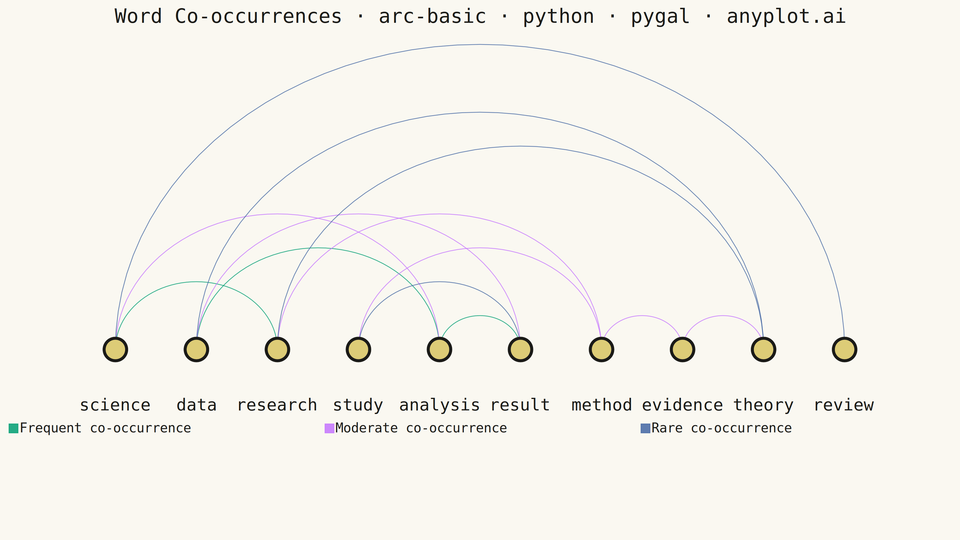
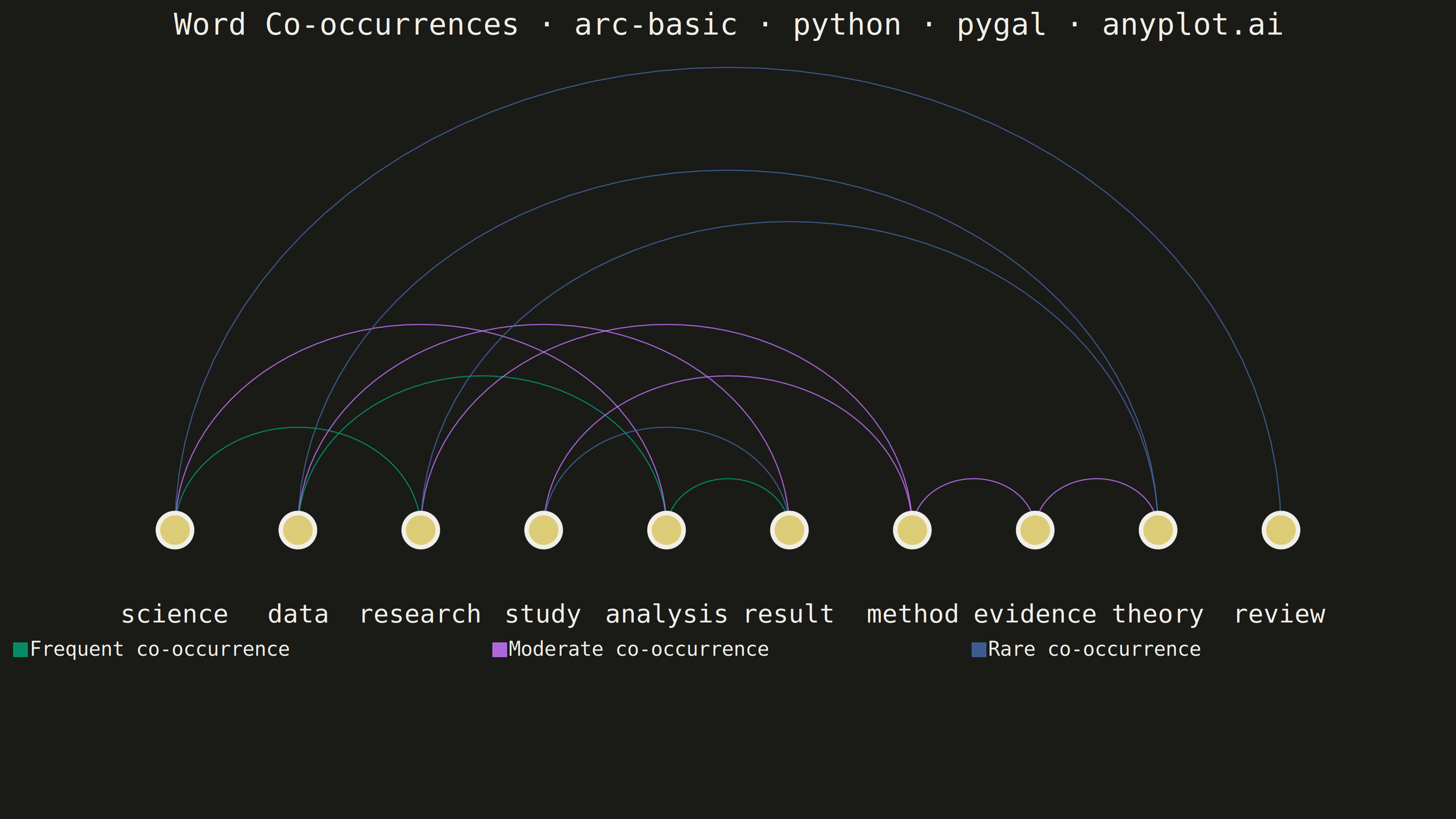
An arc diagram arranges nodes along a single horizontal line and draws connections between them as curved arcs above the line. This layout excels at revealing patterns in sequential or ordered data while minimizing visual clutter compared to force-directed layouts. Arc height typically indicates the distance between connected nodes, making it easy to spot long-range versus short-range connections.
""" anyplot.ai
arc-basic: Basic Arc Diagram
Library: pygal 3.1.0 | Python 3.13.13
Quality: 84/100 | Created: 2026-05-30
"""

import math
import os

import numpy as np
import pygal
from pygal.style import Style


THEME = os.getenv("ANYPLOT_THEME", "light")
PAGE_BG = "#FAF8F1" if THEME == "light" else "#1A1A17"
INK = "#1A1A17" if THEME == "light" else "#F0EFE8"
INK_MUTED = "#6B6A63" if THEME == "light" else "#A8A79F"

IMPRINT_PALETTE = ("#009E73", "#C475FD", "#4467A3", "#BD8233", "#AE3030", "#2ABCCD", "#954477", "#99B314")
NODE_FILL = "#DDCC77"

np.random.seed(42)
nodes = ["science", "data", "research", "study", "analysis", "result", "method", "evidence", "theory", "review"]
n_nodes = len(nodes)

# Edges: (source_idx, target_idx, weight) — weight 1=rare, 2=moderate, 3=frequent
# "review" (index 9) has only one connection — demonstrates a peripheral node
edges = [
    (0, 2, 3),  # science–research (frequent)
    (1, 4, 3),  # data–analysis (frequent)
    (4, 5, 3),  # analysis–result (frequent)
    (0, 4, 2),  # science–analysis (moderate)
    (1, 5, 2),  # data–result (moderate)
    (2, 6, 2),  # research–method (moderate)
    (3, 6, 2),  # study–method (moderate)
    (6, 7, 2),  # method–evidence (moderate)
    (7, 8, 2),  # evidence–theory (moderate)
    (2, 8, 1),  # research–theory (rare)
    (3, 5, 1),  # study–result (rare)
    (1, 8, 1),  # data–theory (rare)
    (0, 9, 1),  # science–review (rare, long-range — "review" has only this edge)
]

arc_colors = {3: IMPRINT_PALETTE[0], 2: IMPRINT_PALETTE[1], 1: IMPRINT_PALETTE[2]}
arc_widths = {1: 5, 2: 14, 3: 26}
weight_labels = {1: "Rare", 2: "Moderate", 3: "Frequent"}

x_positions = np.linspace(1, 9, n_nodes)
y_baseline = 0.5

# Degree-based node sizing: hub nodes larger, peripheral nodes visually smaller
degrees = [0] * n_nodes
for s, t, _ in edges:
    degrees[s] += 1
    degrees[t] += 1

degree_levels = sorted(set(degrees))  # [1, 2, 3]
degree_groups: dict[int, list[int]] = {}
for i, d in enumerate(degrees):
    degree_groups.setdefault(d, []).append(i)

# (outline dots_size, fill dots_size) per degree — hub nodes clearly dominate visually
node_sizes = {1: (30, 20), 2: (46, 34), 3: (62, 48)}

# Colors: 3 legend + 13 arc edges + 2 series per degree level (outline, fill)
node_colors: list[str] = []
for _d in degree_levels:
    node_colors.extend([INK, NODE_FILL])

colors = tuple([arc_colors[3], arc_colors[2], arc_colors[1]] + [arc_colors[w] for _, _, w in edges] + node_colors)

title = "Word Co-occurrences · arc-basic · python · pygal · anyplot.ai"

custom_style = Style(
    background=PAGE_BG,
    plot_background=PAGE_BG,
    foreground=INK,
    foreground_strong=INK,
    foreground_subtle=INK_MUTED,
    colors=colors,
    title_font_size=54,
    label_font_size=46,
    major_label_font_size=36,
    legend_font_size=36,
    value_font_size=28,
    stroke_width=2.5,
    opacity=0.85,
    opacity_hover=1.0,
)

chart = pygal.XY(
    width=2400,
    height=2400,
    style=custom_style,
    fill=False,
    title=title,
    show_legend=True,
    legend_at_bottom=True,
    legend_at_bottom_columns=3,
    legend_box_size=26,
    x_title="",
    y_title="",
    show_x_guides=False,
    show_y_guides=False,
    show_x_labels=True,
    show_y_labels=False,
    stroke=True,
    dots_size=0,
    stroke_style={"width": 5, "linecap": "round"},
    range=(0, 5.0),
    xrange=(0, 10),
    x_labels=[{"value": float(x_positions[i]), "label": nodes[i]} for i in range(n_nodes)],
    x_label_rotation=30,
    truncate_label=-1,
    css=[
        "file://style.css",
        "file://graph.css",
        f"inline:.plot .background {{fill: {PAGE_BG}; stroke: none !important;}}",
        "inline:.axis .line {stroke: none !important;}",
        "inline:.axis .guides .line {stroke: none !important;}",
        "inline:.plot .axis {stroke: none !important;}",
        "inline:.series .line {fill: none !important;}",
        # Hide all legend entries after the 3 weight categories
        "inline:.legends > g:nth-child(n+4) {display: none !important;}",
    ],
    js=[],
)

# Legend entries (Frequent → Moderate → Rare, matching color assignment order)
for w_val, w_label in [(3, "Frequent"), (2, "Moderate"), (1, "Rare")]:
    chart.add(
        f"{w_label} co-occurrence",
        [None],
        stroke=True,
        show_dots=False,
        stroke_style={"width": arc_widths[w_val], "linecap": "round"},
    )

# Arc series: semi-circle above baseline, height ∝ node distance
arc_resolution = 50

for start_idx, end_idx, weight in edges:
    x_start = x_positions[start_idx]
    x_end = x_positions[end_idx]
    x_center = (x_start + x_end) / 2
    arc_radius = abs(x_end - x_start) / 2
    distance = abs(end_idx - start_idx)
    height_scale = 0.4 * distance

    arc_points = [
        {
            "value": (
                x_center - arc_radius * math.cos(math.pi * i / arc_resolution),
                y_baseline + height_scale * math.sin(math.pi * i / arc_resolution),
            ),
            "label": f"{nodes[start_idx]} ↔ {nodes[end_idx]} | {weight_labels[weight]} ({weight}/3)",
        }
        for i in range(arc_resolution + 1)
    ]
    chart.add(
        "", arc_points, stroke=True, show_dots=False, stroke_style={"width": arc_widths[weight], "linecap": "round"}
    )

# Degree-based node series: hub nodes (degree 3) largest, peripheral (degree 1) smallest
# Pygal tooltips in HTML expose per-node degree info — the library's interactive differentiator
for d in degree_levels:
    group_idx = degree_groups[d]
    outline_sz, fill_sz = node_sizes[d]
    conn_word = "connection" if d == 1 else "connections"

    node_pts = [
        {"value": (float(x_positions[i]), y_baseline), "label": f"{nodes[i]} | {d} {conn_word}"} for i in group_idx
    ]
    chart.add("", node_pts, stroke=False, dots_size=outline_sz)
    chart.add("", node_pts, stroke=False, dots_size=fill_sz)

# Save PNG and interactive HTML (HTML exposes per-edge and per-node tooltips on hover)
chart.render_to_png(f"plot-{THEME}.png")

with open(f"plot-{THEME}.html", "wb") as f:
    f.write(chart.render())
Runnable source as JSON, for any HTTP client: https://api.anyplot.ai/specs/arc-basic/pygal/code. Any spec id and library id listed in llms-full.txt fit the same URL shape; every URL below is complete and callable.
{
  "spec_id": "arc-basic",
  "language": "python",
  "library": "pygal",
  "page": "https://anyplot.ai/arc-basic/python/pygal",
  "hub": "https://anyplot.ai/arc-basic",
  "code_json": "https://api.anyplot.ai/specs/arc-basic/pygal/code",
  "spec_json": "https://api.anyplot.ai/specs/arc-basic",
  "render_light_png": "https://storage.googleapis.com/anyplot-images/plots/arc-basic/python/pygal/plot-light.png",
  "render_dark_png": "https://storage.googleapis.com/anyplot-images/plots/arc-basic/python/pygal/plot-dark.png",
  "interactive_light_html": "https://storage.googleapis.com/anyplot-images/plots/arc-basic/python/pygal/plot-light.html",
  "interactive_dark_html": "https://storage.googleapis.com/anyplot-images/plots/arc-basic/python/pygal/plot-dark.html",
  "quality_score": 84.0,
  "license": "MIT",
  "guide": "https://anyplot.ai/llms.txt"
}
Part of Basic Arc Diagram on anyplot.ai.