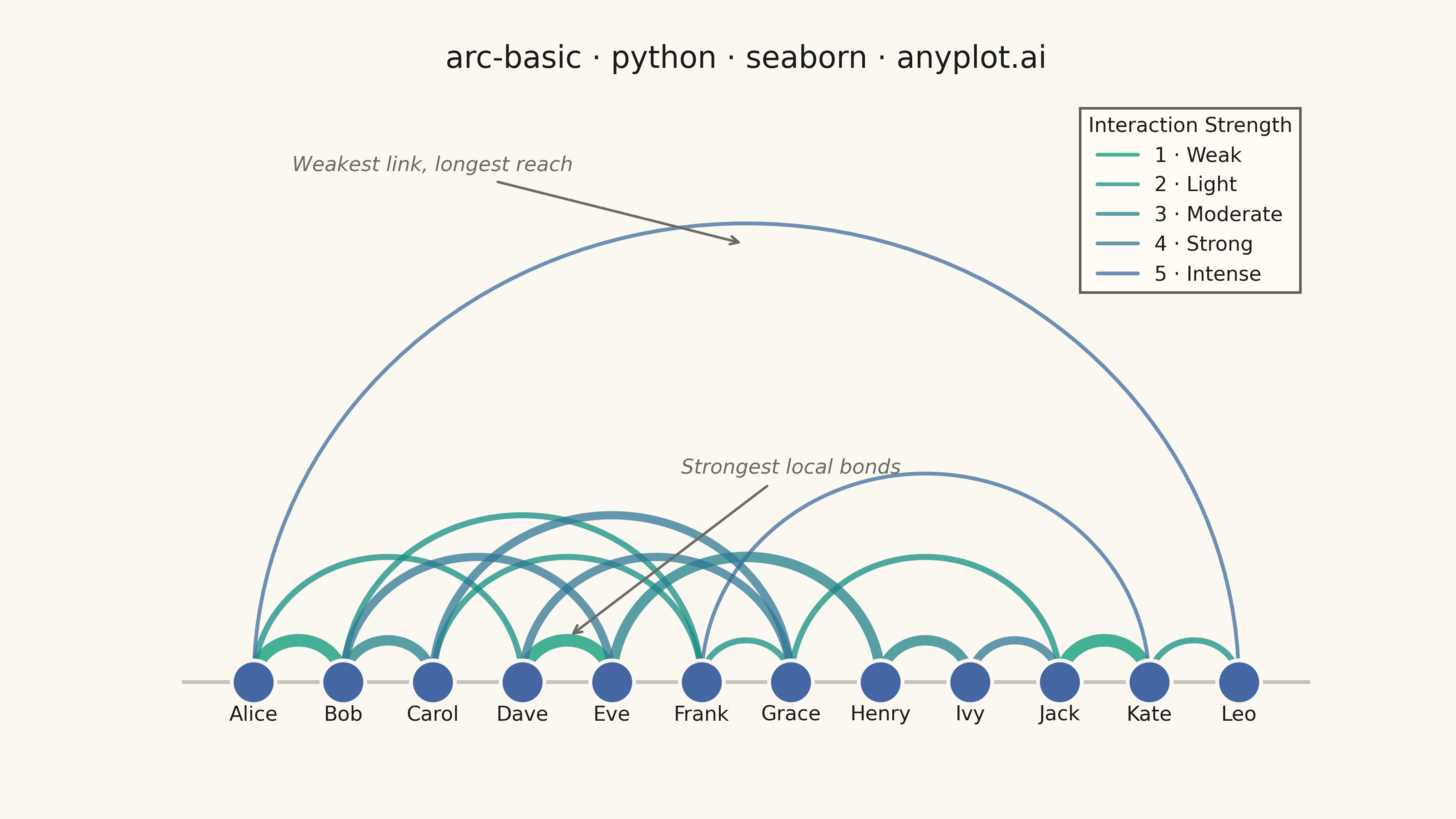
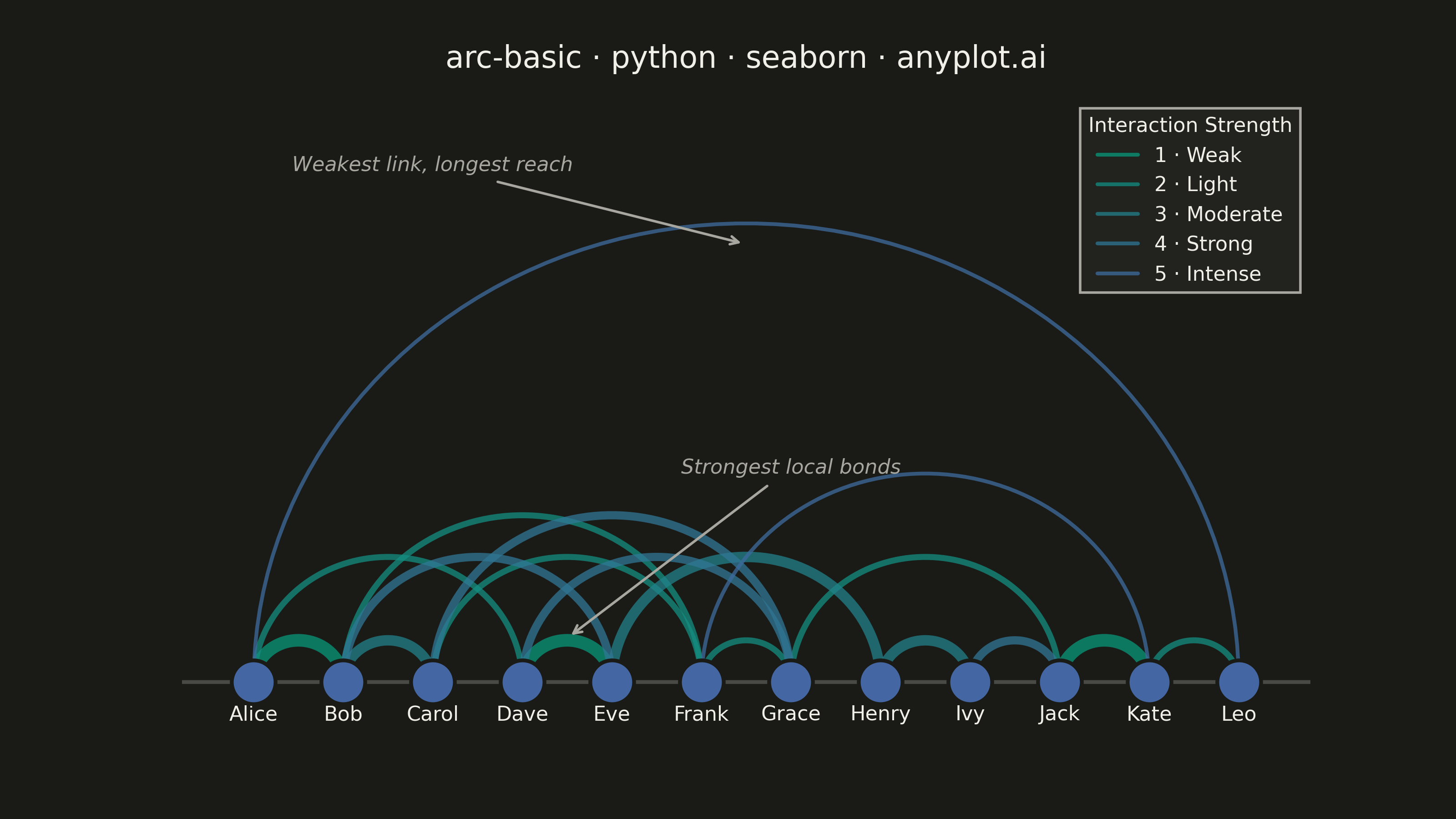
An arc diagram arranges nodes along a single horizontal line and draws connections between them as curved arcs above the line. This layout excels at revealing patterns in sequential or ordered data while minimizing visual clutter compared to force-directed layouts. Arc height typically indicates the distance between connected nodes, making it easy to spot long-range versus short-range connections.
""" anyplot.ai
arc-basic: Basic Arc Diagram
Library: seaborn 0.13.2 | Python 3.13.13
Quality: 91/100 | Updated: 2026-05-30
"""

import os

import matplotlib.pyplot as plt
import numpy as np
import pandas as pd
import seaborn as sns
from matplotlib.colors import LinearSegmentedColormap


# Theme tokens
THEME = os.getenv("ANYPLOT_THEME", "light")
PAGE_BG = "#FAF8F1" if THEME == "light" else "#1A1A17"
ELEVATED_BG = "#FFFDF6" if THEME == "light" else "#242420"
INK = "#1A1A17" if THEME == "light" else "#F0EFE8"
INK_SOFT = "#4A4A44" if THEME == "light" else "#B8B7B0"
INK_MUTED = "#6B6A63" if THEME == "light" else "#A8A79F"

# Imprint sequential colormap for 5 arc weight levels (weak=light, strong=dark)
imprint_seq = LinearSegmentedColormap.from_list("imprint_seq", ["#009E73", "#4467A3"])
palette = [imprint_seq(v) for v in [0.1, 0.3, 0.5, 0.7, 0.9]]

# Apply seaborn theme with theme-adaptive chrome
sns.set_theme(
    style="ticks",
    rc={
        "figure.facecolor": PAGE_BG,
        "axes.facecolor": PAGE_BG,
        "axes.edgecolor": INK_SOFT,
        "axes.labelcolor": INK,
        "text.color": INK,
        "xtick.color": INK_SOFT,
        "ytick.color": INK_SOFT,
        "grid.color": INK,
        "grid.alpha": 0.15,
        "legend.facecolor": ELEVATED_BG,
        "legend.edgecolor": INK_SOFT,
    },
)

# Data: Character interactions in a story (12 characters)
nodes = ["Alice", "Bob", "Carol", "Dave", "Eve", "Frank", "Grace", "Henry", "Ivy", "Jack", "Kate", "Leo"]
n_nodes = len(nodes)

# Edges: (source_index, target_index, interaction_weight)
edges = [
    (0, 1, 5),  # Alice – Bob
    (0, 3, 2),  # Alice – Dave
    (1, 2, 4),  # Bob – Carol
    (1, 4, 3),  # Bob – Eve
    (2, 5, 2),  # Carol – Frank
    (3, 4, 5),  # Dave – Eve
    (3, 6, 3),  # Dave – Grace
    (4, 7, 4),  # Eve – Henry
    (5, 6, 2),  # Frank – Grace
    (0, 11, 1),  # Alice – Leo (long-range)
    (2, 6, 3),  # Carol – Grace
    (1, 5, 2),  # Bob – Frank
    (7, 8, 4),  # Henry – Ivy
    (8, 9, 3),  # Ivy – Jack
    (9, 10, 5),  # Jack – Kate
    (10, 11, 2),  # Kate – Leo
    (6, 9, 2),  # Grace – Jack
    (5, 10, 1),  # Frank – Kate (long-range)
]

x_positions = np.arange(n_nodes)

# Build long-form DataFrame of arc coordinates for seaborn lineplot
arc_rows = []
n_pts = 80
for eid, (src, tgt, w) in enumerate(edges):
    x1, x2 = x_positions[src], x_positions[tgt]
    dist = abs(x2 - x1)
    h = dist * 0.4
    t = np.linspace(0, np.pi, n_pts)
    cx, rx = (x1 + x2) / 2, dist / 2
    arc_x = cx + rx * np.cos(np.pi - t)
    arc_y = h * np.sin(t)
    for xi, yi in zip(arc_x, arc_y, strict=True):
        arc_rows.append({"x": xi, "y": yi, "weight": w, "edge_id": eid})

arc_df = pd.DataFrame(arc_rows)

# Categorize weights for seaborn hue encoding
strength_names = {1: "1 · Weak", 2: "2 · Light", 3: "3 · Moderate", 4: "4 · Strong", 5: "5 · Intense"}
cat_order = [strength_names[k] for k in sorted(strength_names)]
arc_df["strength"] = pd.Categorical(arc_df["weight"].map(strength_names), categories=cat_order, ordered=True)

# Canvas — exactly 3200×1800 px (landscape 16:9)
fig, ax = plt.subplots(figsize=(8, 4.5), dpi=400, facecolor=PAGE_BG)
ax.set_facecolor(PAGE_BG)

# Draw arcs via seaborn lineplot (hue=color by strength, size=thickness by weight)
sns.lineplot(
    data=arc_df,
    x="x",
    y="y",
    hue="strength",
    size="weight",
    units="edge_id",
    estimator=None,
    palette=palette,
    sizes=(2.0, 5.5),
    alpha=0.75,
    ax=ax,
    sort=False,
)

# Keep only color legend entries (remove redundant size entries)
handles, labels_list = ax.get_legend_handles_labels()
cat_set = set(cat_order)
filtered = [(h, lab) for h, lab in zip(handles, labels_list, strict=True) if lab in cat_set]
ax.legend(
    [h for h, _ in filtered],
    [lab for _, lab in filtered],
    title="Interaction Strength",
    title_fontsize=8,
    fontsize=8,
    loc="upper right",
    frameon=True,
    fancybox=False,
    framealpha=0.9,
    edgecolor=INK_SOFT,
    borderpad=1.2,
)

# Degree-based node sizing — more-connected nodes appear larger for visual hierarchy
degree = [0] * n_nodes
for src, tgt, _ in edges:
    degree[src] += 1
    degree[tgt] += 1
node_sizes = [120 + d * 75 for d in degree]

# Draw nodes — Imprint blue (#4467A3) as structural anchors
node_df = pd.DataFrame({"x": x_positions, "y": np.zeros(n_nodes), "size": node_sizes})
sns.scatterplot(
    data=node_df,
    x="x",
    y="y",
    size="size",
    sizes=(min(node_sizes), max(node_sizes)),
    color="#4467A3",
    zorder=5,
    ax=ax,
    legend=False,
    edgecolor=PAGE_BG,
    linewidth=1.5,
)

# Node labels below the baseline
for i, name in enumerate(nodes):
    ax.text(x_positions[i], -0.22, name, ha="center", va="top", fontsize=9, fontweight="medium", color=INK)

# Annotations: contrast between arc distance and weight
ax.annotate(
    "Weakest link, longest reach",
    xy=(5.5, 4.2),
    fontsize=8,
    fontstyle="italic",
    color=INK_MUTED,
    ha="center",
    xytext=(2.0, 4.9),
    arrowprops={"arrowstyle": "->", "color": INK_MUTED, "lw": 1.0},
)
ax.annotate(
    "Strongest local bonds",
    xy=(3.5, 0.42),
    fontsize=8,
    fontstyle="italic",
    color=INK_MUTED,
    ha="center",
    xytext=(6.0, 2.0),
    arrowprops={"arrowstyle": "->", "color": INK_MUTED, "lw": 1.0},
)

# Axis styling
ax.set_xlim(-0.8, n_nodes - 0.2)
ax.set_ylim(-0.45, 5.6)
ax.set_title("arc-basic · python · seaborn · anyplot.ai", fontsize=12, fontweight="medium", color=INK, pad=12)
ax.set_xlabel("")
ax.set_ylabel("")
sns.despine(ax=ax, left=True, bottom=True)
ax.set_xticks([])
ax.set_yticks([])

# Subtle horizontal baseline
ax.axhline(y=0, color=INK_SOFT, linewidth=1.5, alpha=0.3, zorder=1)

plt.savefig(f"plot-{THEME}.png", dpi=400, facecolor=PAGE_BG)
Runnable source as JSON, for any HTTP client: https://api.anyplot.ai/specs/arc-basic/seaborn/code. Any spec id and library id listed in llms-full.txt fit the same URL shape; every URL below is complete and callable.
{
  "spec_id": "arc-basic",
  "language": "python",
  "library": "seaborn",
  "page": "https://anyplot.ai/arc-basic/python/seaborn",
  "hub": "https://anyplot.ai/arc-basic",
  "code_json": "https://api.anyplot.ai/specs/arc-basic/seaborn/code",
  "spec_json": "https://api.anyplot.ai/specs/arc-basic",
  "render_light_png": "https://storage.googleapis.com/anyplot-images/plots/arc-basic/python/seaborn/plot-light.png",
  "render_dark_png": "https://storage.googleapis.com/anyplot-images/plots/arc-basic/python/seaborn/plot-dark.png",
  "quality_score": 91.0,
  "license": "MIT",
  "guide": "https://anyplot.ai/llms.txt"
}
Part of Basic Arc Diagram on anyplot.ai.