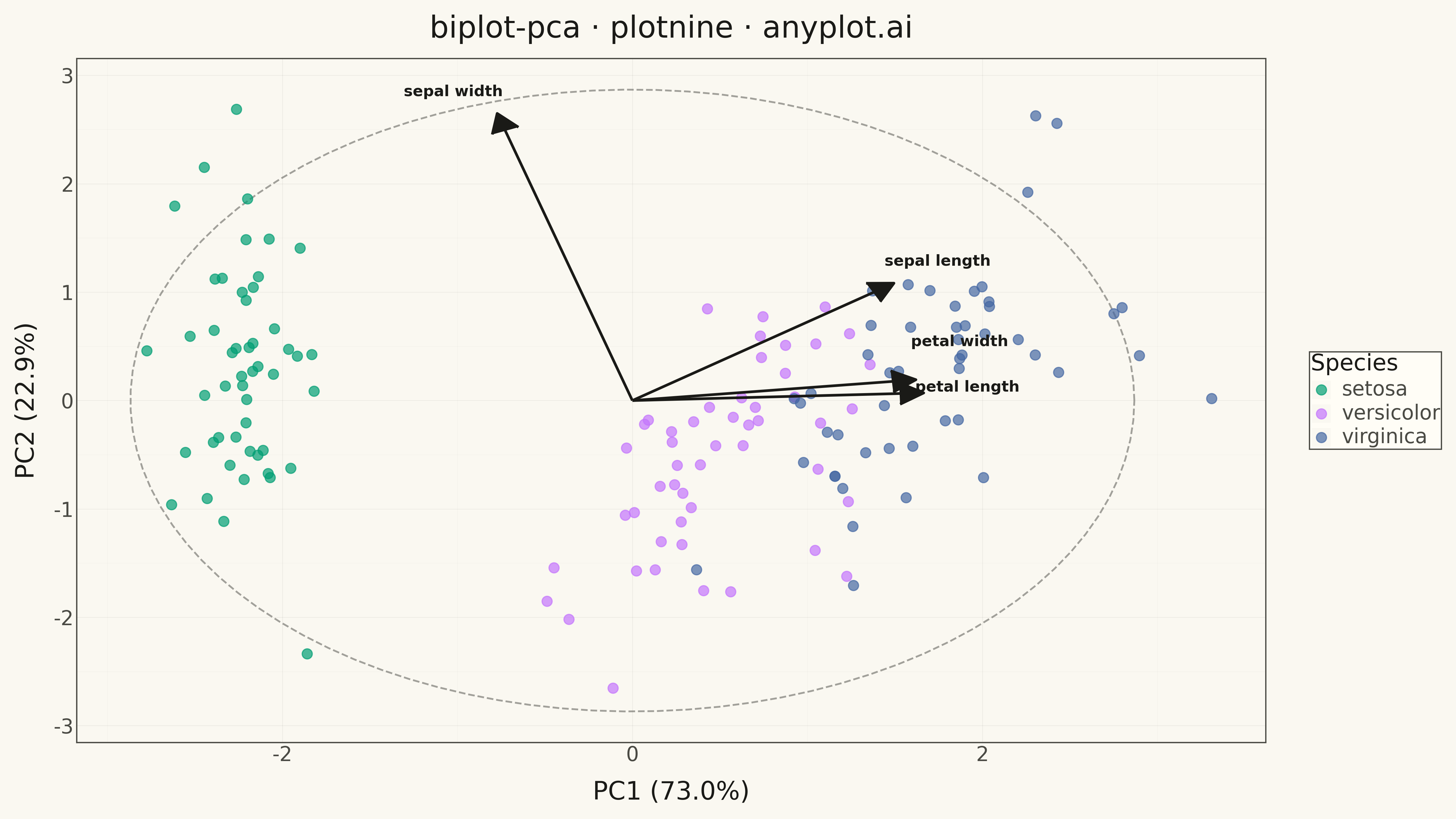
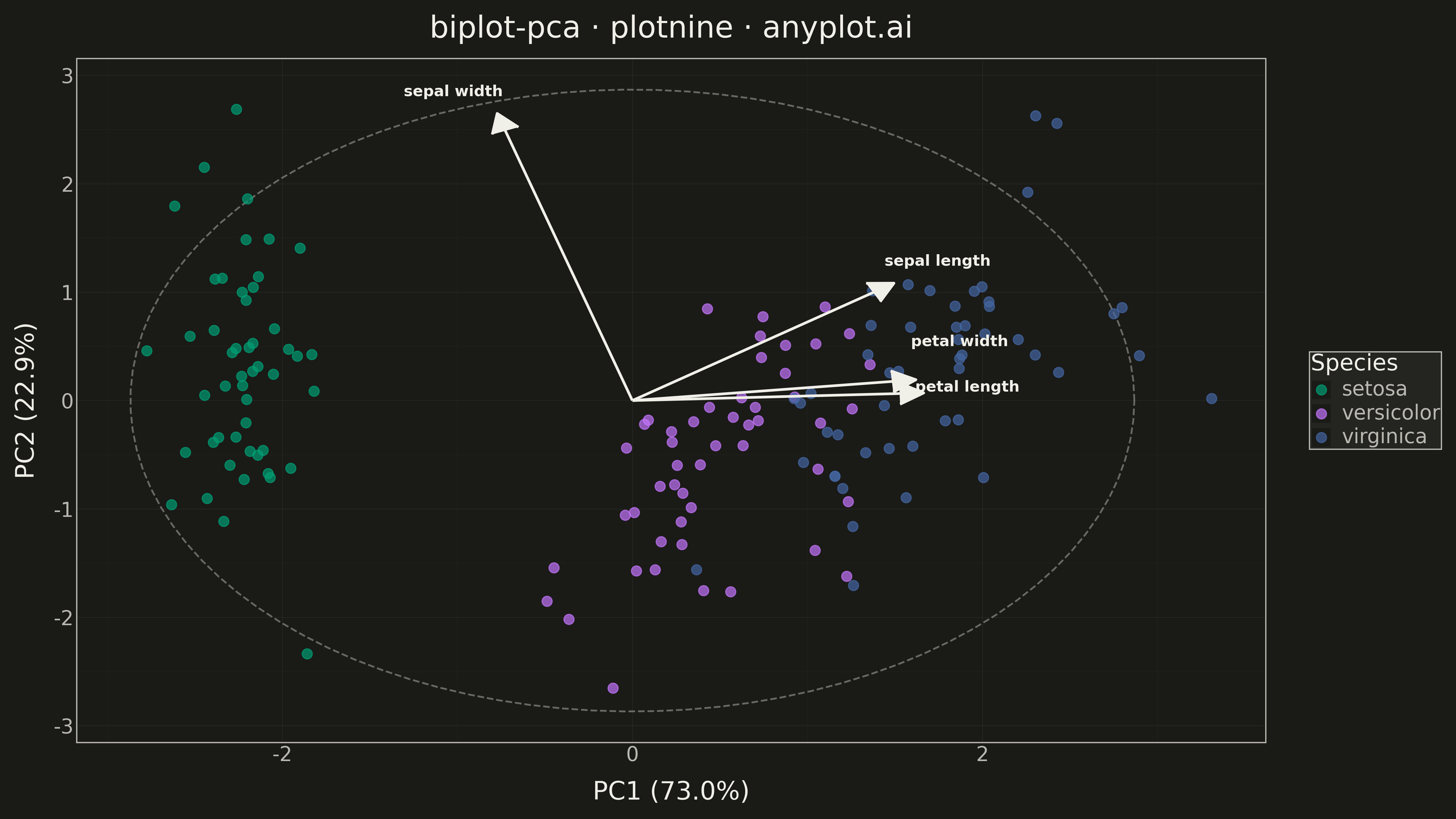
A PCA biplot simultaneously displays both observation scores (as points) and variable loadings (as arrows) in the principal component space. This dual representation is essential for interpreting PCA results, revealing how observations relate to each other and which original variables drive the separation along each principal component. The length and direction of loading arrows indicate variable importance and correlation with the components.
""" anyplot.ai
biplot-pca: PCA Biplot with Scores and Loading Vectors
Library: plotnine 0.15.4 | Python 3.13.13
Quality: 93/100 | Updated: 2026-05-17
"""

import os

import numpy as np
import pandas as pd
from plotnine import (
    aes,
    arrow,
    element_line,
    element_rect,
    element_text,
    geom_path,
    geom_point,
    geom_segment,
    geom_text,
    ggplot,
    labs,
    scale_color_manual,
    theme,
    theme_minimal,
)
from sklearn.datasets import load_iris
from sklearn.decomposition import PCA
from sklearn.preprocessing import StandardScaler


# Theme configuration
THEME = os.getenv("ANYPLOT_THEME", "light")
PAGE_BG = "#FAF8F1" if THEME == "light" else "#1A1A17"
ELEVATED_BG = "#FFFDF6" if THEME == "light" else "#242420"
INK = "#1A1A17" if THEME == "light" else "#F0EFE8"
INK_SOFT = "#4A4A44" if THEME == "light" else "#B8B7B0"

# Okabe-Ito palette (first 3 for species)
IMPRINT = ["#009E73", "#C475FD", "#4467A3"]

# Load Iris dataset
iris = load_iris()
X = iris.data
y = iris.target
feature_names = iris.feature_names
species_names = [iris.target_names[i] for i in y]

# Standardize features
scaler = StandardScaler()
X_scaled = scaler.fit_transform(X)

# Perform PCA
pca = PCA(n_components=2)
scores = pca.fit_transform(X_scaled)
loadings = pca.components_.T  # Shape: (n_features, n_components)
var_explained = pca.explained_variance_ratio_ * 100

# Create scores DataFrame
df_scores = pd.DataFrame({"PC1": scores[:, 0], "PC2": scores[:, 1], "Species": species_names})

# Scale loadings to be visible alongside scores
score_scale = np.max(np.abs(scores)) * 0.8
loading_scale = np.max(np.abs(loadings))
scale_factor = score_scale / loading_scale

# Create loadings DataFrame for arrows
xend = loadings[:, 0] * scale_factor
yend = loadings[:, 1] * scale_factor

df_loadings = pd.DataFrame(
    {
        "x": [0] * len(feature_names),
        "y": [0] * len(feature_names),
        "xend": xend,
        "yend": yend,
        "variable": [name.replace(" (cm)", "") for name in feature_names],
    }
)

# Create label positions with smart offsets to avoid overlap
label_offset = 0.25
df_labels = pd.DataFrame(
    {
        "x": xend + np.sign(xend) * label_offset,
        "y": yend + np.sign(yend) * label_offset * 0.8,
        "variable": [name.replace(" (cm)", "") for name in feature_names],
    }
)
# Manually adjust overlapping labels (petal length and petal width)
df_labels.loc[2, "y"] -= 0.15  # petal length - move down
df_labels.loc[3, "y"] += 0.15  # petal width - move up

# Create unit circle reference (scaled)
theta = np.linspace(0, 2 * np.pi, 100)
df_circle = pd.DataFrame({"x": np.cos(theta) * scale_factor, "y": np.sin(theta) * scale_factor})

# Theme-adaptive theme
anyplot_theme = theme(
    figure_size=(16, 9),
    plot_background=element_rect(fill=PAGE_BG, color=PAGE_BG),
    panel_background=element_rect(fill=PAGE_BG),
    panel_grid_major=element_line(color=INK, size=0.3, alpha=0.10),
    panel_grid_minor=element_line(color=INK, size=0.2, alpha=0.05),
    panel_border=element_rect(color=INK_SOFT, fill=None),
    axis_title=element_text(size=20, color=INK),
    axis_text=element_text(size=16, color=INK_SOFT),
    axis_line=element_line(color=INK_SOFT),
    plot_title=element_text(size=24, color=INK),
    legend_background=element_rect(fill=ELEVATED_BG, color=INK_SOFT),
    legend_text=element_text(size=16, color=INK_SOFT),
    legend_title=element_text(size=18, color=INK),
    text=element_text(size=14),
)

# Create biplot
plot = (
    ggplot()
    # Unit circle reference
    + geom_path(df_circle, aes(x="x", y="y"), color=INK_SOFT, linetype="dashed", size=0.8, alpha=0.5)
    # Observation scores as points
    + geom_point(df_scores, aes(x="PC1", y="PC2", color="Species"), size=4, alpha=0.7)
    # Loading arrows
    + geom_segment(
        df_loadings,
        aes(x="x", y="y", xend="xend", yend="yend"),
        color=INK,
        size=1.2,
        arrow=arrow(length=0.15, type="closed"),
    )
    # Loading labels
    + geom_text(df_labels, aes(x="x", y="y", label="variable"), size=12, color=INK, fontweight="bold")
    # Labels
    + labs(
        x=f"PC1 ({var_explained[0]:.1f}%)",
        y=f"PC2 ({var_explained[1]:.1f}%)",
        title="biplot-pca · plotnine · anyplot.ai",
        color="Species",
    )
    # Theme
    + theme_minimal()
    + anyplot_theme
    + scale_color_manual(values=IMPRINT)
)

# Save
plot.save(f"plot-{THEME}.png", dpi=300, verbose=False)
Runnable source as JSON, for any HTTP client: https://api.anyplot.ai/specs/biplot-pca/plotnine/code. Any spec id and library id listed in llms-full.txt fit the same URL shape; every URL below is complete and callable.
{
  "spec_id": "biplot-pca",
  "language": "python",
  "library": "plotnine",
  "page": "https://anyplot.ai/biplot-pca/python/plotnine",
  "hub": "https://anyplot.ai/biplot-pca",
  "code_json": "https://api.anyplot.ai/specs/biplot-pca/plotnine/code",
  "spec_json": "https://api.anyplot.ai/specs/biplot-pca",
  "render_light_png": "https://storage.googleapis.com/anyplot-images/plots/biplot-pca/python/plotnine/plot-light.png",
  "render_dark_png": "https://storage.googleapis.com/anyplot-images/plots/biplot-pca/python/plotnine/plot-dark.png",
  "quality_score": 93.0,
  "license": "MIT",
  "guide": "https://anyplot.ai/llms.txt"
}
Part of PCA Biplot with Scores and Loading Vectors on anyplot.ai.