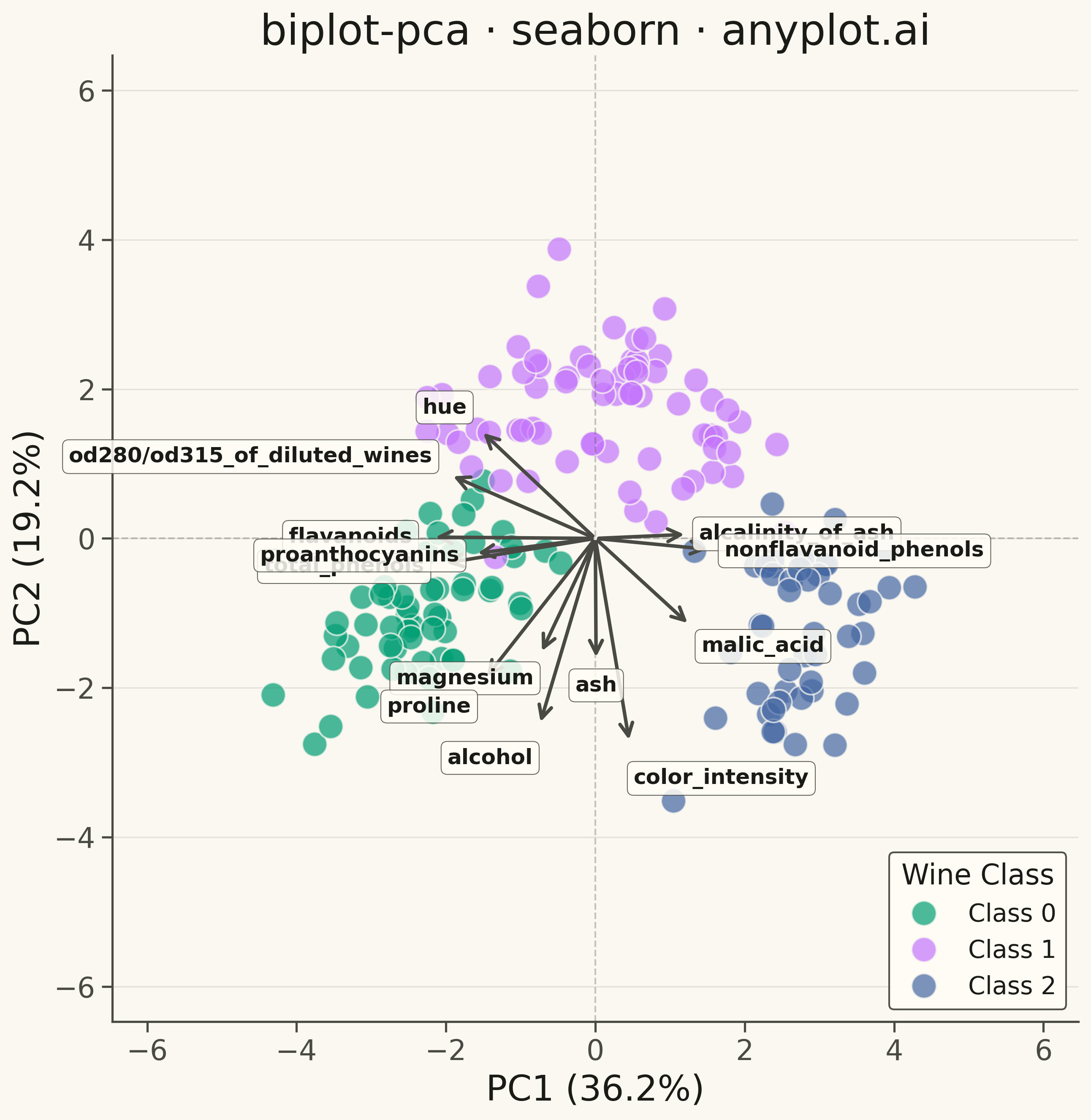
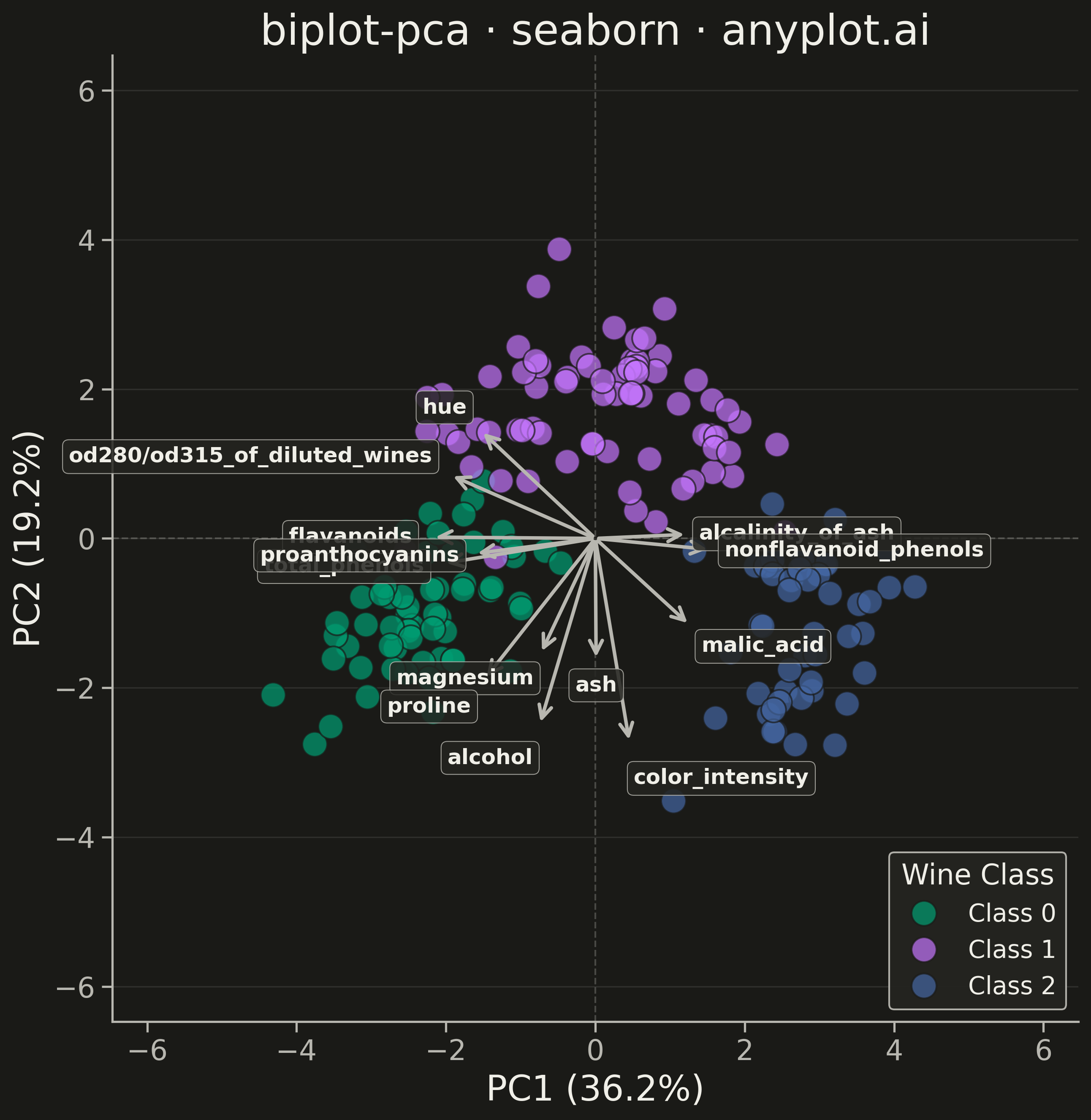
A PCA biplot simultaneously displays both observation scores (as points) and variable loadings (as arrows) in the principal component space. This dual representation is essential for interpreting PCA results, revealing how observations relate to each other and which original variables drive the separation along each principal component. The length and direction of loading arrows indicate variable importance and correlation with the components.
""" anyplot.ai
biplot-pca: PCA Biplot with Scores and Loading Vectors
Library: seaborn 0.13.2 | Python 3.13.13
Quality: 83/100 | Updated: 2026-05-17
"""

import os

import matplotlib.pyplot as plt
import numpy as np
import seaborn as sns
from sklearn.datasets import load_wine


# Theme tokens
THEME = os.getenv("ANYPLOT_THEME", "light")
PAGE_BG = "#FAF8F1" if THEME == "light" else "#1A1A17"
ELEVATED_BG = "#FFFDF6" if THEME == "light" else "#242420"
INK = "#1A1A17" if THEME == "light" else "#F0EFE8"
INK_SOFT = "#4A4A44" if THEME == "light" else "#B8B7B0"

# Okabe-Ito palette
IMPRINT = ["#009E73", "#C475FD", "#4467A3", "#BD8233", "#AE3030"]

# Load Wine dataset
wine = load_wine()
feature_names = wine.feature_names
X = wine.data
target = wine.target

# Standardize features (z-score normalization)
X_mean = X.mean(axis=0)
X_std = X.std(axis=0)
X_scaled = (X - X_mean) / X_std

# Perform PCA using numpy (eigenvalue decomposition of covariance matrix)
cov_matrix = np.cov(X_scaled.T)
eigenvalues, eigenvectors = np.linalg.eigh(cov_matrix)

# Sort eigenvectors by eigenvalues in descending order
idx = np.argsort(eigenvalues)[::-1]
eigenvalues = eigenvalues[idx]
eigenvectors = eigenvectors[:, idx]

# Get first 2 principal components
pc_vectors = eigenvectors[:, :2]

# Project data onto principal components (scores)
scores = X_scaled @ pc_vectors

# Loadings are the eigenvectors
loadings = pc_vectors

# Calculate variance explained
var_explained = eigenvalues[:2] / eigenvalues.sum() * 100

# Create figure with seaborn theme
sns.set_theme(
    style="ticks",
    rc={
        "figure.facecolor": PAGE_BG,
        "axes.facecolor": PAGE_BG,
        "axes.edgecolor": INK_SOFT,
        "axes.labelcolor": INK,
        "text.color": INK,
        "xtick.color": INK_SOFT,
        "ytick.color": INK_SOFT,
        "grid.color": INK,
        "grid.alpha": 0.10,
        "legend.facecolor": ELEVATED_BG,
        "legend.edgecolor": INK_SOFT,
    },
)

fig, ax = plt.subplots(figsize=(16, 9), facecolor=PAGE_BG)
ax.set_facecolor(PAGE_BG)

# Prepare data for seaborn
score_df = {"PC1": scores[:, 0], "PC2": scores[:, 1], "Wine Class": target}

# Map target labels to class names
class_names = ["Class 0", "Class 1", "Class 2"]
score_df["Wine Class"] = [class_names[int(t)] for t in score_df["Wine Class"]]

# Plot observation scores with seaborn using Okabe-Ito colors
sns.scatterplot(
    x="PC1",
    y="PC2",
    hue="Wine Class",
    data=score_df,
    palette=IMPRINT[:3],
    s=200,
    alpha=0.7,
    edgecolor=PAGE_BG,
    linewidth=1,
    ax=ax,
)

# Scale loadings to be visible but not overwhelming
score_max = np.abs(scores).max()
loading_scale = score_max * 1.2

# Draw loading arrows and labels
arrow_color = INK_SOFT
feature_labels = [f.replace(" ", "\n") for f in feature_names[:13]]

# Store arrow endpoints for label positioning
arrow_ends = []
for i, feature in enumerate(feature_labels):
    x_load = loadings[i, 0] * loading_scale
    y_load = loadings[i, 1] * loading_scale
    arrow_ends.append((x_load, y_load, feature))

    # Draw arrow from origin to loading position
    ax.annotate(
        "",
        xy=(x_load, y_load),
        xytext=(0, 0),
        arrowprops={"arrowstyle": "->", "color": arrow_color, "lw": 2.0, "mutation_scale": 18},
    )

# Add labels with smart positioning to avoid overlap
for _i, (x_load, y_load, feature) in enumerate(arrow_ends):
    # Offset text beyond arrow tip
    text_offset = 1.12
    x_text = x_load * text_offset
    y_text = y_load * text_offset

    # Adjust horizontal alignment based on position
    if x_load > 0.3:
        ha = "left"
    elif x_load < -0.3:
        ha = "right"
    else:
        ha = "center"

    # Adjust vertical alignment based on position
    if y_load > 0.5:
        va = "bottom"
    elif y_load < -0.5:
        va = "top"
    else:
        va = "center"

    ax.text(
        x_text,
        y_text,
        feature,
        fontsize=12,
        fontweight="bold",
        ha=ha,
        va=va,
        color=INK,
        bbox={
            "boxstyle": "round,pad=0.3",
            "facecolor": ELEVATED_BG,
            "alpha": 0.85,
            "edgecolor": INK_SOFT,
            "linewidth": 0.5,
        },
    )

# Draw reference lines at origin
ax.axhline(y=0, color=INK_SOFT, linestyle="--", linewidth=1, alpha=0.3)
ax.axvline(x=0, color=INK_SOFT, linestyle="--", linewidth=1, alpha=0.3)

# Styling
ax.set_xlabel(f"PC1 ({var_explained[0]:.1f}%)", fontsize=20, color=INK)
ax.set_ylabel(f"PC2 ({var_explained[1]:.1f}%)", fontsize=20, color=INK)
ax.set_title("biplot-pca · seaborn · anyplot.ai", fontsize=24, fontweight="medium", color=INK)
ax.tick_params(axis="both", labelsize=16, colors=INK_SOFT)

# Remove top and right spines
ax.spines["top"].set_visible(False)
ax.spines["right"].set_visible(False)
for spine in ["left", "bottom"]:
    ax.spines[spine].set_color(INK_SOFT)

# Add subtle grid
ax.yaxis.grid(True, alpha=0.10, linewidth=0.8, color=INK)

# Legend styling
legend = ax.legend(title="Wine Class", fontsize=14, title_fontsize=16, loc="lower right")
legend.get_frame().set_facecolor(ELEVATED_BG)
legend.get_frame().set_edgecolor(INK_SOFT)
legend.get_frame().set_alpha(0.95)
legend.get_title().set_color(INK)
for text in legend.get_texts():
    text.set_color(INK)

# Set balanced axis limits
max_range = max(np.abs(scores).max(), loading_scale) * 1.25
ax.set_xlim(-max_range, max_range)
ax.set_ylim(-max_range, max_range)
ax.set_aspect("equal")

plt.tight_layout()
plt.savefig(f"plot-{THEME}.png", dpi=300, bbox_inches="tight", facecolor=PAGE_BG)
Runnable source as JSON, for any HTTP client: https://api.anyplot.ai/specs/biplot-pca/seaborn/code. Any spec id and library id listed in llms-full.txt fit the same URL shape; every URL below is complete and callable.
{
  "spec_id": "biplot-pca",
  "language": "python",
  "library": "seaborn",
  "page": "https://anyplot.ai/biplot-pca/python/seaborn",
  "hub": "https://anyplot.ai/biplot-pca",
  "code_json": "https://api.anyplot.ai/specs/biplot-pca/seaborn/code",
  "spec_json": "https://api.anyplot.ai/specs/biplot-pca",
  "render_light_png": "https://storage.googleapis.com/anyplot-images/plots/biplot-pca/python/seaborn/plot-light.png",
  "render_dark_png": "https://storage.googleapis.com/anyplot-images/plots/biplot-pca/python/seaborn/plot-dark.png",
  "quality_score": 83.0,
  "license": "MIT",
  "guide": "https://anyplot.ai/llms.txt"
}
Part of PCA Biplot with Scores and Loading Vectors on anyplot.ai.