The same plot in 14 other libraries — JavaScript: D3.js, Apache ECharts, Highcharts, MUI X Charts; Python: Altair, Bokeh, lets-plot, Matplotlib, Plotly, plotnine, Pygal, Seaborn; R: ggplot2; Julia: Makie.jl. Compare all 15 side by side: Grouped Box Plot in Python, R, Julia and JavaScript.
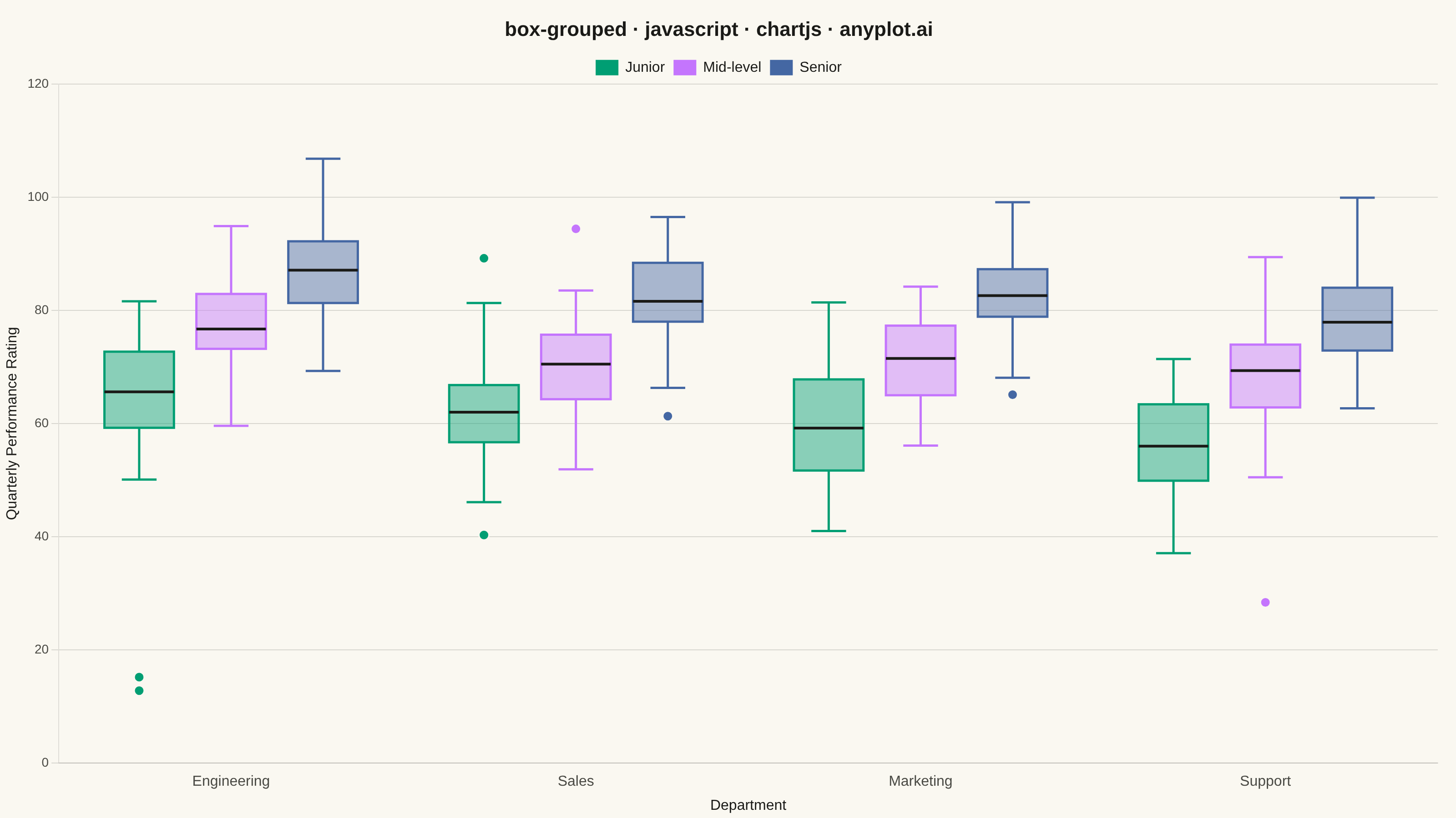
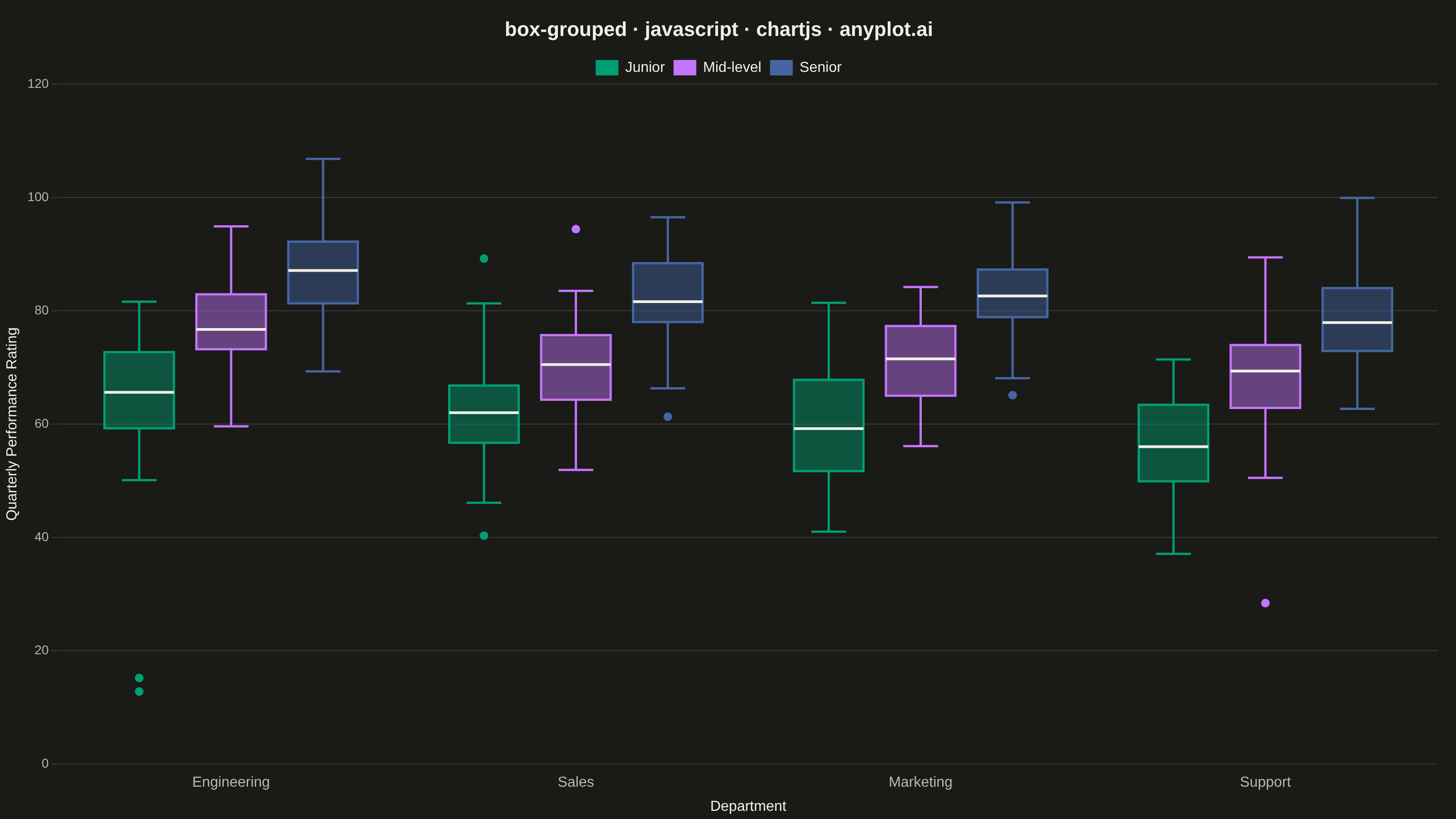
A grouped box plot displays multiple box plots side-by-side within each category, enabling comparison of distributions across subgroups. Each group contains boxes representing different subcategories or conditions, making it ideal for multi-factor comparisons and A/B testing scenarios with multiple metrics.
// anyplot.ai
// box-grouped: Grouped Box Plot
// Library: chartjs 4.4.7 | JavaScript 22.23.2
// Quality: 91/100 | Created: 2026-08-18

const t = window.ANYPLOT_TOKENS;

// --- Deterministic PRNG (LCG + Box-Muller, no seeded Math.random in browser) ---
const lcgState = { s: 20260818 >>> 0 };
function rand() {
  lcgState.s = (lcgState.s * 1664525 + 1013904223) >>> 0;
  return lcgState.s / 4294967296;
}
function randNormal() {
  const u1 = Math.max(rand(), 1e-9);
  const u2 = rand();
  return Math.sqrt(-2 * Math.log(u1)) * Math.cos(2 * Math.PI * u2);
}

function quantile(sorted, q) {
  const pos = (sorted.length - 1) * q;
  const lo = Math.floor(pos);
  const hi = Math.ceil(pos);
  if (lo === hi) return sorted[lo];
  return sorted[lo] + (sorted[hi] - sorted[lo]) * (pos - lo);
}

// --- Data: quarterly performance rating by department and experience level ---
const departments = ["Engineering", "Sales", "Marketing", "Support"];
const levels = [
  { name: "Junior", baseRating: 61, sd: 10 },
  { name: "Mid-level", baseRating: 73, sd: 8 },
  { name: "Senior", baseRating: 83, sd: 7 },
];
const deptShift = { Engineering: 4, Sales: 0, Marketing: -2, Support: -4 };
const n = 45;

const cells = departments.map((dept) =>
  levels.map((level) => {
    const mean = level.baseRating + deptShift[dept];
    const values = Array.from(
      { length: n },
      () => Math.round((mean + randNormal() * level.sd) * 10) / 10,
    );
    return { dept, level: level.name, values };
  }),
);

// Inject a handful of genuine outliers so "beyond whiskers" has something to show.
cells[0][0].values.push(15.2, 12.8);
cells[2][2].values.push(99.1);
cells[3][1].values.push(28.4);

cells.forEach((row) =>
  row.forEach((cell) => {
    const sorted = [...cell.values].sort((a, b) => a - b);
    const q1 = quantile(sorted, 0.25);
    const median = quantile(sorted, 0.5);
    const q3 = quantile(sorted, 0.75);
    const iqr = q3 - q1;
    const loBound = q1 - 1.5 * iqr;
    const hiBound = q3 + 1.5 * iqr;
    const inRange = sorted.filter((v) => v >= loBound && v <= hiBound);
    const whiskerLo = inRange.length ? inRange[0] : q1;
    const whiskerHi = inRange.length ? inRange[inRange.length - 1] : q3;
    const outliers = sorted.filter((v) => v < whiskerLo || v > whiskerHi);
    cell.stats = { q1, median, q3, whiskerLo, whiskerHi, outliers };
  }),
);

const allValues = cells.flatMap((row) =>
  row.flatMap((cell) => [cell.stats.whiskerLo, cell.stats.whiskerHi, ...cell.stats.outliers]),
);
const dataMin = Math.min(...allValues);
const dataMax = Math.max(...allValues);
const dataPad = (dataMax - dataMin) * 0.1;
const axisMin = Math.floor((dataMin - dataPad) / 5) * 5;
const axisMax = Math.ceil((dataMax + dataPad) / 5) * 5;

// --- Mount -------------------------------------------------------------------
const canvas = document.createElement("canvas");
document.getElementById("container").appendChild(canvas);

// --- Custom grouped-box renderer ----------------------------------------------
// Chart.js has no built-in box-plot type; the box/whisker/outlier geometry is
// drawn by hand with the canvas API inside a plugin hook. The invisible grouped
// bar chart underneath supplies correct per-subcategory x-positions and widths
// via its own bar-element metadata — no external chart type or plugin package.
function hexToRgba(hex, alpha) {
  const r = parseInt(hex.slice(1, 3), 16);
  const g = parseInt(hex.slice(3, 5), 16);
  const b = parseInt(hex.slice(5, 7), 16);
  return `rgba(${r}, ${g}, ${b}, ${alpha})`;
}

const groupedBoxPlugin = {
  id: "groupedBox",
  afterDatasetsDraw(chart) {
    const { ctx } = chart;

    levels.forEach((level, levelIdx) => {
      const meta = chart.getDatasetMeta(levelIdx);
      const color = t.palette[levelIdx % t.palette.length];

      departments.forEach((dept, deptIdx) => {
        const el = meta.data[deptIdx];
        if (!el) return;
        const cell = cells[deptIdx][levelIdx];
        const s = cell.stats;
        const cx = el.x;
        const halfWidth = el.width * 0.42;

        const yQ1 = chart.scales.y.getPixelForValue(s.q1);
        const yQ3 = chart.scales.y.getPixelForValue(s.q3);
        const yMed = chart.scales.y.getPixelForValue(s.median);
        const yWhiskerLo = chart.scales.y.getPixelForValue(s.whiskerLo);
        const yWhiskerHi = chart.scales.y.getPixelForValue(s.whiskerHi);

        // Whiskers
        ctx.save();
        ctx.strokeStyle = color;
        ctx.lineWidth = 2.5;
        ctx.beginPath();
        ctx.moveTo(cx, yQ3);
        ctx.lineTo(cx, yWhiskerHi);
        ctx.moveTo(cx - halfWidth * 0.5, yWhiskerHi);
        ctx.lineTo(cx + halfWidth * 0.5, yWhiskerHi);
        ctx.moveTo(cx, yQ1);
        ctx.lineTo(cx, yWhiskerLo);
        ctx.moveTo(cx - halfWidth * 0.5, yWhiskerLo);
        ctx.lineTo(cx + halfWidth * 0.5, yWhiskerLo);
        ctx.stroke();

        // Quartile box
        ctx.fillStyle = hexToRgba(color, 0.45);
        ctx.fillRect(cx - halfWidth, yQ3, halfWidth * 2, yQ1 - yQ3);
        ctx.strokeRect(cx - halfWidth, yQ3, halfWidth * 2, yQ1 - yQ3);

        // Median line
        ctx.strokeStyle = t.ink;
        ctx.lineWidth = 3;
        ctx.beginPath();
        ctx.moveTo(cx - halfWidth, yMed);
        ctx.lineTo(cx + halfWidth, yMed);
        ctx.stroke();
        ctx.restore();

        // Outliers
        ctx.save();
        ctx.fillStyle = color;
        ctx.strokeStyle = t.pageBg;
        ctx.lineWidth = 1.5;
        s.outliers.forEach((v) => {
          const cy = chart.scales.y.getPixelForValue(v);
          ctx.beginPath();
          ctx.arc(cx, cy, 5.5, 0, 2 * Math.PI);
          ctx.fill();
          ctx.stroke();
        });
        ctx.restore();
      });
    });
  },
};

// --- Chart ---------------------------------------------------------------------
new Chart(canvas, {
  type: "bar",
  data: {
    labels: departments,
    datasets: levels.map((level, levelIdx) => ({
      label: level.name,
      data: departments.map(() => 0),
      backgroundColor: "transparent",
      borderWidth: 0,
      categoryPercentage: 0.8,
      barPercentage: 0.9,
    })),
  },
  options: {
    responsive: true,
    maintainAspectRatio: false,
    animation: false,
    layout: { padding: { top: 10, right: 20, bottom: 0, left: 0 } },
    plugins: {
      title: {
        display: true,
        text: "box-grouped · javascript · chartjs · anyplot.ai",
        color: t.ink,
        font: { size: 22 },
      },
      legend: {
        display: true,
        labels: {
          color: t.ink,
          font: { size: 16 },
          boxWidth: 24,
          boxHeight: 16,
          // Bar datasets are invisible (the box-plot glyphs are hand-drawn by
          // groupedBoxPlugin), so build swatches from the same palette colors
          // the plugin uses instead of the datasets' transparent fill.
          generateLabels: (chart) =>
            levels.map((level, i) => ({
              text: level.name,
              fillStyle: t.palette[i % t.palette.length],
              strokeStyle: t.palette[i % t.palette.length],
              fontColor: t.ink,
              datasetIndex: i,
            })),
        },
      },
      tooltip: { enabled: false },
    },
    scales: {
      x: {
        ticks: { color: t.inkSoft, font: { size: 16 } },
        grid: { display: false },
        title: {
          display: true,
          text: "Department",
          color: t.ink,
          font: { size: 16 },
        },
      },
      y: {
        min: axisMin,
        max: axisMax,
        ticks: { color: t.inkSoft, font: { size: 14 } },
        grid: { color: t.grid },
        title: {
          display: true,
          text: "Quarterly Performance Rating",
          color: t.ink,
          font: { size: 16 },
        },
      },
    },
  },
  plugins: [groupedBoxPlugin],
});
Runnable source as JSON, for any HTTP client: https://api.anyplot.ai/specs/box-grouped/chartjs/code. Any spec id and library id listed in llms-full.txt fit the same URL shape; every URL below is complete and callable.
{
  "spec_id": "box-grouped",
  "language": "javascript",
  "library": "chartjs",
  "page": "https://anyplot.ai/box-grouped/javascript/chartjs",
  "hub": "https://anyplot.ai/box-grouped",
  "code_json": "https://api.anyplot.ai/specs/box-grouped/chartjs/code",
  "spec_json": "https://api.anyplot.ai/specs/box-grouped",
  "render_light_png": "https://storage.googleapis.com/anyplot-images/plots/box-grouped/javascript/chartjs/plot-light.png",
  "render_dark_png": "https://storage.googleapis.com/anyplot-images/plots/box-grouped/javascript/chartjs/plot-dark.png",
  "interactive_light_html": "https://storage.googleapis.com/anyplot-images/plots/box-grouped/javascript/chartjs/plot-light.html",
  "interactive_dark_html": "https://storage.googleapis.com/anyplot-images/plots/box-grouped/javascript/chartjs/plot-dark.html",
  "quality_score": 91.0,
  "license": "MIT",
  "guide": "https://anyplot.ai/llms.txt"
}
Part of Grouped Box Plot on anyplot.ai.