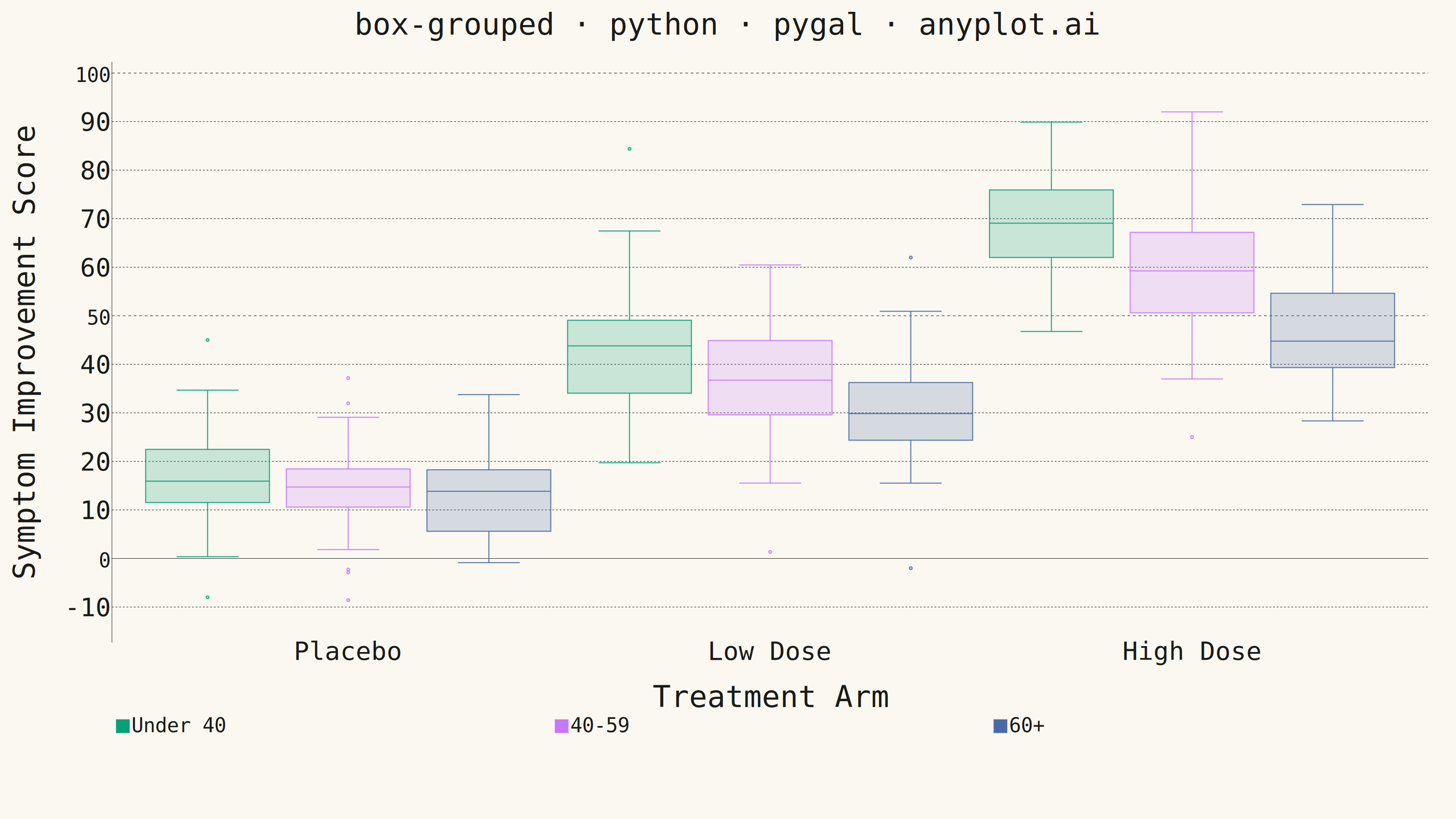
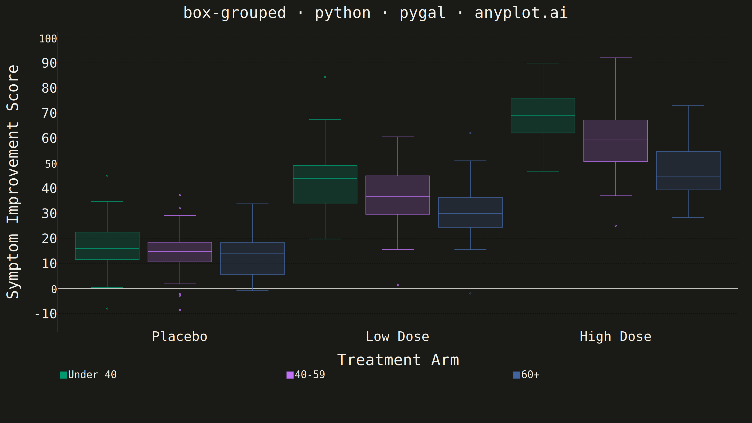
A grouped box plot displays multiple box plots side-by-side within each category, enabling comparison of distributions across subgroups. Each group contains boxes representing different subcategories or conditions, making it ideal for multi-factor comparisons and A/B testing scenarios with multiple metrics.
""" anyplot.ai
box-grouped: Grouped Box Plot
Library: pygal 3.1.3 | Python 3.13.15
Quality: 90/100 | Updated: 2026-08-18
"""

import os

import numpy as np
import pygal
from pygal.style import Style


THEME = os.getenv("ANYPLOT_THEME", "light")
PAGE_BG = "#FAF8F1" if THEME == "light" else "#1A1A17"
INK = "#1A1A17" if THEME == "light" else "#F0EFE8"
INK_MUTED = "#6B6A63" if THEME == "light" else "#A8A79F"

IMPRINT = ("#009E73", "#C475FD", "#4467A3", "#BD8233", "#AE3030", "#2ABCCD", "#954477")

# Data - Clinical trial symptom-improvement scores by treatment arm and patient age group
np.random.seed(42)

treatment_arms = ["Placebo", "Low Dose", "High Dose"]
age_groups = ["Under 40", "40-59", "60+"]

# Generate improvement-score distributions with realistic dose/age effects
data = {}
# Placebo: modest, noisy improvement regardless of age
data[("Placebo", "Under 40")] = np.random.normal(18, 9, 60)
data[("Placebo", "40-59")] = np.random.normal(15, 9, 60)
data[("Placebo", "60+")] = np.random.normal(12, 8, 60)

# Low Dose: moderate improvement, slightly weaker response in older patients
data[("Low Dose", "Under 40")] = np.random.normal(42, 11, 60)
data[("Low Dose", "40-59")] = np.random.normal(37, 11, 60)
data[("Low Dose", "60+")] = np.random.normal(30, 10, 60)

# High Dose: strongest improvement, response still tapers with age
data[("High Dose", "Under 40")] = np.random.normal(68, 10, 60)
data[("High Dose", "40-59")] = np.random.normal(60, 10, 60)
data[("High Dose", "60+")] = np.random.normal(50, 12, 60)

# Add outliers to show box plot features (non-responders and exceptional responders)
data[("Placebo", "Under 40")] = np.append(data[("Placebo", "Under 40")], [-8, 45])
data[("Low Dose", "60+")] = np.append(data[("Low Dose", "60+")], [-2, 62])
data[("High Dose", "40-59")] = np.append(data[("High Dose", "40-59")], [25, 92])

# Subcategory colors: Imprint palette starting with brand green, canonical order
subcategory_colors = IMPRINT[:3]

# Build full color tuple: repeat pattern for each treatment-arm group
all_colors = subcategory_colors * len(treatment_arms)

custom_style = Style(
    background=PAGE_BG,
    plot_background=PAGE_BG,
    foreground=INK,
    foreground_strong=INK,
    foreground_subtle=INK_MUTED,
    colors=all_colors,
    title_font_size=66,
    label_font_size=56,
    major_label_font_size=44,
    legend_font_size=44,
    value_font_size=36,
    opacity=0.97,
    opacity_hover=1.0,
    stroke_width=2.5,
)

# Create box chart with legend showing only 3 age groups
chart = pygal.Box(
    width=3200,
    height=1800,
    style=custom_style,
    title="box-grouped · python · pygal · anyplot.ai",
    x_title="Treatment Arm",
    y_title="Symptom Improvement Score",
    show_legend=True,
    legend_at_bottom=True,
    legend_at_bottom_columns=3,
    legend_box_size=28,
    truncate_legend=-1,
    truncate_label=-1,
    show_y_guides=True,
    show_x_guides=False,
    margin=60,
    box_mode="tukey",
    x_label_rotation=0,
    yrange=(-15, 100),
    range=(-15, 100),
    y_labels=[-10, 0, 10, 20, 30, 40, 50, 60, 70, 80, 90, 100],
    dots_size=9,
)

# Track which age groups have been labeled in legend
labeled_groups = set()

# Add the 9 boxes grouped by treatment arm
for arm in treatment_arms:
    for group in age_groups:
        values = data[(arm, group)].tolist()
        # Only first occurrence of each age group gets a legend entry
        if group not in labeled_groups:
            chart.add(group, values)
            labeled_groups.add(group)
        else:
            # Suppress legend entry with None label
            chart.add(None, values)

# X-axis labels: show treatment arm name in center of each group
x_labels = ["", "Placebo", "", "", "Low Dose", "", "", "High Dose", ""]
chart.x_labels = x_labels

# Save outputs
chart.render_to_file(f"plot-{THEME}.html")
chart.render_to_png(f"plot-{THEME}.png")
Runnable source as JSON, for any HTTP client: https://api.anyplot.ai/specs/box-grouped/pygal/code. Any spec id and library id listed in llms-full.txt fit the same URL shape; every URL below is complete and callable.
{
  "spec_id": "box-grouped",
  "language": "python",
  "library": "pygal",
  "page": "https://anyplot.ai/box-grouped/python/pygal",
  "hub": "https://anyplot.ai/box-grouped",
  "code_json": "https://api.anyplot.ai/specs/box-grouped/pygal/code",
  "spec_json": "https://api.anyplot.ai/specs/box-grouped",
  "render_light_png": "https://storage.googleapis.com/anyplot-images/plots/box-grouped/python/pygal/plot-light.png",
  "render_dark_png": "https://storage.googleapis.com/anyplot-images/plots/box-grouped/python/pygal/plot-dark.png",
  "interactive_light_html": "https://storage.googleapis.com/anyplot-images/plots/box-grouped/python/pygal/plot-light.html",
  "interactive_dark_html": "https://storage.googleapis.com/anyplot-images/plots/box-grouped/python/pygal/plot-dark.html",
  "quality_score": 90.0,
  "license": "MIT",
  "guide": "https://anyplot.ai/llms.txt"
}
Part of Grouped Box Plot on anyplot.ai.