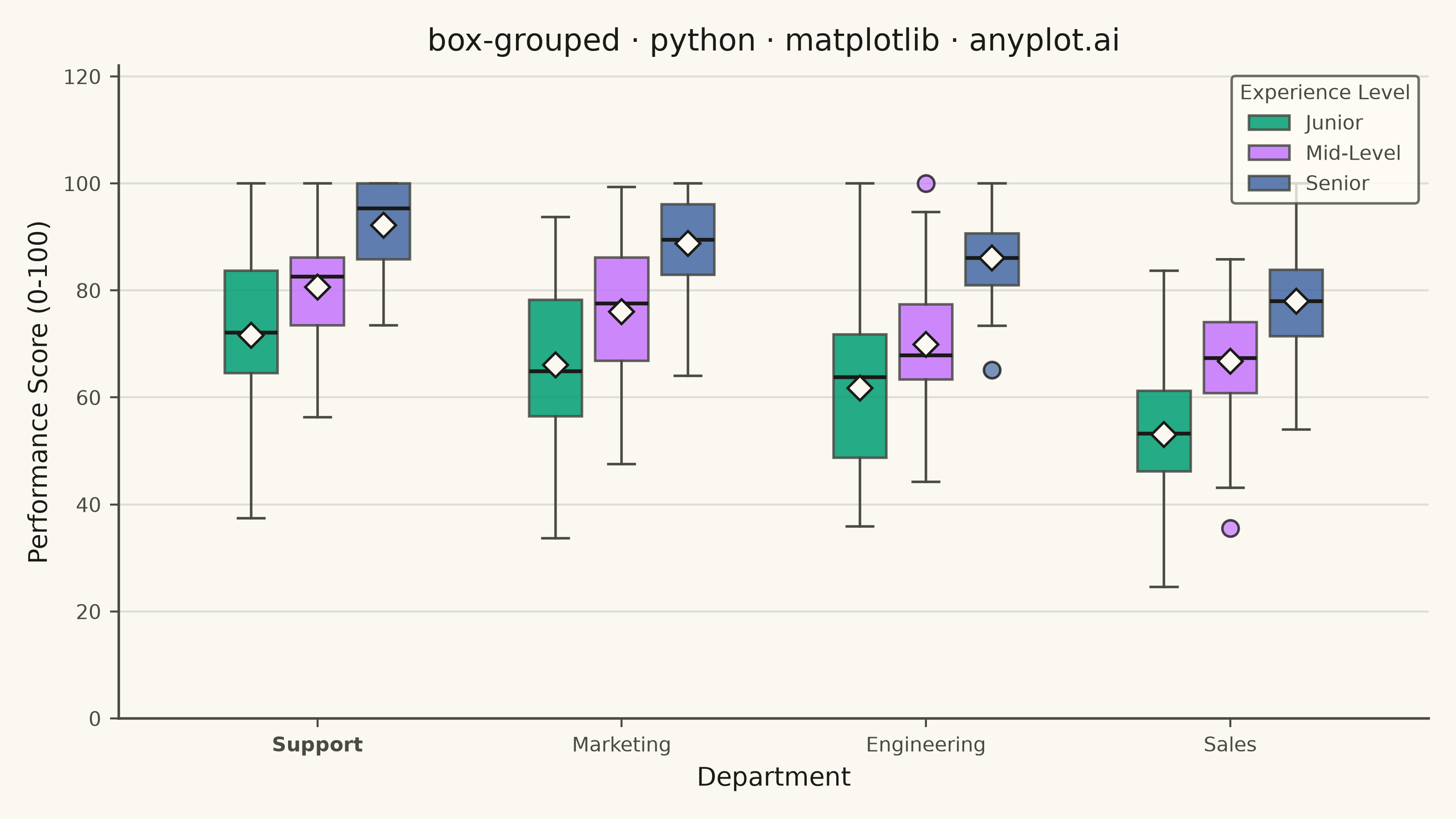
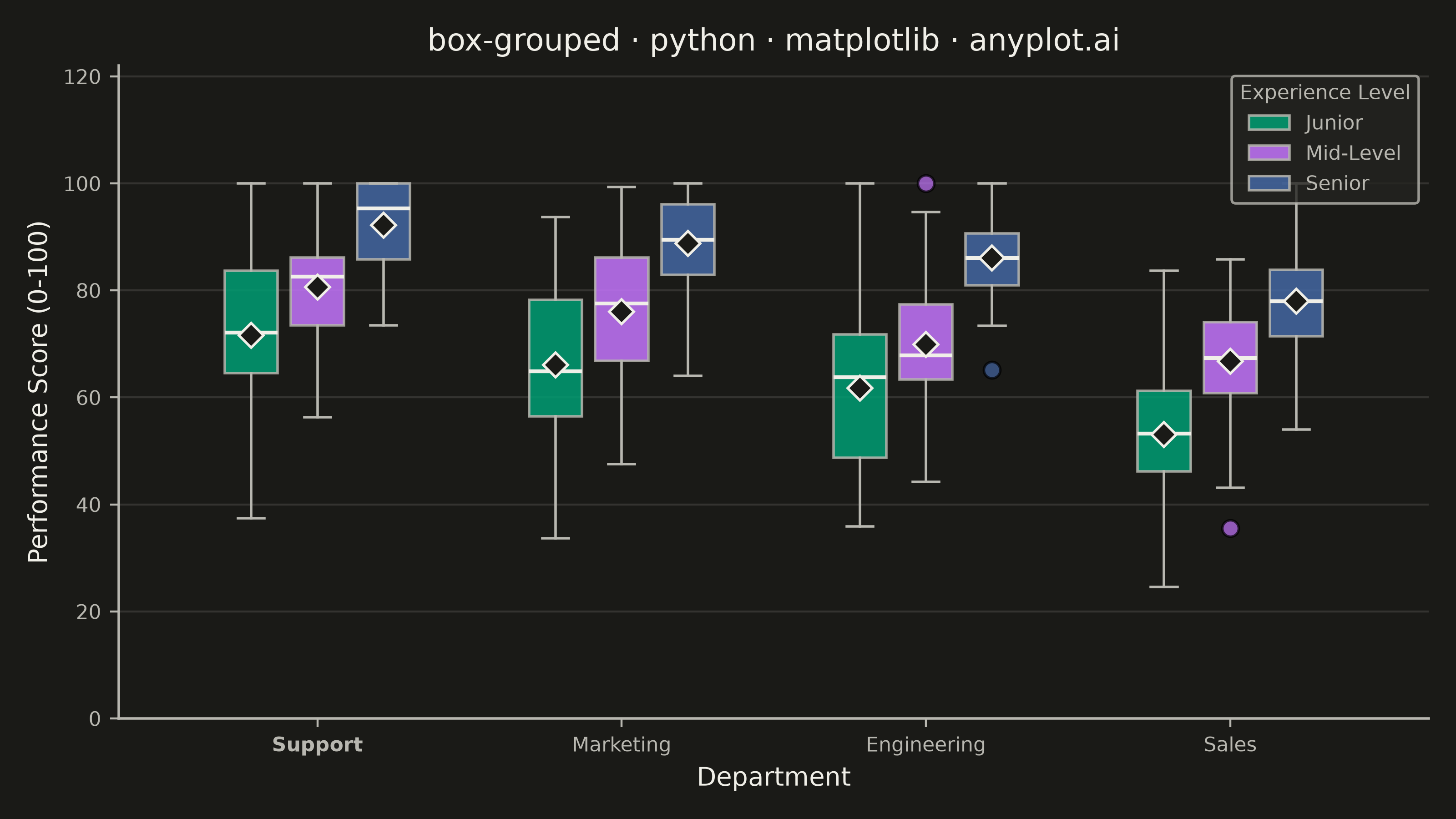
A grouped box plot displays multiple box plots side-by-side within each category, enabling comparison of distributions across subgroups. Each group contains boxes representing different subcategories or conditions, making it ideal for multi-factor comparisons and A/B testing scenarios with multiple metrics.
""" anyplot.ai
box-grouped: Grouped Box Plot
Library: matplotlib 3.11.1 | Python 3.13.15
Quality: 92/100 | Updated: 2026-08-18
"""

import os

import matplotlib.pyplot as plt
import numpy as np


# Theme tokens
THEME = os.getenv("ANYPLOT_THEME", "light")
PAGE_BG = "#FAF8F1" if THEME == "light" else "#1A1A17"
ELEVATED_BG = "#FFFDF6" if THEME == "light" else "#242420"
INK = "#1A1A17" if THEME == "light" else "#F0EFE8"
INK_SOFT = "#4A4A44" if THEME == "light" else "#B8B7B0"

# Imprint palette positions 1-3 (three subcategories)
IMPRINT_PALETTE = ["#009E73", "#C475FD", "#4467A3"]

# Data - Employee performance scores across departments and experience levels
np.random.seed(42)

categories = ["Sales", "Engineering", "Marketing", "Support"]
subcategories = ["Junior", "Mid-Level", "Senior"]

# Generate realistic performance data with varying distributions per department
data = {}
for cat_idx, cat in enumerate(categories):
    data[cat] = {}
    for sub_idx, sub in enumerate(subcategories):
        # Vary base performance by department (Sales lower, Support higher)
        dept_offset = cat_idx * 5
        base = 55 + sub_idx * 12 + dept_offset
        variance = 15 - sub_idx * 3
        n_points = np.random.randint(30, 60)
        scores = np.random.normal(base, variance, n_points)
        # Add outliers to some groups
        if np.random.random() > 0.6:
            outliers = np.random.choice([base - 25, base + 25], size=np.random.randint(1, 3))
            scores = np.concatenate([scores, outliers])
        data[cat][sub] = np.clip(scores, 0, 100)

# Order departments by overall median score, best to worst, for a clearer narrative
categories = sorted(categories, key=lambda cat: -np.median(np.concatenate(list(data[cat].values()))))

# Create plot
title = "box-grouped · python · matplotlib · anyplot.ai"
title_fontsize = round(12 * 67 / len(title)) if len(title) > 67 else 12

fig, ax = plt.subplots(figsize=(8, 4.5), dpi=400, facecolor=PAGE_BG)
ax.set_facecolor(PAGE_BG)

# Calculate positions for grouped boxes
n_categories = len(categories)
n_subcategories = len(subcategories)
box_width = 0.25
group_gap = 0.4

# Plot boxes for each subcategory, marking the mean alongside the median
for sub_idx, sub in enumerate(subcategories):
    positions = []
    box_data = []
    for cat_idx, cat in enumerate(categories):
        pos = cat_idx * (n_subcategories * box_width + group_gap) + sub_idx * box_width
        positions.append(pos)
        box_data.append(data[cat][sub])

    bp = ax.boxplot(
        box_data,
        positions=positions,
        widths=box_width * 0.8,
        patch_artist=True,
        showfliers=True,
        showmeans=True,
        flierprops={"marker": "o", "markerfacecolor": IMPRINT_PALETTE[sub_idx], "markersize": 6.5, "alpha": 0.7},
        medianprops={"color": INK, "linewidth": 1.5},
        meanprops={
            "marker": "D",
            "markerfacecolor": PAGE_BG,
            "markeredgecolor": INK,
            "markersize": 7,
            "markeredgewidth": 1,
        },
        whiskerprops={"color": INK_SOFT, "linewidth": 1},
        capprops={"color": INK_SOFT, "linewidth": 1},
        boxprops={"linewidth": 1},
    )

    # Color the boxes with the Imprint palette
    for patch in bp["boxes"]:
        patch.set_facecolor(IMPRINT_PALETTE[sub_idx])
        patch.set_alpha(0.85)
        patch.set_edgecolor(INK_SOFT)

# Set x-axis tick positions and labels
center_positions = [
    cat_idx * (n_subcategories * box_width + group_gap) + (n_subcategories - 1) * box_width / 2
    for cat_idx in range(n_categories)
]
ax.set_xticks(center_positions)
ax.set_xticklabels(categories, fontsize=8, color=INK)
# Sharpen the best-to-worst narrative: bold the top-performing department as a focal point
ax.get_xticklabels()[0].set_fontweight("bold")

# Labels and title
ax.set_xlabel("Department", fontsize=10, color=INK)
ax.set_ylabel("Performance Score (0-100)", fontsize=10, color=INK)
ax.set_title(title, fontsize=title_fontsize, fontweight="medium", color=INK)

# Tick params
ax.tick_params(axis="both", labelsize=8, colors=INK_SOFT, labelcolor=INK_SOFT)

# Legend (diamond marker explains the mean; box color explains experience level)
legend_patches = [
    plt.Rectangle((0, 0), 1, 1, facecolor=IMPRINT_PALETTE[i], edgecolor=INK_SOFT, alpha=0.85)
    for i in range(len(subcategories))
]
leg = ax.legend(legend_patches, subcategories, title="Experience Level", loc="upper right", fontsize=8)
if leg:
    leg.get_frame().set_facecolor(ELEVATED_BG)
    leg.get_frame().set_edgecolor(INK_SOFT)
    leg.get_title().set_color(INK_SOFT)
    leg.get_title().set_fontsize(8)
    plt.setp(leg.get_texts(), color=INK_SOFT)

# Grid (y-axis only, subtle)
ax.yaxis.grid(True, alpha=0.12, linewidth=0.8, color=INK)
ax.set_axisbelow(True)

# Spine styling
ax.spines["top"].set_visible(False)
ax.spines["right"].set_visible(False)
for s in ("left", "bottom"):
    ax.spines[s].set_color(INK_SOFT)
    ax.spines[s].set_linewidth(1)

# Y-axis limits — extra headroom above the data ceiling so the legend never crowds
# whiskers/fliers, even on data regenerations with taller spreads
ax.set_ylim(0, 122)

plt.tight_layout()
plt.savefig(f"plot-{THEME}.png", dpi=400, facecolor=PAGE_BG)
Runnable source as JSON, for any HTTP client: https://api.anyplot.ai/specs/box-grouped/matplotlib/code. Any spec id and library id listed in llms-full.txt fit the same URL shape; every URL below is complete and callable.
{
  "spec_id": "box-grouped",
  "language": "python",
  "library": "matplotlib",
  "page": "https://anyplot.ai/box-grouped/python/matplotlib",
  "hub": "https://anyplot.ai/box-grouped",
  "code_json": "https://api.anyplot.ai/specs/box-grouped/matplotlib/code",
  "spec_json": "https://api.anyplot.ai/specs/box-grouped",
  "render_light_png": "https://storage.googleapis.com/anyplot-images/plots/box-grouped/python/matplotlib/plot-light.png",
  "render_dark_png": "https://storage.googleapis.com/anyplot-images/plots/box-grouped/python/matplotlib/plot-dark.png",
  "quality_score": 92.0,
  "license": "MIT",
  "guide": "https://anyplot.ai/llms.txt"
}
Part of Grouped Box Plot on anyplot.ai.