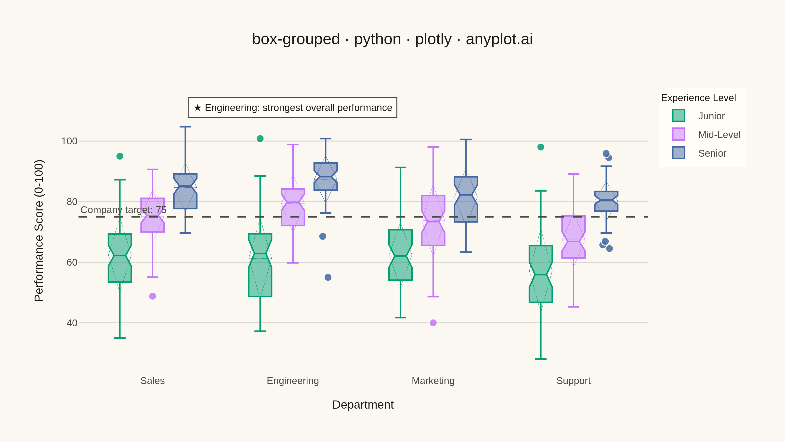
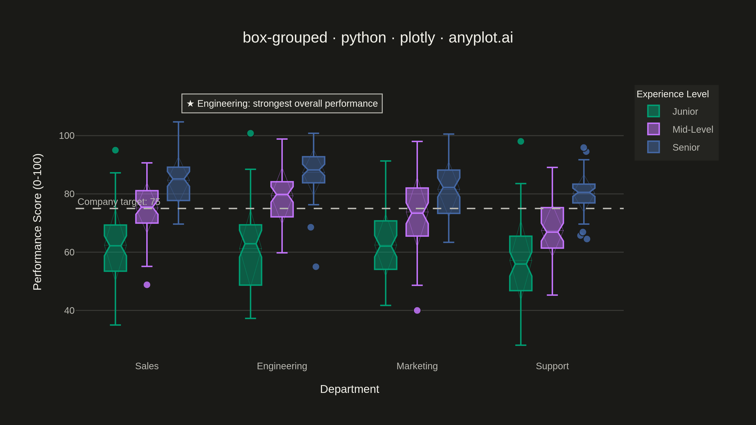
A grouped box plot displays multiple box plots side-by-side within each category, enabling comparison of distributions across subgroups. Each group contains boxes representing different subcategories or conditions, making it ideal for multi-factor comparisons and A/B testing scenarios with multiple metrics.
""" anyplot.ai
box-grouped: Grouped Box Plot
Library: plotly 6.9.0 | Python 3.13.15
Quality: 91/100 | Updated: 2026-08-18
"""

import os

import numpy as np
import plotly.graph_objects as go


# Theme tokens
THEME = os.getenv("ANYPLOT_THEME", "light")
PAGE_BG = "#FAF8F1" if THEME == "light" else "#1A1A17"
ELEVATED_BG = "#FFFDF6" if THEME == "light" else "#242420"
INK = "#1A1A17" if THEME == "light" else "#F0EFE8"
INK_SOFT = "#4A4A44" if THEME == "light" else "#B8B7B0"
GRID = "rgba(26,26,23,0.15)" if THEME == "light" else "rgba(240,239,232,0.15)"

# Imprint palette
IMPRINT = ["#009E73", "#C475FD", "#4467A3"]

# Data - Employee performance scores by department and experience level
np.random.seed(42)

categories = ["Sales", "Engineering", "Marketing", "Support"]
subcategories = ["Junior", "Mid-Level", "Senior"]

# Generate realistic performance data with varying distributions
data = {
    "Sales": {
        "Junior": np.random.normal(65, 12, 50),
        "Mid-Level": np.random.normal(75, 10, 50),
        "Senior": np.random.normal(85, 8, 50),
    },
    "Engineering": {
        "Junior": np.random.normal(60, 15, 50),
        "Mid-Level": np.random.normal(78, 9, 50),
        "Senior": np.random.normal(88, 6, 50),
    },
    "Marketing": {
        "Junior": np.random.normal(62, 14, 50),
        "Mid-Level": np.random.normal(72, 11, 50),
        "Senior": np.random.normal(82, 9, 50),
    },
    "Support": {
        "Junior": np.random.normal(58, 13, 50),
        "Mid-Level": np.random.normal(70, 10, 50),
        "Senior": np.random.normal(80, 7, 50),
    },
}

# Add some outliers for feature coverage
data["Sales"]["Junior"] = np.append(data["Sales"]["Junior"], [35, 95])
data["Engineering"]["Senior"] = np.append(data["Engineering"]["Senior"], [55, 95])
data["Marketing"]["Mid-Level"] = np.append(data["Marketing"]["Mid-Level"], [40, 98])

# Create figure
fig = go.Figure()

# Add box traces for each subcategory
for i, subcat in enumerate(subcategories):
    x_vals = []
    y_vals = []
    for cat in categories:
        values = data[cat][subcat]
        x_vals.extend([cat] * len(values))
        y_vals.extend(values)

    fig.add_trace(
        go.Box(
            x=x_vals,
            y=y_vals,
            name=subcat,
            marker_color=IMPRINT[i],
            boxmean="sd",
            notched=True,
            line={"width": 1.5},
            marker={"size": 8, "opacity": 0.85, "line": {"width": 1, "color": PAGE_BG}},
            boxpoints="outliers",
            jitter=0.4,
            pointpos=0,
        )
    )

# Second storytelling layer — call out the department with the strongest overall performance
dept_medians = {cat: float(np.median(np.concatenate([data[cat][s] for s in subcategories]))) for cat in categories}
best_dept = max(dept_medians, key=dept_medians.get)
fig.add_annotation(
    x=best_dept,
    xref="x",
    y=0.97,
    yref="paper",
    text=f"★ {best_dept}: strongest overall performance",
    showarrow=False,
    font={"size": 10, "color": INK},
    bgcolor=ELEVATED_BG,
    bordercolor=INK_SOFT,
    borderwidth=1,
    borderpad=4,
)

# Benchmark line for visual hierarchy — flags a company-wide performance target
TARGET_SCORE = 75
fig.add_hline(
    y=TARGET_SCORE,
    line={"color": INK_SOFT, "width": 1.5, "dash": "dash"},
    annotation_text=f"Company target: {TARGET_SCORE}",
    annotation_position="top left",
    annotation_font={"size": 10, "color": INK_SOFT},
)

# Update layout — canonical 3200x1800 landscape canvas
title_text = "box-grouped · python · plotly · anyplot.ai"
fig.update_layout(
    autosize=False,
    title={"text": title_text, "font": {"size": 16, "color": INK}, "x": 0.5, "xanchor": "center"},
    xaxis={
        "title": {"text": "Department", "font": {"size": 12, "color": INK}},
        "tickfont": {"size": 10, "color": INK_SOFT},
        "showgrid": False,
        "showline": False,
        "zeroline": False,
    },
    yaxis={
        "title": {"text": "Performance Score (0-100)", "font": {"size": 12, "color": INK}},
        "tickfont": {"size": 10, "color": INK_SOFT},
        "gridcolor": GRID,
        "gridwidth": 1,
        "showline": False,
        "zeroline": False,
    },
    legend={
        "title": {"text": "Experience Level", "font": {"size": 10, "color": INK}},
        "font": {"size": 10, "color": INK_SOFT},
        "bgcolor": ELEVATED_BG,
        "borderwidth": 0,
        "x": 1.02,
        "y": 1,
        "xanchor": "left",
        "yanchor": "top",
    },
    boxmode="group",
    paper_bgcolor=PAGE_BG,
    plot_bgcolor=PAGE_BG,
    font={"color": INK},
    margin={"l": 80, "r": 140, "t": 90, "b": 70},
)

# Save as PNG and HTML — hard target: 3200x1800 (landscape)
fig.write_image(f"plot-{THEME}.png", width=800, height=450, scale=4)
fig.write_html(f"plot-{THEME}.html", include_plotlyjs="cdn")
Runnable source as JSON, for any HTTP client: https://api.anyplot.ai/specs/box-grouped/plotly/code. Any spec id and library id listed in llms-full.txt fit the same URL shape; every URL below is complete and callable.
{
  "spec_id": "box-grouped",
  "language": "python",
  "library": "plotly",
  "page": "https://anyplot.ai/box-grouped/python/plotly",
  "hub": "https://anyplot.ai/box-grouped",
  "code_json": "https://api.anyplot.ai/specs/box-grouped/plotly/code",
  "spec_json": "https://api.anyplot.ai/specs/box-grouped",
  "render_light_png": "https://storage.googleapis.com/anyplot-images/plots/box-grouped/python/plotly/plot-light.png",
  "render_dark_png": "https://storage.googleapis.com/anyplot-images/plots/box-grouped/python/plotly/plot-dark.png",
  "interactive_light_html": "https://storage.googleapis.com/anyplot-images/plots/box-grouped/python/plotly/plot-light.html",
  "interactive_dark_html": "https://storage.googleapis.com/anyplot-images/plots/box-grouped/python/plotly/plot-dark.html",
  "quality_score": 91.0,
  "license": "MIT",
  "guide": "https://anyplot.ai/llms.txt"
}
Part of Grouped Box Plot on anyplot.ai.