The same plot in 14 other libraries — JavaScript: Chart.js, D3.js, Highcharts, MUI X Charts; Python: Altair, Bokeh, lets-plot, Matplotlib, Plotly, plotnine, Pygal, Seaborn; R: ggplot2; Julia: Makie.jl. Compare all 15 side by side: Grouped Box Plot in Python, R, Julia and JavaScript.
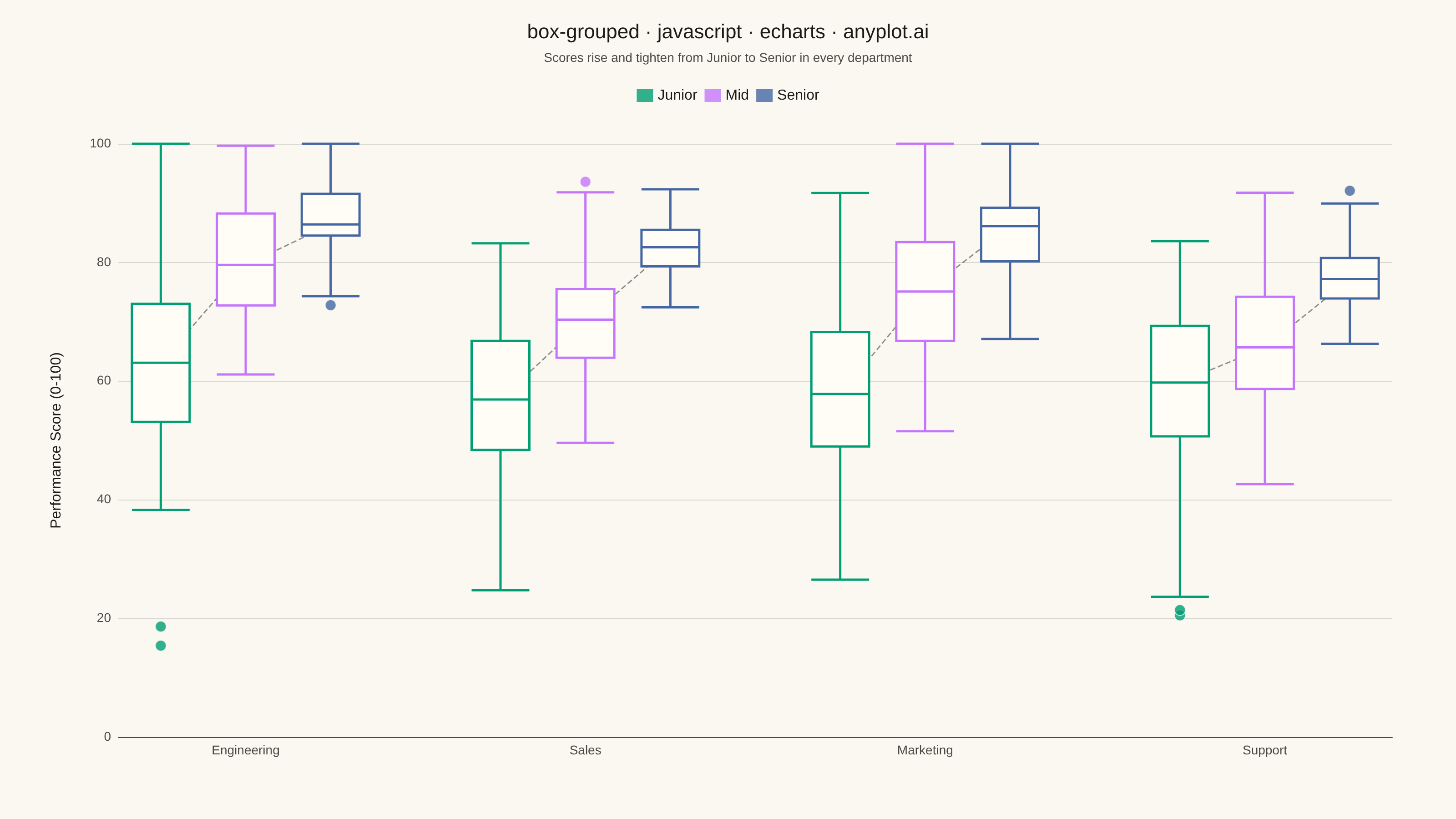
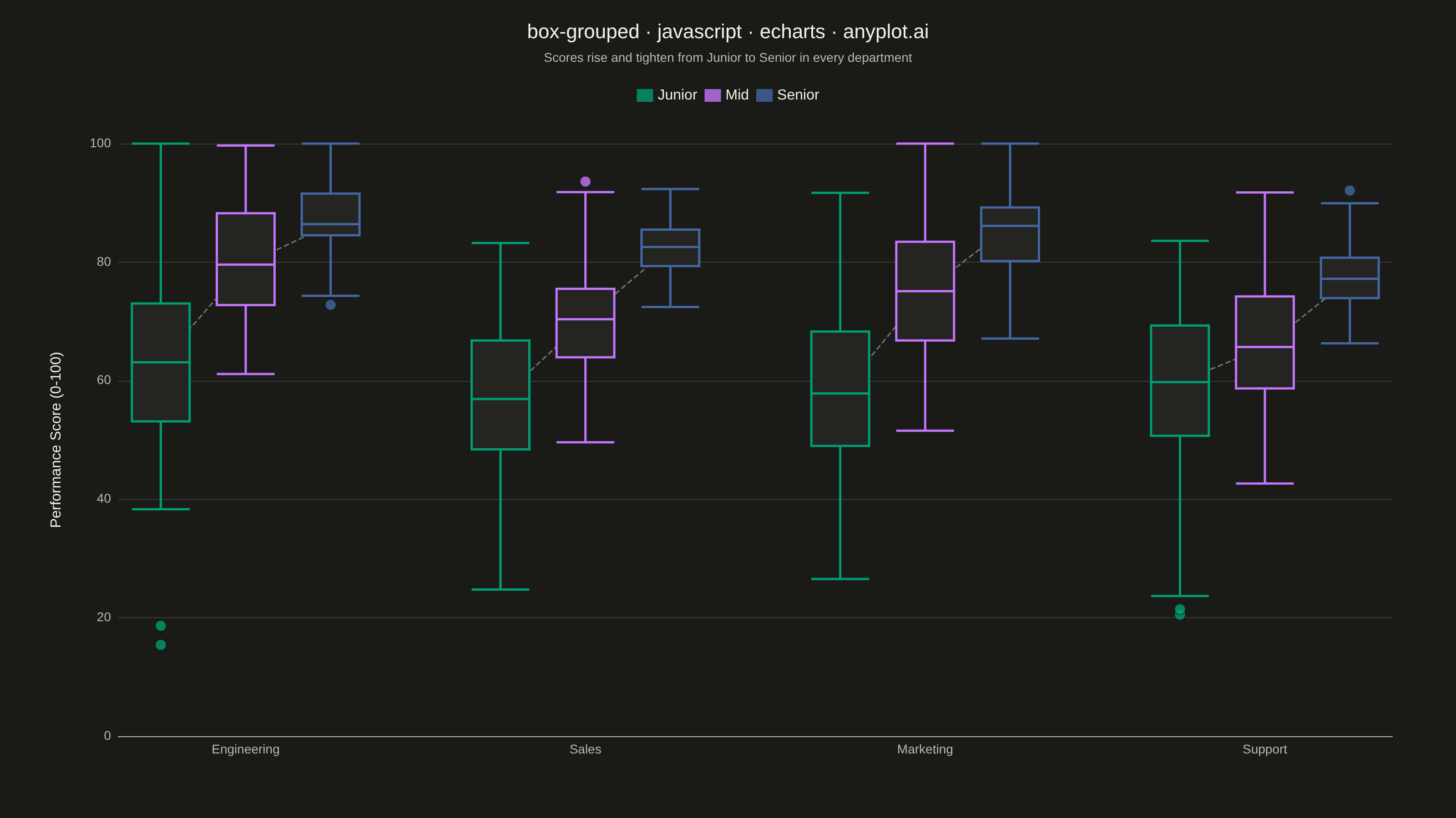
A grouped box plot displays multiple box plots side-by-side within each category, enabling comparison of distributions across subgroups. Each group contains boxes representing different subcategories or conditions, making it ideal for multi-factor comparisons and A/B testing scenarios with multiple metrics.
// anyplot.ai
// box-grouped: Grouped Box Plot
// Library: echarts 6.1.0 | JavaScript 22.23.2
// Quality: 91/100 | Created: 2026-08-18

const t = window.ANYPLOT_TOKENS;

// --- Data (in-memory, deterministic) ----------------------------------------
// Simple LCG + Box-Muller so the sample data is reproducible without Math.random().
let seed = 42;
function rand() {
  seed = (seed * 1103515245 + 12345) & 0x7fffffff;
  return seed / 0x7fffffff;
}
function randNormal(mean, std) {
  const u1 = Math.max(rand(), 1e-9);
  const u2 = rand();
  return mean + std * Math.sqrt(-2 * Math.log(u1)) * Math.cos(2 * Math.PI * u2);
}

// NOTE: echarts.dataTool.prepareBoxplotData is unavailable here -- the harness
// loads only the core `echarts` bundle, not the separate dataTool extension
// that mounts it, so quartiles/fences are computed by hand below.
function quantile(sorted, q) {
  const pos = (sorted.length - 1) * q;
  const base = Math.floor(pos);
  const rest = pos - base;
  return sorted[base + 1] !== undefined
    ? sorted[base] + rest * (sorted[base + 1] - sorted[base])
    : sorted[base];
}

function boxStats(values) {
  const sorted = values.slice().sort((a, b) => a - b);
  const q1 = quantile(sorted, 0.25);
  const median = quantile(sorted, 0.5);
  const q3 = quantile(sorted, 0.75);
  const iqr = q3 - q1;
  const lowerFence = q1 - 1.5 * iqr;
  const upperFence = q3 + 1.5 * iqr;
  const inliers = sorted.filter((v) => v >= lowerFence && v <= upperFence);
  const outliers = sorted.filter((v) => v < lowerFence || v > upperFence);
  return {
    whiskerLow: inliers.length ? inliers[0] : q1,
    q1,
    median,
    q3,
    whiskerHigh: inliers.length ? inliers[inliers.length - 1] : q3,
    outliers,
  };
}

const N_SAMPLES = 45;
const departments = ["Engineering", "Sales", "Marketing", "Support"];
const levels = ["Junior", "Mid", "Senior"];
const levelBaseline = { Junior: 60, Mid: 73, Senior: 84 };
const levelSpread = { Junior: 16, Mid: 11, Senior: 6 };
const deptOffset = { Engineering: 4, Sales: -3, Marketing: 1, Support: -6 };
const middleLevelIndex = Math.floor((levels.length - 1) / 2);

const categories = [];
const boxItems = [];
const outlierItems = [];
// Dashed line connecting each department's Junior->Mid->Senior medians, so the
// "scores rise and tighten with seniority" trend is visible at a glance
// instead of something the viewer has to piece together box-by-box.
const medianTrend = [];

departments.forEach((dept, i) => {
  levels.forEach((level, j) => {
    const samples = [];
    for (let k = 0; k < N_SAMPLES; k++) {
      const raw = randNormal(
        levelBaseline[level] + deptOffset[dept],
        levelSpread[level],
      );
      samples.push(Math.min(100, Math.max(0, raw)));
    }
    const stats = boxStats(samples);
    const catIndex = categories.length;
    categories.push(j === middleLevelIndex ? dept : "");
    boxItems.push({
      name: `${level} · ${dept}`,
      value: [
        stats.whiskerLow,
        stats.q1,
        stats.median,
        stats.q3,
        stats.whiskerHigh,
      ],
      itemStyle: {
        color: t.elevatedBg,
        borderColor: t.palette[j],
        borderWidth: 2.5,
      },
    });
    medianTrend.push(stats.median);
    stats.outliers.forEach((v) => {
      outlierItems.push({
        name: `${level} · ${dept} outlier`,
        value: [catIndex, v],
        itemStyle: {
          color: t.palette[j],
          borderColor: t.pageBg,
          borderWidth: 1,
        },
      });
    });
  });
  // Gap tick between department groups so the side-by-side boxes read as clusters.
  // NaN values (rather than a bare null item) keep echarts' box-plot data
  // preprocessing happy while still making data.hasValue() skip the render.
  if (i < departments.length - 1) {
    categories.push("");
    boxItems.push({ value: [NaN, NaN, NaN, NaN, NaN] });
    medianTrend.push(null);
  }
});

const title = "box-grouped · javascript · echarts · anyplot.ai";

// --- Init -------------------------------------------------------------------
const chart = echarts.init(document.getElementById("container"));

// --- Option -----------------------------------------------------------------
chart.setOption({
  animation: false,
  backgroundColor: "transparent",
  title: {
    text: title,
    subtext: "Scores rise and tighten from Junior to Senior in every department",
    left: "center",
    top: 20,
    textStyle: { color: t.ink, fontSize: 22, fontWeight: 500 },
    subtextStyle: { color: t.inkSoft, fontSize: 14 },
  },
  legend: {
    data: levels,
    top: 92,
    itemWidth: 18,
    itemHeight: 14,
    textStyle: { color: t.ink, fontSize: 16 },
  },
  tooltip: {
    trigger: "item",
    formatter: (params) => {
      if (params.seriesType === "boxplot") {
        const [low, q1, median, q3, high] = params.data.value;
        return [
          `<strong>${params.name}</strong>`,
          `Max: ${high.toFixed(1)}`,
          `Q3: ${q3.toFixed(1)}`,
          `Median: ${median.toFixed(1)}`,
          `Q1: ${q1.toFixed(1)}`,
          `Min: ${low.toFixed(1)}`,
        ].join("<br/>");
      }
      if (params.seriesName === "Outliers") {
        return `<strong>${params.name}</strong><br/>Score: ${params.data.value[1].toFixed(1)}`;
      }
      return params.name;
    },
  },
  grid: { left: 130, right: 70, top: 158, bottom: 90 },
  xAxis: {
    type: "category",
    data: categories,
    axisLabel: { color: t.inkSoft, fontSize: 14, interval: 0 },
    axisLine: { lineStyle: { color: t.inkSoft } },
    axisTick: { show: false },
    splitLine: { show: false },
  },
  yAxis: {
    type: "value",
    name: "Performance Score (0-100)",
    nameLocation: "middle",
    nameGap: 60,
    nameTextStyle: { color: t.ink, fontSize: 16 },
    min: 0,
    max: 100,
    axisLabel: { color: t.inkSoft, fontSize: 14 },
    axisLine: { lineStyle: { color: t.inkSoft } },
    splitLine: { lineStyle: { color: t.grid } },
  },
  series: [
    ...levels.map((level, j) => ({
      name: level,
      type: "scatter",
      data: [],
      symbol: "rect",
      symbolSize: [16, 14],
      itemStyle: { color: t.palette[j] },
    })),
    {
      name: "Distribution",
      type: "boxplot",
      data: boxItems,
      boxWidth: ["45%", "68%"],
    },
    {
      name: "Outliers",
      type: "scatter",
      data: outlierItems,
      symbolSize: 12,
      z: 3,
    },
    {
      name: "Median trend",
      type: "line",
      data: medianTrend,
      connectNulls: false,
      symbol: "none",
      silent: true,
      z: 1,
      lineStyle: { color: t.inkSoft, width: 1.5, type: "dashed", opacity: 0.6 },
      tooltip: { show: false },
    },
  ],
});
Runnable source as JSON, for any HTTP client: https://api.anyplot.ai/specs/box-grouped/echarts/code. Any spec id and library id listed in llms-full.txt fit the same URL shape; every URL below is complete and callable.
{
  "spec_id": "box-grouped",
  "language": "javascript",
  "library": "echarts",
  "page": "https://anyplot.ai/box-grouped/javascript/echarts",
  "hub": "https://anyplot.ai/box-grouped",
  "code_json": "https://api.anyplot.ai/specs/box-grouped/echarts/code",
  "spec_json": "https://api.anyplot.ai/specs/box-grouped",
  "render_light_png": "https://storage.googleapis.com/anyplot-images/plots/box-grouped/javascript/echarts/plot-light.png",
  "render_dark_png": "https://storage.googleapis.com/anyplot-images/plots/box-grouped/javascript/echarts/plot-dark.png",
  "interactive_light_html": "https://storage.googleapis.com/anyplot-images/plots/box-grouped/javascript/echarts/plot-light.html",
  "interactive_dark_html": "https://storage.googleapis.com/anyplot-images/plots/box-grouped/javascript/echarts/plot-dark.html",
  "quality_score": 91.0,
  "license": "MIT",
  "guide": "https://anyplot.ai/llms.txt"
}
Part of Grouped Box Plot on anyplot.ai.