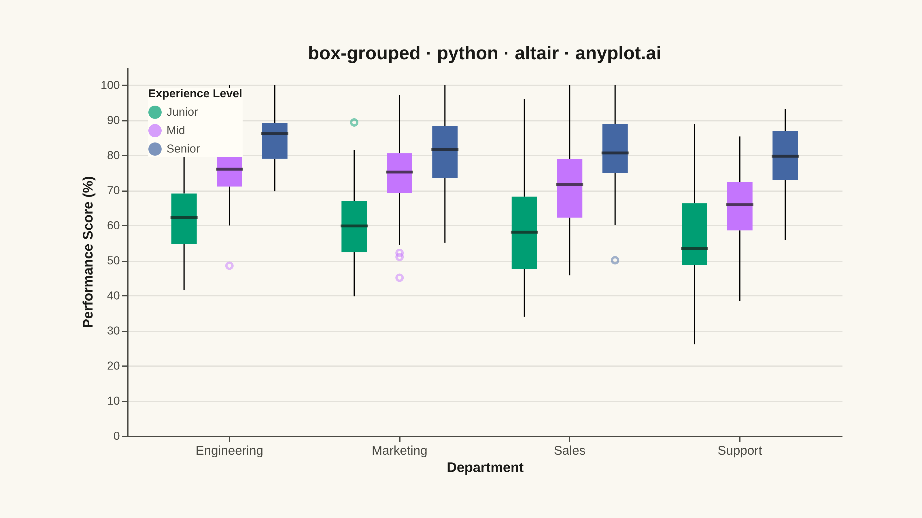
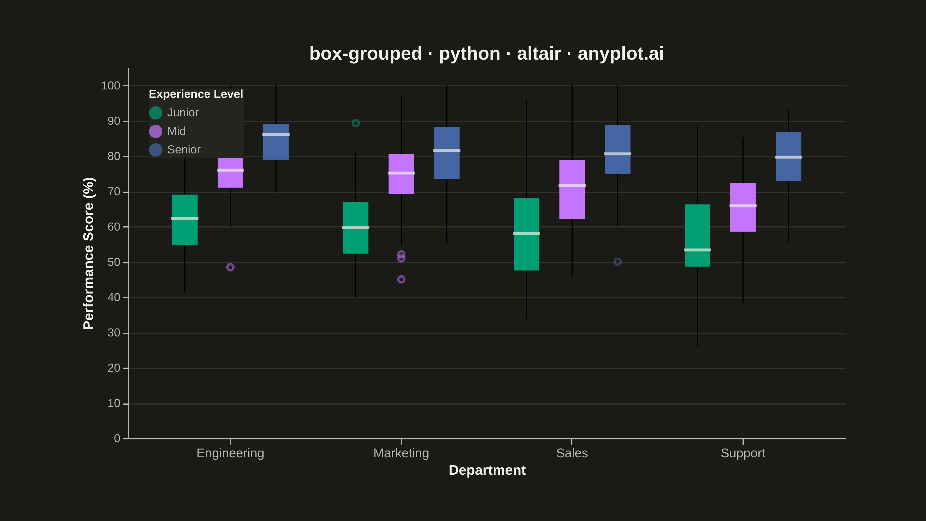
A grouped box plot displays multiple box plots side-by-side within each category, enabling comparison of distributions across subgroups. Each group contains boxes representing different subcategories or conditions, making it ideal for multi-factor comparisons and A/B testing scenarios with multiple metrics.
""" anyplot.ai
box-grouped: Grouped Box Plot
Library: altair 6.2.2 | Python 3.13.15
Quality: 86/100 | Updated: 2026-08-18
"""

import os

import altair
import numpy as np
import pandas as pd
from PIL import Image


# Theme tokens
THEME = os.getenv("ANYPLOT_THEME", "light")
PAGE_BG = "#FAF8F1" if THEME == "light" else "#1A1A17"
ELEVATED_BG = "#FFFDF6" if THEME == "light" else "#242420"
INK = "#1A1A17" if THEME == "light" else "#F0EFE8"
INK_SOFT = "#4A4A44" if THEME == "light" else "#B8B7B0"

# Imprint palette (positions 1, 2, 3 for Junior, Mid, Senior)
IMPRINT = ["#009E73", "#C475FD", "#4467A3"]

# Data - Employee performance scores across departments and experience levels
np.random.seed(42)

departments = ["Engineering", "Sales", "Marketing", "Support"]
experience_levels = ["Junior", "Mid", "Senior"]

data = []
# Create varied distributions for each combination
distributions = {
    ("Engineering", "Junior"): (65, 12),
    ("Engineering", "Mid"): (75, 10),
    ("Engineering", "Senior"): (85, 8),
    ("Sales", "Junior"): (55, 15),
    ("Sales", "Mid"): (70, 12),
    ("Sales", "Senior"): (80, 10),
    ("Marketing", "Junior"): (60, 14),
    ("Marketing", "Mid"): (72, 11),
    ("Marketing", "Senior"): (82, 9),
    ("Support", "Junior"): (58, 13),
    ("Support", "Mid"): (68, 12),
    ("Support", "Senior"): (78, 10),
}

for dept in departments:
    for exp in experience_levels:
        mean, std = distributions[(dept, exp)]
        n_samples = 50
        values = np.random.normal(mean, std, n_samples)
        # Add some outliers
        if np.random.random() > 0.5:
            values = np.append(values, [mean + 3.5 * std, mean - 3 * std])
        # Clip to realistic range
        values = np.clip(values, 0, 100)
        for v in values:
            data.append({"Department": dept, "Experience": exp, "Performance Score": v})

df = pd.DataFrame(data)

# Order departments by descending Senior-level median score, giving the
# grouped comparison a clear takeaway (best- to worst-performing department).
dept_order = (
    df[df["Experience"] == "Senior"]
    .groupby("Department")["Performance Score"]
    .median()
    .sort_values(ascending=False)
    .index.tolist()
)

# Create grouped box plot with theme-adaptive styling
chart = (
    altair.Chart(df)
    .mark_boxplot(size=22, median={"stroke": INK, "strokeWidth": 1.5}, outliers={"size": 28, "strokeOpacity": 0.7})
    .encode(
        x=altair.X(
            "Department:N",
            title="Department",
            sort=dept_order,
            axis=altair.Axis(labelFontSize=11, titleFontSize=12, labelAngle=0),
        ),
        y=altair.Y(
            "Performance Score:Q",
            title="Performance Score (%)",
            scale=altair.Scale(domain=[0, 105]),
            axis=altair.Axis(labelFontSize=10, titleFontSize=12),
        ),
        color=altair.Color(
            "Experience:N",
            title="Experience Level",
            scale=altair.Scale(domain=["Junior", "Mid", "Senior"], range=IMPRINT),
            legend=altair.Legend(titleFontSize=10, labelFontSize=10, symbolSize=100, orient="top-left"),
        ),
        xOffset="Experience:N",
        tooltip=["Department:N", "Experience:N", "Performance Score:Q"],
    )
    .properties(
        width=620,
        height=320,
        background=PAGE_BG,
        title=altair.Title(text="box-grouped · python · altair · anyplot.ai", fontSize=16, anchor="middle"),
    )
    .configure_view(fill=PAGE_BG, stroke=None)
    .configure_axis(
        domainColor=INK_SOFT, tickColor=INK_SOFT, gridColor=INK, gridOpacity=0.10, labelColor=INK_SOFT, titleColor=INK
    )
    .configure_title(color=INK)
    .configure_legend(fillColor=ELEVATED_BG, strokeColor=None, labelColor=INK_SOFT, titleColor=INK)
)

# Save as PNG and HTML with theme-suffixed filenames
chart.save(f"plot-{THEME}.png", scale_factor=4.0)
chart.save(f"plot-{THEME}.html")

# Canvas contract: pad (never crop) the exported PNG up to the exact target.
TW, TH = 3200, 1800
_img = Image.open(f"plot-{THEME}.png").convert("RGB")
_w, _h = _img.size
if _w > TW or _h > TH:
    raise SystemExit(
        f"altair vl-convert produced {_w}x{_h}, exceeds target {TW}x{TH}. "
        f"Shrink chart .properties(width=, height=) values and re-render."
    )
if _w < TW or _h < TH:
    _canvas = Image.new("RGB", (TW, TH), PAGE_BG)
    _canvas.paste(_img, ((TW - _w) // 2, (TH - _h) // 2))
    _canvas.save(f"plot-{THEME}.png")
Runnable source as JSON, for any HTTP client: https://api.anyplot.ai/specs/box-grouped/altair/code. Any spec id and library id listed in llms-full.txt fit the same URL shape; every URL below is complete and callable.
{
  "spec_id": "box-grouped",
  "language": "python",
  "library": "altair",
  "page": "https://anyplot.ai/box-grouped/python/altair",
  "hub": "https://anyplot.ai/box-grouped",
  "code_json": "https://api.anyplot.ai/specs/box-grouped/altair/code",
  "spec_json": "https://api.anyplot.ai/specs/box-grouped",
  "render_light_png": "https://storage.googleapis.com/anyplot-images/plots/box-grouped/python/altair/plot-light.png",
  "render_dark_png": "https://storage.googleapis.com/anyplot-images/plots/box-grouped/python/altair/plot-dark.png",
  "interactive_light_html": "https://storage.googleapis.com/anyplot-images/plots/box-grouped/python/altair/plot-light.html",
  "interactive_dark_html": "https://storage.googleapis.com/anyplot-images/plots/box-grouped/python/altair/plot-dark.html",
  "quality_score": 86.0,
  "license": "MIT",
  "guide": "https://anyplot.ai/llms.txt"
}
Part of Grouped Box Plot on anyplot.ai.