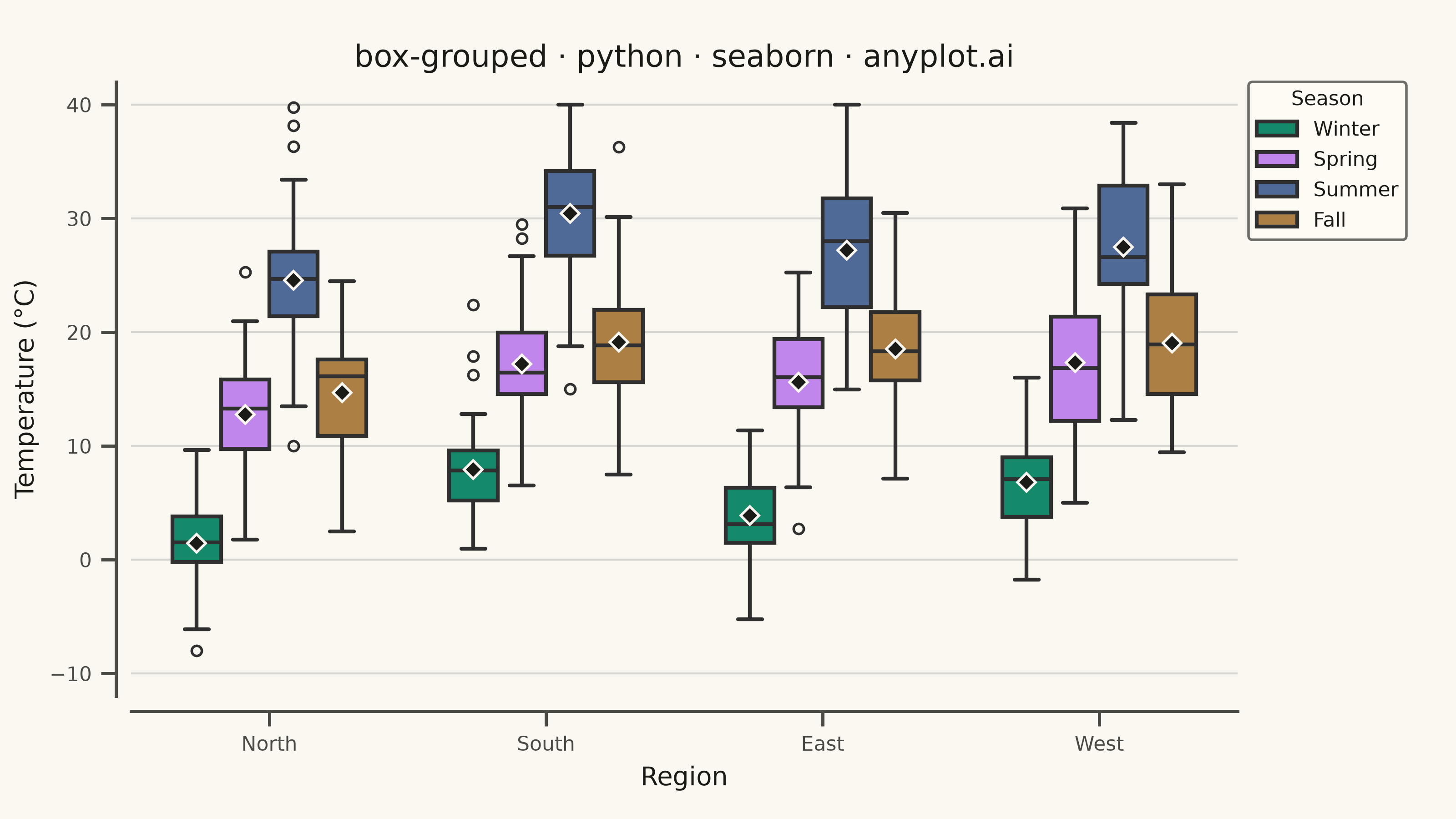
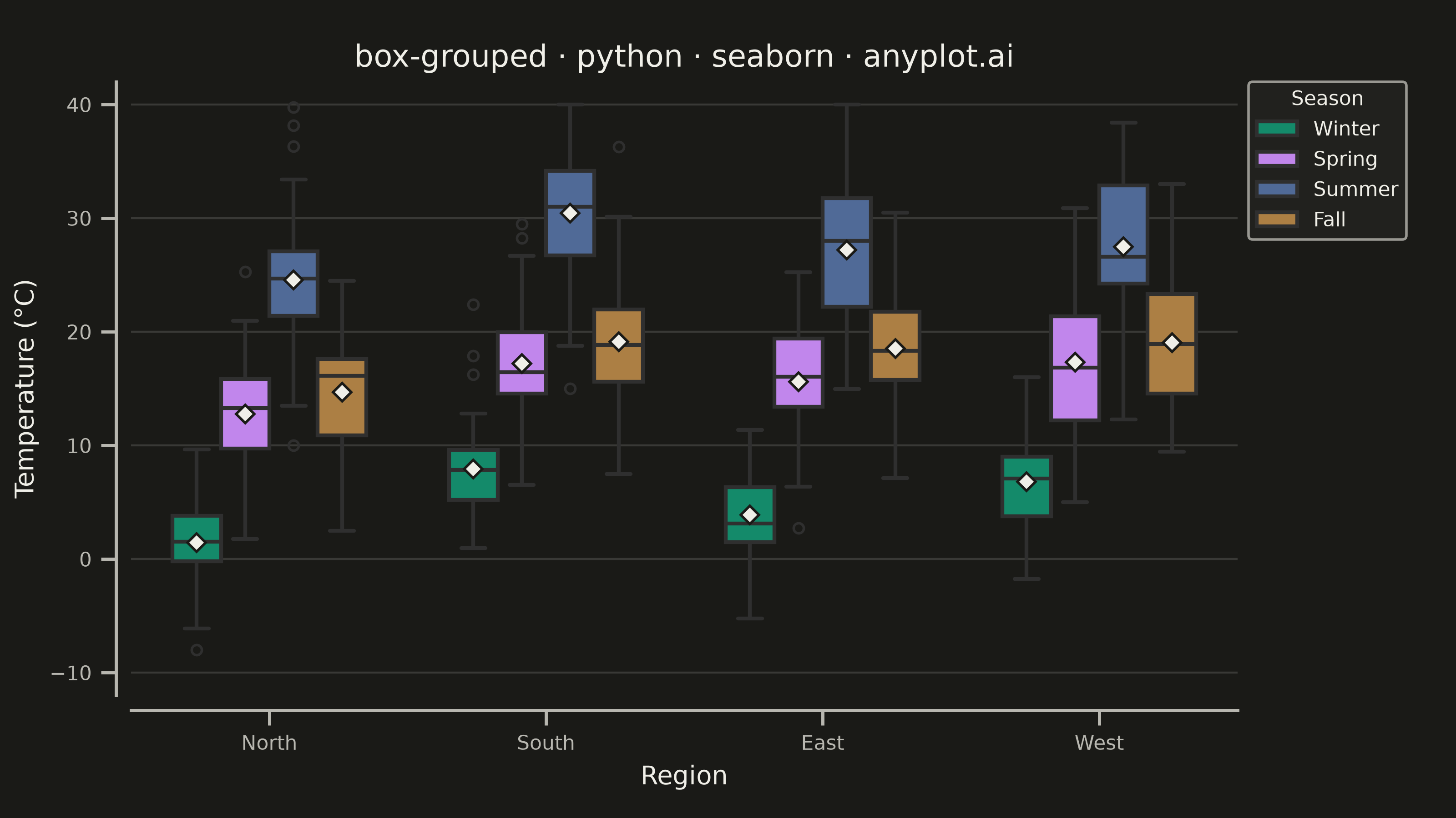
A grouped box plot displays multiple box plots side-by-side within each category, enabling comparison of distributions across subgroups. Each group contains boxes representing different subcategories or conditions, making it ideal for multi-factor comparisons and A/B testing scenarios with multiple metrics.
""" anyplot.ai
box-grouped: Grouped Box Plot
Library: seaborn 0.13.2 | Python 3.13.15
Quality: 91/100 | Updated: 2026-08-18
"""

import os

import matplotlib.pyplot as plt
import numpy as np
import pandas as pd
import seaborn as sns


# Theme tokens
THEME = os.getenv("ANYPLOT_THEME", "light")
PAGE_BG = "#FAF8F1" if THEME == "light" else "#1A1A17"
ELEVATED_BG = "#FFFDF6" if THEME == "light" else "#242420"
INK = "#1A1A17" if THEME == "light" else "#F0EFE8"
INK_SOFT = "#4A4A44" if THEME == "light" else "#B8B7B0"

# Imprint palette - first series always #009E73
IMPRINT = ["#009E73", "#C475FD", "#4467A3", "#BD8233"]

# Data - Temperature distributions by region and season
np.random.seed(42)

regions = ["North", "South", "East", "West"]
seasons = ["Winter", "Spring", "Summer", "Fall"]

data = []
for region in regions:
    for season in seasons:
        n = np.random.randint(35, 50)
        # Different temperature distributions per region/season
        season_base = {"Winter": 5, "Spring": 15, "Summer": 28, "Fall": 18}[season]
        region_offset = {"North": -3, "South": 2, "East": 0, "West": 1}[region]
        base = season_base + region_offset

        season_spread = {"Winter": 4, "Spring": 5, "Summer": 6, "Fall": 5}[season]
        values = np.random.normal(base, season_spread, n)
        # Add realistic outliers (unusual temperature days)
        if np.random.random() > 0.6:
            values = np.append(values, base + season_spread * np.random.choice([-2.5, 2.5], size=1))
        values = np.clip(values, -10, 40)

        for v in values:
            data.append({"Region": region, "Season": season, "Temperature (°C)": v})

df = pd.DataFrame(data)

# Plot setup
sns.set_theme(
    style="ticks",
    rc={
        "figure.facecolor": PAGE_BG,
        "axes.facecolor": PAGE_BG,
        "axes.edgecolor": INK_SOFT,
        "axes.labelcolor": INK,
        "text.color": INK,
        "xtick.color": INK_SOFT,
        "ytick.color": INK_SOFT,
        "grid.color": INK,
        "grid.alpha": 0.10,
        "legend.facecolor": ELEVATED_BG,
        "legend.edgecolor": INK_SOFT,
    },
)

fig, ax = plt.subplots(figsize=(8, 4.5), dpi=400)

# Create grouped box plot, mean diamonds add a distinctive second statistic
# beyond the median line without cluttering the chart
sns.boxplot(
    data=df,
    x="Region",
    y="Temperature (°C)",
    hue="Season",
    palette=IMPRINT,
    ax=ax,
    width=0.7,
    linewidth=1.5,
    fliersize=4,
    order=regions,
    hue_order=seasons,
    showmeans=True,
    meanprops={"marker": "D", "markerfacecolor": INK, "markeredgecolor": PAGE_BG, "markersize": 5},
)

# Styling
ax.set_xlabel("Region", fontsize=10, color=INK)
ax.set_ylabel("Temperature (°C)", fontsize=10, color=INK)
ax.set_title("box-grouped · python · seaborn · anyplot.ai", fontsize=12, color=INK)
ax.tick_params(axis="both", labelsize=8, colors=INK_SOFT)
# Legend placed outside the axes so it never overlaps the West/Summer boxes
ax.legend(title="Season", fontsize=8, title_fontsize=8, loc="upper left", bbox_to_anchor=(1.01, 1.0), borderaxespad=0)
ax.set_ylim(-12, 42)
ax.yaxis.grid(True, alpha=0.15, linewidth=0.8)
ax.xaxis.grid(False)

# Trim spines away from the data range for a cleaner, less boxed-in frame
sns.despine(ax=ax, offset=6)
ax.spines["left"].set_color(INK_SOFT)
ax.spines["bottom"].set_color(INK_SOFT)

fig.subplots_adjust(left=0.09, right=0.85, top=0.90, bottom=0.15)
plt.savefig(f"plot-{THEME}.png", dpi=400, facecolor=PAGE_BG)
Runnable source as JSON, for any HTTP client: https://api.anyplot.ai/specs/box-grouped/seaborn/code. Any spec id and library id listed in llms-full.txt fit the same URL shape; every URL below is complete and callable.
{
  "spec_id": "box-grouped",
  "language": "python",
  "library": "seaborn",
  "page": "https://anyplot.ai/box-grouped/python/seaborn",
  "hub": "https://anyplot.ai/box-grouped",
  "code_json": "https://api.anyplot.ai/specs/box-grouped/seaborn/code",
  "spec_json": "https://api.anyplot.ai/specs/box-grouped",
  "render_light_png": "https://storage.googleapis.com/anyplot-images/plots/box-grouped/python/seaborn/plot-light.png",
  "render_dark_png": "https://storage.googleapis.com/anyplot-images/plots/box-grouped/python/seaborn/plot-dark.png",
  "quality_score": 91.0,
  "license": "MIT",
  "guide": "https://anyplot.ai/llms.txt"
}
Part of Grouped Box Plot on anyplot.ai.