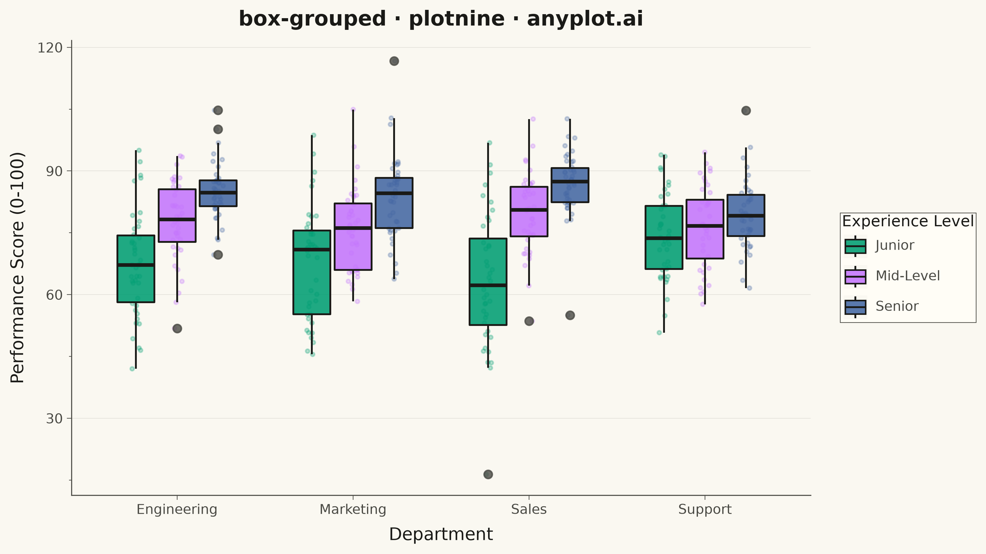
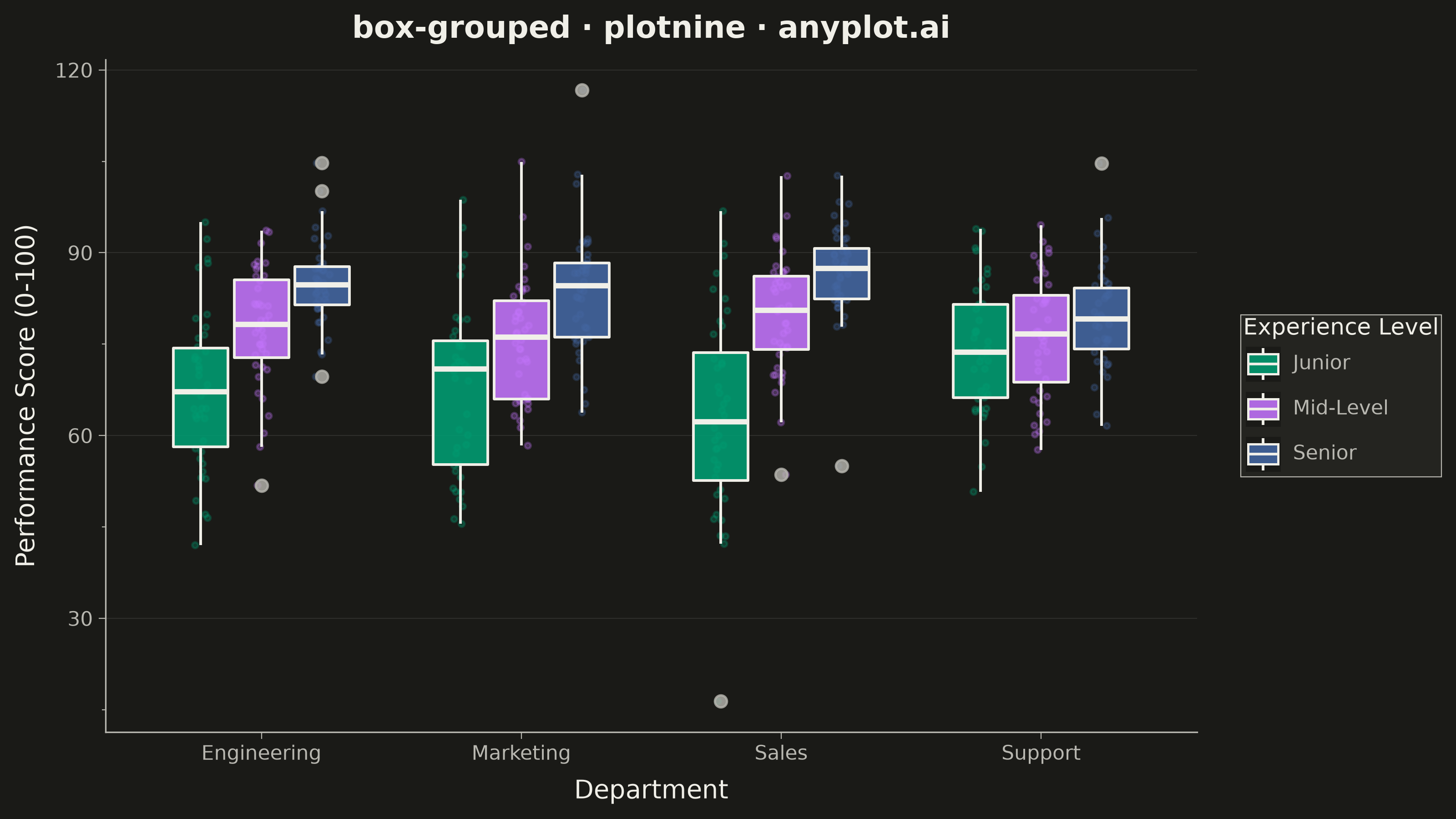
A grouped box plot displays multiple box plots side-by-side within each category, enabling comparison of distributions across subgroups. Each group contains boxes representing different subcategories or conditions, making it ideal for multi-factor comparisons and A/B testing scenarios with multiple metrics.
""" anyplot.ai
box-grouped: Grouped Box Plot
Library: plotnine 0.15.8 | Python 3.13.15
Quality: 92/100 | Updated: 2026-08-18
"""

import os

import numpy as np
import pandas as pd
from plotnine import (
    aes,
    element_blank,
    element_line,
    element_rect,
    element_text,
    geom_boxplot,
    geom_jitter,
    ggplot,
    ggsave,
    labs,
    position_dodge2,
    position_jitterdodge,
    scale_color_manual,
    scale_fill_manual,
    theme,
    theme_minimal,
)


# Theme tokens
THEME = os.getenv("ANYPLOT_THEME", "light")
PAGE_BG = "#FAF8F1" if THEME == "light" else "#1A1A17"
ELEVATED_BG = "#FFFDF6" if THEME == "light" else "#242420"
INK = "#1A1A17" if THEME == "light" else "#F0EFE8"
INK_SOFT = "#4A4A44" if THEME == "light" else "#B8B7B0"

# Imprint palette (first series always #009E73)
IMPRINT = ["#009E73", "#C475FD", "#4467A3"]

# Data: Employee performance scores by department and experience level
np.random.seed(42)

departments = ["Engineering", "Marketing", "Sales", "Support"]
experience_levels = ["Junior", "Mid-Level", "Senior"]

data = []
for dept in departments:
    for exp in experience_levels:
        # Create realistic performance distributions that vary by dept and experience
        n = 40
        if dept == "Engineering":
            base = 70 if exp == "Junior" else 78 if exp == "Mid-Level" else 85
            spread = 12 if exp == "Junior" else 10 if exp == "Mid-Level" else 8
        elif dept == "Marketing":
            base = 68 if exp == "Junior" else 75 if exp == "Mid-Level" else 82
            spread = 14 if exp == "Junior" else 11 if exp == "Mid-Level" else 9
        elif dept == "Sales":
            base = 65 if exp == "Junior" else 77 if exp == "Mid-Level" else 88
            spread = 15 if exp == "Junior" else 12 if exp == "Mid-Level" else 7
        else:  # Support
            base = 72 if exp == "Junior" else 76 if exp == "Mid-Level" else 80
            spread = 10 if exp == "Junior" else 9 if exp == "Mid-Level" else 8

        values = np.random.normal(base, spread, n)
        # Add some outliers
        if exp == "Senior" and dept == "Sales":
            values = np.append(values, [55, 98])
        if exp == "Junior" and dept == "Engineering":
            values = np.append(values, [42, 95])

        for v in values:
            data.append({"Department": dept, "Experience": exp, "Score": v})

df = pd.DataFrame(data)

# Order experience levels properly
df["Experience"] = pd.Categorical(df["Experience"], categories=experience_levels, ordered=True)

# Create theme
anyplot_theme = theme(
    plot_background=element_rect(fill=PAGE_BG, color=PAGE_BG),
    panel_background=element_rect(fill=PAGE_BG),
    panel_grid_major_x=element_blank(),
    panel_grid_major_y=element_line(color=INK, size=0.3, alpha=0.12),
    panel_grid_minor=element_blank(),
    panel_border=element_blank(),
    axis_line=element_line(color=INK_SOFT, size=0.6),
    axis_title=element_text(color=INK, size=10),
    axis_text=element_text(color=INK_SOFT, size=8),
    axis_ticks=element_line(color=INK_SOFT, size=0.4),
    plot_title=element_text(color=INK, size=12, weight="bold"),
    legend_background=element_rect(fill=ELEVATED_BG, color=INK_SOFT, size=0.4),
    legend_text=element_text(color=INK_SOFT, size=8),
    legend_title=element_text(color=INK, size=9),
    figure_size=(8, 4.5),
)

# Grouped box plot: dodged boxes per experience level, jittered raw scores
# underneath for distributional texture (design refinement over library defaults)
plot = (
    ggplot(df, aes(x="Department", y="Score"))
    + geom_jitter(
        aes(color="Experience"),
        position=position_jitterdodge(jitter_width=0.15, dodge_width=0.7),
        size=0.8,
        alpha=0.28,
        show_legend=False,
    )
    + geom_boxplot(
        aes(fill="Experience"),
        position=position_dodge2(preserve="single", padding=0.1),
        width=0.7,
        color=INK,
        size=0.6,
        alpha=0.88,
        outlier_size=2.2,
        outlier_alpha=0.8,
        outlier_color=INK_SOFT,
    )
    + scale_fill_manual(values=IMPRINT)
    + scale_color_manual(values=IMPRINT)
    + labs(
        x="Department",
        y="Performance Score (0-100)",
        title="box-grouped · plotnine · anyplot.ai",
        fill="Experience Level",
    )
    + theme_minimal()
    + anyplot_theme
)

# Save
ggsave(plot, filename=f"plot-{THEME}.png", dpi=400, width=8, height=4.5, units="in")
Runnable source as JSON, for any HTTP client: https://api.anyplot.ai/specs/box-grouped/plotnine/code. Any spec id and library id listed in llms-full.txt fit the same URL shape; every URL below is complete and callable.
{
  "spec_id": "box-grouped",
  "language": "python",
  "library": "plotnine",
  "page": "https://anyplot.ai/box-grouped/python/plotnine",
  "hub": "https://anyplot.ai/box-grouped",
  "code_json": "https://api.anyplot.ai/specs/box-grouped/plotnine/code",
  "spec_json": "https://api.anyplot.ai/specs/box-grouped",
  "render_light_png": "https://storage.googleapis.com/anyplot-images/plots/box-grouped/python/plotnine/plot-light.png",
  "render_dark_png": "https://storage.googleapis.com/anyplot-images/plots/box-grouped/python/plotnine/plot-dark.png",
  "quality_score": 92.0,
  "license": "MIT",
  "guide": "https://anyplot.ai/llms.txt"
}
Part of Grouped Box Plot on anyplot.ai.