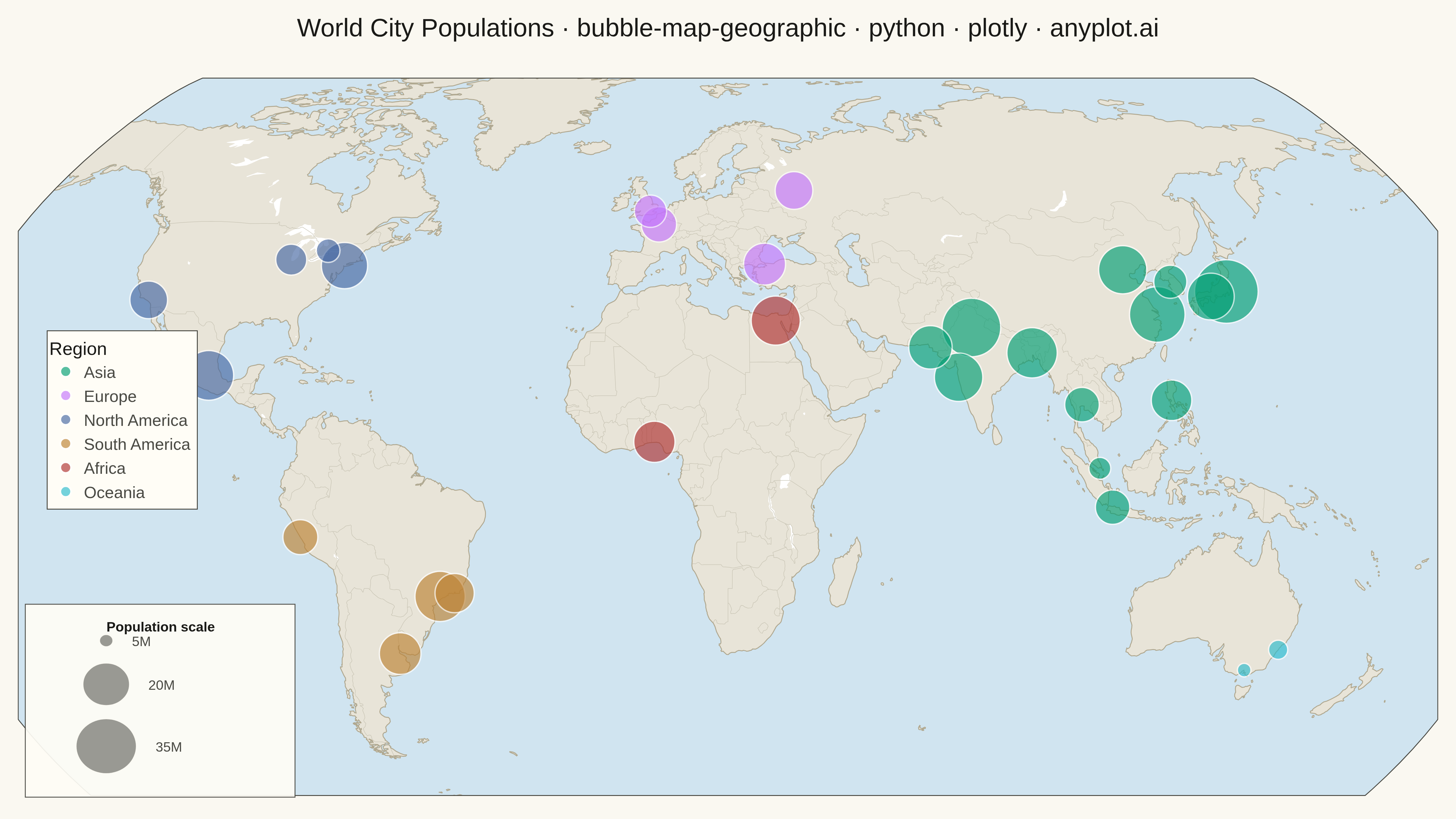
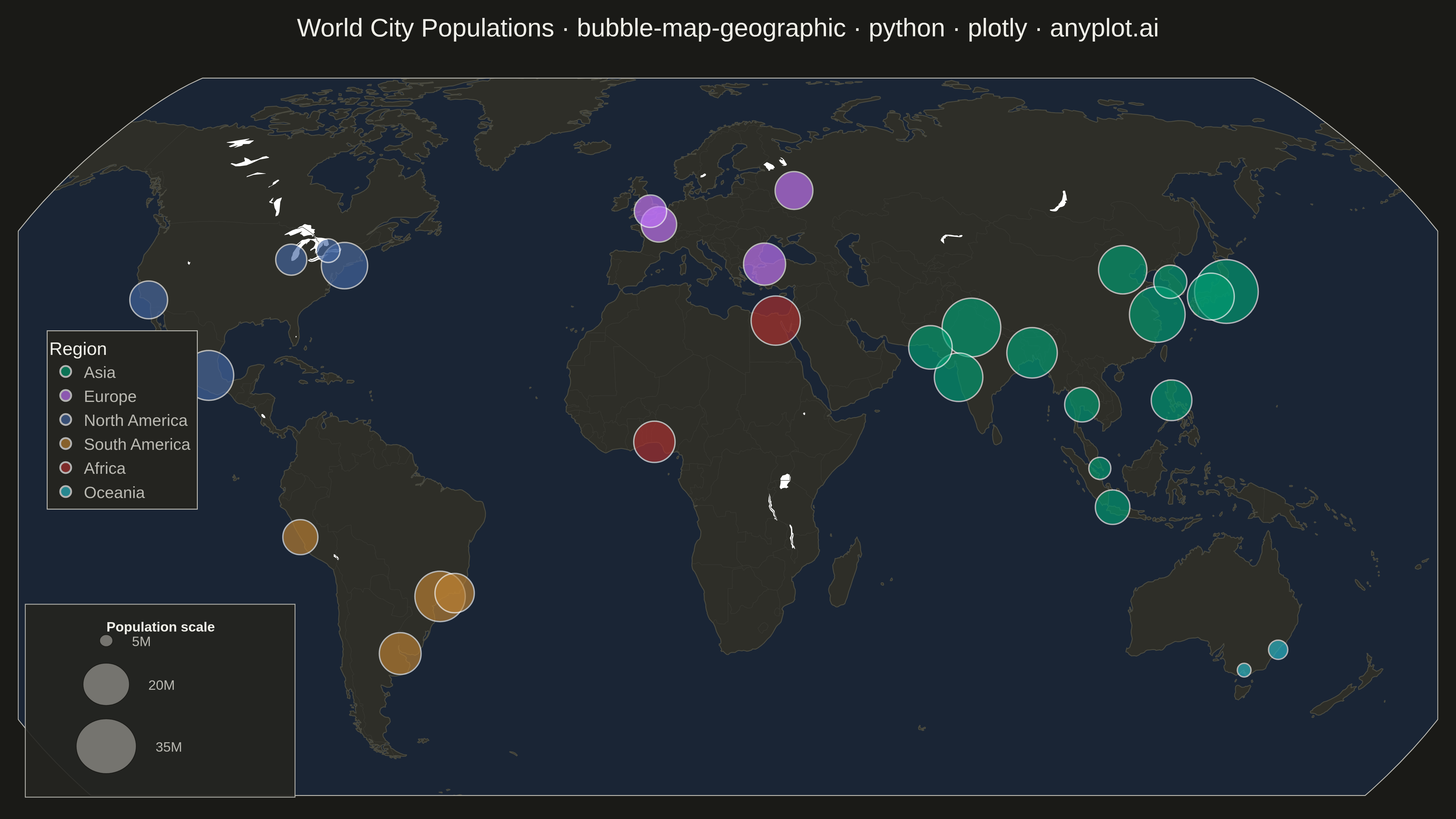
A geographic bubble map where markers are sized proportionally to quantitative data values at each location. Unlike scatter maps where size is optional, bubble maps use marker size as the primary visual encoding to show data magnitude across geographic regions. This visualization makes it immediately apparent where high and low values occur spatially, enabling intuitive comparison of quantities across locations.
""" anyplot.ai
bubble-map-geographic: Bubble Map with Sized Geographic Markers
Library: plotly 6.7.0 | Python 3.13.13
Quality: 86/100 | Updated: 2026-05-18
"""

import os

import numpy as np
import pandas as pd
import plotly.graph_objects as go


# Theme tokens
THEME = os.getenv("ANYPLOT_THEME", "light")
PAGE_BG = "#FAF8F1" if THEME == "light" else "#1A1A17"
ELEVATED_BG = "#FFFDF6" if THEME == "light" else "#242420"
INK = "#1A1A17" if THEME == "light" else "#F0EFE8"
INK_SOFT = "#4A4A44" if THEME == "light" else "#B8B7B0"

LAND_COLOR = "#E8E4D8" if THEME == "light" else "#2E2E28"
OCEAN_COLOR = "#D0E4F0" if THEME == "light" else "#1A2535"
COAST_COLOR = "#B0A890" if THEME == "light" else "#4A4A40"
COUNTRY_COLOR = "#C8C4B4" if THEME == "light" else "#3A3A34"

# Okabe-Ito palette for regions (canonical order, first = #009E73)
REGION_COLORS = {
    "Asia": "#009E73",
    "Europe": "#C475FD",
    "North America": "#4467A3",
    "South America": "#BD8233",
    "Africa": "#AE3030",
    "Oceania": "#2ABCCD",
}
REGION_ORDER = ["Asia", "Europe", "North America", "South America", "Africa", "Oceania"]

# Data: Major world cities with population (in millions)
np.random.seed(42)

cities = [
    {"city": "Tokyo", "lat": 35.6762, "lon": 139.6503, "pop": 37.4, "region": "Asia"},
    {"city": "Delhi", "lat": 28.7041, "lon": 77.1025, "pop": 31.2, "region": "Asia"},
    {"city": "Shanghai", "lat": 31.2304, "lon": 121.4737, "pop": 27.8, "region": "Asia"},
    {"city": "São Paulo", "lat": -23.5505, "lon": -46.6333, "pop": 22.4, "region": "South America"},
    {"city": "Mexico City", "lat": 19.4326, "lon": -99.1332, "pop": 21.9, "region": "North America"},
    {"city": "Cairo", "lat": 30.0444, "lon": 31.2357, "pop": 21.3, "region": "Africa"},
    {"city": "Mumbai", "lat": 19.0760, "lon": 72.8777, "pop": 20.7, "region": "Asia"},
    {"city": "Beijing", "lat": 39.9042, "lon": 116.4074, "pop": 20.5, "region": "Asia"},
    {"city": "Dhaka", "lat": 23.8103, "lon": 90.4125, "pop": 22.5, "region": "Asia"},
    {"city": "Osaka", "lat": 34.6937, "lon": 135.5023, "pop": 19.2, "region": "Asia"},
    {"city": "New York", "lat": 40.7128, "lon": -74.0060, "pop": 18.8, "region": "North America"},
    {"city": "Karachi", "lat": 24.8607, "lon": 67.0011, "pop": 16.5, "region": "Asia"},
    {"city": "Buenos Aires", "lat": -34.6037, "lon": -58.3816, "pop": 15.2, "region": "South America"},
    {"city": "Istanbul", "lat": 41.0082, "lon": 28.9784, "pop": 15.4, "region": "Europe"},
    {"city": "Lagos", "lat": 6.5244, "lon": 3.3792, "pop": 14.9, "region": "Africa"},
    {"city": "Manila", "lat": 14.5995, "lon": 120.9842, "pop": 14.4, "region": "Asia"},
    {"city": "Rio de Janeiro", "lat": -22.9068, "lon": -43.1729, "pop": 13.5, "region": "South America"},
    {"city": "Los Angeles", "lat": 34.0522, "lon": -118.2437, "pop": 12.5, "region": "North America"},
    {"city": "Moscow", "lat": 55.7558, "lon": 37.6173, "pop": 12.5, "region": "Europe"},
    {"city": "Paris", "lat": 48.8566, "lon": 2.3522, "pop": 11.1, "region": "Europe"},
    {"city": "London", "lat": 51.5074, "lon": -0.1278, "pop": 9.5, "region": "Europe"},
    {"city": "Lima", "lat": -12.0464, "lon": -77.0428, "pop": 10.9, "region": "South America"},
    {"city": "Bangkok", "lat": 13.7563, "lon": 100.5018, "pop": 10.7, "region": "Asia"},
    {"city": "Jakarta", "lat": -6.2088, "lon": 106.8456, "pop": 10.6, "region": "Asia"},
    {"city": "Seoul", "lat": 37.5665, "lon": 126.9780, "pop": 9.9, "region": "Asia"},
    {"city": "Sydney", "lat": -33.8688, "lon": 151.2093, "pop": 5.4, "region": "Oceania"},
    {"city": "Melbourne", "lat": -37.8136, "lon": 144.9631, "pop": 5.0, "region": "Oceania"},
    {"city": "Toronto", "lat": 43.6532, "lon": -79.3832, "pop": 6.3, "region": "North America"},
    {"city": "Chicago", "lat": 41.8781, "lon": -87.6298, "pop": 8.9, "region": "North America"},
    {"city": "Singapore", "lat": 1.3521, "lon": 103.8198, "pop": 5.9, "region": "Asia"},
]

df = pd.DataFrame(cities)

# Bubble sizing: scale area proportional to population (sqrt of normalized value)
min_size, max_size = 15, 70
pop_min, pop_max = df["pop"].min(), df["pop"].max()
df["marker_size"] = min_size + (max_size - min_size) * np.sqrt((df["pop"] - pop_min) / (pop_max - pop_min))

# Plot
fig = go.Figure()

for region in REGION_ORDER:
    rdf = df[df["region"] == region]
    if rdf.empty:
        continue
    fig.add_trace(
        go.Scattergeo(
            lon=rdf["lon"],
            lat=rdf["lat"],
            text=rdf.apply(lambda r: f"{r['city']}<br>Population: {r['pop']:.1f}M", axis=1),
            marker={
                "size": rdf["marker_size"],
                "color": REGION_COLORS[region],
                "opacity": 0.65,
                "line": {"width": 1.5, "color": "white"},
                "sizemode": "diameter",
            },
            name=region,
            hovertemplate="%{text}<extra></extra>",
        )
    )

# Style
fig.update_layout(
    paper_bgcolor=PAGE_BG,
    plot_bgcolor=PAGE_BG,
    title={
        "text": "World City Populations · bubble-map-geographic · python · plotly · anyplot.ai",
        "font": {"size": 28, "color": INK},
        "x": 0.5,
        "xanchor": "center",
    },
    geo={
        "showland": True,
        "landcolor": LAND_COLOR,
        "showocean": True,
        "oceancolor": OCEAN_COLOR,
        "showcoastlines": True,
        "coastlinecolor": COAST_COLOR,
        "coastlinewidth": 1,
        "showframe": True,
        "framecolor": INK_SOFT,
        "framewidth": 1,
        "showcountries": True,
        "countrycolor": COUNTRY_COLOR,
        "countrywidth": 0.5,
        "projection_type": "natural earth",
        "lataxis": {"range": [-60, 75]},
        "lonaxis": {"range": [-140, 180]},
        "bgcolor": PAGE_BG,
    },
    legend={
        "title": {"text": "Region", "font": {"size": 20, "color": INK}},
        "font": {"size": 18, "color": INK_SOFT},
        "itemsizing": "constant",
        "x": 0.02,
        "y": 0.40,
        "xanchor": "left",
        "yanchor": "bottom",
        "bgcolor": ELEVATED_BG,
        "bordercolor": INK_SOFT,
        "borderwidth": 1,
    },
    margin={"l": 20, "r": 20, "t": 80, "b": 20},
)

# Visual size legend: circle shapes in paper coordinates
FIG_W, FIG_H = 1600, 900
ref_pops = [35, 20, 5]
ref_sizes_px = [min_size + (max_size - min_size) * np.sqrt((p - pop_min) / (pop_max - pop_min)) for p in ref_pops]

fig.add_shape(
    type="rect",
    xref="paper",
    yref="paper",
    x0=0.005,
    y0=0.005,
    x1=0.195,
    y1=0.270,
    fillcolor=ELEVATED_BG,
    line={"color": INK_SOFT, "width": 1},
    opacity=0.92,
)

fig.add_annotation(
    text="<b>Population scale</b>",
    xref="paper",
    yref="paper",
    x=0.100,
    y=0.252,
    showarrow=False,
    font={"size": 15, "color": INK},
    align="center",
    xanchor="center",
    yanchor="top",
)

cx = 0.062
y_centers = [0.075, 0.160, 0.220]
labels = ["35M", "20M", "5M"]

for size_px, y_c, label in zip(ref_sizes_px, y_centers, labels, strict=False):
    rx = (size_px / 2) / FIG_W
    ry = (size_px / 2) / FIG_H
    fig.add_shape(
        type="circle",
        xref="paper",
        yref="paper",
        x0=cx - rx,
        y0=y_c - ry,
        x1=cx + rx,
        y1=y_c + ry,
        fillcolor=INK_SOFT,
        line={"color": PAGE_BG, "width": 1},
        opacity=0.55,
    )
    fig.add_annotation(
        text=label,
        xref="paper",
        yref="paper",
        x=cx + rx + 0.012,
        y=y_c,
        showarrow=False,
        font={"size": 15, "color": INK_SOFT},
        align="left",
        xanchor="left",
        yanchor="middle",
    )

# Save
fig.write_image(f"plot-{THEME}.png", width=FIG_W, height=FIG_H, scale=3)
fig.write_html(f"plot-{THEME}.html", include_plotlyjs="cdn")
Runnable source as JSON, for any HTTP client: https://api.anyplot.ai/specs/bubble-map-geographic/plotly/code. Any spec id and library id listed in llms-full.txt fit the same URL shape; every URL below is complete and callable.
{
  "spec_id": "bubble-map-geographic",
  "language": "python",
  "library": "plotly",
  "page": "https://anyplot.ai/bubble-map-geographic/python/plotly",
  "hub": "https://anyplot.ai/bubble-map-geographic",
  "code_json": "https://api.anyplot.ai/specs/bubble-map-geographic/plotly/code",
  "spec_json": "https://api.anyplot.ai/specs/bubble-map-geographic",
  "render_light_png": "https://storage.googleapis.com/anyplot-images/plots/bubble-map-geographic/python/plotly/plot-light.png",
  "render_dark_png": "https://storage.googleapis.com/anyplot-images/plots/bubble-map-geographic/python/plotly/plot-dark.png",
  "interactive_light_html": "https://storage.googleapis.com/anyplot-images/plots/bubble-map-geographic/python/plotly/plot-light.html",
  "interactive_dark_html": "https://storage.googleapis.com/anyplot-images/plots/bubble-map-geographic/python/plotly/plot-dark.html",
  "quality_score": 86.0,
  "license": "MIT",
  "guide": "https://anyplot.ai/llms.txt"
}
Part of Bubble Map with Sized Geographic Markers on anyplot.ai.