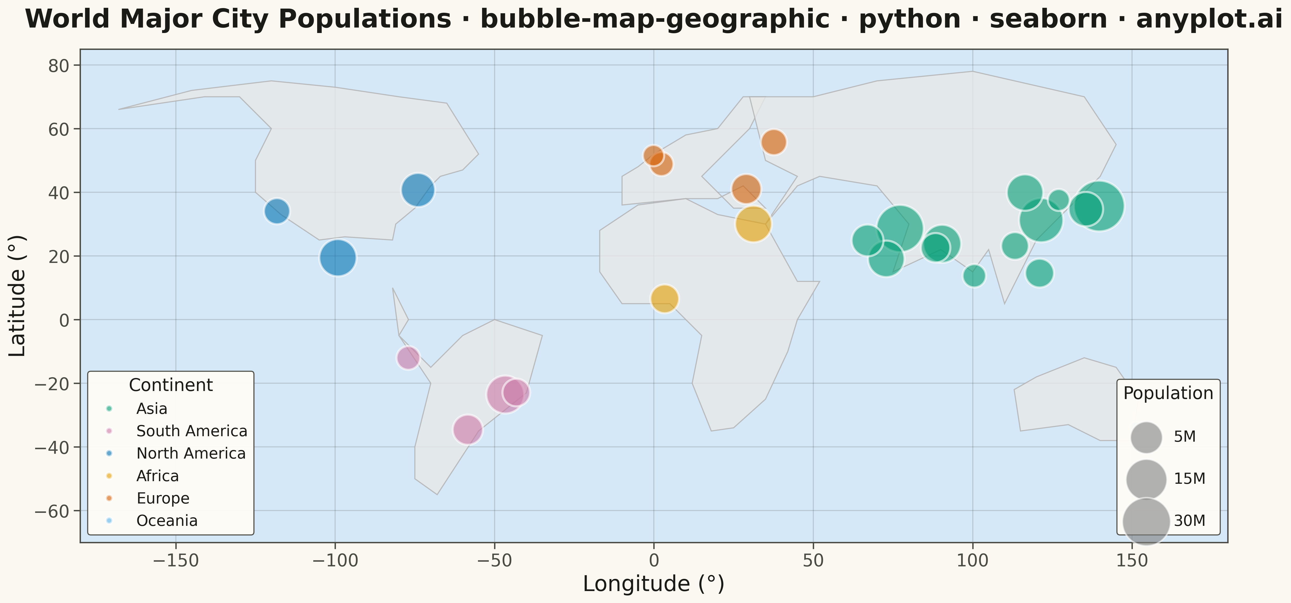
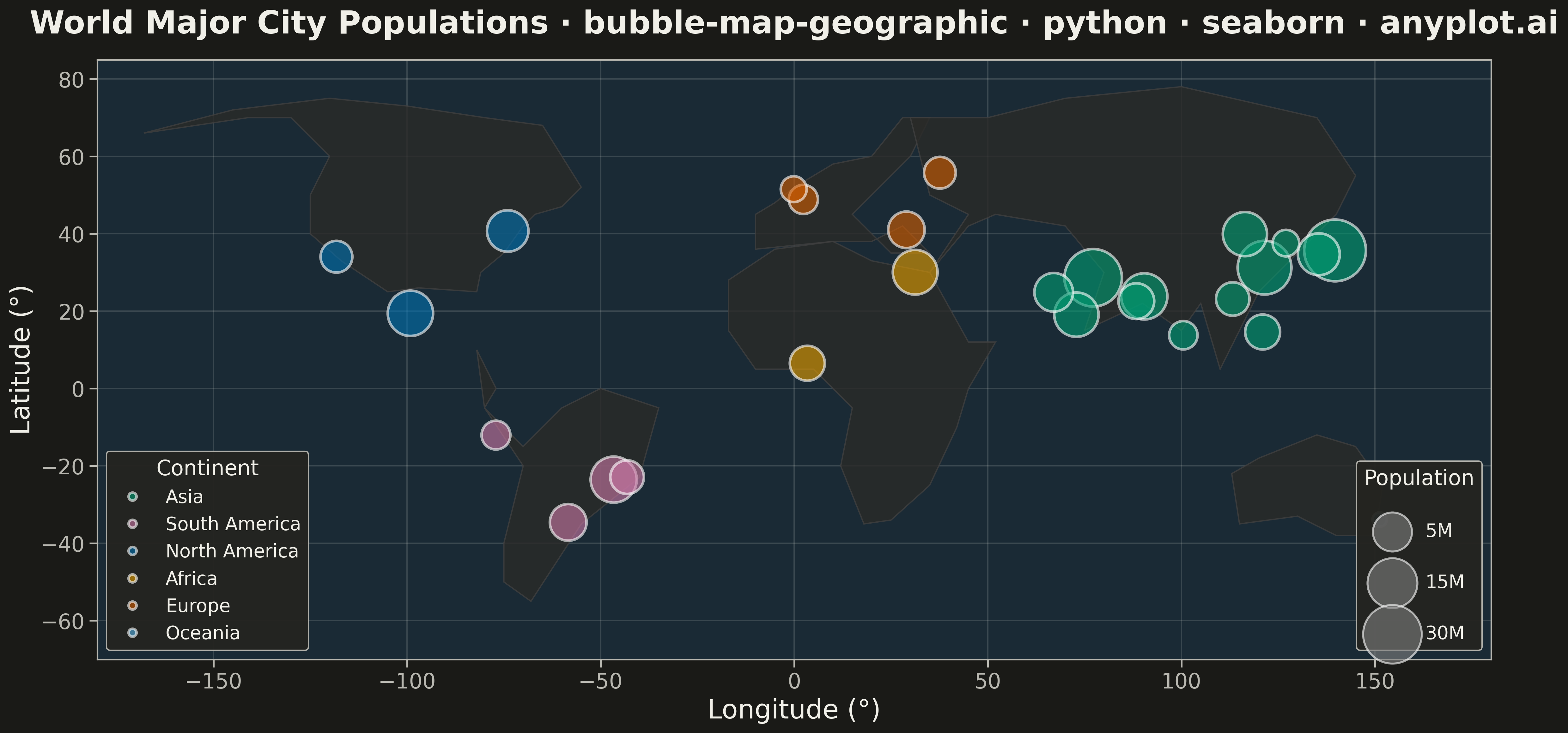
A geographic bubble map where markers are sized proportionally to quantitative data values at each location. Unlike scatter maps where size is optional, bubble maps use marker size as the primary visual encoding to show data magnitude across geographic regions. This visualization makes it immediately apparent where high and low values occur spatially, enabling intuitive comparison of quantities across locations.
""" anyplot.ai
bubble-map-geographic: Bubble Map with Sized Geographic Markers
Library: seaborn 0.13.2 | Python 3.13.13
Quality: 81/100 | Updated: 2026-05-18
"""

import matplotlib.pyplot as plt
import numpy as np
import pandas as pd
import seaborn as sns


# Simplified world coastline polygons (major continents outline)
WORLD_COASTLINES = [
    # North America
    [
        (-168, 66),
        (-141, 70),
        (-130, 70),
        (-120, 60),
        (-125, 50),
        (-125, 40),
        (-117, 33),
        (-105, 25),
        (-97, 26),
        (-82, 25),
        (-81, 30),
        (-75, 35),
        (-70, 42),
        (-67, 45),
        (-60, 47),
        (-55, 52),
        (-60, 60),
        (-65, 68),
        (-80, 70),
        (-100, 73),
        (-120, 75),
        (-145, 72),
        (-168, 66),
    ],
    # South America
    [
        (-82, 10),
        (-77, 0),
        (-80, -5),
        (-70, -15),
        (-60, -5),
        (-50, 0),
        (-35, -5),
        (-40, -23),
        (-55, -35),
        (-68, -55),
        (-75, -50),
        (-75, -40),
        (-70, -20),
        (-80, -5),
        (-82, 10),
    ],
    # Europe
    [
        (-10, 36),
        (-10, 45),
        (-5, 48),
        (0, 52),
        (5, 55),
        (10, 58),
        (20, 60),
        (28, 70),
        (35, 70),
        (30, 60),
        (25, 55),
        (20, 50),
        (15, 45),
        (20, 40),
        (25, 35),
        (35, 35),
        (28, 42),
        (20, 38),
        (10, 38),
        (-10, 36),
    ],
    # Africa
    [
        (-17, 15),
        (-17, 28),
        (-5, 36),
        (10, 38),
        (20, 33),
        (35, 30),
        (45, 12),
        (52, 12),
        (45, 0),
        (42, -10),
        (35, -25),
        (25, -34),
        (18, -35),
        (12, -20),
        (15, -5),
        (5, 5),
        (-10, 5),
        (-17, 15),
    ],
    # Asia
    [
        (35, 30),
        (45, 42),
        (52, 45),
        (70, 42),
        (80, 30),
        (75, 15),
        (90, 22),
        (100, 15),
        (105, 22),
        (110, 5),
        (120, 25),
        (130, 35),
        (140, 45),
        (145, 55),
        (135, 70),
        (100, 78),
        (70, 75),
        (50, 70),
        (30, 70),
        (35, 50),
        (45, 45),
        (35, 30),
    ],
    # Australia
    [
        (113, -22),
        (120, -18),
        (135, -12),
        (145, -15),
        (152, -25),
        (150, -38),
        (140, -38),
        (130, -33),
        (115, -35),
        (113, -22),
    ],
]

# Data: World cities with populations (millions)
np.random.seed(42)

cities_data = {
    "city": [
        "Tokyo",
        "Delhi",
        "Shanghai",
        "Sao Paulo",
        "Mexico City",
        "Cairo",
        "Mumbai",
        "Beijing",
        "Dhaka",
        "Osaka",
        "New York",
        "Karachi",
        "Buenos Aires",
        "Istanbul",
        "Kolkata",
        "Manila",
        "Lagos",
        "Rio de Janeiro",
        "Guangzhou",
        "Los Angeles",
        "Moscow",
        "Paris",
        "Bangkok",
        "London",
        "Lima",
        "Seoul",
        "Sydney",
    ],
    "latitude": [
        35.68,
        28.61,
        31.23,
        -23.55,
        19.43,
        30.04,
        19.08,
        39.90,
        23.81,
        34.69,
        40.71,
        24.86,
        -34.60,
        41.01,
        22.57,
        14.60,
        6.52,
        -22.91,
        23.13,
        34.05,
        55.76,
        48.86,
        13.76,
        51.51,
        -12.05,
        37.57,
        -33.87,
    ],
    "longitude": [
        139.69,
        77.21,
        121.47,
        -46.63,
        -99.13,
        31.24,
        72.88,
        116.41,
        90.41,
        135.50,
        -74.01,
        67.01,
        -58.38,
        28.98,
        88.36,
        120.98,
        3.38,
        -43.17,
        113.26,
        -118.24,
        37.62,
        2.35,
        100.50,
        -0.13,
        -77.04,
        127.00,
        151.21,
    ],
    "population": [
        37.4,
        32.9,
        29.2,
        22.4,
        21.8,
        21.3,
        21.0,
        20.9,
        22.5,
        19.1,
        18.8,
        16.8,
        15.5,
        15.4,
        14.9,
        14.4,
        14.4,
        13.6,
        13.5,
        12.5,
        12.5,
        11.1,
        10.7,
        9.5,
        10.9,
        9.8,
        5.4,
    ],
    "continent": [
        "Asia",
        "Asia",
        "Asia",
        "South America",
        "North America",
        "Africa",
        "Asia",
        "Asia",
        "Asia",
        "Asia",
        "North America",
        "Asia",
        "South America",
        "Europe",
        "Asia",
        "Asia",
        "Africa",
        "South America",
        "Asia",
        "North America",
        "Europe",
        "Europe",
        "Asia",
        "Europe",
        "South America",
        "Asia",
        "Oceania",
    ],
}

df = pd.DataFrame(cities_data)

# Scale bubble sizes: area proportional to population using sqrt scaling
# Bubble map emphasizes size encoding - use larger range than scatter
min_size = 120
max_size = 2200
df["bubble_size"] = min_size + (max_size - min_size) * (np.sqrt(df["population"]) / np.sqrt(df["population"].max()))

# Set seaborn theme
sns.set_theme(style="whitegrid", context="talk", font_scale=1.1)

# Create figure
fig, ax = plt.subplots(figsize=(16, 9))

# Set map extent
ax.set_xlim(-180, 180)
ax.set_ylim(-70, 85)
ax.set_aspect("equal")

# Draw simplified coastlines as background
for coastline in WORLD_COASTLINES:
    if len(coastline) > 2:
        lons = [p[0] for p in coastline]
        lats = [p[1] for p in coastline]
        ax.fill(lons, lats, color="#e8e8e8", edgecolor="#b0b0b0", linewidth=1, alpha=0.8, zorder=1)

# Ocean background
ax.set_facecolor("#d4e8f7")

# Color palette for continents
continent_palette = {
    "Asia": "#306998",
    "Europe": "#FFD43B",
    "North America": "#E07B53",
    "South America": "#5AAE61",
    "Africa": "#9D6AB8",
    "Oceania": "#2DB5AE",
}

# Plot bubbles using seaborn scatterplot
# Use size parameter with explicit sizes tuple for bubble encoding
sns.scatterplot(
    data=df,
    x="longitude",
    y="latitude",
    hue="continent",
    size="population",
    sizes=(min_size, max_size),
    palette=continent_palette,
    alpha=0.6,
    edgecolor="white",
    linewidth=2,
    ax=ax,
    zorder=3,
    legend="full",
)

# Customize legends - separate continent and size legends
handles, labels = ax.get_legend_handles_labels()

# Find indices for continent legend (skip size entries)
continent_indices = [i for i, label in enumerate(labels) if label in continent_palette]
continent_handles = [handles[i] for i in continent_indices]
continent_labels = [labels[i] for i in continent_indices]

# Continent legend
legend1 = ax.legend(
    continent_handles,
    continent_labels,
    loc="lower left",
    fontsize=14,
    title="Continent",
    title_fontsize=16,
    framealpha=0.95,
    edgecolor="#cccccc",
)
ax.add_artist(legend1)

# Size legend showing population scale
size_legend_pops = [5, 15, 30]
size_legend_elements = []
for pop in size_legend_pops:
    size = min_size + (max_size - min_size) * (np.sqrt(pop) / np.sqrt(df["population"].max()))
    elem = plt.scatter([], [], s=size, c="gray", alpha=0.6, edgecolor="white", linewidth=1.5)
    size_legend_elements.append(elem)

size_legend = ax.legend(
    handles=size_legend_elements,
    labels=[f"{p}M" for p in size_legend_pops],
    loc="lower right",
    fontsize=14,
    title="Population",
    title_fontsize=16,
    framealpha=0.95,
    edgecolor="#cccccc",
    labelspacing=1.8,
)

# Labels and styling
ax.set_xlabel("Longitude (°)", fontsize=20)
ax.set_ylabel("Latitude (°)", fontsize=20)
ax.set_title(
    "World Major City Populations · bubble-map-geographic · seaborn · pyplots.ai",
    fontsize=24,
    fontweight="bold",
    pad=20,
)
ax.tick_params(axis="both", labelsize=16)

# Subtle grid
ax.grid(True, alpha=0.3, linestyle="--", color="#888888")
ax.set_axisbelow(True)

plt.tight_layout()
plt.savefig("plot.png", dpi=300, bbox_inches="tight")
Runnable source as JSON, for any HTTP client: https://api.anyplot.ai/specs/bubble-map-geographic/seaborn/code. Any spec id and library id listed in llms-full.txt fit the same URL shape; every URL below is complete and callable.
{
  "spec_id": "bubble-map-geographic",
  "language": "python",
  "library": "seaborn",
  "page": "https://anyplot.ai/bubble-map-geographic/python/seaborn",
  "hub": "https://anyplot.ai/bubble-map-geographic",
  "code_json": "https://api.anyplot.ai/specs/bubble-map-geographic/seaborn/code",
  "spec_json": "https://api.anyplot.ai/specs/bubble-map-geographic",
  "render_light_png": "https://storage.googleapis.com/anyplot-images/plots/bubble-map-geographic/python/seaborn/plot-light.png",
  "render_dark_png": "https://storage.googleapis.com/anyplot-images/plots/bubble-map-geographic/python/seaborn/plot-dark.png",
  "quality_score": 81.0,
  "license": "MIT",
  "guide": "https://anyplot.ai/llms.txt"
}
Part of Bubble Map with Sized Geographic Markers on anyplot.ai.