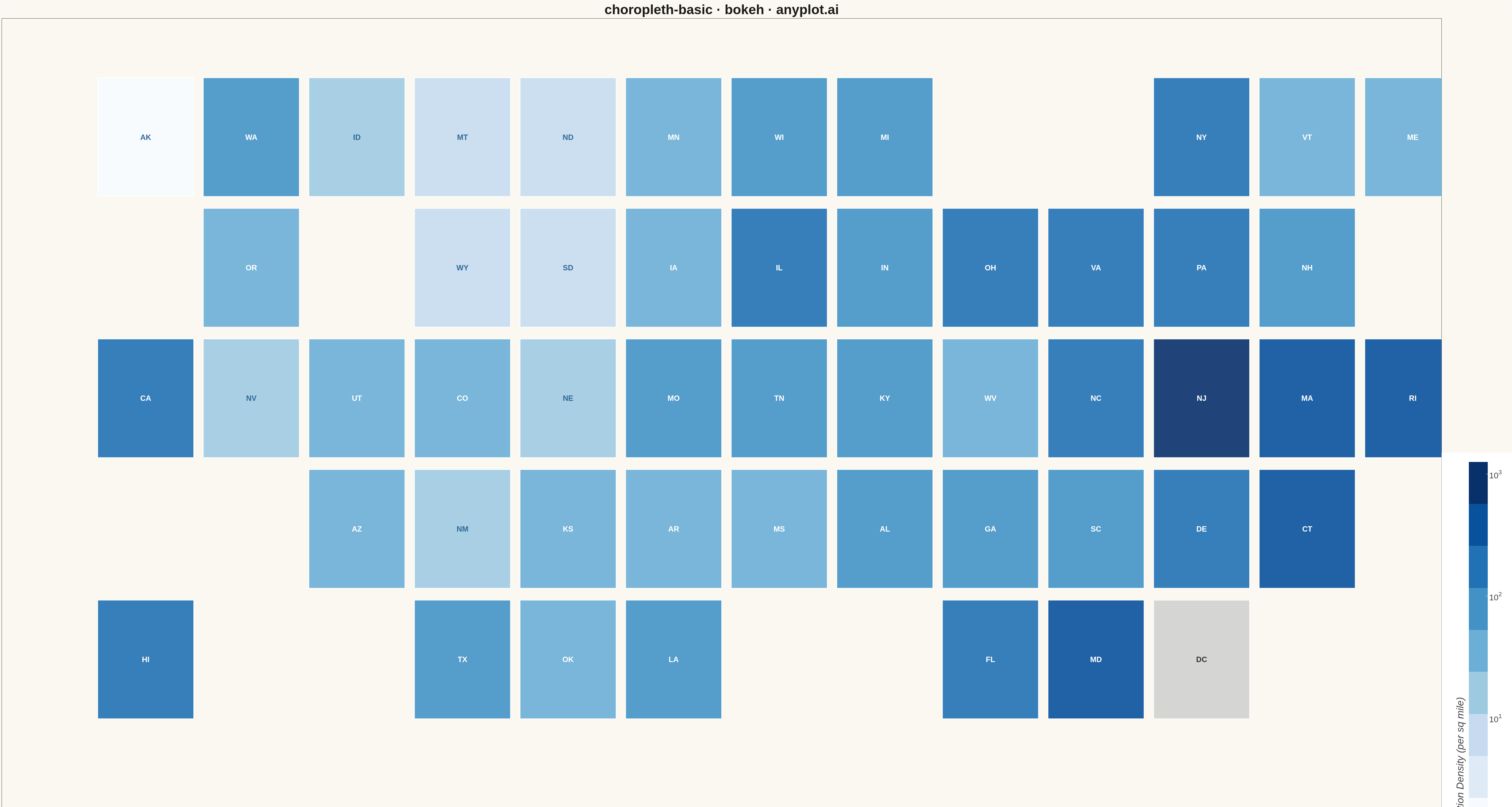
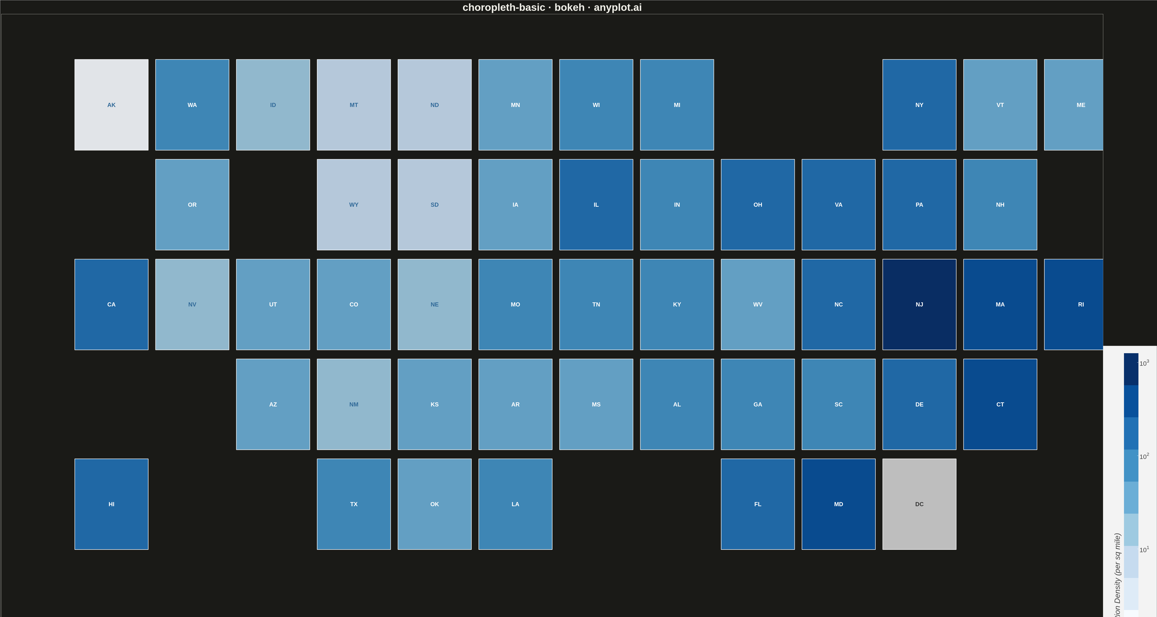
A choropleth map visualizes data by shading geographic regions (countries, states, or counties) according to a measured variable. This technique is ideal for showing regional patterns and spatial distributions, making it easy to identify areas with high or low values at a glance. The color intensity represents the data magnitude, creating an intuitive way to understand geographic variation.
""" anyplot.ai
choropleth-basic: Choropleth Map with Regional Coloring
Library: bokeh 3.9.0 | Python 3.13.13
Quality: 73/100 | Updated: 2026-05-15
"""

import math

from bokeh.io import export_png
from bokeh.models import ColorBar, ColumnDataSource, LabelSet, LogColorMapper
from bokeh.palettes import Blues9
from bokeh.plotting import figure


# Data: US states arranged in a tile grid map layout (all 50 states + DC)
# Grid positions (col, row) - approximating geographic positions
regions = {
    "AK": (0, 5),
    "HI": (0, 1),
    "WA": (1, 5),
    "OR": (1, 4),
    "CA": (0, 3),
    "NV": (1, 3),
    "ID": (2, 5),
    "MT": (3, 5),
    "WY": (3, 4),
    "UT": (2, 3),
    "AZ": (2, 2),
    "CO": (3, 3),
    "NM": (3, 2),
    "ND": (4, 5),
    "SD": (4, 4),
    "NE": (4, 3),
    "KS": (4, 2),
    "OK": (4, 1),
    "TX": (3, 1),
    "MN": (5, 5),
    "IA": (5, 4),
    "MO": (5, 3),
    "AR": (5, 2),
    "LA": (5, 1),
    "WI": (6, 5),
    "IL": (6, 4),
    "IN": (7, 4),
    "MI": (7, 5),
    "OH": (8, 4),
    "KY": (7, 3),
    "TN": (6, 3),
    "MS": (6, 2),
    "AL": (7, 2),
    "GA": (8, 2),
    "FL": (8, 1),
    "SC": (9, 2),
    "NC": (9, 3),
    "VA": (9, 4),
    "WV": (8, 3),
    "PA": (10, 4),
    "NY": (10, 5),
    "VT": (11, 5),
    "NH": (11, 4),
    "ME": (12, 5),
    "MA": (11, 3),
    "RI": (12, 3),
    "CT": (11, 2),
    "NJ": (10, 3),
    "DE": (10, 2),
    "MD": (9, 1),
    "DC": (10, 1),
}

# Population density values (people per sq mile) - realistic ranges
density_values = {
    "AK": 1,
    "HI": 226,
    "CA": 253,
    "TX": 112,
    "FL": 411,
    "NY": 408,
    "PA": 286,
    "IL": 227,
    "OH": 289,
    "GA": 185,
    "NC": 218,
    "MI": 177,
    "NJ": 1263,
    "VA": 218,
    "WA": 117,
    "AZ": 64,
    "MA": 901,
    "TN": 167,
    "IN": 189,
    "MO": 89,
    "MD": 636,
    "WI": 108,
    "CO": 57,
    "MN": 71,
    "SC": 173,
    "AL": 99,
    "LA": 107,
    "KY": 114,
    "OR": 44,
    "OK": 58,
    "CT": 733,
    "IA": 57,
    "MS": 63,
    "AR": 58,
    "UT": 40,
    "NV": 28,
    "KS": 36,
    "NM": 17,
    "NE": 25,
    "WV": 74,
    "ID": 23,
    "ME": 44,
    "NH": 154,
    "RI": 1061,
    "MT": 8,
    "DE": 508,
    "SD": 12,
    "ND": 11,
    "VT": 68,
    "WY": 6,
    # DC intentionally missing to demonstrate missing data handling
}

# Prepare data for rectangles
xs = []
ys = []
widths = []
heights = []
colors = []
abbrevs = []
abbrev_x = []
abbrev_y = []

# Color mapping - use log scale to better differentiate low-density states
min_val = max(1, min(density_values.values()))  # Log scale needs min > 0
max_val = max(density_values.values())
palette = list(reversed(Blues9))
color_mapper = LogColorMapper(palette=palette, low=min_val, high=max_val, nan_color="#d0d0d0")

# Process each region - rect is centered, so adjust coords to center of tile
for abbrev, (col, row) in regions.items():
    center_x = col * 1.1 + 0.5
    center_y = row * 1.1 + 0.5
    xs.append(center_x)
    ys.append(center_y)
    widths.append(1.0)
    heights.append(1.0)
    abbrev_x.append(center_x)
    abbrev_y.append(center_y)
    abbrevs.append(abbrev)

    if abbrev in density_values:
        density = density_values[abbrev]
        # Map to color index using log scale for better low-value differentiation
        log_min = math.log10(min_val)
        log_max = math.log10(max_val)
        log_val = math.log10(max(density, 1))  # Ensure positive for log
        norm = (log_val - log_min) / (log_max - log_min)
        idx = min(int(norm * (len(palette) - 1)), len(palette) - 1)
        colors.append(palette[idx])
    else:
        # Missing data - gray with pattern indication
        colors.append("#d0d0d0")

# Create data sources
rect_source = ColumnDataSource(data={"x": xs, "y": ys, "width": widths, "height": heights, "fill_color": colors})

# Determine text colors based on background (using log scale)
text_colors = []
log_min = math.log10(min_val)
log_max = math.log10(max_val)
for abbrev in abbrevs:
    if abbrev not in density_values:
        text_colors.append("#333333")
    else:
        density = density_values[abbrev]
        log_val = math.log10(max(density, 1))
        norm = (log_val - log_min) / (log_max - log_min)
        text_colors.append("white" if norm > 0.5 else "#306998")

label_source = ColumnDataSource(data={"x": abbrev_x, "y": abbrev_y, "text": abbrevs, "text_color": text_colors})

# Create figure (4800x2700 for landscape)
p = figure(
    width=4800,
    height=2700,
    title="choropleth-basic · bokeh · pyplots.ai",
    x_axis_location=None,
    y_axis_location=None,
    tools="",
    toolbar_location=None,
    x_range=(-1, 14),
    y_range=(0, 7),
)

# Remove grid and axes
p.grid.grid_line_color = None
p.outline_line_color = None
p.xaxis.visible = False
p.yaxis.visible = False

# Draw rectangles for each state
p.rect(
    x="x",
    y="y",
    width="width",
    height="height",
    source=rect_source,
    fill_color="fill_color",
    fill_alpha=0.9,
    line_color="white",
    line_width=2,
)

# Add state abbreviation labels
labels = LabelSet(
    x="x",
    y="y",
    text="text",
    text_color="text_color",
    source=label_source,
    text_align="center",
    text_baseline="middle",
    text_font_size="18pt",
    text_font_style="bold",
)
p.add_layout(labels)

# Title styling
p.title.text_font_size = "32pt"
p.title.align = "center"

# Color bar for legend - made larger for prominence
color_bar = ColorBar(
    color_mapper=color_mapper,
    width=60,
    height=1200,
    location=(0, 0),
    title="Population Density (per sq mile)",
    title_text_font_size="24pt",
    major_label_text_font_size="20pt",
    title_standoff=20,
    padding=30,
    margin=40,
)
p.add_layout(color_bar, "right")

# Save output
export_png(p, filename="plot.png")
Runnable source as JSON, for any HTTP client: https://api.anyplot.ai/specs/choropleth-basic/bokeh/code. Any spec id and library id listed in llms-full.txt fit the same URL shape; every URL below is complete and callable.
{
  "spec_id": "choropleth-basic",
  "language": "python",
  "library": "bokeh",
  "page": "https://anyplot.ai/choropleth-basic/python/bokeh",
  "hub": "https://anyplot.ai/choropleth-basic",
  "code_json": "https://api.anyplot.ai/specs/choropleth-basic/bokeh/code",
  "spec_json": "https://api.anyplot.ai/specs/choropleth-basic",
  "render_light_png": "https://storage.googleapis.com/anyplot-images/plots/choropleth-basic/python/bokeh/plot-light.png",
  "render_dark_png": "https://storage.googleapis.com/anyplot-images/plots/choropleth-basic/python/bokeh/plot-dark.png",
  "interactive_light_html": "https://storage.googleapis.com/anyplot-images/plots/choropleth-basic/python/bokeh/plot-light.html",
  "interactive_dark_html": "https://storage.googleapis.com/anyplot-images/plots/choropleth-basic/python/bokeh/plot-dark.html",
  "quality_score": 73.0,
  "license": "MIT",
  "guide": "https://anyplot.ai/llms.txt"
}
Part of Choropleth Map with Regional Coloring on anyplot.ai.