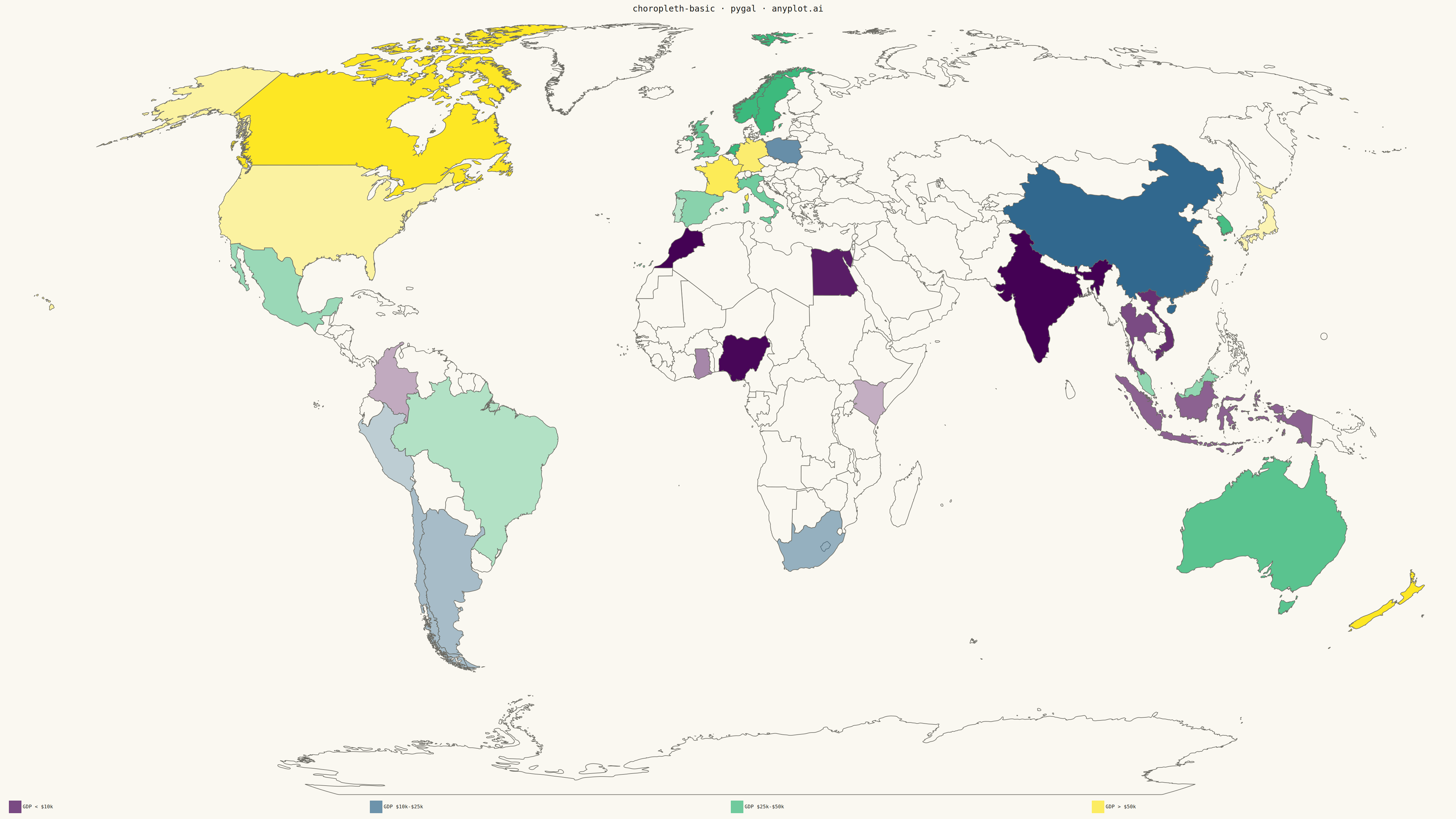
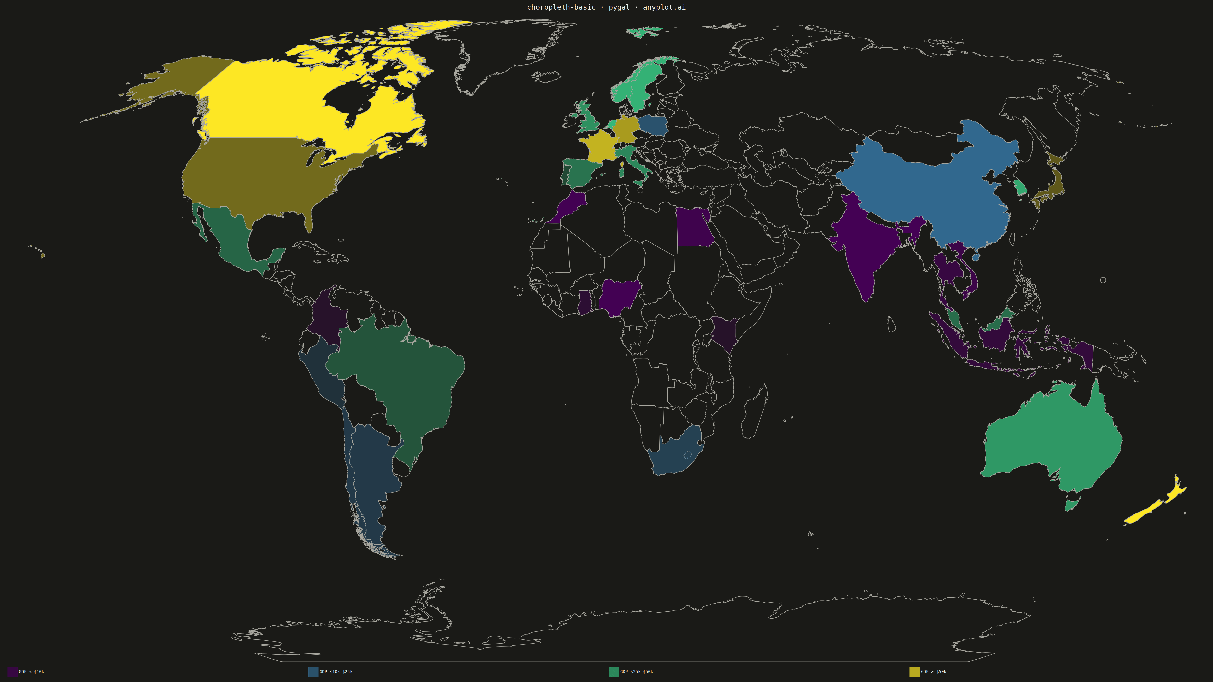
A choropleth map visualizes data by shading geographic regions (countries, states, or counties) according to a measured variable. This technique is ideal for showing regional patterns and spatial distributions, making it easy to identify areas with high or low values at a glance. The color intensity represents the data magnitude, creating an intuitive way to understand geographic variation.
""" anyplot.ai
choropleth-basic: Choropleth Map with Regional Coloring
Library: pygal 3.1.0 | Python 3.13.13
Quality: 83/100 | Updated: 2026-05-15
"""

import os

import numpy as np
from pygal.style import Style
from pygal_maps_world.maps import World


THEME = os.getenv("ANYPLOT_THEME", "light")

# Theme tokens
PAGE_BG = "#FAF8F1" if THEME == "light" else "#1A1A17"
INK = "#1A1A17" if THEME == "light" else "#F0EFE8"
INK_MUTED = "#6B6A63" if THEME == "light" else "#A8A79F"

# Viridis-inspired sequential colors (light to dark purples/blues)
# These work well on both light and dark backgrounds
VIRIDIS_COLORS = [
    "#440154",  # dark purple
    "#31688e",  # blue
    "#35b779",  # green
    "#fde724",  # yellow
]

# Data: GDP per capita (synthetic but realistic ranges)
np.random.seed(42)

# Select a diverse set of countries from different regions
country_codes = [
    # Americas
    "us",
    "ca",
    "mx",
    "br",
    "ar",
    "cl",
    "co",
    "pe",
    # Europe
    "de",
    "fr",
    "gb",
    "it",
    "es",
    "nl",
    "se",
    "no",
    "pl",
    "pt",
    # Asia
    "cn",
    "jp",
    "in",
    "kr",
    "id",
    "th",
    "vn",
    "my",
    # Africa
    "za",
    "eg",
    "ng",
    "ke",
    "ma",
    "gh",
    # Oceania
    "au",
    "nz",
]

# Generate realistic GDP per capita values (in thousands USD)
high_income = ["us", "ca", "de", "fr", "gb", "nl", "se", "no", "jp", "kr", "au", "nz"]
upper_middle = ["mx", "br", "ar", "cl", "cn", "my", "za", "pl", "pt", "it", "es"]

gdp_data = {}
for code in country_codes:
    if code in high_income:
        gdp_data[code] = np.random.uniform(40, 85)
    elif code in upper_middle:
        gdp_data[code] = np.random.uniform(10, 40)
    else:
        gdp_data[code] = np.random.uniform(1, 15)

# Bin data into ranges for legend clarity
bins = [
    ("GDP < $10k", {k: v for k, v in gdp_data.items() if v < 10}),
    ("GDP $10k-$25k", {k: v for k, v in gdp_data.items() if 10 <= v < 25}),
    ("GDP $25k-$50k", {k: v for k, v in gdp_data.items() if 25 <= v < 50}),
    ("GDP > $50k", {k: v for k, v in gdp_data.items() if v >= 50}),
]

# Map bins to colors from viridis palette
bin_colors = VIRIDIS_COLORS[: len(bins)]

# Custom style for large canvas with theme-adaptive colors
custom_style = Style(
    background=PAGE_BG,
    plot_background=PAGE_BG,
    foreground=INK,
    foreground_strong=INK,
    foreground_subtle=INK_MUTED,
    colors=tuple(bin_colors),
    title_font_size=28,
    label_font_size=22,
    legend_font_size=16,
    major_label_font_size=18,
    value_font_size=14,
    tooltip_font_size=14,
    no_data_font_size=14,
)

# Create world map
worldmap = World(
    style=custom_style,
    width=4800,
    height=2700,
    title="choropleth-basic · pygal · anyplot.ai",
    show_legend=True,
    legend_at_bottom=True,
    legend_at_bottom_columns=4,
    legend_box_size=40,
    no_data="#888888" if THEME == "light" else "#666666",
)

# Add each bin as a separate series
for label, data in bins:
    worldmap.add(label, data)

# Save outputs
worldmap.render_to_file(f"plot-{THEME}.html")
worldmap.render_to_png(f"plot-{THEME}.png")
Runnable source as JSON, for any HTTP client: https://api.anyplot.ai/specs/choropleth-basic/pygal/code. Any spec id and library id listed in llms-full.txt fit the same URL shape; every URL below is complete and callable.
{
  "spec_id": "choropleth-basic",
  "language": "python",
  "library": "pygal",
  "page": "https://anyplot.ai/choropleth-basic/python/pygal",
  "hub": "https://anyplot.ai/choropleth-basic",
  "code_json": "https://api.anyplot.ai/specs/choropleth-basic/pygal/code",
  "spec_json": "https://api.anyplot.ai/specs/choropleth-basic",
  "render_light_png": "https://storage.googleapis.com/anyplot-images/plots/choropleth-basic/python/pygal/plot-light.png",
  "render_dark_png": "https://storage.googleapis.com/anyplot-images/plots/choropleth-basic/python/pygal/plot-dark.png",
  "interactive_light_html": "https://storage.googleapis.com/anyplot-images/plots/choropleth-basic/python/pygal/plot-light.html",
  "interactive_dark_html": "https://storage.googleapis.com/anyplot-images/plots/choropleth-basic/python/pygal/plot-dark.html",
  "quality_score": 83.0,
  "license": "MIT",
  "guide": "https://anyplot.ai/llms.txt"
}
Part of Choropleth Map with Regional Coloring on anyplot.ai.