The same plot in 13 other libraries — Python: Altair, Bokeh, lets-plot, Matplotlib, Plotly, plotnine, Pygal, Seaborn; Julia: Makie.jl; JavaScript: Chart.js, D3.js, Apache ECharts, Highcharts. Compare all 14 side by side: Choropleth Map with Regional Coloring in Python, R, Julia and JavaScript.
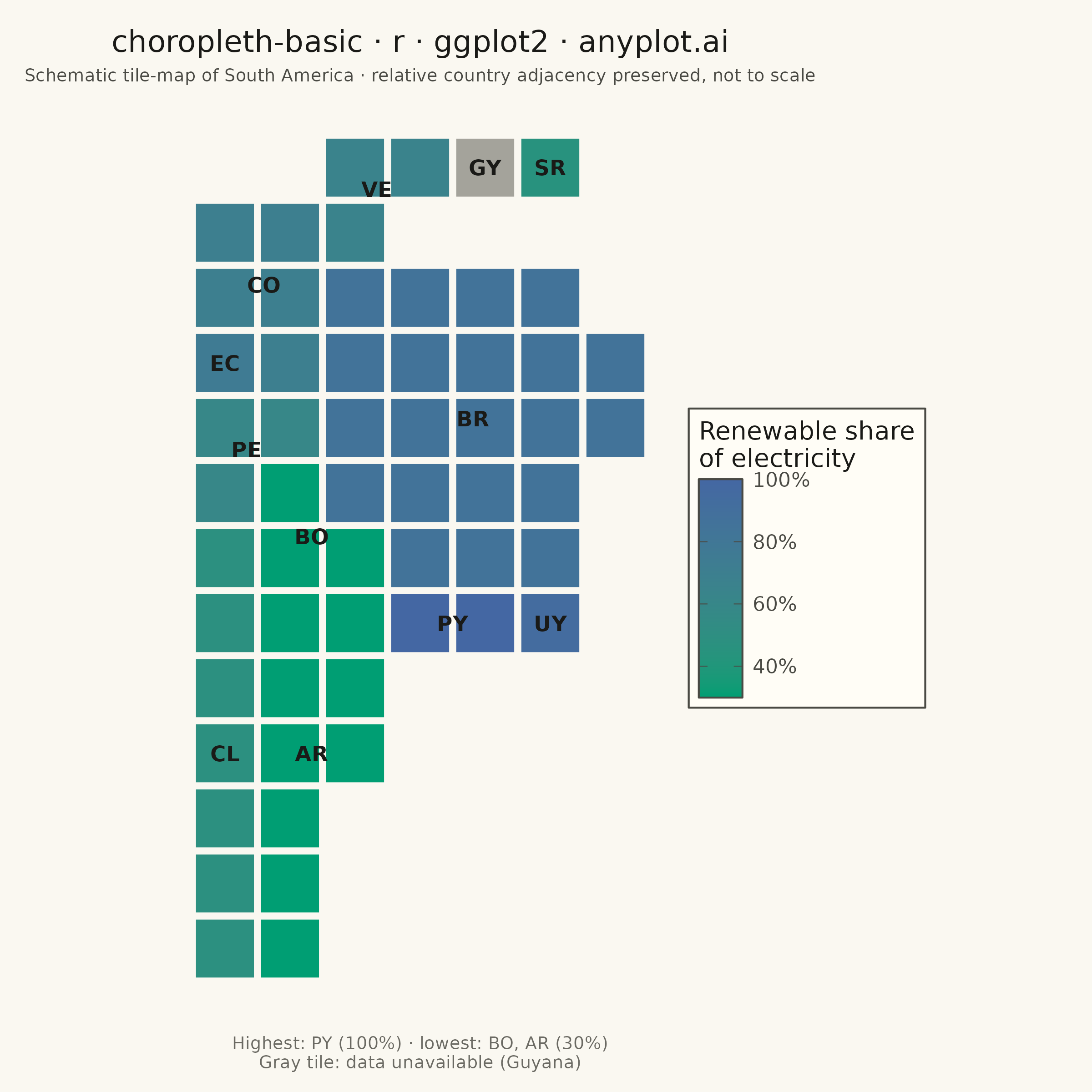
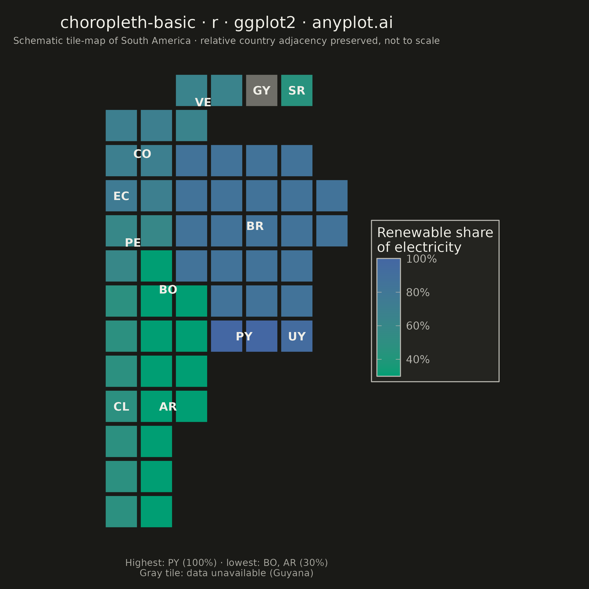
A choropleth map visualizes data by shading geographic regions (countries, states, or counties) according to a measured variable. This technique is ideal for showing regional patterns and spatial distributions, making it easy to identify areas with high or low values at a glance. The color intensity represents the data magnitude, creating an intuitive way to understand geographic variation.
#' anyplot.ai
#' choropleth-basic: Choropleth Map with Regional Coloring
#' Library: ggplot2 3.5.1 | R 4.4.1
#' Quality: 85/100 | Created: 2026-09-02

library(ggplot2)
library(dplyr)
library(tibble)
library(scales)
library(ragg)

# --- Theme tokens -------------------------------------------------------
THEME       <- Sys.getenv("ANYPLOT_THEME", "light")
PAGE_BG     <- if (THEME == "light") "#FAF8F1" else "#1A1A17"
ELEVATED_BG <- if (THEME == "light") "#FFFDF6" else "#242420"
INK         <- if (THEME == "light") "#1A1A17" else "#F0EFE8"
INK_SOFT    <- if (THEME == "light") "#4A4A44" else "#B8B7B0"
INK_MUTED   <- if (THEME == "light") "#6B6A63" else "#A8A79F"

# --- Data -----------------------------------------------------------------
# ggplot2 has no native geographic-boundary support (needs sf/ggmap, out of
# scope here), so the map is expressed as a schematic unit-tile mosaic —
# each South American country is a set of grid cells, laid out to preserve
# real relative position/adjacency. geom_tile() then renders it natively.
cell_list <- list(
  Venezuela = matrix(c(2, 6, 3, 6, 2, 5), ncol = 2, byrow = TRUE),
  Guyana    = matrix(c(4, 6), ncol = 2, byrow = TRUE),
  Suriname  = matrix(c(5, 6), ncol = 2, byrow = TRUE),
  Colombia  = matrix(c(0, 5, 1, 5, 0, 4, 1, 4, 1, 3), ncol = 2, byrow = TRUE),
  Ecuador   = matrix(c(0, 3), ncol = 2, byrow = TRUE),
  Peru      = matrix(c(0, 2, 1, 2, 0, 1), ncol = 2, byrow = TRUE),
  Brazil    = matrix(c(
    2, 4, 3, 4, 4, 4, 5, 4,
    2, 3, 3, 3, 4, 3, 5, 3, 6, 3,
    2, 2, 3, 2, 4, 2, 5, 2, 6, 2,
    2, 1, 3, 1, 4, 1, 5, 1,
    3, 0, 4, 0, 5, 0
  ), ncol = 2, byrow = TRUE),
  Bolivia   = matrix(c(1, 1, 2, 0, 1, 0), ncol = 2, byrow = TRUE),
  Paraguay  = matrix(c(3, -1, 4, -1), ncol = 2, byrow = TRUE),
  Chile     = matrix(c(0, 0, 0, -1, 0, -2, 0, -3, 0, -4, 0, -5, 0, -6), ncol = 2, byrow = TRUE),
  Argentina = matrix(c(
    1, -1, 2, -1,
    1, -2, 2, -2,
    1, -3, 2, -3,
    1, -4,
    1, -5,
    1, -6
  ), ncol = 2, byrow = TRUE),
  Uruguay   = matrix(c(5, -1), ncol = 2, byrow = TRUE)
)

country_cells <- bind_rows(lapply(names(cell_list), function(country) {
  cells <- cell_list[[country]]
  tibble(country = country, col = cells[, 1], row = cells[, 2])
}))

country_code <- c(
  Venezuela = "VE", Guyana = "GY", Suriname = "SR", Colombia = "CO",
  Ecuador = "EC", Peru = "PE", Brazil = "BR", Bolivia = "BO",
  Paraguay = "PY", Chile = "CL", Argentina = "AR", Uruguay = "UY"
)

# Renewable share of electricity generation (%) — Guyana is left NA to
# demonstrate missing-data handling.
renewable_share <- tibble(
  country = names(country_code),
  value   = c(65, NA, 45, 70, 75, 60, 85, 30, 100, 48, 30, 94)
)

df <- country_cells %>%
  left_join(renewable_share, by = "country")

centroids <- df %>%
  group_by(country) %>%
  summarize(x = mean(col), y = mean(row), value = first(value), .groups = "drop") %>%
  mutate(code = country_code[country])

df_present <- df %>% filter(!is.na(value))
df_missing <- df %>% filter(is.na(value))

# Highest/lowest-share countries are named in the caption below (no on-map
# marker: a per-cell highlight either creates seams across multi-cell
# countries like Bolivia/Argentina or collides with their centroid label).
extreme_countries <- df_present %>%
  distinct(country, value) %>%
  filter(value == max(value) | value == min(value)) %>%
  mutate(code = country_code[country])

highest_codes <- extreme_countries %>%
  filter(value == max(value)) %>%
  pull(code) %>%
  paste(collapse = ", ")
highest_value <- max(extreme_countries$value)
lowest_codes <- extreme_countries %>%
  filter(value == min(value)) %>%
  pull(code) %>%
  paste(collapse = ", ")
lowest_value <- min(extreme_countries$value)

# --- Title (fontsize scales with title length, see plot-generator.md) -----
# No descriptive prefix: the legend title already names the metric, and the
# square canvas leaves less horizontal room than the landscape default.
title_text <- "choropleth-basic · r · ggplot2 · anyplot.ai"
title_len   <- nchar(title_text)
title_ratio <- if (title_len > 67) 67 / title_len else 1
title_size  <- max(8, round(12 * title_ratio))

# --- Plot -------------------------------------------------------------------
p <- ggplot() +
  geom_tile(
    data = df_present, aes(x = col, y = row, fill = value),
    color = PAGE_BG, linewidth = 0.6, width = 0.94, height = 0.94
  ) +
  geom_tile(
    data = df_missing, aes(x = col, y = row),
    fill = INK_MUTED, color = PAGE_BG, linewidth = 0.6,
    width = 0.94, height = 0.94, alpha = 0.6
  ) +
  geom_text(
    data = centroids, aes(x = x, y = y, label = code),
    size = 3, color = INK, fontface = "bold"
  ) +
  scale_fill_gradient(
    low = "#009E73", high = "#4467A3",
    name = "Renewable share\nof electricity",
    labels = label_percent(scale = 1),
    na.value = INK_MUTED,
    guide = guide_colorbar(frame.colour = INK_SOFT, ticks.colour = INK_SOFT)
  ) +
  coord_fixed(ratio = 1) +
  labs(
    title    = title_text,
    subtitle = "Schematic tile-map of South America · relative country adjacency preserved, not to scale",
    caption  = paste0(
      "Highest: ", highest_codes, " (", highest_value, "%) · lowest: ",
      lowest_codes, " (", lowest_value, "%)\nGray tile: data unavailable (Guyana)"
    )
  ) +
  theme_minimal(base_size = 8) +
  theme(
    plot.background   = element_rect(fill = PAGE_BG, color = PAGE_BG),
    panel.background  = element_rect(fill = PAGE_BG, color = NA),
    panel.grid        = element_blank(),
    axis.text         = element_blank(),
    axis.title        = element_blank(),
    axis.ticks        = element_blank(),
    plot.title        = element_text(size = title_size, color = INK, hjust = 0.5),
    plot.subtitle     = element_text(size = 7, color = INK_SOFT, hjust = 0.5),
    plot.caption      = element_text(size = 7, color = INK_MUTED, hjust = 0.5),
    legend.background = element_rect(fill = ELEVATED_BG, color = INK_SOFT),
    legend.text       = element_text(size = 8, color = INK_SOFT),
    legend.title      = element_text(size = 10, color = INK),
    legend.position   = "right",
    plot.margin       = margin(t = 12, r = 8, b = 8, l = 8)
  )

# --- Save -------------------------------------------------------------------
ggsave(
  filename = sprintf("plot-%s.png", THEME),
  plot     = p,
  device   = ragg::agg_png,
  width    = 6,
  height   = 6,
  units    = "in",
  dpi      = 400
)
Runnable source as JSON, for any HTTP client: https://api.anyplot.ai/specs/choropleth-basic/ggplot2/code. Any spec id and library id listed in llms-full.txt fit the same URL shape; every URL below is complete and callable.
{
  "spec_id": "choropleth-basic",
  "language": "r",
  "library": "ggplot2",
  "page": "https://anyplot.ai/choropleth-basic/r/ggplot2",
  "hub": "https://anyplot.ai/choropleth-basic",
  "code_json": "https://api.anyplot.ai/specs/choropleth-basic/ggplot2/code",
  "spec_json": "https://api.anyplot.ai/specs/choropleth-basic",
  "render_light_png": "https://storage.googleapis.com/anyplot-images/plots/choropleth-basic/r/ggplot2/plot-light.png",
  "render_dark_png": "https://storage.googleapis.com/anyplot-images/plots/choropleth-basic/r/ggplot2/plot-dark.png",
  "quality_score": 85.0,
  "license": "MIT",
  "guide": "https://anyplot.ai/llms.txt"
}
Part of Choropleth Map with Regional Coloring on anyplot.ai.