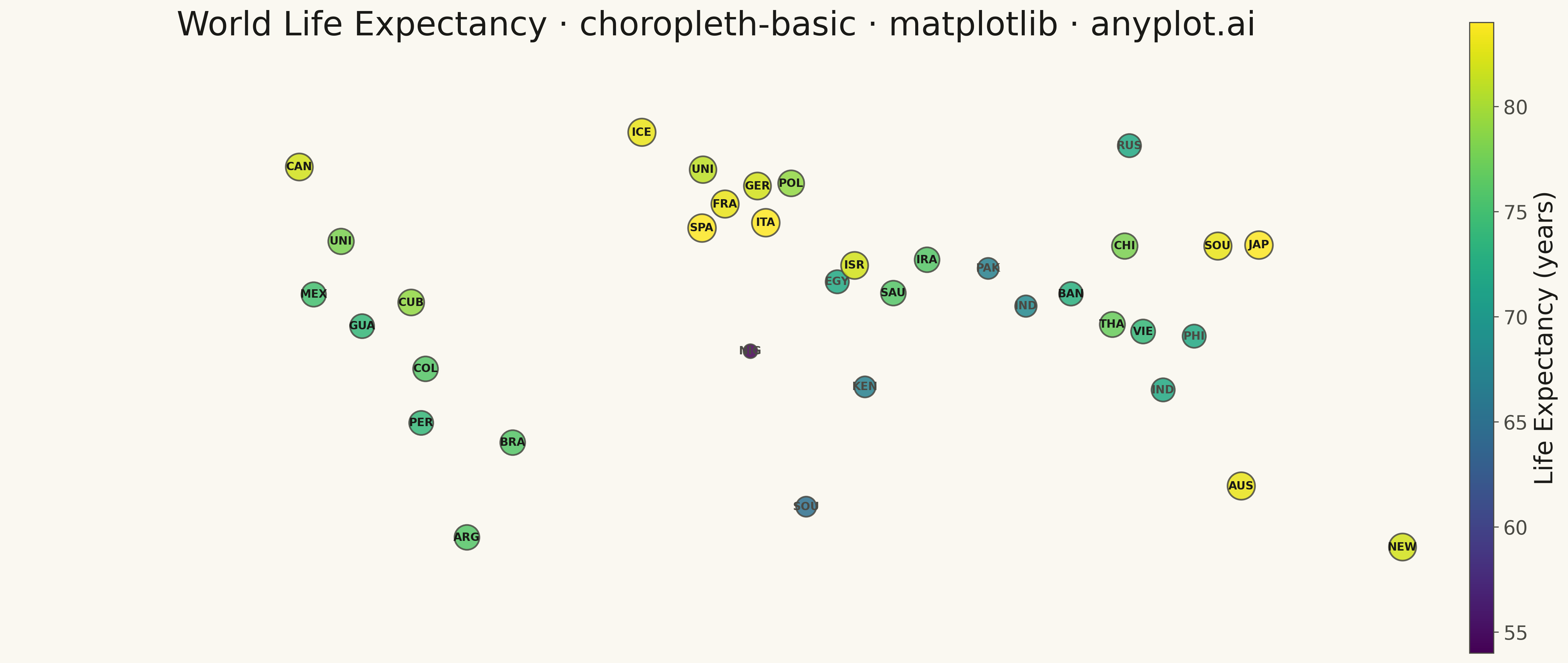
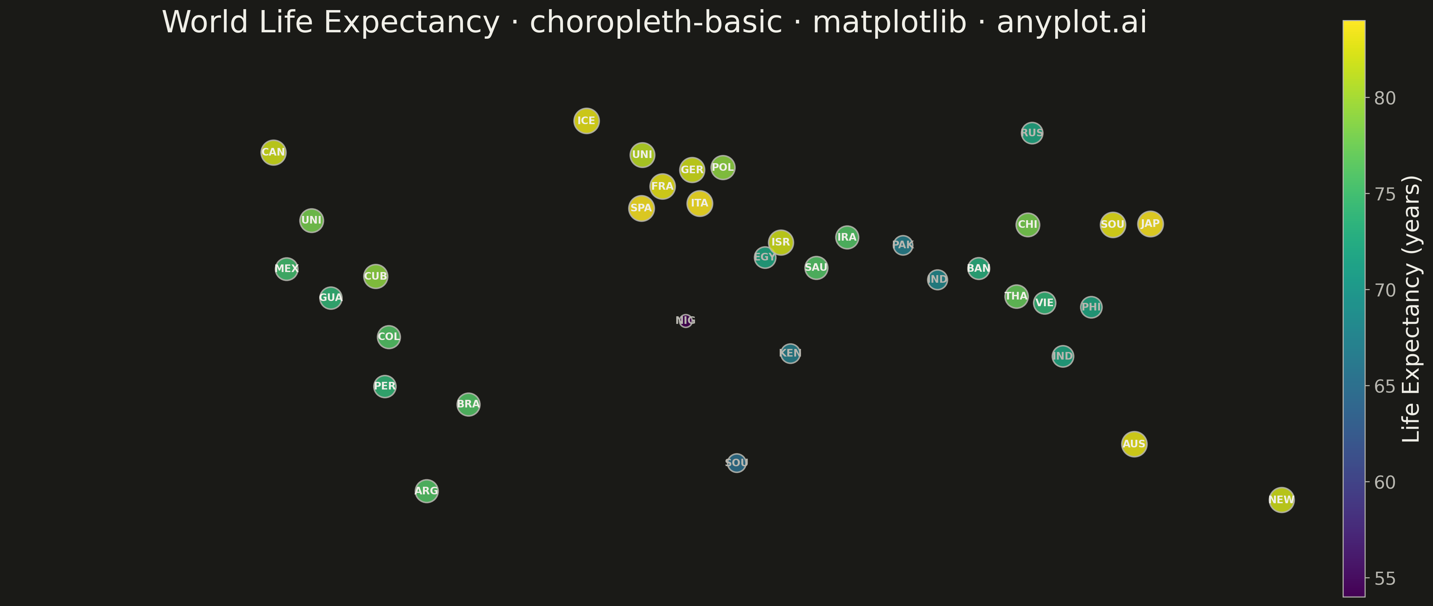
A choropleth map visualizes data by shading geographic regions (countries, states, or counties) according to a measured variable. This technique is ideal for showing regional patterns and spatial distributions, making it easy to identify areas with high or low values at a glance. The color intensity represents the data magnitude, creating an intuitive way to understand geographic variation.
""" anyplot.ai
choropleth-basic: Choropleth Map with Regional Coloring
Library: matplotlib 3.10.9 | Python 3.13.13
Quality: 78/100 | Updated: 2026-05-15
"""

import os
import sys


# Prevent matplotlib.py from shadowing the matplotlib package
script_dir = os.path.dirname(os.path.abspath(__file__))
sys.path = [p for p in sys.path if os.path.abspath(p) != script_dir]

import matplotlib.pyplot as plt
import numpy as np


THEME = os.getenv("ANYPLOT_THEME", "light")
PAGE_BG = "#FAF8F1" if THEME == "light" else "#1A1A17"
INK = "#1A1A17" if THEME == "light" else "#F0EFE8"
INK_SOFT = "#4A4A44" if THEME == "light" else "#B8B7B0"

# Country data with geographic coordinates (lat, lon) and life expectancy
country_data = {
    "Canada": {"lat": 56.1, "lon": -106.3, "le": 82},
    "United States": {"lat": 37.1, "lon": -95.7, "le": 78},
    "Mexico": {"lat": 23.6, "lon": -102.6, "le": 75},
    "Guatemala": {"lat": 15.5, "lon": -90.3, "le": 74},
    "Cuba": {"lat": 21.5, "lon": -77.8, "le": 79},
    "Colombia": {"lat": 4.6, "lon": -74.1, "le": 76},
    "Brazil": {"lat": -14.2, "lon": -51.9, "le": 76},
    "Peru": {"lat": -9.2, "lon": -75.2, "le": 74},
    "Argentina": {"lat": -38.4, "lon": -63.6, "le": 76},
    "Iceland": {"lat": 64.9, "lon": -19.0, "le": 83},
    "United Kingdom": {"lat": 55.4, "lon": -3.4, "le": 81},
    "France": {"lat": 46.6, "lon": 2.2, "le": 83},
    "Germany": {"lat": 51.2, "lon": 10.5, "le": 82},
    "Spain": {"lat": 40.5, "lon": -3.7, "le": 84},
    "Italy": {"lat": 41.9, "lon": 12.6, "le": 84},
    "Poland": {"lat": 51.9, "lon": 19.1, "le": 79},
    "Russia": {"lat": 61.5, "lon": 105.3, "le": 72},
    "Nigeria": {"lat": 9.1, "lon": 8.7, "le": 54},
    "Egypt": {"lat": 26.8, "lon": 30.8, "le": 72},
    "South Africa": {"lat": -30.6, "lon": 22.9, "le": 65},
    "Kenya": {"lat": -0.0, "lon": 37.9, "le": 67},
    "Saudi Arabia": {"lat": 23.9, "lon": 45.1, "le": 76},
    "Iran": {"lat": 32.4, "lon": 53.7, "le": 76},
    "Israel": {"lat": 31.0, "lon": 35.2, "le": 82},
    "India": {"lat": 20.6, "lon": 78.9, "le": 68},
    "Pakistan": {"lat": 30.2, "lon": 69.3, "le": 67},
    "Bangladesh": {"lat": 23.7, "lon": 90.4, "le": 73},
    "Thailand": {"lat": 15.9, "lon": 100.9, "le": 77},
    "Indonesia": {"lat": -0.8, "lon": 113.9, "le": 72},
    "Vietnam": {"lat": 14.1, "lon": 108.8, "le": 74},
    "Philippines": {"lat": 12.9, "lon": 121.8, "le": 72},
    "China": {"lat": 35.9, "lon": 104.1, "le": 78},
    "Japan": {"lat": 36.2, "lon": 138.3, "le": 84},
    "South Korea": {"lat": 35.9, "lon": 127.8, "le": 83},
    "Australia": {"lat": -25.3, "lon": 133.8, "le": 83},
    "New Zealand": {"lat": -40.9, "lon": 174.9, "le": 82},
}

# Create figure with geographic extent
fig, ax = plt.subplots(figsize=(16, 9), facecolor=PAGE_BG)
ax.set_facecolor(PAGE_BG)

# Prepare colormap and normalization
cmap = plt.cm.RdYlGn
norm = plt.Normalize(vmin=54, vmax=84)

# Calculate region sizes based on life expectancy (larger = higher life expectancy)
# Scale from 0.4 to 1.2 for visual variety
size_scale = np.linspace(0.4, 1.2, 4)

# Plot geographic regions with varying sizes
for country, data in country_data.items():
    lat, lon, le = data["lat"], data["lon"], data["le"]
    color = cmap(norm(le))

    # Create proportionally sized hex marker
    size = 80 + (le - 54) * 8  # Scale marker size by life expectancy
    ax.scatter(lon, lat, s=size, c=[color], edgecolors=INK_SOFT, linewidth=1, alpha=0.85, marker="H", zorder=2)

    # Add country label with theme-aware color
    # Use light ink for low values, dark ink for high values
    text_color = INK_SOFT if le < 70 else INK
    ax.text(
        lon,
        lat,
        country[:3].upper(),
        ha="center",
        va="center",
        fontsize=9,
        fontweight="bold",
        color=text_color,
        zorder=3,
    )

# Set geographic bounds (world extent)
ax.set_xlim(-180, 180)
ax.set_ylim(-60, 85)
ax.set_aspect("equal")

# Remove axes for cleaner appearance
ax.set_xticks([])
ax.set_yticks([])
for spine in ax.spines.values():
    spine.set_visible(False)

# Add subtle grid for geographic reference
ax.grid(True, alpha=0.05, color=INK_SOFT, linewidth=0.5, linestyle=":")
ax.set_axisbelow(True)

# Add colorbar
cbar = plt.cm.ScalarMappable(cmap=cmap, norm=norm)
cbar.set_array([])
cbar_ax = fig.add_axes([0.92, 0.15, 0.015, 0.7])
cbar_obj = plt.colorbar(cbar, cax=cbar_ax)
cbar_obj.set_label("Life Expectancy (years)", fontsize=18, color=INK)
cbar_ax.tick_params(labelsize=14, colors=INK_SOFT)
for spine in cbar_ax.spines.values():
    spine.set_color(INK_SOFT)

# Title
title = "World Life Expectancy · choropleth-basic · matplotlib · anyplot.ai"
ax.text(0.5, 1.02, title, transform=ax.transAxes, fontsize=24, fontweight="medium", color=INK, ha="center", va="bottom")

plt.tight_layout(rect=[0, 0, 0.9, 1])

# Save to script directory
output_path = os.path.join(script_dir, f"plot-{THEME}.png")
plt.savefig(output_path, dpi=300, bbox_inches="tight", facecolor=PAGE_BG)
Runnable source as JSON, for any HTTP client: https://api.anyplot.ai/specs/choropleth-basic/matplotlib/code. Any spec id and library id listed in llms-full.txt fit the same URL shape; every URL below is complete and callable.
{
  "spec_id": "choropleth-basic",
  "language": "python",
  "library": "matplotlib",
  "page": "https://anyplot.ai/choropleth-basic/python/matplotlib",
  "hub": "https://anyplot.ai/choropleth-basic",
  "code_json": "https://api.anyplot.ai/specs/choropleth-basic/matplotlib/code",
  "spec_json": "https://api.anyplot.ai/specs/choropleth-basic",
  "render_light_png": "https://storage.googleapis.com/anyplot-images/plots/choropleth-basic/python/matplotlib/plot-light.png",
  "render_dark_png": "https://storage.googleapis.com/anyplot-images/plots/choropleth-basic/python/matplotlib/plot-dark.png",
  "quality_score": 78.0,
  "license": "MIT",
  "guide": "https://anyplot.ai/llms.txt"
}
Part of Choropleth Map with Regional Coloring on anyplot.ai.