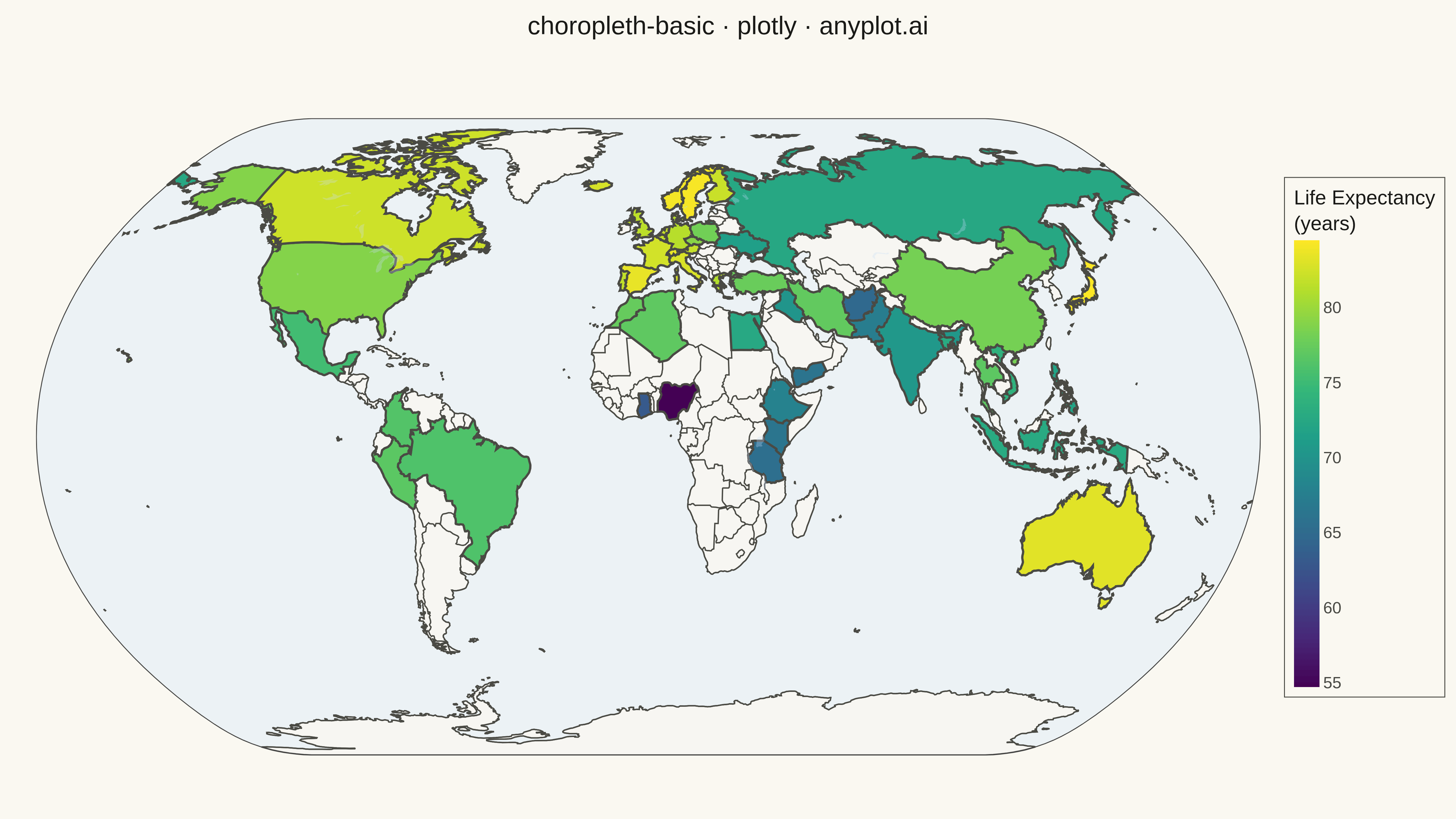
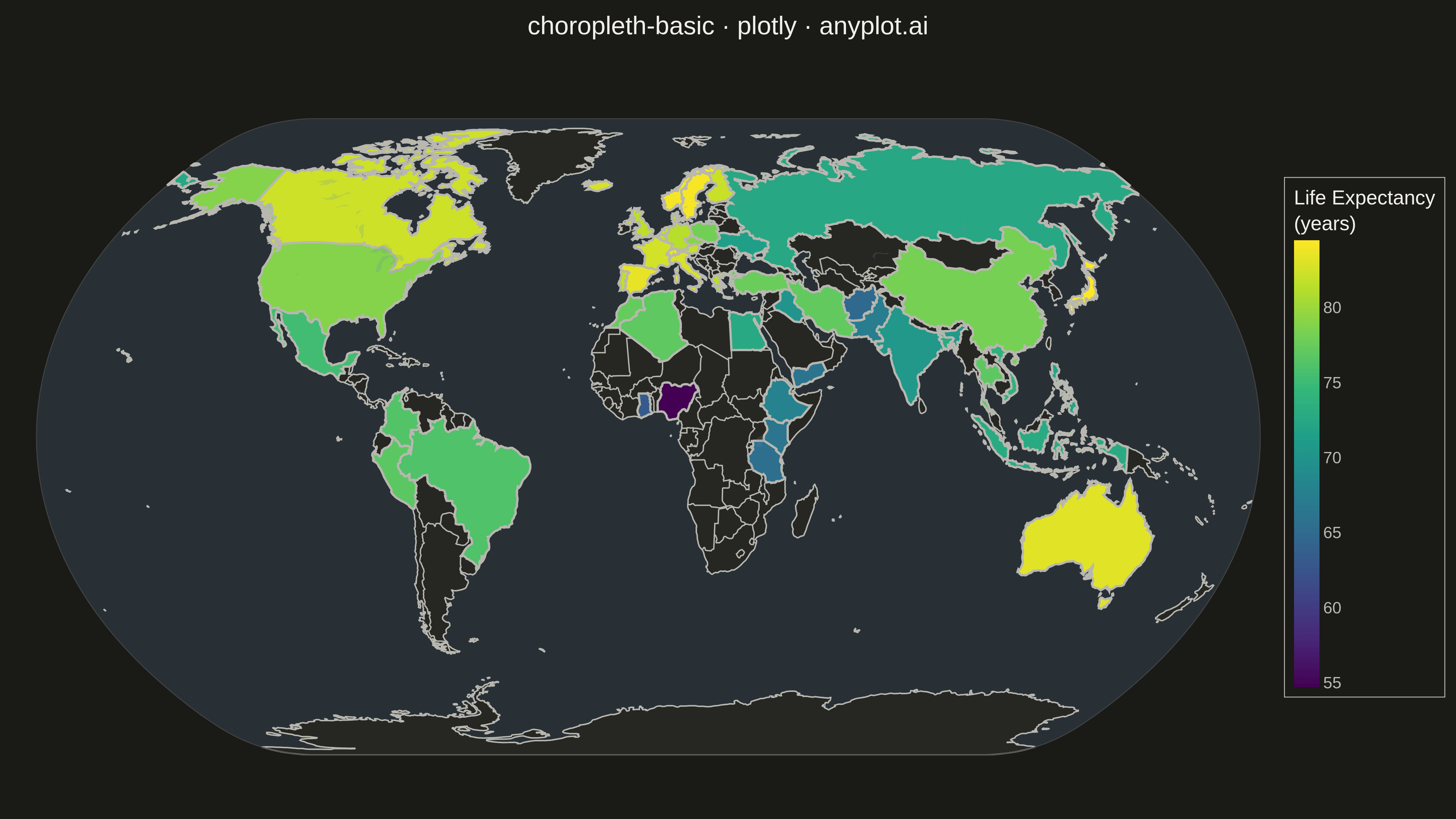
A choropleth map visualizes data by shading geographic regions (countries, states, or counties) according to a measured variable. This technique is ideal for showing regional patterns and spatial distributions, making it easy to identify areas with high or low values at a glance. The color intensity represents the data magnitude, creating an intuitive way to understand geographic variation.
""" anyplot.ai
choropleth-basic: Choropleth Map with Regional Coloring
Library: plotly 6.7.0 | Python 3.13.13
Quality: 94/100 | Updated: 2026-05-15
"""

import os

import numpy as np
import pandas as pd
import plotly.express as px


# Theme tokens
THEME = os.getenv("ANYPLOT_THEME", "light")
PAGE_BG = "#FAF8F1" if THEME == "light" else "#1A1A17"
ELEVATED_BG = "#FFFDF6" if THEME == "light" else "#242420"
INK = "#1A1A17" if THEME == "light" else "#F0EFE8"
INK_SOFT = "#4A4A44" if THEME == "light" else "#B8B7B0"

# Data - Life expectancy by country (years)
np.random.seed(42)

countries_data = {
    "country": [
        "CHN",
        "IND",
        "USA",
        "IDN",
        "BRA",
        "PAK",
        "NGA",
        "BGD",
        "RUS",
        "MEX",
        "JPN",
        "EGY",
        "PHL",
        "ETH",
        "VNM",
        "TUR",
        "IRN",
        "DEU",
        "THA",
        "FRA",
        "GBR",
        "TZA",
        "ITA",
        "KEN",
        "COL",
        "ESP",
        "UKR",
        "DZA",
        "IRQ",
        "AFG",
        "CAN",
        "MAR",
        "AUS",
        "PER",
        "ANG",
        "GHA",
        "YEM",
        "NLD",
        "CHE",
        "POL",
        "SWE",
        "BEL",
        "CZE",
        "GRC",
        "PRT",
        "AUT",
        "NOR",
        "DNK",
        "FIN",
        "ISL",
    ],
    "life_expectancy": [
        78.2,
        70.5,
        78.9,
        72.8,
        76.1,
        67.3,
        54.7,
        72.8,
        72.5,
        75.3,
        84.5,
        72.6,
        71.9,
        67.9,
        73.8,
        77.6,
        77.2,
        81.3,
        76.9,
        82.5,
        81.5,
        65.5,
        82.8,
        66.3,
        76.3,
        83.5,
        71.4,
        77.0,
        70.2,
        64.8,
        82.3,
        77.4,
        83.2,
        76.8,
        60.8,
        63.1,
        66.2,
        81.9,
        83.6,
        78.0,
        84.2,
        81.8,
        79.1,
        81.1,
        81.7,
        81.9,
        84.1,
        81.2,
        82.1,
        82.7,
    ],
}

df = pd.DataFrame(countries_data)

# Create choropleth map with world scope
fig = px.choropleth(
    df,
    locations="country",
    color="life_expectancy",
    color_continuous_scale="Viridis",
    scope="world",
    hover_data={"country": True, "life_expectancy": ":.1f"},
    labels={"life_expectancy": "Life Expectancy (years)"},
)

# Update colorbar for theme adaptation
fig.update_layout(
    coloraxis_colorbar=dict(
        title=dict(text="Life Expectancy<br>(years)", font=dict(size=22, color=INK)),
        tickfont=dict(size=18, color=INK_SOFT),
        thickness=28,
        len=0.75,
        x=1.02,
        tickcolor=INK_SOFT,
        bordercolor=INK_SOFT,
        borderwidth=1,
    )
)

# Update layout for theme-adaptive rendering
fig.update_layout(
    title=dict(
        text="choropleth-basic · plotly · anyplot.ai",
        font=dict(size=28, color=INK, family="sans-serif"),
        x=0.5,
        xanchor="center",
        y=0.98,
        yanchor="top",
    ),
    geo=dict(
        scope="world",
        projection_type="natural earth",
        showland=True,
        landcolor="rgba(243, 243, 243, 0.5)" if THEME == "light" else "rgba(50, 50, 48, 0.5)",
        showocean=True,
        oceancolor="rgba(204, 229, 255, 0.3)" if THEME == "light" else "rgba(100, 140, 180, 0.2)",
        showcountries=True,
        countrycolor=INK_SOFT,
        countrywidth=1.5,
        showcoastlines=True,
        coastlinecolor=INK_SOFT,
        coastlinewidth=1.5,
        showlakes=True,
        lakecolor="rgba(200, 220, 255, 0.3)" if THEME == "light" else "rgba(100, 140, 180, 0.2)",
        bgcolor=PAGE_BG,
    ),
    paper_bgcolor=PAGE_BG,
    plot_bgcolor=PAGE_BG,
    font=dict(color=INK, family="sans-serif"),
    margin=dict(l=40, r=140, t=100, b=40),
    height=900,
    width=1600,
)

# Update traces for border visibility
fig.update_traces(marker_line_width=2.5, marker_line_color=INK_SOFT)

# Save as PNG (4800x2700 px via scale parameter)
fig.write_image(f"plot-{THEME}.png", width=1600, height=900, scale=3)

# Save as interactive HTML
fig.write_html(f"plot-{THEME}.html", include_plotlyjs="cdn")
Runnable source as JSON, for any HTTP client: https://api.anyplot.ai/specs/choropleth-basic/plotly/code. Any spec id and library id listed in llms-full.txt fit the same URL shape; every URL below is complete and callable.
{
  "spec_id": "choropleth-basic",
  "language": "python",
  "library": "plotly",
  "page": "https://anyplot.ai/choropleth-basic/python/plotly",
  "hub": "https://anyplot.ai/choropleth-basic",
  "code_json": "https://api.anyplot.ai/specs/choropleth-basic/plotly/code",
  "spec_json": "https://api.anyplot.ai/specs/choropleth-basic",
  "render_light_png": "https://storage.googleapis.com/anyplot-images/plots/choropleth-basic/python/plotly/plot-light.png",
  "render_dark_png": "https://storage.googleapis.com/anyplot-images/plots/choropleth-basic/python/plotly/plot-dark.png",
  "interactive_light_html": "https://storage.googleapis.com/anyplot-images/plots/choropleth-basic/python/plotly/plot-light.html",
  "interactive_dark_html": "https://storage.googleapis.com/anyplot-images/plots/choropleth-basic/python/plotly/plot-dark.html",
  "quality_score": 94.0,
  "license": "MIT",
  "guide": "https://anyplot.ai/llms.txt"
}
Part of Choropleth Map with Regional Coloring on anyplot.ai.