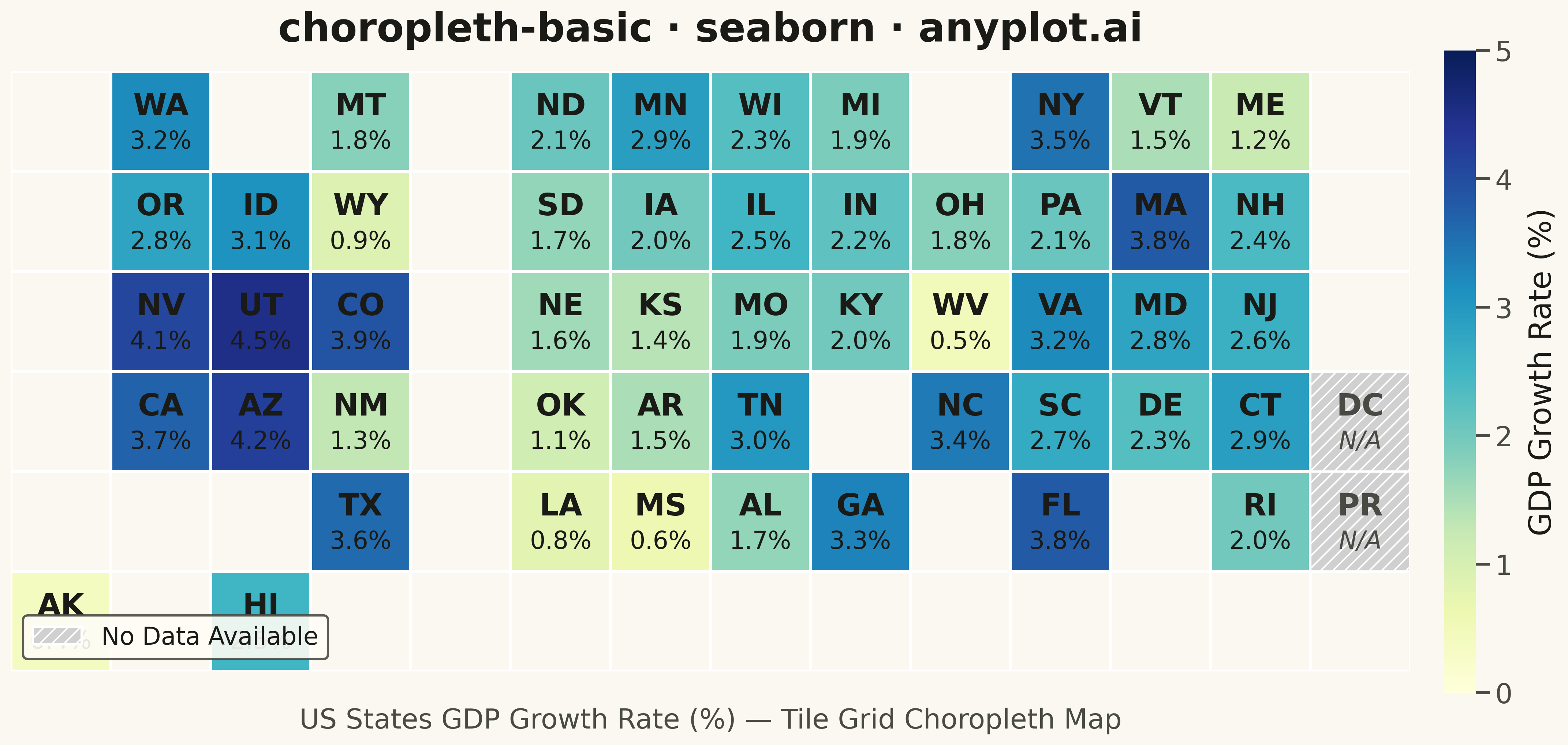
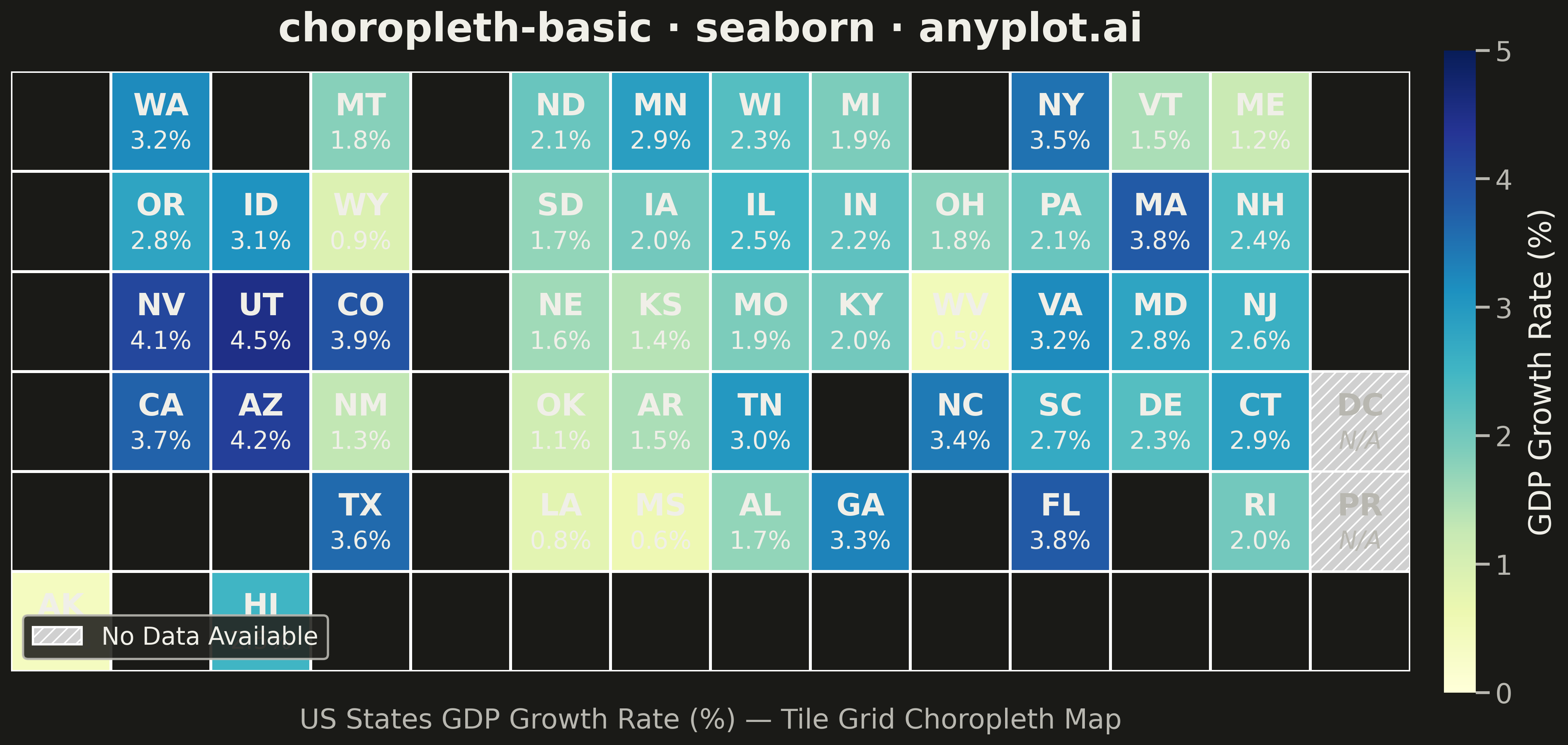
A choropleth map visualizes data by shading geographic regions (countries, states, or counties) according to a measured variable. This technique is ideal for showing regional patterns and spatial distributions, making it easy to identify areas with high or low values at a glance. The color intensity represents the data magnitude, creating an intuitive way to understand geographic variation.
""" anyplot.ai
choropleth-basic: Choropleth Map with Regional Coloring
Library: seaborn 0.13.2 | Python 3.13.13
Quality: 82/100 | Updated: 2026-05-15
"""

import matplotlib.patches as mpatches
import matplotlib.pyplot as plt
import numpy as np
import pandas as pd
import seaborn as sns


# Data: US states tile grid map with economic data (GDP growth rate %)
# Tile grid maps are a recognized cartogram technique that ensures equal visual weight per region
np.random.seed(42)

# State data with grid positions (row, col) approximating US map layout
# Values represent GDP growth rate (%) - None indicates missing data
states_data = {
    # Row 0 (top - Pacific Northwest, Northern states)
    "WA": (0, 1, 3.2),
    "MT": (0, 3, 1.8),
    "ND": (0, 5, 2.1),
    "MN": (0, 6, 2.9),
    "WI": (0, 7, 2.3),
    "MI": (0, 8, 1.9),
    "NY": (0, 10, 3.5),
    "VT": (0, 11, 1.5),
    "ME": (0, 12, 1.2),
    # Row 1
    "OR": (1, 1, 2.8),
    "ID": (1, 2, 3.1),
    "WY": (1, 3, 0.9),
    "SD": (1, 5, 1.7),
    "IA": (1, 6, 2.0),
    "IL": (1, 7, 2.5),
    "IN": (1, 8, 2.2),
    "OH": (1, 9, 1.8),
    "PA": (1, 10, 2.1),
    "MA": (1, 11, 3.8),
    "NH": (1, 12, 2.4),
    # Row 2
    "NV": (2, 1, 4.1),
    "UT": (2, 2, 4.5),
    "CO": (2, 3, 3.9),
    "NE": (2, 5, 1.6),
    "KS": (2, 6, 1.4),
    "MO": (2, 7, 1.9),
    "KY": (2, 8, 2.0),
    "WV": (2, 9, 0.5),
    "VA": (2, 10, 3.2),
    "MD": (2, 11, 2.8),
    "NJ": (2, 12, 2.6),
    # Row 3
    "CA": (3, 1, 3.7),
    "AZ": (3, 2, 4.2),
    "NM": (3, 3, 1.3),
    "OK": (3, 5, 1.1),
    "AR": (3, 6, 1.5),
    "TN": (3, 7, 3.0),
    "NC": (3, 9, 3.4),
    "SC": (3, 10, 2.7),
    "DE": (3, 11, 2.3),
    "CT": (3, 12, 2.9),
    # Row 4 (bottom - Southern states)
    "TX": (4, 3, 3.6),
    "LA": (4, 5, 0.8),
    "MS": (4, 6, 0.6),
    "AL": (4, 7, 1.7),
    "GA": (4, 8, 3.3),
    "FL": (4, 10, 3.8),
    "RI": (4, 12, 2.0),
    # Missing data examples (show as gray/hatched pattern per spec)
    "PR": (4, 13, None),  # Puerto Rico - no data
    # Alaska and Hawaii (offset)
    "AK": (5, 0, 0.4),
    "HI": (5, 2, 2.5),
    "DC": (3, 13, None),  # DC - no data available
}

# Create DataFrame
rows = []
for state, (r, c, val) in states_data.items():
    rows.append({"state": state, "row": r, "col": c, "gdp_growth": val})
df = pd.DataFrame(rows)

# Create grid matrix for heatmap (6 rows x 14 cols)
n_rows, n_cols = 6, 14
grid = np.full((n_rows, n_cols), np.nan)
state_labels = np.full((n_rows, n_cols), "", dtype=object)
missing_mask = np.zeros((n_rows, n_cols), dtype=bool)

for _, row in df.iterrows():
    r, c = int(row["row"]), int(row["col"])
    if row["gdp_growth"] is not None and not pd.isna(row["gdp_growth"]):
        grid[r, c] = row["gdp_growth"]
    else:
        missing_mask[r, c] = True  # Mark as missing data
    state_labels[r, c] = row["state"]

# Set up seaborn styling
sns.set_theme(style="white", context="talk", font_scale=1.2)

# Create figure with appropriate size for 4800x2700 output
fig, ax = plt.subplots(figsize=(16, 9))

# Create heatmap using seaborn with masked values for empty cells
empty_mask = np.isnan(grid) & ~missing_mask  # True for truly empty cells (no state)
heatmap = sns.heatmap(
    grid,
    mask=empty_mask,
    cmap="YlGnBu",
    annot=False,  # We'll add custom annotations
    cbar=True,
    cbar_kws={"label": "GDP Growth Rate (%)", "shrink": 0.7, "aspect": 20, "pad": 0.02},
    linewidths=1.5,  # Reduced from 3 to be less overwhelming
    linecolor="white",
    square=True,
    vmin=0,
    vmax=5,
    ax=ax,
)

# Add gray cells for missing data with hatching pattern
for i in range(n_rows):
    for j in range(n_cols):
        if missing_mask[i, j]:
            # Draw gray rectangle with hatching for missing data
            rect = mpatches.Rectangle(
                (j, i), 1, 1, fill=True, facecolor="#d0d0d0", edgecolor="white", linewidth=1.5, hatch="///", zorder=2
            )
            ax.add_patch(rect)

# Customize colorbar
cbar = heatmap.collections[0].colorbar
cbar.ax.tick_params(labelsize=18)
cbar.set_label("GDP Growth Rate (%)", fontsize=20, labelpad=10)

# Add state code and value annotations
for i in range(n_rows):
    for j in range(n_cols):
        if state_labels[i, j]:  # If there's a state here
            # State code (larger, bold)
            ax.text(
                j + 0.5,
                i + 0.35,
                state_labels[i, j],
                ha="center",
                va="center",
                fontsize=20,
                fontweight="bold",
                color="#1a1a1a" if not missing_mask[i, j] else "#666666",
            )
            # Value or "N/A" for missing data (increased from 13pt to 16pt)
            if not missing_mask[i, j] and not np.isnan(grid[i, j]):
                ax.text(
                    j + 0.5,
                    i + 0.7,
                    f"{grid[i, j]:.1f}%",
                    ha="center",
                    va="center",
                    fontsize=16,
                    color="#333333",
                    fontweight="medium",
                )
            else:
                ax.text(
                    j + 0.5, i + 0.7, "N/A", ha="center", va="center", fontsize=16, color="#888888", fontstyle="italic"
                )

# Styling
ax.set_title("choropleth-basic · seaborn · pyplots.ai", fontsize=26, pad=20, fontweight="bold")

# Remove axis labels and ticks (tile grid doesn't need them)
ax.set_xticks([])
ax.set_yticks([])
ax.set_xlabel("")
ax.set_ylabel("")

# Add legend for missing data
missing_patch = mpatches.Patch(facecolor="#d0d0d0", edgecolor="white", hatch="///", label="No Data Available")
ax.legend(handles=[missing_patch], loc="lower left", fontsize=16, framealpha=0.9)

# Add subtitle explaining the visualization
ax.text(
    0.5,
    -0.06,
    "US States GDP Growth Rate (%) — Tile Grid Choropleth Map",
    ha="center",
    va="top",
    fontsize=18,
    color="#555555",
    transform=ax.transAxes,
)

plt.tight_layout()
plt.savefig("plot.png", dpi=300, bbox_inches="tight")
Runnable source as JSON, for any HTTP client: https://api.anyplot.ai/specs/choropleth-basic/seaborn/code. Any spec id and library id listed in llms-full.txt fit the same URL shape; every URL below is complete and callable.
{
  "spec_id": "choropleth-basic",
  "language": "python",
  "library": "seaborn",
  "page": "https://anyplot.ai/choropleth-basic/python/seaborn",
  "hub": "https://anyplot.ai/choropleth-basic",
  "code_json": "https://api.anyplot.ai/specs/choropleth-basic/seaborn/code",
  "spec_json": "https://api.anyplot.ai/specs/choropleth-basic",
  "render_light_png": "https://storage.googleapis.com/anyplot-images/plots/choropleth-basic/python/seaborn/plot-light.png",
  "render_dark_png": "https://storage.googleapis.com/anyplot-images/plots/choropleth-basic/python/seaborn/plot-dark.png",
  "quality_score": 82.0,
  "license": "MIT",
  "guide": "https://anyplot.ai/llms.txt"
}
Part of Choropleth Map with Regional Coloring on anyplot.ai.