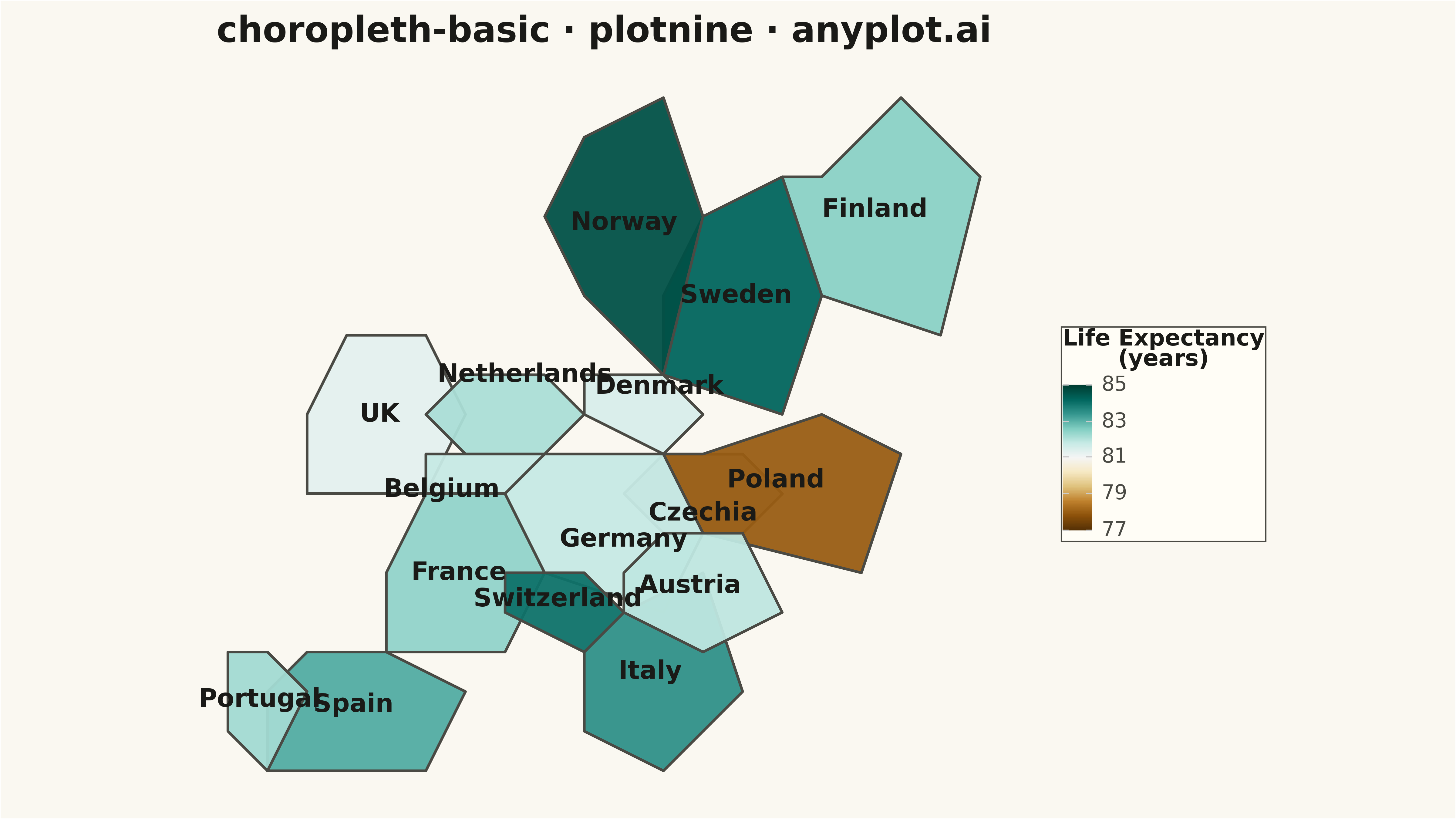
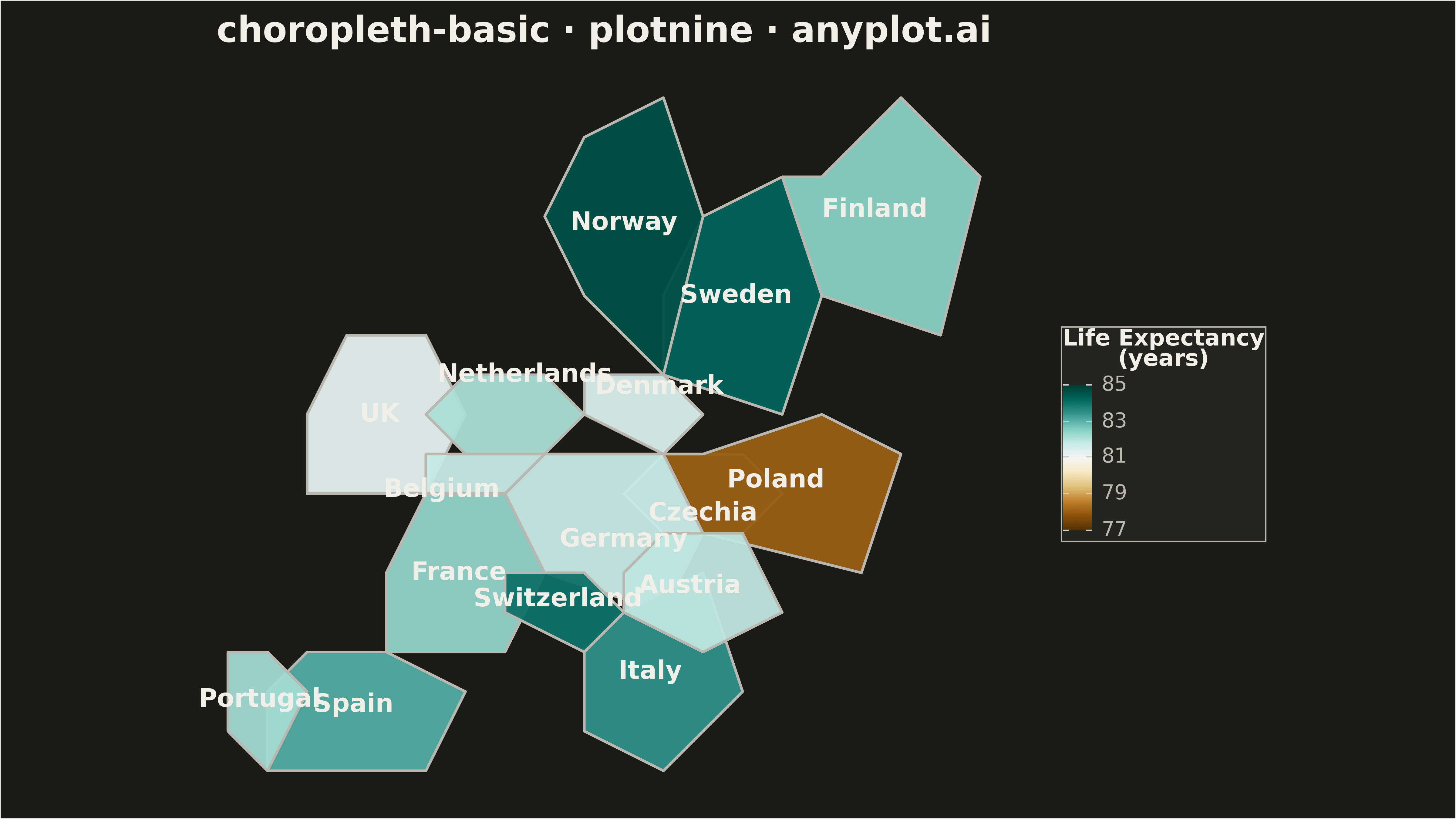
A choropleth map visualizes data by shading geographic regions (countries, states, or counties) according to a measured variable. This technique is ideal for showing regional patterns and spatial distributions, making it easy to identify areas with high or low values at a glance. The color intensity represents the data magnitude, creating an intuitive way to understand geographic variation.
""" anyplot.ai
choropleth-basic: Choropleth Map with Regional Coloring
Library: plotnine 0.15.4 | Python 3.13.13
Quality: 81/100 | Updated: 2026-05-15
"""

import os

import numpy as np
import pandas as pd
from plotnine import (
    aes,
    coord_fixed,
    element_blank,
    element_line,
    element_rect,
    element_text,
    geom_polygon,
    geom_text,
    ggplot,
    labs,
    scale_fill_cmap,
    theme,
)


THEME = os.getenv("ANYPLOT_THEME", "light")
PAGE_BG = "#FAF8F1" if THEME == "light" else "#1A1A17"
ELEVATED_BG = "#FFFDF6" if THEME == "light" else "#242420"
INK = "#1A1A17" if THEME == "light" else "#F0EFE8"
INK_SOFT = "#4A4A44" if THEME == "light" else "#B8B7B0"
MISSING_DATA_COLOR = "#A9A9A9" if THEME == "light" else "#696969"

np.random.seed(42)

# Simplified European country boundaries (approximate polygon coordinates)
countries = {
    "France": [(0, 0), (3, 0), (4, 2), (3, 4), (1, 4), (0, 2)],
    "Germany": [(4, 2), (7, 1), (8, 3), (7, 5), (4, 5), (3, 4)],
    "Spain": [(-3, -3), (1, -3), (2, -1), (0, 0), (-2, 0), (-3, -1)],
    "Italy": [(5, -2), (7, -3), (9, -1), (8, 2), (6, 1), (5, 0)],
    "Poland": [(8, 3), (12, 2), (13, 5), (11, 6), (8, 5), (7, 5)],
    "UK": [(-2, 4), (1, 4), (2, 6), (1, 8), (-1, 8), (-2, 6)],
    "Sweden": [(7, 7), (10, 6), (11, 9), (10, 12), (8, 11), (7, 9)],
    "Norway": [(5, 9), (7, 7), (8, 11), (7, 14), (5, 13), (4, 11)],
    "Finland": [(11, 9), (14, 8), (15, 12), (13, 14), (11, 12), (10, 12)],
    "Austria": [(6, 1), (8, 0), (10, 1), (9, 3), (7, 3), (6, 2)],
    "Netherlands": [(2, 5), (4, 5), (5, 6), (4, 7), (2, 7), (1, 6)],
    "Belgium": [(1, 4), (3, 4), (4, 5), (2, 5), (1, 5)],
    "Switzerland": [(3, 1), (5, 0), (6, 1), (5, 2), (4, 2), (3, 2)],
    "Portugal": [(-4, -2), (-3, -3), (-2, -1), (-3, 0), (-4, 0)],
    "Denmark": [(5, 6), (7, 5), (8, 6), (7, 7), (5, 7)],
    "Czechia": [(7, 3), (9, 3), (10, 4), (9, 5), (7, 5), (6, 4)],
}

# Life expectancy at birth (years) - realistic values for 2023-2024
# Czechia has None to demonstrate missing data handling
life_expectancy = {
    "France": 82.4,
    "Germany": 81.8,
    "Spain": 83.1,
    "Italy": 83.5,
    "Poland": 78.0,
    "UK": 81.3,
    "Sweden": 84.2,
    "Norway": 84.6,
    "Finland": 82.5,
    "Austria": 81.9,
    "Netherlands": 82.1,
    "Belgium": 81.8,
    "Switzerland": 84.0,
    "Portugal": 82.2,
    "Denmark": 81.5,
    "Czechia": None,
}

# Build polygon dataframe
polygon_data = []
for country, coords in countries.items():
    closed_coords = coords + [coords[0]]
    for i, (x, y) in enumerate(closed_coords):
        polygon_data.append(
            {"country": country, "x": x, "y": y, "order": i, "life_expectancy": life_expectancy[country]}
        )

df = pd.DataFrame(polygon_data)

# Calculate centroids for country labels
label_offsets = {
    "Netherlands": (0.5, 1.0),
    "Belgium": (-0.8, -0.5),
    "Germany": (0.5, -0.5),
    "Denmark": (0.5, 0.5),
    "Czechia": (0, -0.5),
}

centroids = []
for country, coords in countries.items():
    cx = np.mean([c[0] for c in coords])
    cy = np.mean([c[1] for c in coords])
    if country in label_offsets:
        cx += label_offsets[country][0]
        cy += label_offsets[country][1]
    expectancy = life_expectancy[country]
    centroids.append({"country": country, "x": cx, "y": cy, "life_expectancy": expectancy})

df_centroids = pd.DataFrame(centroids)

# Separate data with and without values for missing data handling
df_with_data = df[df["life_expectancy"].notna()].copy()
df_missing = df[df["life_expectancy"].isna()].copy()

# Create the choropleth map
plot = (
    ggplot()
    + geom_polygon(
        df_missing, aes(x="x", y="y", group="country"), fill=MISSING_DATA_COLOR, color=INK_SOFT, size=0.6, alpha=0.7
    )
    + geom_polygon(
        df_with_data, aes(x="x", y="y", group="country", fill="life_expectancy"), color=INK_SOFT, size=0.6, alpha=0.95
    )
    + geom_text(df_centroids, aes(x="x", y="y", label="country"), size=7, color=INK)
    + scale_fill_cmap(cmap_name="BrBG", name="Life Expectancy\n(years)", limits=(77, 85))
    + coord_fixed(ratio=1.0)
    + labs(title="choropleth-basic · plotnine · anyplot.ai")
    + theme(
        figure_size=(16, 9),
        plot_title=element_text(size=24, ha="center", color=INK),
        plot_background=element_rect(fill=PAGE_BG, color=PAGE_BG),
        panel_background=element_rect(fill=PAGE_BG, color=PAGE_BG),
        panel_grid=element_blank(),
        panel_border=element_line(color=INK_SOFT, size=0.3),
        axis_text=element_blank(),
        axis_title=element_blank(),
        axis_ticks=element_blank(),
        legend_title=element_text(size=16, color=INK),
        legend_text=element_text(size=14, color=INK_SOFT),
        legend_background=element_rect(fill=ELEVATED_BG, color=INK_SOFT),
        legend_position="right",
    )
)

# Save the plot
plot.save(f"plot-{THEME}.png", dpi=300, verbose=False)
Runnable source as JSON, for any HTTP client: https://api.anyplot.ai/specs/choropleth-basic/plotnine/code. Any spec id and library id listed in llms-full.txt fit the same URL shape; every URL below is complete and callable.
{
  "spec_id": "choropleth-basic",
  "language": "python",
  "library": "plotnine",
  "page": "https://anyplot.ai/choropleth-basic/python/plotnine",
  "hub": "https://anyplot.ai/choropleth-basic",
  "code_json": "https://api.anyplot.ai/specs/choropleth-basic/plotnine/code",
  "spec_json": "https://api.anyplot.ai/specs/choropleth-basic",
  "render_light_png": "https://storage.googleapis.com/anyplot-images/plots/choropleth-basic/python/plotnine/plot-light.png",
  "render_dark_png": "https://storage.googleapis.com/anyplot-images/plots/choropleth-basic/python/plotnine/plot-dark.png",
  "quality_score": 81.0,
  "license": "MIT",
  "guide": "https://anyplot.ai/llms.txt"
}
Part of Choropleth Map with Regional Coloring on anyplot.ai.