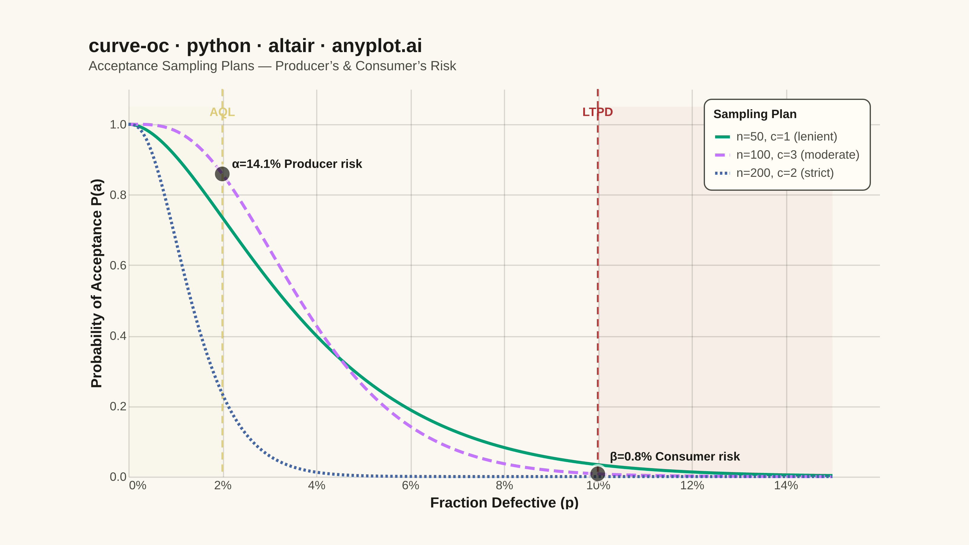
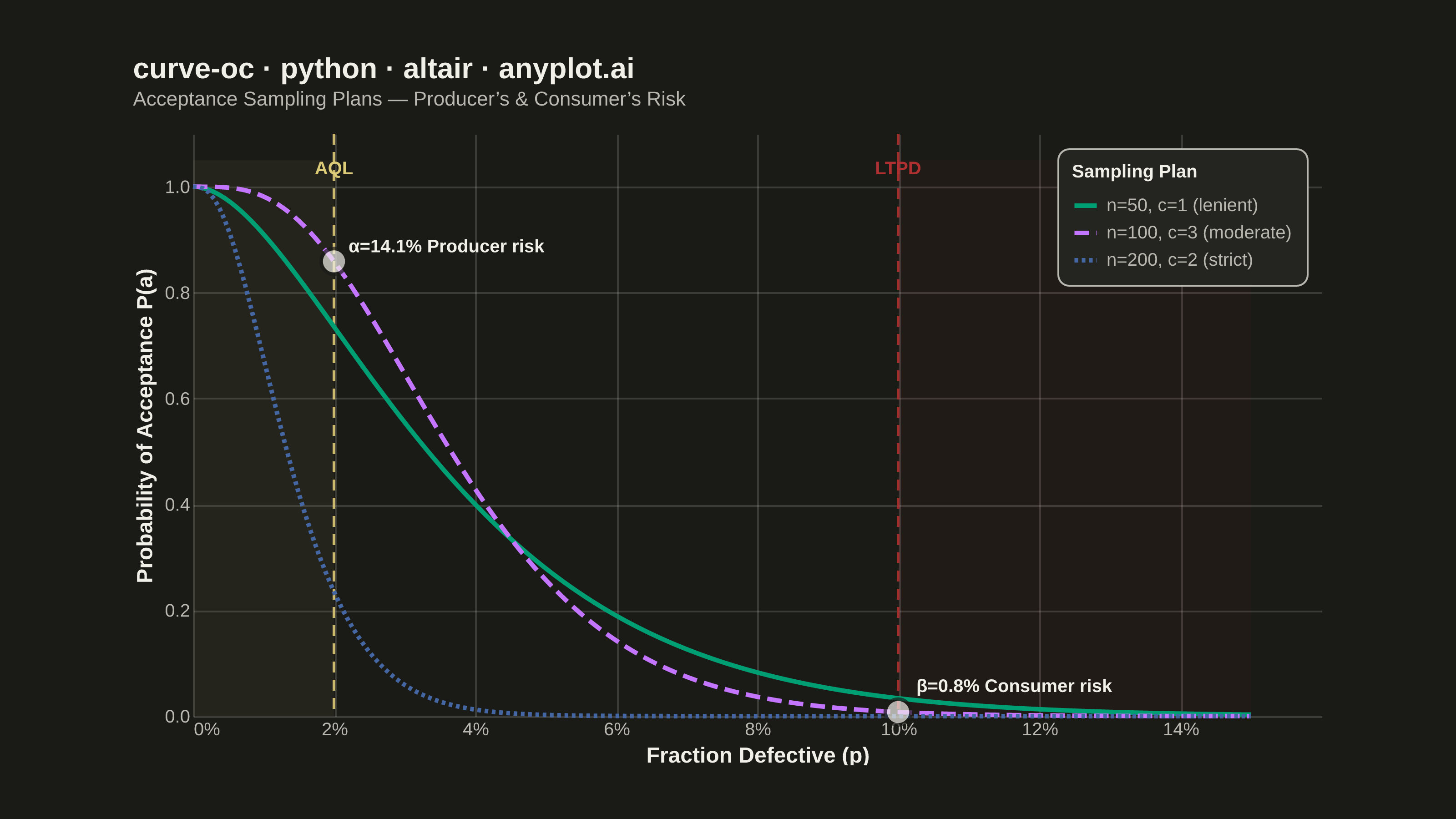
An Operating Characteristic (OC) curve shows the probability of accepting a lot as a function of the true fraction defective in that lot. It is the primary tool for evaluating and comparing acceptance sampling plans, revealing how well an inspection plan discriminates between good and bad lots. The S-shaped curve highlights producer's risk (rejecting good lots) and consumer's risk (accepting bad lots), making it essential for designing effective quality inspection strategies.
""" anyplot.ai
curve-oc: Operating Characteristic (OC) Curve
Library: altair 6.2.1 | Python 3.13.14
Quality: 90/100 | Updated: 2026-06-20
"""

# Remove the script's own directory from sys.path so the installed altair
# package is found instead of this file (altair.py shadows the package otherwise)
import os as _os
import sys as _sys


_here = _os.path.dirname(_os.path.abspath(__file__))
_sys.path = [p for p in _sys.path if p and _os.path.abspath(p) != _here]
del _here, _os, _sys

import os
from math import comb

import altair as alt
import numpy as np
import pandas as pd
from PIL import Image


# Theme-adaptive chrome tokens (Imprint palette)
THEME = os.getenv("ANYPLOT_THEME", "light")
PAGE_BG = "#FAF8F1" if THEME == "light" else "#1A1A17"
ELEVATED_BG = "#FFFDF6" if THEME == "light" else "#242420"
INK = "#1A1A17" if THEME == "light" else "#F0EFE8"
INK_SOFT = "#4A4A44" if THEME == "light" else "#B8B7B0"
INK_MUTED = "#6B6A63" if THEME == "light" else "#A8A79F"

# Imprint categorical palette — hybrid-v3 sort, first series always #009E73
IMPRINT_PALETTE = [
    "#009E73",  # 1 brand green — always first series
    "#C475FD",  # 2 lavender
    "#4467A3",  # 3 blue
    "#BD8233",  # 4 ochre
    "#AE3030",  # 5 matte red — semantic: rejection / consumer risk zone
    "#2ABCCD",  # 6 cyan
    "#954477",  # 7 rose
    "#99B314",  # 8 lime
]
ANYPLOT_AMBER = "#DDCC77"  # warning / acceptable quality threshold

# --- Data: binomial OC curves for three acceptance sampling plans ---
fraction_defective = np.linspace(0, 0.15, 200)

sampling_plans = [
    {"n": 50, "c": 1, "label": "n=50, c=1 (lenient)"},
    {"n": 100, "c": 3, "label": "n=100, c=3 (moderate)"},
    {"n": 200, "c": 2, "label": "n=200, c=2 (strict)"},
]

rows = []
for plan in sampling_plans:
    n, c = plan["n"], plan["c"]
    prob_accept = np.zeros_like(fraction_defective, dtype=float)
    for k in range(c + 1):
        prob_accept += comb(n, k) * fraction_defective**k * (1 - fraction_defective) ** (n - k)
    for p, pa in zip(fraction_defective, prob_accept, strict=True):
        rows.append({"fraction_defective": p, "probability_acceptance": pa, "plan": plan["label"]})

df = pd.DataFrame(rows)

# AQL / LTPD reference points annotated on the moderate plan (n=100, c=3)
aql = 0.02
ltpd = 0.10
pa_at_aql = sum(comb(100, k) * aql**k * (1 - aql) ** (100 - k) for k in range(4))
alpha = 1 - pa_at_aql
pa_at_ltpd = sum(comb(100, k) * ltpd**k * (1 - ltpd) ** (100 - k) for k in range(4))
beta = pa_at_ltpd

ref_data = pd.DataFrame(
    [
        {"x": aql, "y": pa_at_aql, "risk": f"α={alpha:.1%} Producer risk"},
        {"x": ltpd, "y": pa_at_ltpd, "risk": f"β={beta:.1%} Consumer risk"},
    ]
)

# --- Encodings ---
plan_order = [p["label"] for p in sampling_plans]
color_scale = alt.Scale(domain=plan_order, range=[IMPRINT_PALETTE[0], IMPRINT_PALETTE[1], IMPRINT_PALETTE[2]])
dash_scale = alt.Scale(domain=plan_order, range=[[1, 0], [8, 4], [2, 2]])

nearest = alt.selection_point(nearest=True, on="pointerover", fields=["fraction_defective"], empty=False)

base_x = alt.X(
    "fraction_defective:Q",
    title="Fraction Defective (p)",
    scale=alt.Scale(domain=[0, 0.15]),
    axis=alt.Axis(format=".0%", values=np.arange(0, 0.16, 0.02).tolist()),
)
base_y = alt.Y(
    "probability_acceptance:Q",
    title="Probability of Acceptance P(a)",
    scale=alt.Scale(domain=[0, 1.05]),
    axis=alt.Axis(values=np.arange(0, 1.1, 0.1).tolist()),
)

# --- OC curves with Imprint palette + dash redundancy ---
oc_lines = (
    alt.Chart(df)
    .mark_line(strokeWidth=2.5)
    .encode(
        x=base_x,
        y=base_y,
        color=alt.Color(
            "plan:N",
            scale=color_scale,
            sort=plan_order,
            legend=alt.Legend(
                title="Sampling Plan",
                titleFontSize=10,
                titleFontWeight="bold",
                titleColor=INK,
                labelFontSize=10,
                labelColor=INK_SOFT,
                symbolStrokeWidth=2.5,
                symbolSize=150,
                orient="top-right",
                offset=8,
                padding=8,
                cornerRadius=6,
                fillColor=ELEVATED_BG,
                strokeColor=INK_SOFT,
                direction="vertical",
            ),
        ),
        strokeDash=alt.StrokeDash("plan:N", scale=dash_scale, sort=plan_order, legend=None),
    )
)

# --- Hover interaction ---
select_layer = (
    alt.Chart(df)
    .mark_point(size=300, opacity=0)
    .encode(x=alt.X("fraction_defective:Q"), y=alt.Y("probability_acceptance:Q"))
    .add_params(nearest)
)

hover_rule = (
    alt.Chart(df)
    .mark_rule(strokeWidth=1, color=INK_SOFT, strokeDash=[3, 3], opacity=0.5)
    .encode(x=alt.X("fraction_defective:Q"))
    .transform_filter(nearest)
)

hover_points = (
    alt.Chart(df)
    .mark_point(filled=True, stroke=PAGE_BG, strokeWidth=1.5)
    .encode(
        x=alt.X("fraction_defective:Q"),
        y=alt.Y("probability_acceptance:Q"),
        color=alt.Color("plan:N", scale=color_scale, legend=None),
        size=alt.condition(nearest, alt.value(200), alt.value(0)),
        tooltip=[
            alt.Tooltip("plan:N", title="Plan"),
            alt.Tooltip("fraction_defective:Q", title="Fraction Defective", format=".3f"),
            alt.Tooltip("probability_acceptance:Q", title="P(Accept)", format=".3f"),
        ],
    )
)

# --- AQL reference line + label (amber = acceptable quality threshold / caution) ---
aql_rule = (
    alt.Chart(pd.DataFrame([{"x": aql}]))
    .mark_rule(strokeDash=[6, 4], strokeWidth=1.5, color=ANYPLOT_AMBER, opacity=0.9)
    .encode(x=alt.X("x:Q"))
)
aql_label = (
    alt.Chart(pd.DataFrame([{"x": aql, "y": 1.02, "text": "AQL"}]))
    .mark_text(fontSize=10, fontWeight="bold", color=ANYPLOT_AMBER, dy=-4)
    .encode(x=alt.X("x:Q"), y=alt.Y("y:Q"), text="text:N")
)

# --- LTPD reference line + label (matte red = rejection boundary / consumer risk zone) ---
ltpd_rule = (
    alt.Chart(pd.DataFrame([{"x": ltpd}]))
    .mark_rule(strokeDash=[6, 4], strokeWidth=1.5, color=IMPRINT_PALETTE[4], opacity=0.9)
    .encode(x=alt.X("x:Q"))
)
ltpd_label = (
    alt.Chart(pd.DataFrame([{"x": ltpd, "y": 1.02, "text": "LTPD"}]))
    .mark_text(fontSize=10, fontWeight="bold", color=IMPRINT_PALETTE[4], dy=-4)
    .encode(x=alt.X("x:Q"), y=alt.Y("y:Q"), text="text:N")
)

# --- Risk annotation points on the n=100, c=3 curve ---
risk_points = (
    alt.Chart(ref_data)
    .mark_point(filled=True, size=200, stroke=PAGE_BG, strokeWidth=2, color=INK)
    .encode(
        x=alt.X("x:Q"),
        y=alt.Y("y:Q"),
        tooltip=[alt.Tooltip("risk:N", title="Risk"), alt.Tooltip("y:Q", title="P(Accept)", format=".3f")],
    )
)
alpha_label = (
    alt.Chart(ref_data.iloc[:1])
    .mark_text(fontSize=10, fontWeight="bold", align="left", dx=8, dy=-8, color=INK)
    .encode(x=alt.X("x:Q"), y=alt.Y("y:Q"), text="risk:N")
)
beta_label = (
    alt.Chart(ref_data.iloc[1:])
    .mark_text(fontSize=10, fontWeight="bold", align="left", dx=10, dy=-14, color=INK)
    .encode(x=alt.X("x:Q"), y=alt.Y("y:Q"), text="risk:N")
)

# --- Shaded risk zones (subtle, storytelling only) ---
alpha_area = (
    alt.Chart(pd.DataFrame([{"x": 0, "x2": aql, "y": 0, "y2": 1.05}]))
    .mark_rect(fill=ANYPLOT_AMBER, opacity=0.05)
    .encode(x=alt.X("x:Q"), x2="x2:Q", y=alt.Y("y:Q"), y2="y2:Q")
)
beta_area = (
    alt.Chart(pd.DataFrame([{"x": ltpd, "x2": 0.15, "y": 0, "y2": 1.05}]))
    .mark_rect(fill=IMPRINT_PALETTE[4], opacity=0.05)
    .encode(x=alt.X("x:Q"), x2="x2:Q", y=alt.Y("y:Q"), y2="y2:Q")
)

# --- Compose all layers ---
chart = (
    alpha_area
    + beta_area
    + aql_rule
    + ltpd_rule
    + oc_lines
    + hover_points
    + risk_points
    + alpha_label
    + beta_label
    + aql_label
    + ltpd_label
    + select_layer
    + hover_rule
)

chart = (
    chart.properties(
        width=620,
        height=320,
        background=PAGE_BG,
        padding={"left": 0, "right": 0, "top": 0, "bottom": 0},
        title=alt.Title(
            "curve-oc · python · altair · anyplot.ai",
            subtitle="Acceptance Sampling Plans — Producer’s & Consumer’s Risk",
            fontSize=16,
            subtitleFontSize=11,
            subtitleColor=INK_SOFT,
            color=INK,
            anchor="start",
            offset=12,
        ),
    )
    .configure_view(continuousWidth=620, continuousHeight=320, fill=PAGE_BG, strokeWidth=0)
    .configure_axis(
        labelFontSize=10,
        titleFontSize=12,
        titleColor=INK,
        labelColor=INK_SOFT,
        gridOpacity=0.15,
        gridColor=INK,
        domainWidth=0,
        tickSize=0,
    )
    .configure_legend(titlePadding=6, labelLimit=300)
    .configure_title(color=INK)
)

# --- Save PNG and pad to exact 3200 × 1800 ---
chart.save(f"plot-{THEME}.png", scale_factor=4.0)

TW, TH = 3200, 1800
_img = Image.open(f"plot-{THEME}.png").convert("RGB")
_w, _h = _img.size
if _w > TW or _h > TH:
    raise SystemExit(
        f"altair vl-convert produced {_w}×{_h}, exceeds target {TW}×{TH}. "
        f"Shrink chart .properties(width=, height=) values and re-render."
    )
if _w < TW or _h < TH:
    _canvas = Image.new("RGB", (TW, TH), PAGE_BG)
    _canvas.paste(_img, ((TW - _w) // 2, (TH - _h) // 2))
    _canvas.save(f"plot-{THEME}.png")

chart.save(f"plot-{THEME}.html")
Runnable source as JSON, for any HTTP client: https://api.anyplot.ai/specs/curve-oc/altair/code. Any spec id and library id listed in llms-full.txt fit the same URL shape; every URL below is complete and callable.
{
  "spec_id": "curve-oc",
  "language": "python",
  "library": "altair",
  "page": "https://anyplot.ai/curve-oc/python/altair",
  "hub": "https://anyplot.ai/curve-oc",
  "code_json": "https://api.anyplot.ai/specs/curve-oc/altair/code",
  "spec_json": "https://api.anyplot.ai/specs/curve-oc",
  "render_light_png": "https://storage.googleapis.com/anyplot-images/plots/curve-oc/python/altair/plot-light.png",
  "render_dark_png": "https://storage.googleapis.com/anyplot-images/plots/curve-oc/python/altair/plot-dark.png",
  "interactive_light_html": "https://storage.googleapis.com/anyplot-images/plots/curve-oc/python/altair/plot-light.html",
  "interactive_dark_html": "https://storage.googleapis.com/anyplot-images/plots/curve-oc/python/altair/plot-dark.html",
  "quality_score": 90.0,
  "license": "MIT",
  "guide": "https://anyplot.ai/llms.txt"
}
Part of Operating Characteristic (OC) Curve on anyplot.ai.