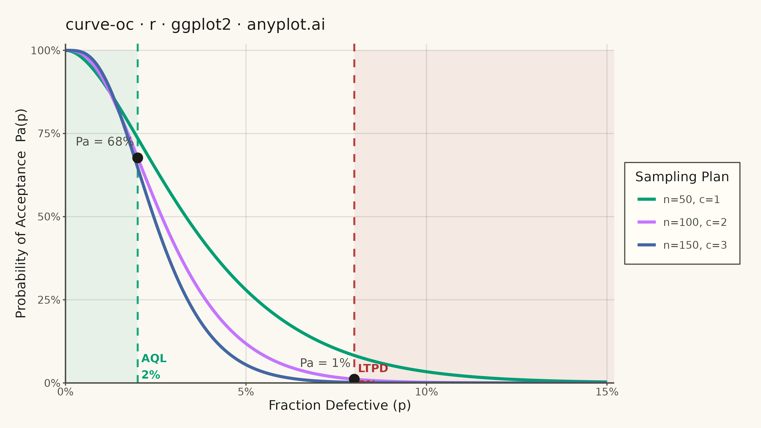
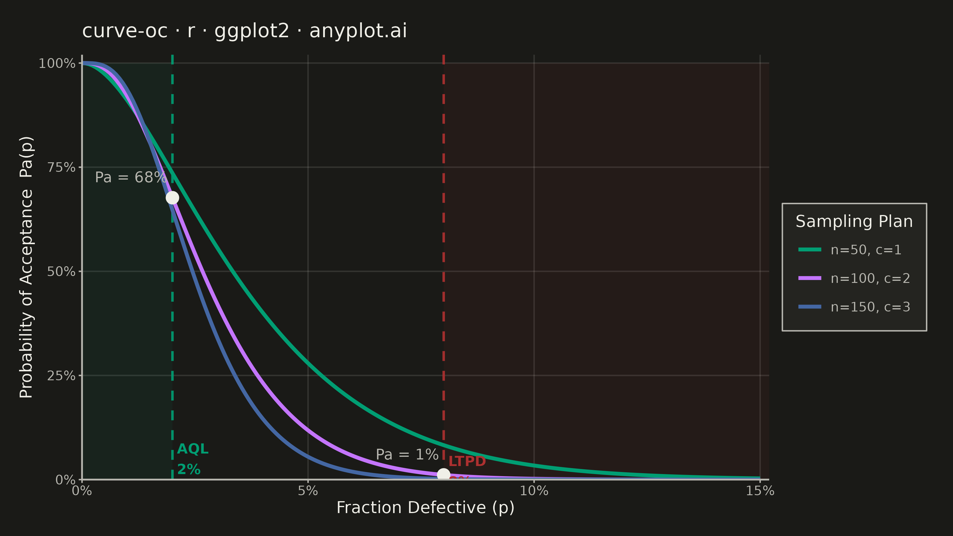
An Operating Characteristic (OC) curve shows the probability of accepting a lot as a function of the true fraction defective in that lot. It is the primary tool for evaluating and comparing acceptance sampling plans, revealing how well an inspection plan discriminates between good and bad lots. The S-shaped curve highlights producer's risk (rejecting good lots) and consumer's risk (accepting bad lots), making it essential for designing effective quality inspection strategies.
#' anyplot.ai
#' curve-oc: Operating Characteristic (OC) Curve
#' Library: ggplot2 3.5.1 | R 4.4.1
#' Quality: 89/100 | Created: 2026-06-20

library(ggplot2)
library(scales)
library(ragg)

set.seed(42)

# Theme tokens (Imprint palette — theme-adaptive chrome)
THEME       <- Sys.getenv("ANYPLOT_THEME", "light")
PAGE_BG     <- if (THEME == "light") "#FAF8F1" else "#1A1A17"
ELEVATED_BG <- if (THEME == "light") "#FFFDF6" else "#242420"
INK         <- if (THEME == "light") "#1A1A17" else "#F0EFE8"
INK_SOFT    <- if (THEME == "light") "#4A4A44" else "#B8B7B0"

IMPRINT_PALETTE <- c(
  "#009E73",  # 1 - brand green (first series, always)
  "#C475FD",  # 2 - lavender
  "#4467A3",  # 3 - blue
  "#BD8233",  # 4 - ochre
  "#AE3030",  # 5 - matte red (semantic anchor: bad/loss/error)
  "#2ABCCD",  # 6 - cyan
  "#954477",  # 7 - rose
  "#99B314"   # 8 - lime
)

# Data: OC curves via binomial CDF — P(accept) = P(X <= c) where X ~ Bin(n, p)
p_seq <- seq(0, 0.15, length.out = 200)

plans <- list(
  list(n = 50,  c = 1, label = "n=50, c=1"),
  list(n = 100, c = 2, label = "n=100, c=2"),
  list(n = 150, c = 3, label = "n=150, c=3")
)

df_list <- lapply(plans, function(plan) {
  data.frame(
    fraction_defective     = p_seq,
    probability_acceptance = pbinom(plan$c, size = plan$n, prob = p_seq),
    sampling_plan          = plan$label,
    stringsAsFactors       = FALSE
  )
})

df <- do.call(rbind, df_list)
df$sampling_plan <- factor(df$sampling_plan, levels = sapply(plans, `[[`, "label"))

# AQL and LTPD reference values
AQL  <- 0.02   # acceptable quality level
LTPD <- 0.08   # lot tolerance percent defective

# Risk points on the n=100, c=2 reference plan
ref_n <- plans[[2]]$n
ref_c <- plans[[2]]$c
pa_aql  <- pbinom(ref_c, size = ref_n, prob = AQL)
pa_ltpd <- pbinom(ref_c, size = ref_n, prob = LTPD)

risk_df <- data.frame(
  fraction_defective     = c(AQL,    LTPD),
  probability_acceptance = c(pa_aql, pa_ltpd)
)

plan_colors <- IMPRINT_PALETTE[1:3]

title_text <- "curve-oc · r · ggplot2 · anyplot.ai"

# Plot
p <- ggplot(df, aes(x = fraction_defective, y = probability_acceptance,
                    color = sampling_plan)) +
  # Shaded risk zones
  annotate("rect",
    xmin = 0,    xmax = AQL,
    ymin = 0,    ymax = 1,
    fill = IMPRINT_PALETTE[1], alpha = 0.07
  ) +
  annotate("rect",
    xmin = LTPD, xmax = 0.152,
    ymin = 0,    ymax = 1,
    fill = IMPRINT_PALETTE[5], alpha = 0.07
  ) +
  # Vertical reference lines
  geom_vline(xintercept = AQL,  linetype = "dashed",
             color = IMPRINT_PALETTE[1], linewidth = 0.7, alpha = 0.9) +
  geom_vline(xintercept = LTPD, linetype = "dashed",
             color = IMPRINT_PALETTE[5], linewidth = 0.7, alpha = 0.9) +
  # OC curves
  geom_line(linewidth = 1.1) +
  # Risk marker points on the reference plan
  geom_point(data = risk_df,
             aes(x = fraction_defective, y = probability_acceptance),
             color = INK, size = 3.5, shape = 16, inherit.aes = FALSE) +
  # AQL label
  annotate("text",
    x = AQL + 0.001, y = 0.05,
    label = "AQL\n2%", hjust = 0,
    color = IMPRINT_PALETTE[1], size = 3.0, fontface = "bold"
  ) +
  # LTPD label (y=0.02 to avoid crowding with Pa annotation above)
  annotate("text",
    x = LTPD + 0.001, y = 0.02,
    label = "LTPD\n8%", hjust = 0,
    color = IMPRINT_PALETTE[5], size = 3.0, fontface = "bold"
  ) +
  # Producer's risk annotation (Pa at AQL)
  annotate("text",
    x = AQL - 0.001, y = pa_aql + 0.05,
    label = sprintf("Pa = %.0f%%", pa_aql * 100),
    hjust = 1, color = INK_SOFT, size = 3.2
  ) +
  # Consumer's risk annotation (Pa at LTPD)
  annotate("text",
    x = LTPD - 0.001, y = pa_ltpd + 0.05,
    label = sprintf("Pa = %.0f%%", pa_ltpd * 100),
    hjust = 1, color = INK_SOFT, size = 3.2
  ) +
  scale_color_manual(values = plan_colors, name = "Sampling Plan") +
  scale_x_continuous(
    labels = scales::percent_format(accuracy = 1),
    limits = c(0, 0.152),
    expand = c(0, 0)
  ) +
  scale_y_continuous(
    labels = scales::percent_format(accuracy = 1),
    limits = c(0, 1.02),
    expand = c(0, 0)
  ) +
  labs(
    title = title_text,
    x     = "Fraction Defective (p)",
    y     = "Probability of Acceptance  Pa(p)"
  ) +
  theme_minimal(base_size = 8) +
  theme(
    plot.background   = element_rect(fill = PAGE_BG, color = PAGE_BG),
    panel.background  = element_rect(fill = PAGE_BG, color = NA),
    panel.grid.major  = element_line(color = scales::alpha(INK, 0.12), linewidth = 0.4),
    panel.grid.minor  = element_blank(),
    panel.border      = element_blank(),
    axis.line         = element_line(color = INK_SOFT, linewidth = 0.5),
    axis.ticks        = element_line(color = INK_SOFT, linewidth = 0.4),
    axis.title        = element_text(color = INK,      size = 10),
    axis.text         = element_text(color = INK_SOFT, size = 8),
    plot.title        = element_text(color = INK,      size = 12, face = "plain",
                                     margin = margin(b = 8)),
    legend.background = element_rect(fill = ELEVATED_BG, color = INK_SOFT,
                                     linewidth = 0.4),
    legend.text       = element_text(color = INK_SOFT, size = 8),
    legend.title      = element_text(color = INK,      size = 10),
    legend.position   = "right",
    legend.margin     = margin(6, 8, 6, 8),
    plot.margin       = margin(14, 16, 12, 12)
  )

# Save (landscape: 3200 x 1800 px)
ggsave(
  filename = sprintf("plot-%s.png", THEME),
  plot     = p,
  device   = ragg::agg_png,
  width    = 8,
  height   = 4.5,
  units    = "in",
  dpi      = 400
)
Runnable source as JSON, for any HTTP client: https://api.anyplot.ai/specs/curve-oc/ggplot2/code. Any spec id and library id listed in llms-full.txt fit the same URL shape; every URL below is complete and callable.
{
  "spec_id": "curve-oc",
  "language": "r",
  "library": "ggplot2",
  "page": "https://anyplot.ai/curve-oc/r/ggplot2",
  "hub": "https://anyplot.ai/curve-oc",
  "code_json": "https://api.anyplot.ai/specs/curve-oc/ggplot2/code",
  "spec_json": "https://api.anyplot.ai/specs/curve-oc",
  "render_light_png": "https://storage.googleapis.com/anyplot-images/plots/curve-oc/r/ggplot2/plot-light.png",
  "render_dark_png": "https://storage.googleapis.com/anyplot-images/plots/curve-oc/r/ggplot2/plot-dark.png",
  "quality_score": 89.0,
  "license": "MIT",
  "guide": "https://anyplot.ai/llms.txt"
}
Part of Operating Characteristic (OC) Curve on anyplot.ai.