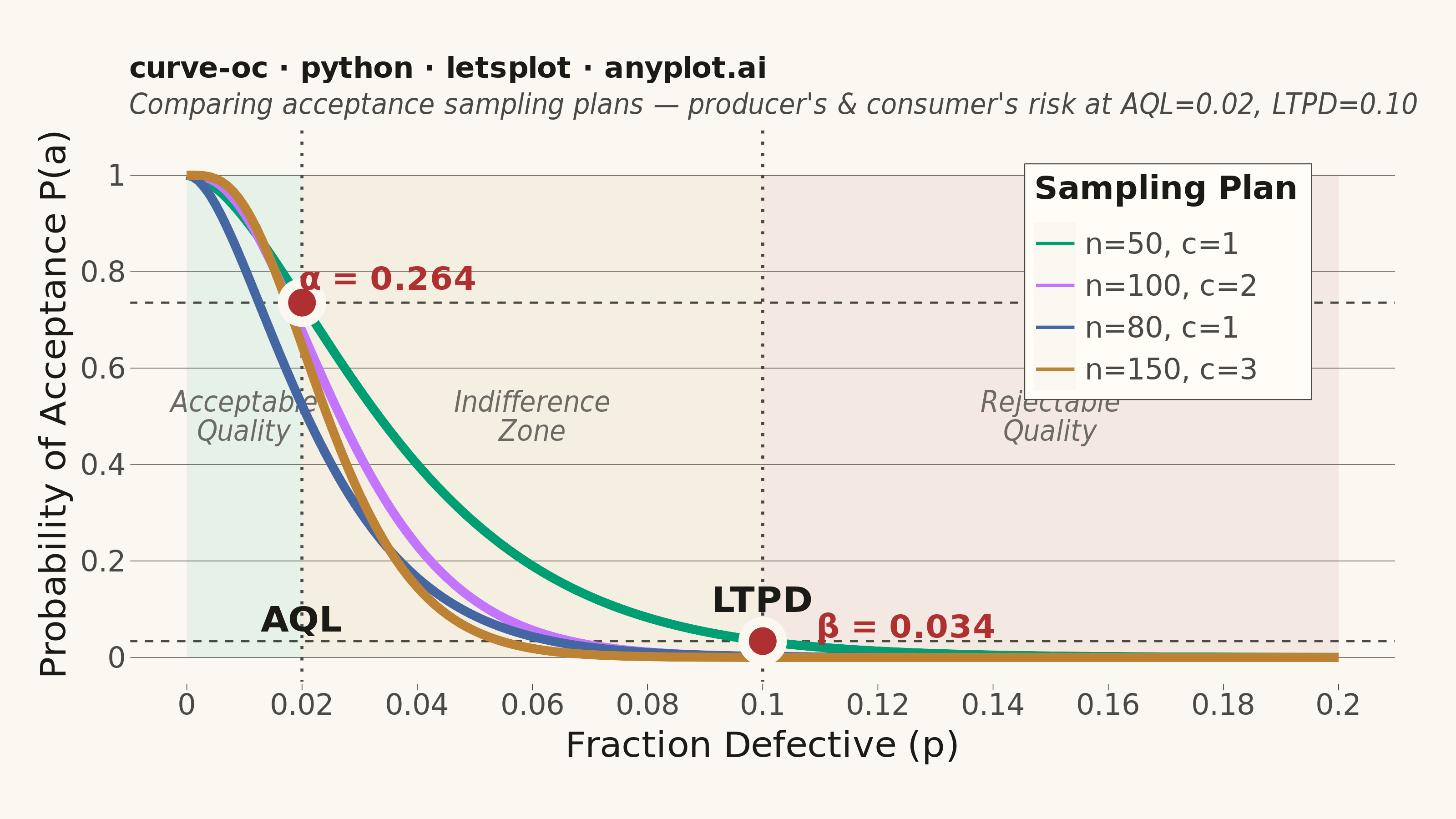
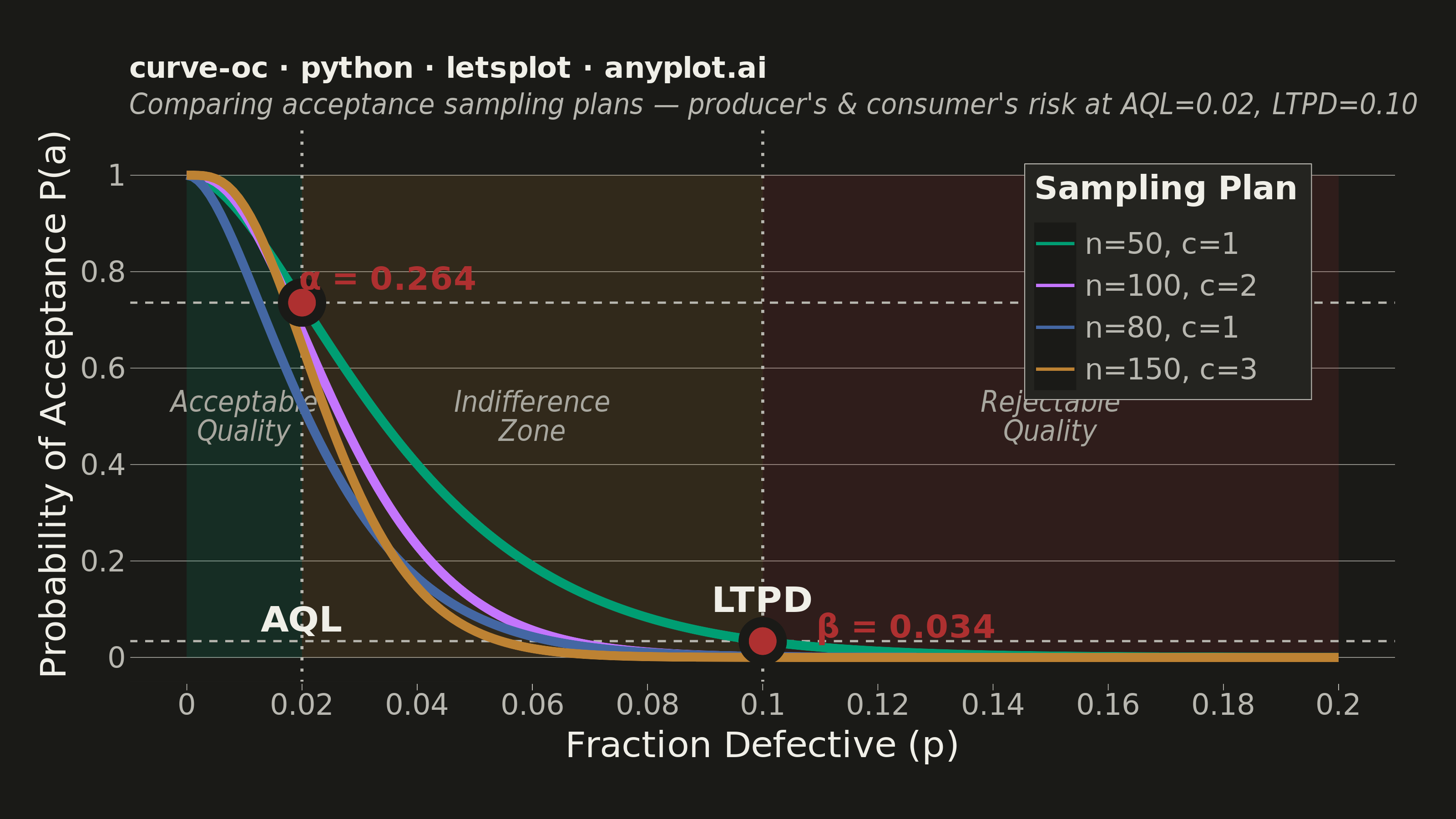
An Operating Characteristic (OC) curve shows the probability of accepting a lot as a function of the true fraction defective in that lot. It is the primary tool for evaluating and comparing acceptance sampling plans, revealing how well an inspection plan discriminates between good and bad lots. The S-shaped curve highlights producer's risk (rejecting good lots) and consumer's risk (accepting bad lots), making it essential for designing effective quality inspection strategies.
""" anyplot.ai
curve-oc: Operating Characteristic (OC) Curve
Library: letsplot 4.10.1 | Python 3.13.14
Quality: 90/100 | Updated: 2026-06-20
"""

import os

import numpy as np
import pandas as pd
from lets_plot import *
from scipy.stats import binom


LetsPlot.setup_html()

# Theme tokens
THEME = os.getenv("ANYPLOT_THEME", "light")
PAGE_BG = "#FAF8F1" if THEME == "light" else "#1A1A17"
ELEVATED_BG = "#FFFDF6" if THEME == "light" else "#242420"
INK = "#1A1A17" if THEME == "light" else "#F0EFE8"
INK_SOFT = "#4A4A44" if THEME == "light" else "#B8B7B0"
INK_MUTED = "#6B6A63" if THEME == "light" else "#A8A79F"

# Imprint palette — canonical order, first 4 positions for the 4 OC curves
IMPRINT_PALETTE = ["#009E73", "#C475FD", "#4467A3", "#BD8233", "#AE3030", "#2ABCCD", "#954477", "#99B314"]

# Data — OC curves for acceptance sampling plans
fraction_defective = np.linspace(0, 0.20, 200)
plans = [(50, 1, "n=50, c=1"), (100, 2, "n=100, c=2"), (80, 1, "n=80, c=1"), (150, 3, "n=150, c=3")]
aql = 0.02
ltpd = 0.10

rows = []
for n, c, label in plans:
    pa = binom.cdf(c, n, fraction_defective)
    for p, prob in zip(fraction_defective, pa):
        rows.append({"fraction_defective": p, "probability_acceptance": prob, "plan": label})

df = pd.DataFrame(rows)

# Risk points for primary plan (n=50, c=1)
pa_aql = float(binom.cdf(1, 50, aql))
pa_ltpd = float(binom.cdf(1, 50, ltpd))
alpha_risk = 1 - pa_aql
beta_risk = pa_ltpd

df_risk = pd.DataFrame(
    {"x": [aql, ltpd], "y": [pa_aql, pa_ltpd], "label": [f"α = {alpha_risk:.3f}", f"β = {beta_risk:.3f}"]}
)

# Quality zone backgrounds — Imprint semantic colors (green/ochre/red) at low alpha
zone_fills = ["#009E73", "#BD8233", "#AE3030"]
zone_alpha = 0.08 if THEME == "light" else 0.14

df_zones = pd.DataFrame(
    {
        "xmin": [0.0, aql, ltpd],
        "xmax": [aql, ltpd, 0.20],
        "ymin": [0.0, 0.0, 0.0],
        "ymax": [1.0, 1.0, 1.0],
        "fill": zone_fills,
        "zone": ["Acceptable\nQuality", "Indifference\nZone", "Rejectable\nQuality"],
        "lx": [0.01, 0.06, 0.15],
    }
)

# Title length-aware fontsize scaling
title = "curve-oc · python · letsplot · anyplot.ai"
n_chars = len(title)
ratio = 67 / n_chars if n_chars > 67 else 1.0
title_size = max(11, round(16 * ratio))

plot = (
    ggplot()
    # Quality zone shading
    + geom_rect(
        data=df_zones,
        mapping=aes(xmin="xmin", xmax="xmax", ymin="ymin", ymax="ymax", fill="fill"),
        alpha=zone_alpha,
        color="rgba(0,0,0,0)",
    )
    + scale_fill_identity()
    # Zone labels
    + geom_text(data=df_zones, mapping=aes(x="lx", label="zone"), y=0.5, size=8, color=INK_MUTED, fontface="italic")
    # Vertical reference lines (geom_vline — idiomatic)
    + geom_vline(xintercept=aql, linetype="dotted", color=INK_SOFT, size=0.7)
    + geom_vline(xintercept=ltpd, linetype="dotted", color=INK_SOFT, size=0.7)
    # Horizontal risk reference lines (geom_hline — idiomatic)
    + geom_hline(yintercept=pa_aql, linetype="dashed", color=INK_SOFT, size=0.5)
    + geom_hline(yintercept=pa_ltpd, linetype="dashed", color=INK_SOFT, size=0.5)
    # OC curves with formatted tooltips
    + geom_line(
        data=df,
        mapping=aes(x="fraction_defective", y="probability_acceptance", color="plan"),
        size=2.2,
        tooltips=layer_tooltips()
        .format("fraction_defective", ".3f")
        .format("probability_acceptance", ".3f")
        .line("@plan")
        .line("p = @fraction_defective")
        .line("P(accept) = @probability_acceptance"),
    )
    # Risk point markers — Imprint semantic red for risk/error role
    + geom_point(data=df_risk, mapping=aes(x="x", y="y"), size=7, shape=21, fill="#AE3030", color=PAGE_BG, stroke=2.5)
    # Alpha risk label
    + geom_text(
        data=df_risk.iloc[:1],
        mapping=aes(x="x", y="y", label="label"),
        size=9,
        color="#AE3030",
        fontface="bold",
        nudge_x=0.015,
        nudge_y=0.05,
    )
    # Beta risk label
    + geom_text(
        data=df_risk.iloc[1:2],
        mapping=aes(x="x", y="y", label="label"),
        size=9,
        color="#AE3030",
        fontface="bold",
        nudge_x=0.025,
        nudge_y=0.03,
    )
    # AQL label
    + geom_text(
        data=pd.DataFrame({"x": [aql], "label": ["AQL"]}),
        mapping=aes(x="x", label="label"),
        y=0.08,
        size=10,
        color=INK,
        fontface="bold",
    )
    # LTPD label
    + geom_text(
        data=pd.DataFrame({"x": [ltpd], "label": ["LTPD"]}),
        mapping=aes(x="x", label="label"),
        y=0.12,
        size=10,
        color=INK,
        fontface="bold",
    )
    + scale_color_manual(values=IMPRINT_PALETTE[:4])
    + scale_x_continuous(breaks=[0.0, 0.02, 0.04, 0.06, 0.08, 0.10, 0.12, 0.14, 0.16, 0.18, 0.20], limits=[0.0, 0.20])
    + scale_y_continuous(limits=[0.0, 1.05], breaks=[0.0, 0.2, 0.4, 0.6, 0.8, 1.0])
    + labs(
        x="Fraction Defective (p)",
        y="Probability of Acceptance P(a)",
        title=title,
        subtitle="Comparing acceptance sampling plans — producer's & consumer's risk at AQL=0.02, LTPD=0.10",
        color="Sampling Plan",
    )
    + theme(
        axis_title=element_text(size=20, color=INK),
        axis_text=element_text(size=16, color=INK_SOFT),
        plot_title=element_text(size=title_size, color=INK, face="bold"),
        plot_subtitle=element_text(size=16, color=INK_SOFT, face="italic"),
        legend_text=element_text(size=16, color=INK_SOFT),
        legend_title=element_text(size=18, face="bold", color=INK),
        panel_grid_major_x=element_blank(),
        panel_grid_minor_x=element_blank(),
        panel_grid_major_y=element_line(color=INK_SOFT, size=0.3),
        panel_grid_minor_y=element_blank(),
        panel_background=element_rect(fill=PAGE_BG, color=PAGE_BG),
        plot_background=element_rect(fill=PAGE_BG, color=PAGE_BG),
        axis_line_x=element_line(color=INK_SOFT, size=0.8),
        axis_line_y=element_line(color=INK_SOFT, size=0.8),
        axis_ticks=element_line(color=INK_SOFT, size=0.4),
        legend_position=[0.82, 0.72],
        legend_background=element_rect(fill=ELEVATED_BG, color=INK_SOFT, size=0.5),
        plot_margin=[30, 30, 30, 20],
    )
    + ggsize(800, 450)
)

# Save
ggsave(plot, f"plot-{THEME}.png", path=".", scale=4)
ggsave(plot, f"plot-{THEME}.html", path=".")
Runnable source as JSON, for any HTTP client: https://api.anyplot.ai/specs/curve-oc/letsplot/code. Any spec id and library id listed in llms-full.txt fit the same URL shape; every URL below is complete and callable.
{
  "spec_id": "curve-oc",
  "language": "python",
  "library": "letsplot",
  "page": "https://anyplot.ai/curve-oc/python/letsplot",
  "hub": "https://anyplot.ai/curve-oc",
  "code_json": "https://api.anyplot.ai/specs/curve-oc/letsplot/code",
  "spec_json": "https://api.anyplot.ai/specs/curve-oc",
  "render_light_png": "https://storage.googleapis.com/anyplot-images/plots/curve-oc/python/letsplot/plot-light.png",
  "render_dark_png": "https://storage.googleapis.com/anyplot-images/plots/curve-oc/python/letsplot/plot-dark.png",
  "interactive_light_html": "https://storage.googleapis.com/anyplot-images/plots/curve-oc/python/letsplot/plot-light.html",
  "interactive_dark_html": "https://storage.googleapis.com/anyplot-images/plots/curve-oc/python/letsplot/plot-dark.html",
  "quality_score": 90.0,
  "license": "MIT",
  "guide": "https://anyplot.ai/llms.txt"
}
Part of Operating Characteristic (OC) Curve on anyplot.ai.