The same plot in 14 other libraries — JavaScript: Chart.js, D3.js, Apache ECharts, MUI X Charts; Python: Altair, Bokeh, lets-plot, Matplotlib, Plotly, plotnine, Pygal, Seaborn; R: ggplot2; Julia: Makie.jl. Compare all 15 side by side: Basic Density Plot in Python, R, Julia and JavaScript.
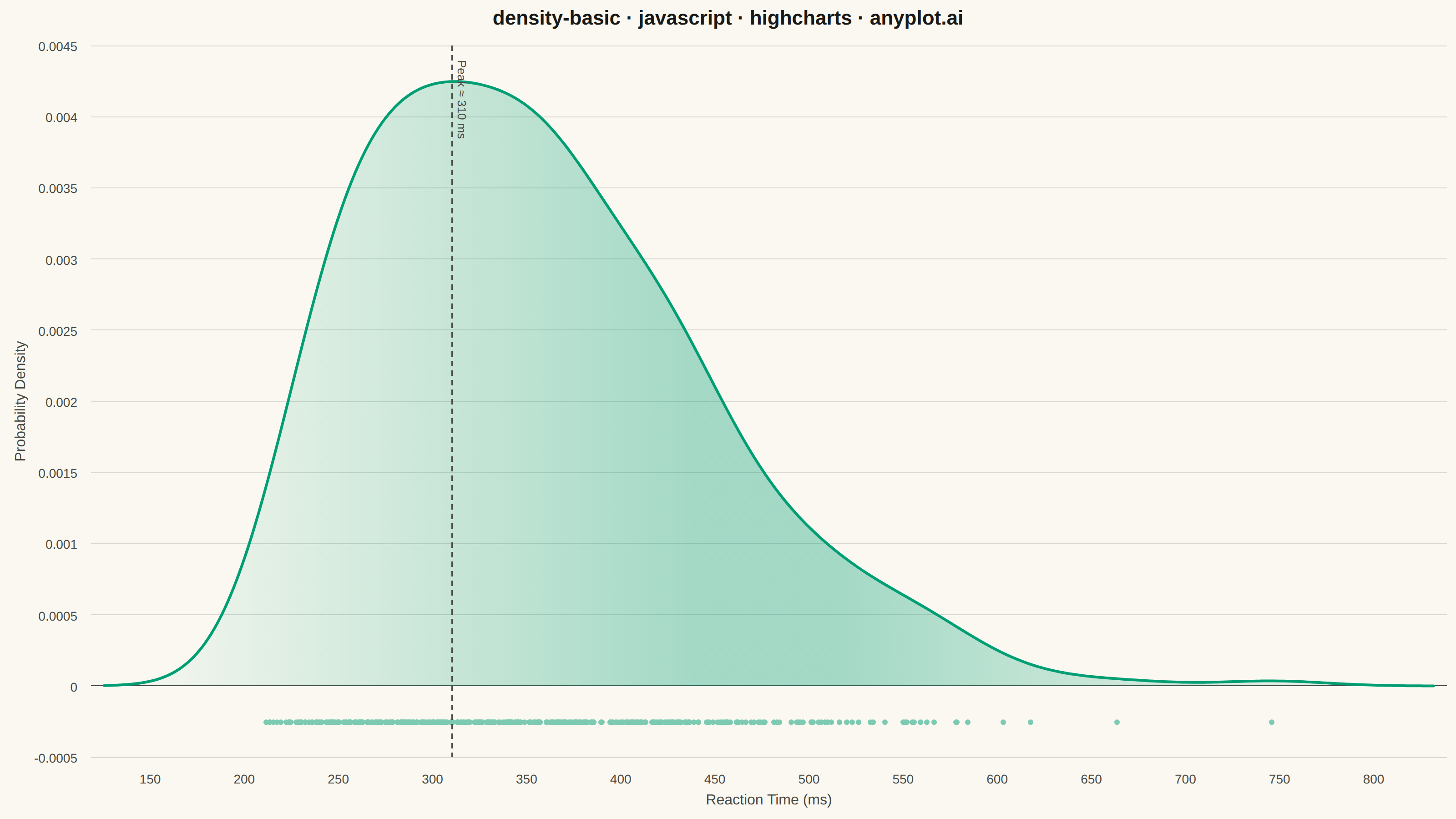
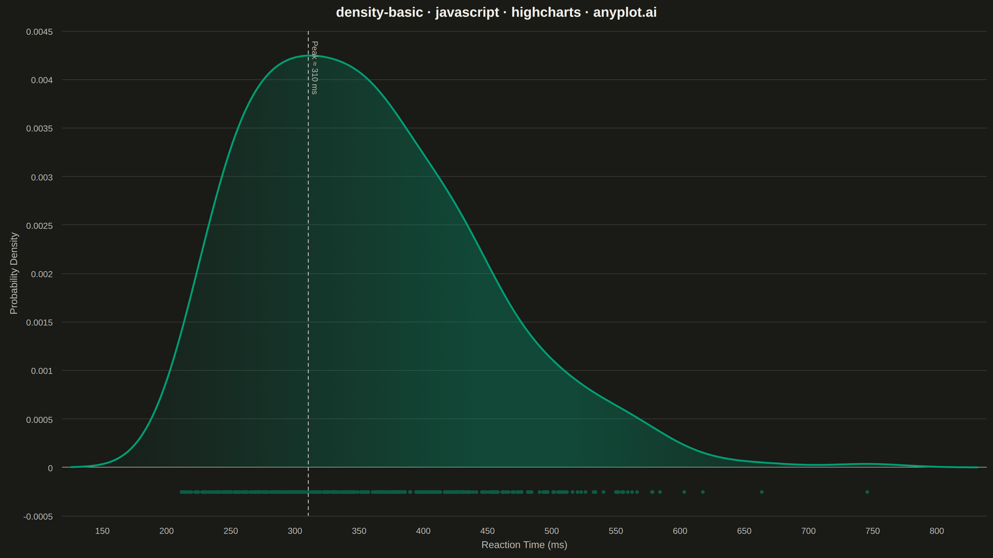
A density plot (also known as Kernel Density Estimation or KDE plot) visualizes the distribution of a continuous variable by smoothing the data into a continuous probability density curve. Unlike histograms which use discrete bins, density plots provide a smooth representation of the underlying distribution, making it easier to identify patterns such as skewness, modality, and overall shape.
// anyplot.ai
// density-basic: Basic Density Plot
// Library: highcharts 12.6.0 | JavaScript 22.23.2
// Quality: 94/100 | Created: 2026-08-24
const t = window.ANYPLOT_TOKENS;

// --- Data: reaction times (ms) in a cognitive test, right-skewed ----------
let seed = 42;
function rand() {
  seed = (seed * 1103515245 + 12345) & 0x7fffffff;
  return seed / 0x7fffffff;
}
function exponential(mean) {
  return -Math.log(1 - rand()) * mean;
}

const sampleSize = 400;
const gammaShape = 4;
const componentMean = 45;
const baselineMs = 180;
const reactionTimes = Array.from({ length: sampleSize }, () => {
  let total = baselineMs;
  for (let i = 0; i < gammaShape; i++) total += exponential(componentMean);
  return total;
});

// --- Kernel density estimate (Gaussian kernel, Silverman bandwidth) -------
function mean(arr) {
  return arr.reduce((a, b) => a + b, 0) / arr.length;
}
function std(arr) {
  const m = mean(arr);
  const variance = arr.reduce((a, b) => a + (b - m) ** 2, 0) / (arr.length - 1);
  return Math.sqrt(variance);
}
function gaussianPdf(z) {
  return Math.exp(-0.5 * z * z) / Math.sqrt(2 * Math.PI);
}

const n = reactionTimes.length;
const bandwidth = 1.06 * std(reactionTimes) * n ** (-1 / 5);
const dataMin = Math.min(...reactionTimes);
const dataMax = Math.max(...reactionTimes);
const gridPoints = 200;
const gridMin = dataMin - 3 * bandwidth;
const gridMax = dataMax + 3 * bandwidth;
const step = (gridMax - gridMin) / (gridPoints - 1);

const densityCurve = [];
for (let i = 0; i < gridPoints; i++) {
  const x = gridMin + i * step;
  const density =
    reactionTimes.reduce((sum, xi) => sum + gaussianPdf((x - xi) / bandwidth), 0) /
    (n * bandwidth);
  densityCurve.push([x, density]);
}

const maxDensity = Math.max(...densityCurve.map((p) => p[1]));
const rugY = -maxDensity * 0.06;
const rugData = reactionTimes.map((v) => [v, rugY]);
const peakPoint = densityCurve.reduce((best, p) => (p[1] > best[1] ? p : best));
const peakX = peakPoint[0];

// --- Chart -------------------------------------------------------------
Highcharts.chart("container", {
  chart: {
    type: "areaspline",
    backgroundColor: "transparent",
    animation: false,
    style: { fontFamily: "inherit" },
  },
  credits: { enabled: false },
  colors: t.palette,
  title: {
    text: "density-basic · javascript · highcharts · anyplot.ai",
    style: { color: t.ink, fontSize: "22px", fontWeight: "600" },
  },
  xAxis: {
    title: { text: "Reaction Time (ms)", style: { color: t.inkSoft, fontSize: "16px" } },
    lineWidth: 0,
    tickWidth: 0,
    gridLineColor: t.grid,
    labels: { style: { color: t.inkSoft, fontSize: "14px" } },
    plotLines: [
      {
        value: peakX,
        color: t.inkSoft,
        dashStyle: "Dash",
        width: 1.5,
        zIndex: 5,
        label: {
          text: `Peak ≈ ${Math.round(peakX)} ms`,
          style: { color: t.inkSoft, fontSize: "13px" },
          align: "left",
          x: 6,
          y: 16,
        },
      },
    ],
  },
  yAxis: {
    min: -maxDensity * 0.09,
    title: { text: "Probability Density", style: { color: t.inkSoft, fontSize: "16px" } },
    lineWidth: 0,
    gridLineColor: t.grid,
    labels: { style: { color: t.inkSoft, fontSize: "14px" } },
    plotLines: [{ value: 0, color: t.inkSoft, width: 1, zIndex: 1 }],
  },
  legend: { enabled: false },
  plotOptions: {
    series: { animation: false },
    areaspline: {
      lineWidth: 3,
      marker: { enabled: false },
    },
    scatter: {
      marker: { radius: 3, symbol: "circle" },
      opacity: 0.5,
    },
  },
  series: [
    {
      type: "areaspline",
      name: "Density",
      data: densityCurve,
      color: t.palette[0],
      fillColor: {
        linearGradient: { x1: 0, y1: 0, x2: 1, y2: 0 },
        stops: [
          [0, Highcharts.color(t.palette[0]).setOpacity(0).get("rgba")],
          [0.45, Highcharts.color(t.palette[0]).setOpacity(0.35).get("rgba")],
          [0.55, Highcharts.color(t.palette[0]).setOpacity(0.35).get("rgba")],
          [1, Highcharts.color(t.palette[0]).setOpacity(0).get("rgba")],
        ],
      },
    },
    { type: "scatter", name: "Observations", data: rugData, color: t.palette[0] },
  ],
});
Runnable source as JSON, for any HTTP client: https://api.anyplot.ai/specs/density-basic/highcharts/code. Any spec id and library id listed in llms-full.txt fit the same URL shape; every URL below is complete and callable.
{
  "spec_id": "density-basic",
  "language": "javascript",
  "library": "highcharts",
  "page": "https://anyplot.ai/density-basic/javascript/highcharts",
  "hub": "https://anyplot.ai/density-basic",
  "code_json": "https://api.anyplot.ai/specs/density-basic/highcharts/code",
  "spec_json": "https://api.anyplot.ai/specs/density-basic",
  "render_light_png": "https://storage.googleapis.com/anyplot-images/plots/density-basic/javascript/highcharts/plot-light.png",
  "render_dark_png": "https://storage.googleapis.com/anyplot-images/plots/density-basic/javascript/highcharts/plot-dark.png",
  "interactive_light_html": "https://storage.googleapis.com/anyplot-images/plots/density-basic/javascript/highcharts/plot-light.html",
  "interactive_dark_html": "https://storage.googleapis.com/anyplot-images/plots/density-basic/javascript/highcharts/plot-dark.html",
  "quality_score": 94.0,
  "license": "MIT",
  "guide": "https://anyplot.ai/llms.txt"
}
Part of Basic Density Plot on anyplot.ai.