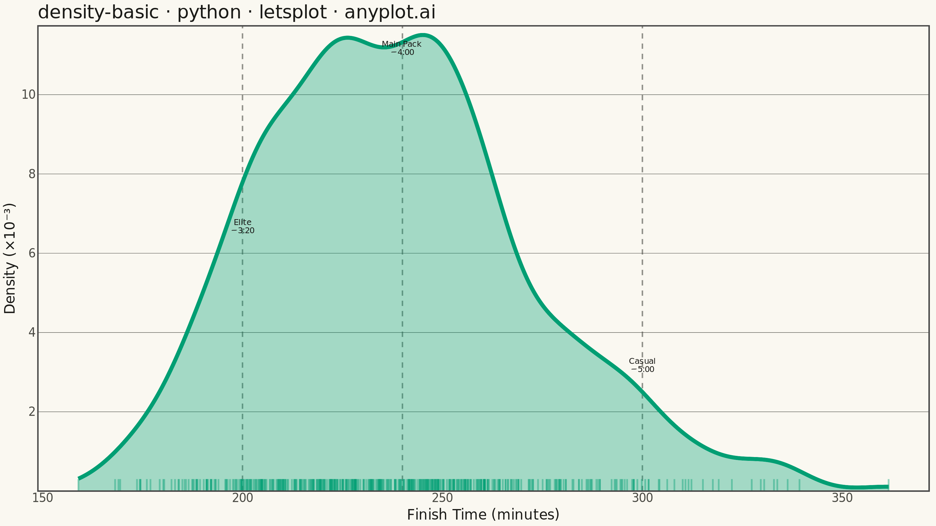
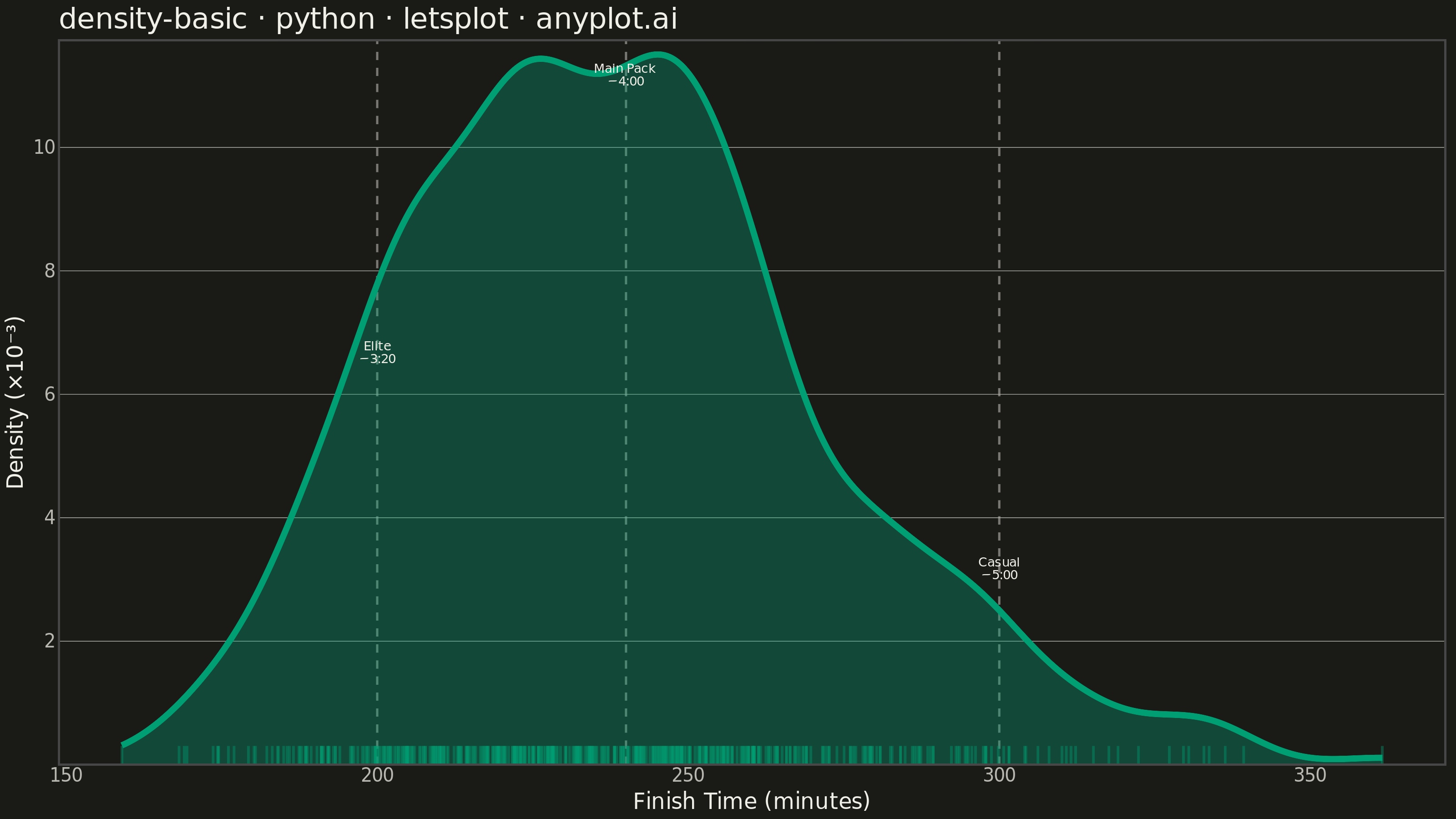
A density plot (also known as Kernel Density Estimation or KDE plot) visualizes the distribution of a continuous variable by smoothing the data into a continuous probability density curve. Unlike histograms which use discrete bins, density plots provide a smooth representation of the underlying distribution, making it easier to identify patterns such as skewness, modality, and overall shape.
""" anyplot.ai
density-basic: Basic Density Plot
Library: letsplot 4.10.1 | Python 3.13.13
Quality: 89/100 | Updated: 2026-05-30
"""

import os

import numpy as np
import pandas as pd
from lets_plot import (
    LetsPlot,
    aes,
    element_blank,
    element_line,
    element_rect,
    element_text,
    geom_density,
    geom_segment,
    geom_text,
    geom_vline,
    ggplot,
    ggsize,
    labs,
    layer_tooltips,
    scale_x_continuous,
    scale_y_continuous,
    theme,
    theme_minimal,
)
from lets_plot.export import ggsave


LetsPlot.setup_html()

# Theme tokens — Imprint palette, theme-adaptive chrome
THEME = os.getenv("ANYPLOT_THEME", "light")
PAGE_BG = "#FAF8F1" if THEME == "light" else "#1A1A17"
ELEVATED_BG = "#FFFDF6" if THEME == "light" else "#242420"
INK = "#1A1A17" if THEME == "light" else "#F0EFE8"
INK_SOFT = "#4A4A44" if THEME == "light" else "#B8B7B0"
BRAND = "#009E73"  # Imprint palette position 1 — always first series

# Data - Marathon finish times: trimodal distribution with realistic right skew
np.random.seed(42)
finish_minutes = np.concatenate(
    [
        np.random.normal(240, 25, 350),  # Main pack (~4 hour runners)
        np.random.normal(200, 15, 100),  # Competitive runners (~3:20)
        np.random.normal(300, 20, 50),  # Casual runners (~5 hours)
    ]
)
finish_minutes = np.clip(finish_minutes, 140, 400)
df = pd.DataFrame({"time": finish_minutes})

# Rug data: individual observations as small vertical ticks at the x-axis
rug_df = pd.DataFrame({"x": finish_minutes, "y0": 0.0, "y1": 0.0003})

# Peak annotation data for the three runner sub-populations
peaks_df = pd.DataFrame(
    {
        "x": [200, 240, 300],
        "y": [0.0065, 0.0110, 0.0030],
        "label": ["Elite\n~3:20", "Main Pack\n~4:00", "Casual\n~5:00"],
    }
)

# Title
title = "density-basic · python · letsplot · anyplot.ai"

# Chrome theme (theme-adaptive background, text, grid)
anyplot_theme = theme(
    plot_background=element_rect(fill=PAGE_BG, color=PAGE_BG),
    panel_background=element_rect(fill=PAGE_BG),
    panel_border=element_blank(),
    panel_grid_major_x=element_blank(),
    panel_grid_major_y=element_line(color=INK_SOFT, size=0.3),
    panel_grid_minor=element_blank(),
    axis_title=element_text(color=INK, size=12),
    axis_text=element_text(color=INK_SOFT, size=10),
    axis_ticks=element_blank(),
    plot_title=element_text(color=INK, size=16),
    legend_background=element_rect(fill=ELEVATED_BG, color=INK_SOFT),
)

# Plot
plot = (
    ggplot(df, aes(x="time"))
    + geom_vline(data=peaks_df, mapping=aes(xintercept="x"), color=INK_SOFT, linetype="dashed", size=0.5, alpha=0.6)
    + geom_density(
        fill=BRAND,
        color=BRAND,
        alpha=0.35,
        size=1.5,
        kernel="gaussian",
        adjust=0.85,
        trim=True,
        tooltips=layer_tooltips().line("density|@..density.."),
    )
    + geom_segment(data=rug_df, mapping=aes(x="x", y="y0", xend="x", yend="y1"), color=BRAND, alpha=0.40, size=0.6)
    + geom_text(data=peaks_df, mapping=aes(x="x", y="y", label="label"), color=INK, size=3.5, vjust=0, hjust=0.5)
    + labs(x="Finish Time (minutes)", y="Density (×10⁻³)", title=title)
    + scale_x_continuous(breaks=list(range(150, 401, 50)))
    + scale_y_continuous(
        breaks=[0.002, 0.004, 0.006, 0.008, 0.010], labels=["2", "4", "6", "8", "10"], expand=[0.02, 0, 0.15, 0]
    )
    + theme_minimal()
    + anyplot_theme
    + ggsize(800, 450)
)

# Save — theme-suffixed filenames, scale=4 → 3200×1800 px
ggsave(plot, f"plot-{THEME}.png", path=".", scale=4)
ggsave(plot, f"plot-{THEME}.html", path=".")
Runnable source as JSON, for any HTTP client: https://api.anyplot.ai/specs/density-basic/letsplot/code. Any spec id and library id listed in llms-full.txt fit the same URL shape; every URL below is complete and callable.
{
  "spec_id": "density-basic",
  "language": "python",
  "library": "letsplot",
  "page": "https://anyplot.ai/density-basic/python/letsplot",
  "hub": "https://anyplot.ai/density-basic",
  "code_json": "https://api.anyplot.ai/specs/density-basic/letsplot/code",
  "spec_json": "https://api.anyplot.ai/specs/density-basic",
  "render_light_png": "https://storage.googleapis.com/anyplot-images/plots/density-basic/python/letsplot/plot-light.png",
  "render_dark_png": "https://storage.googleapis.com/anyplot-images/plots/density-basic/python/letsplot/plot-dark.png",
  "interactive_light_html": "https://storage.googleapis.com/anyplot-images/plots/density-basic/python/letsplot/plot-light.html",
  "interactive_dark_html": "https://storage.googleapis.com/anyplot-images/plots/density-basic/python/letsplot/plot-dark.html",
  "quality_score": 89.0,
  "license": "MIT",
  "guide": "https://anyplot.ai/llms.txt"
}
Part of Basic Density Plot on anyplot.ai.