The same plot in 14 other libraries — JavaScript: Chart.js, D3.js, Apache ECharts, Highcharts; Python: Altair, Bokeh, lets-plot, Matplotlib, Plotly, plotnine, Pygal, Seaborn; R: ggplot2; Julia: Makie.jl. Compare all 15 side by side: Basic Density Plot in Python, R, Julia and JavaScript.
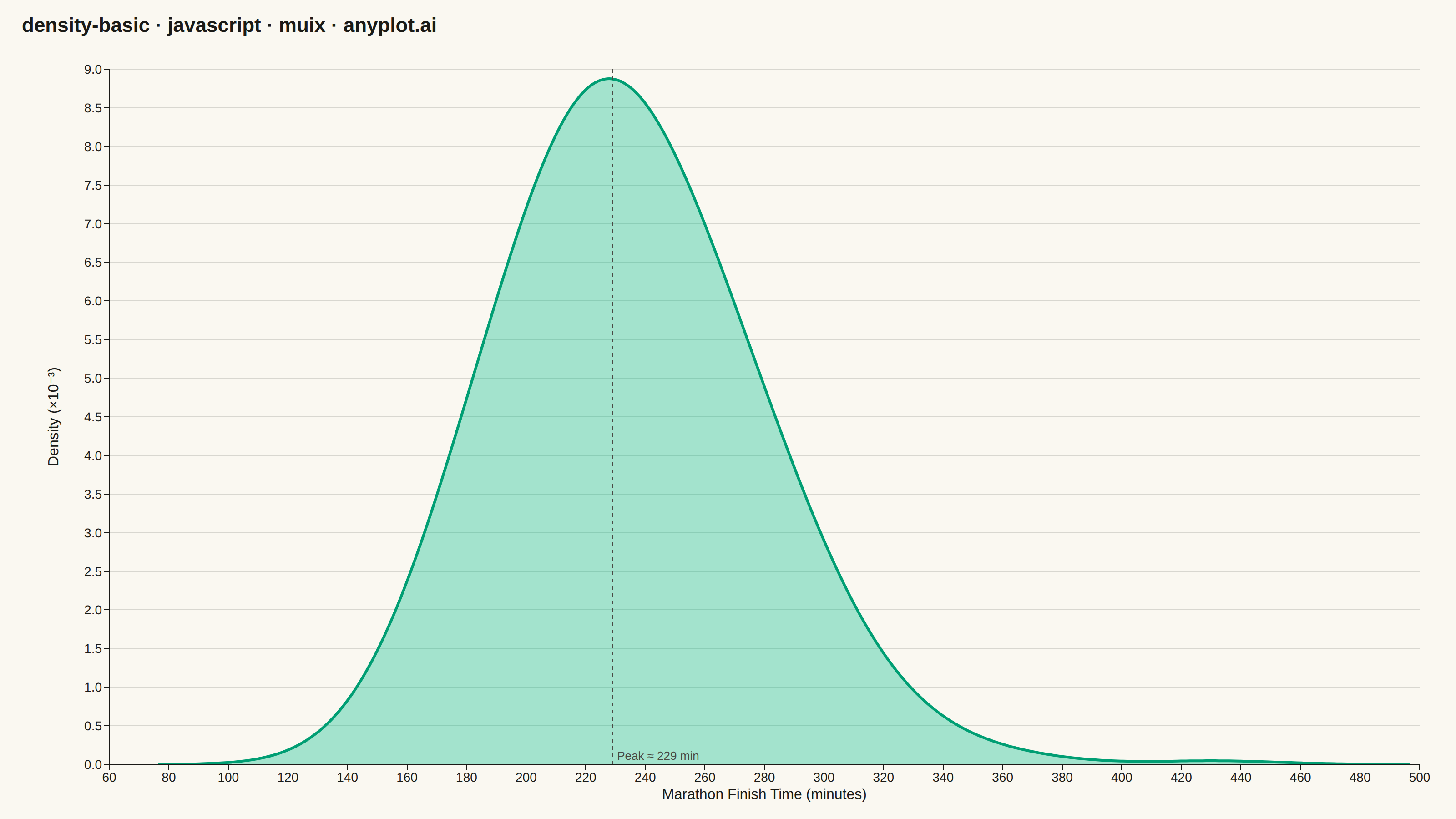
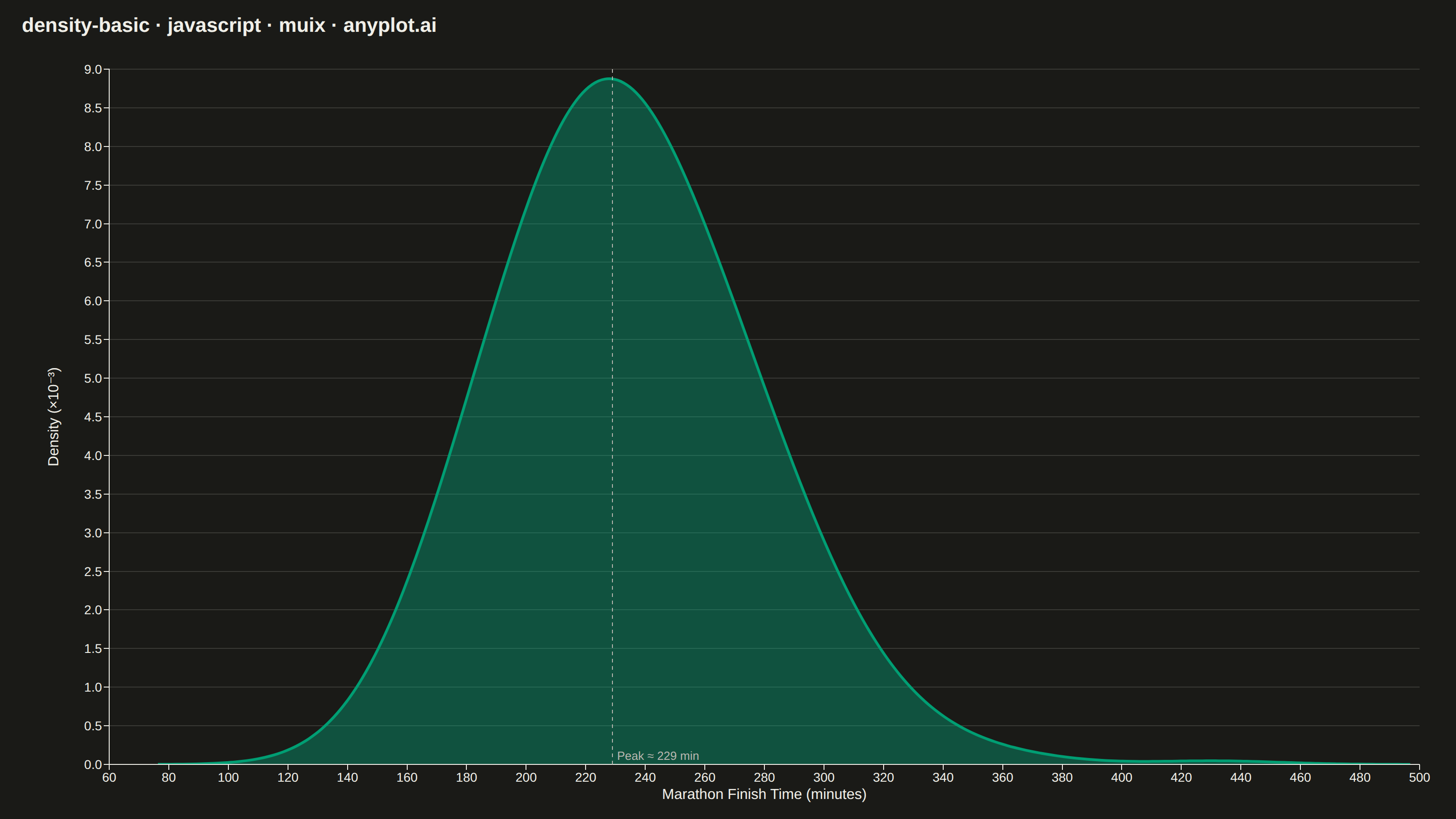
A density plot (also known as Kernel Density Estimation or KDE plot) visualizes the distribution of a continuous variable by smoothing the data into a continuous probability density curve. Unlike histograms which use discrete bins, density plots provide a smooth representation of the underlying distribution, making it easier to identify patterns such as skewness, modality, and overall shape.
// anyplot.ai
// density-basic: Basic Density Plot
// Library: muix 7.29.1 | JavaScript 22.23.2
// Quality: 89/100 | Created: 2026-08-24
import { LineChart } from "@mui/x-charts/LineChart";
import { ChartsReferenceLine } from "@mui/x-charts/ChartsReferenceLine";

const t = window.ANYPLOT_TOKENS;
const TITLE = "density-basic · javascript · muix · anyplot.ai";
const TITLE_HEIGHT = 56;

// --- Data (in-memory, deterministic): marathon finish times, right-skewed ---
// Small LCG so results are reproducible without a seeded Math.random().
function lcg(seed) {
  let state = seed;
  return () => {
    state = (state * 1664525 + 1013904223) % 4294967296;
    return state / 4294967296;
  };
}

const rand = lcg(42);

function randomNormal() {
  const u1 = Math.max(rand(), 1e-9);
  const u2 = rand();
  return Math.sqrt(-2 * Math.log(u1)) * Math.cos(2 * Math.PI * u2);
}

const SAMPLE_SIZE = 400;
const LOG_MEAN = Math.log(230); // median finish time ~230 minutes
const LOG_SD = 0.18; // slower-runner tail produces the right skew

const finishTimes = Array.from({ length: SAMPLE_SIZE }, () =>
  Math.exp(LOG_MEAN + LOG_SD * randomNormal()),
);

// --- Gaussian KDE (Silverman's rule of thumb for bandwidth) -----------------
function gaussianKernel(u) {
  return Math.exp(-0.5 * u * u) / Math.sqrt(2 * Math.PI);
}

const n = finishTimes.length;
const meanTime = finishTimes.reduce((sum, v) => sum + v, 0) / n;
const variance =
  finishTimes.reduce((sum, v) => sum + (v - meanTime) ** 2, 0) / (n - 1);
// Multiplier bumped well above the textbook 1.06 so the sparse right tail
// (a handful of very slow finishers) decays smoothly instead of showing a
// spurious secondary bump around individual outlier points.
const bandwidth = 1.8 * Math.sqrt(variance) * n ** (-1 / 5);

const dataMin = Math.min(...finishTimes);
const dataMax = Math.max(...finishTimes);
const GRID_POINTS = 200;
const gridStart = dataMin - 3 * bandwidth;
const gridStep = (dataMax + 3 * bandwidth - gridStart) / (GRID_POINTS - 1);

const grid = Array.from(
  { length: GRID_POINTS },
  (_, i) => gridStart + i * gridStep,
);
// Scaled ×1000 so y-axis ticks read as clean one-decimal numbers.
const density = grid.map(
  (x) =>
    (1000 *
      finishTimes.reduce(
        (sum, xi) => sum + gaussianKernel((x - xi) / bandwidth),
        0,
      )) /
    (n * bandwidth),
);

// Focal-point annotation: mark the modal (peak-density) finish time.
const peakIndex = density.indexOf(Math.max(...density));
const peakFinishTime = Math.round(grid[peakIndex]);

export default function Chart() {
  const chartHeight = window.ANYPLOT_SIZE.height - TITLE_HEIGHT;

  return (
    <div
      style={{
        width: window.ANYPLOT_SIZE.width,
        height: window.ANYPLOT_SIZE.height,
      }}
    >
      <div
        style={{
          height: TITLE_HEIGHT,
          lineHeight: `${TITLE_HEIGHT}px`,
          paddingLeft: 24,
          fontSize: 22,
          fontWeight: 600,
          color: t.ink,
        }}
      >
        {TITLE}
      </div>
      <LineChart
        width={window.ANYPLOT_SIZE.width}
        height={chartHeight}
        margin={{ left: 120, right: 40, top: 20, bottom: 60 }}
        skipAnimation
        series={[
          {
            data: density,
            label: "Density",
            color: t.palette[0],
            area: true,
            curve: "natural",
            showMark: false,
          },
        ]}
        xAxis={[
          {
            data: grid,
            scaleType: "linear",
            label: "Marathon Finish Time (minutes)",
            labelStyle: { fontSize: 16 },
            tickLabelStyle: { fontSize: 14 },
            valueFormatter: (v) => v.toFixed(0),
          },
        ]}
        yAxis={[
          {
            label: "Density (×10⁻³)",
            labelStyle: { fontSize: 16 },
            // tickFontSize only drives the axis-label offset (see ChartsYAxis
            // labelRefPoint) — actual tick glyphs stay at tickLabelStyle's 14px.
            tickFontSize: 40,
            tickLabelStyle: { fontSize: 14 },
            valueFormatter: (v) => v.toFixed(1),
          },
        ]}
        grid={{ horizontal: true }}
        slotProps={{ legend: { hidden: true } }}
        sx={{
          "& .MuiAreaElement-root": { fillOpacity: 0.35 },
          "& .MuiLineElement-root": { strokeWidth: 3 },
        }}
      >
        <ChartsReferenceLine
          x={peakFinishTime}
          label={`Peak ≈ ${peakFinishTime} min`}
          labelAlign="end"
          labelStyle={{ fontSize: 13, fill: t.inkSoft }}
          lineStyle={{ stroke: t.inkSoft, strokeDasharray: "4 4" }}
        />
      </LineChart>
    </div>
  );
}
Runnable source as JSON, for any HTTP client: https://api.anyplot.ai/specs/density-basic/muix/code. Any spec id and library id listed in llms-full.txt fit the same URL shape; every URL below is complete and callable.
{
  "spec_id": "density-basic",
  "language": "javascript",
  "library": "muix",
  "page": "https://anyplot.ai/density-basic/javascript/muix",
  "hub": "https://anyplot.ai/density-basic",
  "code_json": "https://api.anyplot.ai/specs/density-basic/muix/code",
  "spec_json": "https://api.anyplot.ai/specs/density-basic",
  "render_light_png": "https://storage.googleapis.com/anyplot-images/plots/density-basic/javascript/muix/plot-light.png",
  "render_dark_png": "https://storage.googleapis.com/anyplot-images/plots/density-basic/javascript/muix/plot-dark.png",
  "interactive_light_html": "https://storage.googleapis.com/anyplot-images/plots/density-basic/javascript/muix/plot-light.html",
  "interactive_dark_html": "https://storage.googleapis.com/anyplot-images/plots/density-basic/javascript/muix/plot-dark.html",
  "quality_score": 89.0,
  "license": "MIT",
  "guide": "https://anyplot.ai/llms.txt"
}
Part of Basic Density Plot on anyplot.ai.