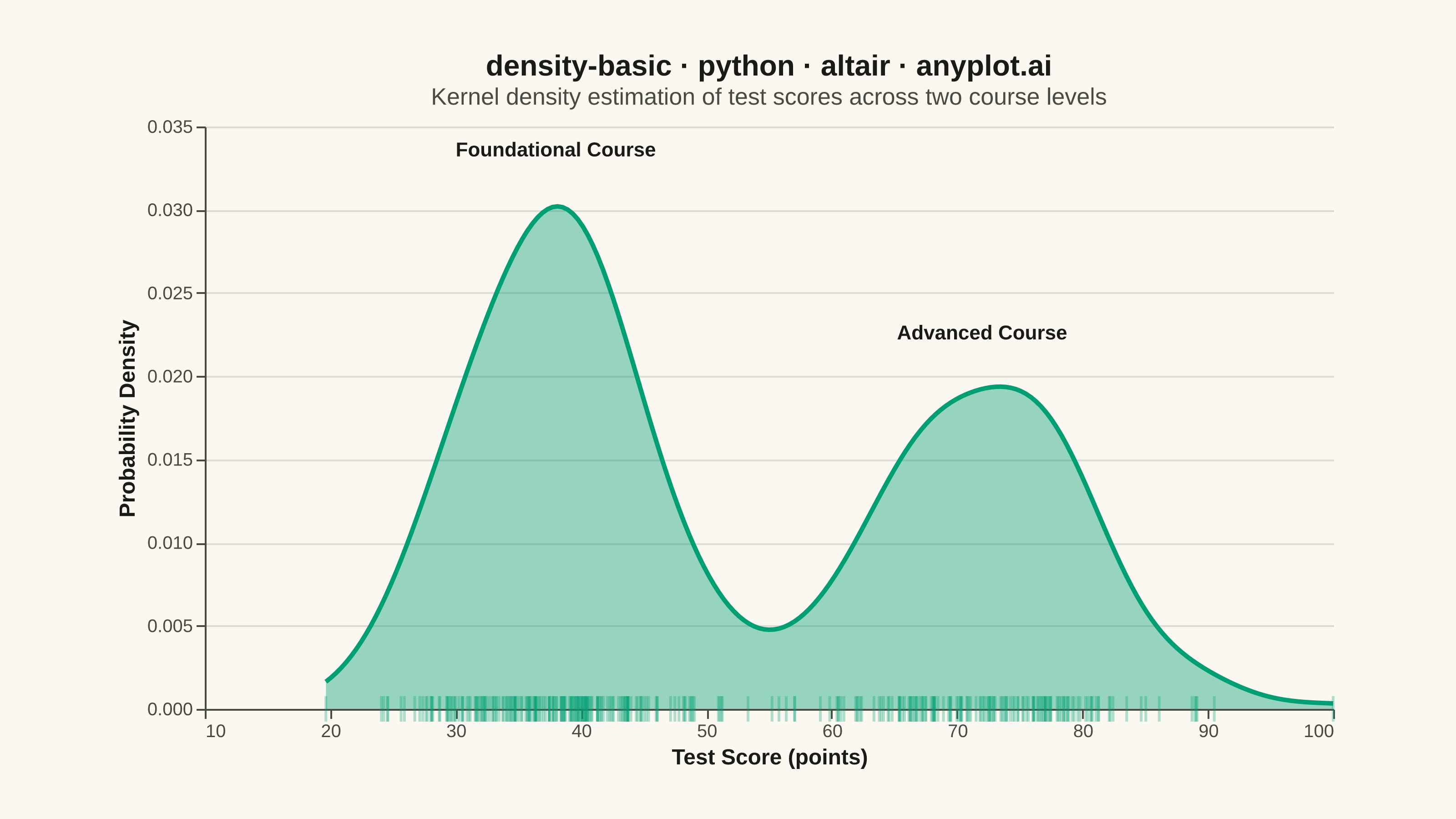
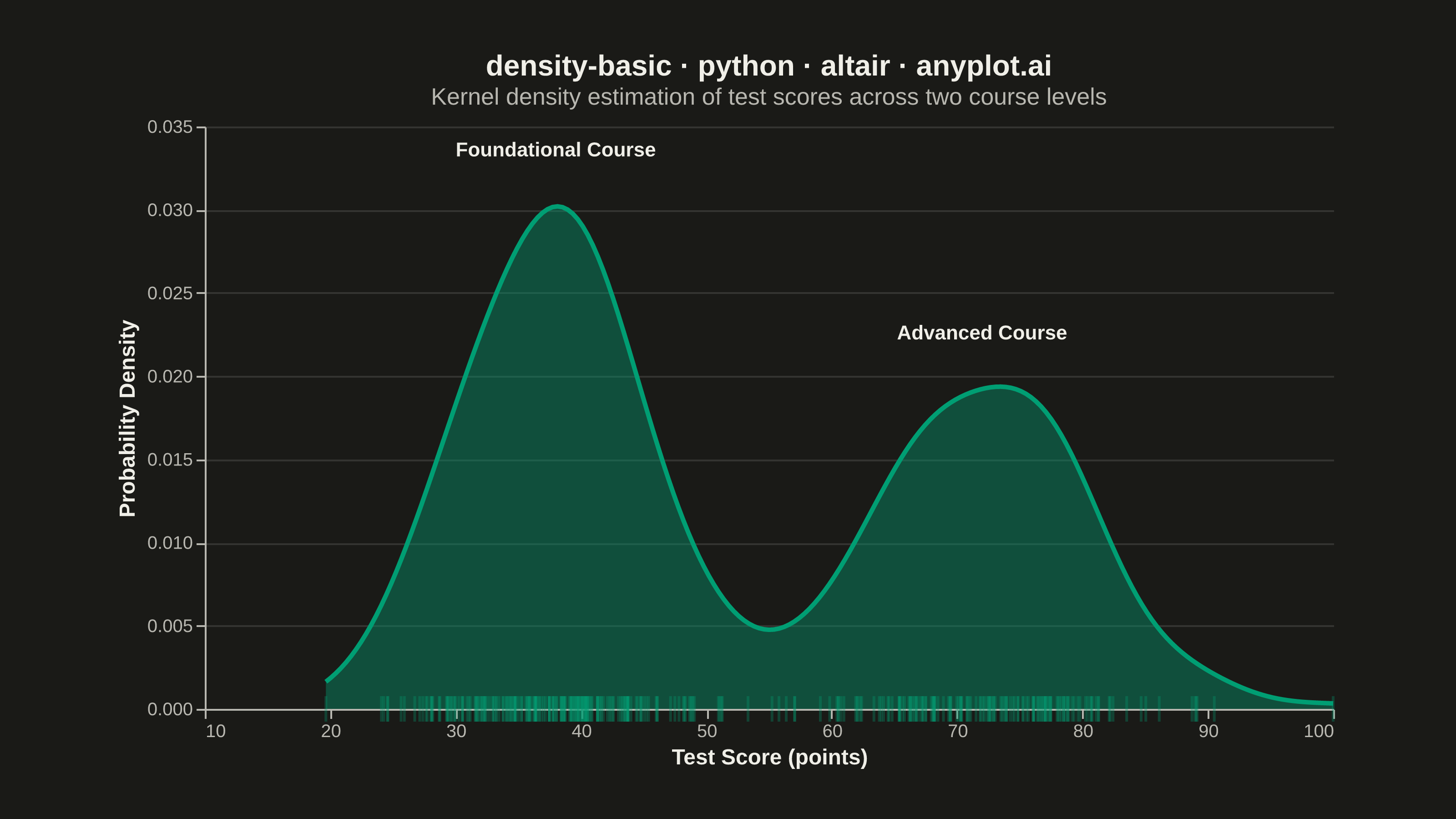
A density plot (also known as Kernel Density Estimation or KDE plot) visualizes the distribution of a continuous variable by smoothing the data into a continuous probability density curve. Unlike histograms which use discrete bins, density plots provide a smooth representation of the underlying distribution, making it easier to identify patterns such as skewness, modality, and overall shape.
""" anyplot.ai
density-basic: Basic Density Plot
Library: altair 6.1.0 | Python 3.13.13
Quality: 93/100 | Updated: 2026-05-30
"""

import importlib
import os
import sys

import numpy as np
import pandas as pd
from PIL import Image


# Drop script directory from sys.path so `altair` resolves the package, not this file
sys.path[:] = [p for p in sys.path if os.path.abspath(p or ".") != os.path.dirname(os.path.abspath(__file__))]
alt = importlib.import_module("altair")

# Theme tokens — Imprint palette
THEME = os.getenv("ANYPLOT_THEME", "light")
PAGE_BG = "#FAF8F1" if THEME == "light" else "#1A1A17"
INK = "#1A1A17" if THEME == "light" else "#F0EFE8"
INK_SOFT = "#4A4A44" if THEME == "light" else "#B8B7B0"
BRAND = "#009E73"  # Imprint palette position 1 — ALWAYS first series

# Data - bimodal distribution showing two student groups with distinct performance
np.random.seed(42)
values = np.concatenate(
    [
        np.random.normal(loc=38, scale=7, size=200),  # Group A — foundational course
        np.random.normal(loc=72, scale=8, size=150),  # Group B — advanced course
    ]
)
values = np.clip(values, 5, 100)

df = pd.DataFrame({"Test Score": values})

# Peak annotations to highlight the two modes of the bimodal distribution
peaks = pd.DataFrame(
    {"Test Score": [38, 72], "density": [0.032, 0.021], "label": ["Foundational Course", "Advanced Course"]}
)

# Nearest-point selection for interactive density readout (HTML export)
nearest = alt.selection_point(nearest=True, on="pointerover", fields=["Test Score"], empty=False)

# Density curve with filled area
density_layer = (
    alt.Chart(df)
    .transform_density("Test Score", as_=["Test Score", "density"], bandwidth=4)
    .mark_area(opacity=0.40, color=BRAND, line={"color": BRAND, "strokeWidth": 2.5})
    .encode(
        x=alt.X(
            "Test Score:Q",
            title="Test Score (points)",
            scale=alt.Scale(domain=[10, 100]),
            axis=alt.Axis(tickCount=10, grid=False),
        ),
        y=alt.Y("density:Q", title="Probability Density", axis=alt.Axis(format=".3f")),
        tooltip=[
            alt.Tooltip("Test Score:Q", title="Score", format=".1f"),
            alt.Tooltip("density:Q", title="Density", format=".4f"),
        ],
    )
)

# Invisible points on density curve driving nearest-point selection
hover_points = (
    alt.Chart(df)
    .transform_density("Test Score", as_=["Test Score", "density"], bandwidth=4)
    .mark_point(opacity=0)
    .encode(x="Test Score:Q", y="density:Q")
    .add_params(nearest)
)

# Hover dot — conditionally visible point at cursor position
hover_dot = (
    alt.Chart(df)
    .transform_density("Test Score", as_=["Test Score", "density"], bandwidth=4)
    .mark_point(size=80, filled=True, color=BRAND)
    .encode(x="Test Score:Q", y="density:Q", opacity=alt.condition(nearest, alt.value(1), alt.value(0)))
)

# Peak annotation labels
annotations = (
    alt.Chart(peaks)
    .mark_text(fontSize=11, fontWeight="bold", color=INK, dy=-14)
    .encode(x="Test Score:Q", y="density:Q", text="label:N")
)

# Rug plot — tick marks showing individual observations at density=0
rug = (
    alt.Chart(df)
    .mark_tick(color=BRAND, opacity=0.3, thickness=1.5, size=14)
    .encode(x=alt.X("Test Score:Q"), y=alt.Y(datum=0))
)

# Title length-scaled font size (default 16px at 67-char baseline)
title_text = "density-basic · python · altair · anyplot.ai"
title_fs = round(16 * 67 / len(title_text)) if len(title_text) > 67 else 16

chart = (
    alt.layer(density_layer, rug, annotations, hover_points, hover_dot)
    .properties(
        width=620,
        height=320,
        background=PAGE_BG,
        title=alt.Title(
            text=title_text,
            subtitle="Kernel density estimation of test scores across two course levels",
            fontSize=title_fs,
            subtitleFontSize=13,
            subtitleColor=INK_SOFT,
        ),
    )
    .configure_view(fill=PAGE_BG, strokeWidth=0)
    .configure_axis(
        domainColor=INK_SOFT,
        tickColor=INK_SOFT,
        gridColor=INK,
        gridOpacity=0.12,
        labelColor=INK_SOFT,
        labelFontSize=10,
        titleColor=INK,
        titleFontSize=12,
    )
    .configure_title(color=INK)
)

# Save PNG then pad to exact 3200 × 1800 target
chart.save(f"plot-{THEME}.png", scale_factor=4.0)

TW, TH = 3200, 1800
_img = Image.open(f"plot-{THEME}.png").convert("RGB")
_w, _h = _img.size
if _w > TW or _h > TH:
    raise SystemExit(
        f"altair vl-convert produced {_w}×{_h}, exceeds target {TW}×{TH}. "
        f"Shrink chart .properties(width=, height=) values and re-render."
    )
if _w < TW or _h < TH:
    _canvas = Image.new("RGB", (TW, TH), PAGE_BG)
    _canvas.paste(_img, ((TW - _w) // 2, (TH - _h) // 2))
    _canvas.save(f"plot-{THEME}.png")

# Save interactive HTML with selection-driven hover readout
chart.save(f"plot-{THEME}.html")
Runnable source as JSON, for any HTTP client: https://api.anyplot.ai/specs/density-basic/altair/code. Any spec id and library id listed in llms-full.txt fit the same URL shape; every URL below is complete and callable.
{
  "spec_id": "density-basic",
  "language": "python",
  "library": "altair",
  "page": "https://anyplot.ai/density-basic/python/altair",
  "hub": "https://anyplot.ai/density-basic",
  "code_json": "https://api.anyplot.ai/specs/density-basic/altair/code",
  "spec_json": "https://api.anyplot.ai/specs/density-basic",
  "render_light_png": "https://storage.googleapis.com/anyplot-images/plots/density-basic/python/altair/plot-light.png",
  "render_dark_png": "https://storage.googleapis.com/anyplot-images/plots/density-basic/python/altair/plot-dark.png",
  "interactive_light_html": "https://storage.googleapis.com/anyplot-images/plots/density-basic/python/altair/plot-light.html",
  "interactive_dark_html": "https://storage.googleapis.com/anyplot-images/plots/density-basic/python/altair/plot-dark.html",
  "quality_score": 93.0,
  "license": "MIT",
  "guide": "https://anyplot.ai/llms.txt"
}
Part of Basic Density Plot on anyplot.ai.