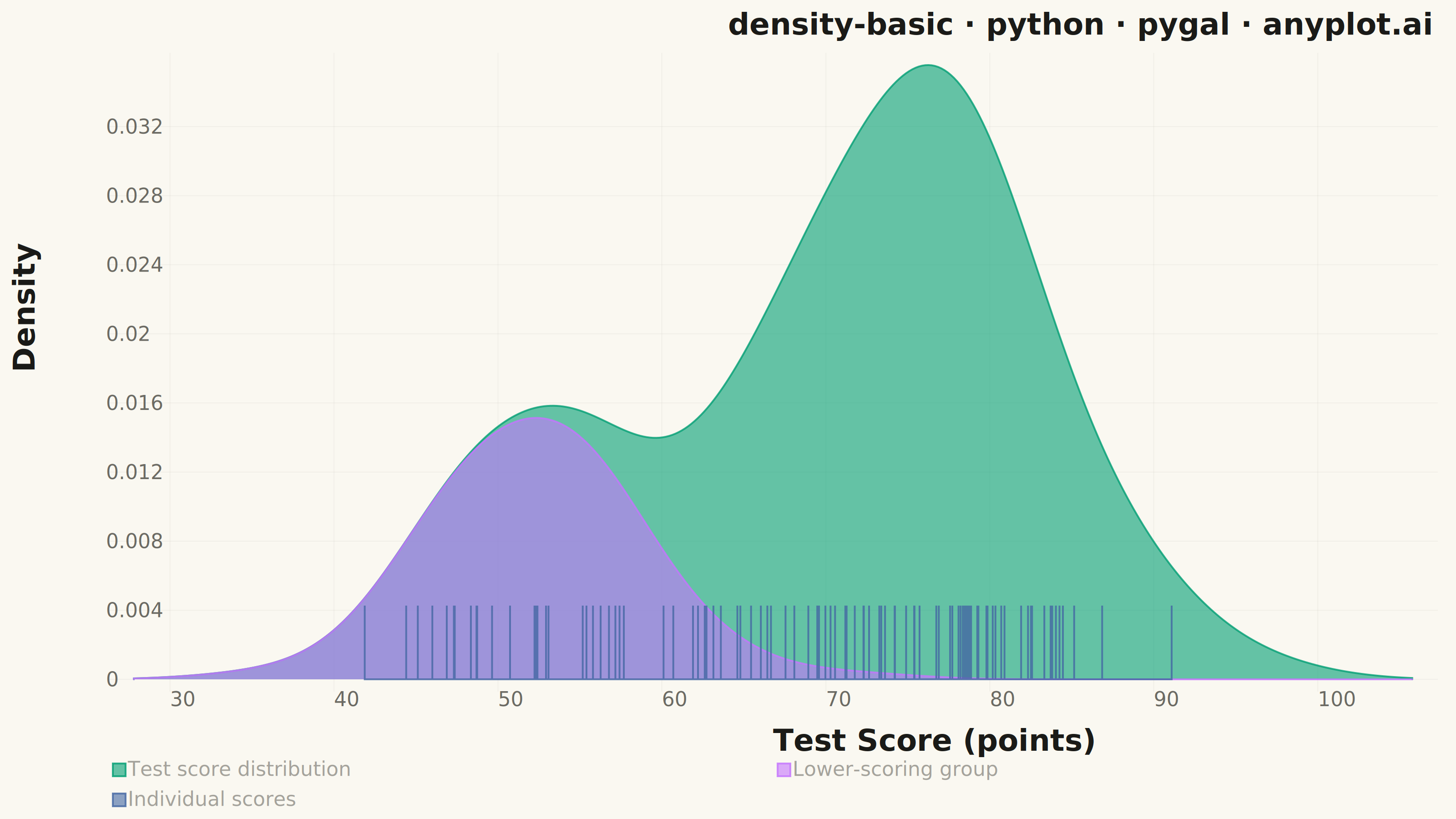
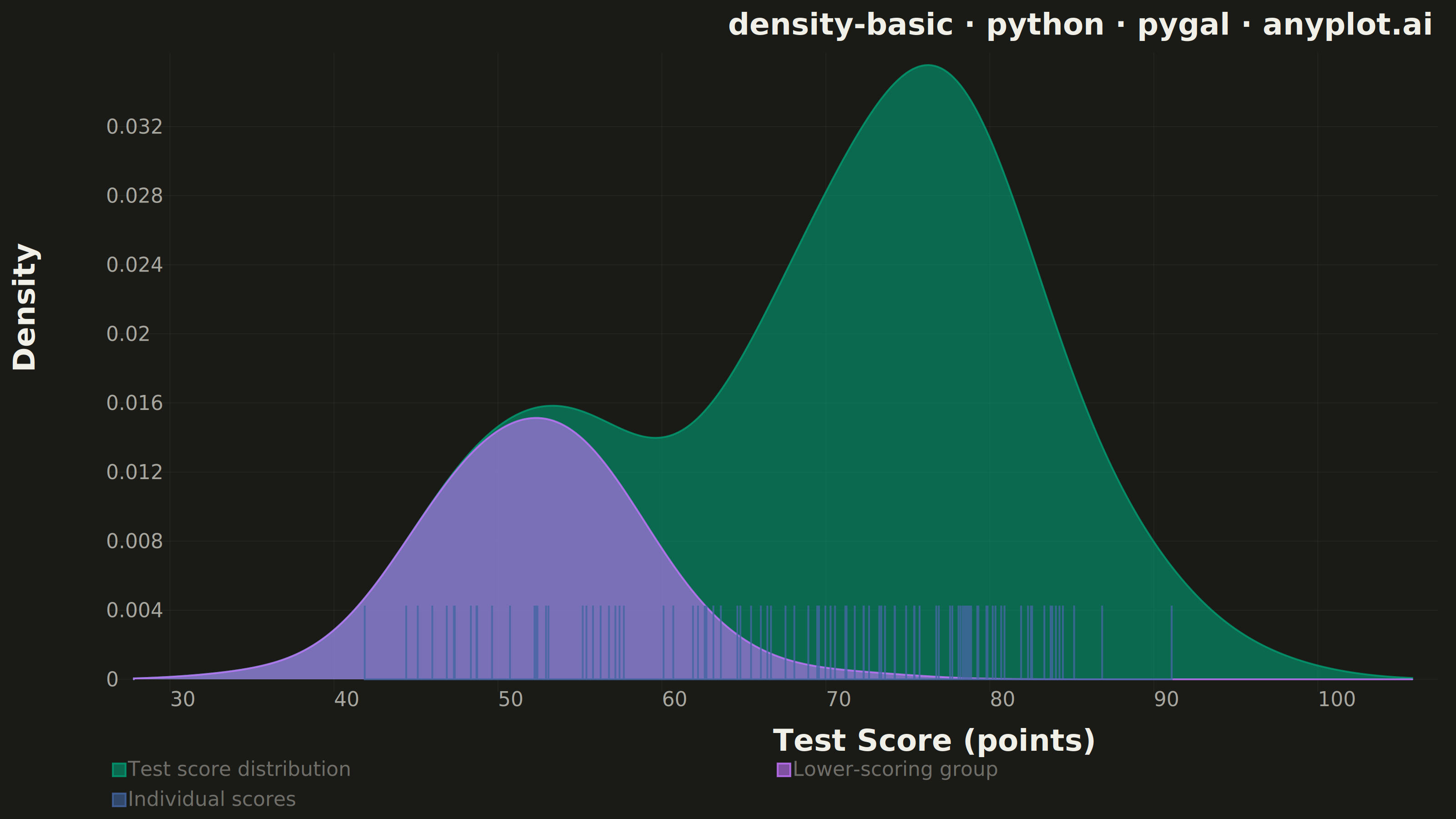
A density plot (also known as Kernel Density Estimation or KDE plot) visualizes the distribution of a continuous variable by smoothing the data into a continuous probability density curve. Unlike histograms which use discrete bins, density plots provide a smooth representation of the underlying distribution, making it easier to identify patterns such as skewness, modality, and overall shape.
""" anyplot.ai
density-basic: Basic Density Plot
Library: pygal 3.1.0 | Python 3.13.13
Quality: 86/100 | Updated: 2026-05-30
"""

import sys


# Remove script directory from sys.path so "import pygal" resolves to the installed package,
# not this file itself (which would cause a circular import on the script's own name).
if sys.path and sys.path[0]:
    sys.path.pop(0)

import os

import numpy as np
import pygal
from pygal.style import Style


# Theme tokens — Imprint palette, theme-adaptive chrome
THEME = os.getenv("ANYPLOT_THEME", "light")
PAGE_BG = "#FAF8F1" if THEME == "light" else "#1A1A17"
INK = "#1A1A17" if THEME == "light" else "#F0EFE8"
INK_MUTED = "#6B6A63" if THEME == "light" else "#A8A79F"

# Imprint categorical palette — first series always #009E73
IMPRINT_PALETTE = ("#009E73", "#C475FD", "#4467A3", "#BD8233", "#AE3030", "#2ABCCD", "#954477", "#99B314")

# Data — test scores with clear bimodal structure (two student groups)
np.random.seed(42)
main_scores = np.random.normal(76, 8, 200)
secondary_scores = np.random.normal(52, 5, 70)
scores = np.concatenate([main_scores, secondary_scores])

# KDE with Gaussian kernel and Scott's rule bandwidth
x_range = np.linspace(scores.min() - 8, scores.max() + 8, 400)
n = len(scores)
bandwidth = n ** (-1 / 5) * np.std(scores)

# Combined density
density = np.zeros_like(x_range)
for xi in scores:
    density += np.exp(-0.5 * ((x_range - xi) / bandwidth) ** 2)
density /= n * bandwidth * np.sqrt(2 * np.pi)

# Secondary component density (weighted by proportion) for visual storytelling
density_sec = np.zeros_like(x_range)
for xi in secondary_scores:
    density_sec += np.exp(-0.5 * ((x_range - xi) / bandwidth) ** 2)
density_sec /= n * bandwidth * np.sqrt(2 * np.pi)

# Imprint palette style — theme-adaptive chrome
custom_style = Style(
    background=PAGE_BG,
    plot_background=PAGE_BG,
    foreground=INK,
    foreground_strong=INK,
    foreground_subtle=INK_MUTED,
    colors=IMPRINT_PALETTE,
    title_font_size=66,
    label_font_size=44,
    major_label_font_size=44,
    legend_font_size=44,
    value_font_size=36,
    stroke_width=4,
    opacity=0.60,
    opacity_hover=0.85,
    font_family="'Segoe UI', Roboto, 'Helvetica Neue', Arial, sans-serif",
)

# Theme-adaptive CSS overrides for spine removal and chrome
css_rules = [
    "file://style.css",
    f"inline:.plot .background {{fill: {PAGE_BG} !important; stroke: none !important; stroke-width: 0 !important;}}",
    f"inline:.graph > .background {{fill: {PAGE_BG} !important; stroke: none !important;}}",
    f"inline:.axis .guides .line {{stroke: {INK_MUTED} !important; stroke-width: 0.8px; opacity: 0.15;}}",
    "inline:.axis.x > path.line {stroke: none !important; stroke-width: 0 !important;}",
    "inline:.axis.y > path.line {stroke: none !important; stroke-width: 0 !important;}",
    f"inline:.axis .guides text {{fill: {INK_MUTED} !important;}}",
    f"inline:text.title {{font-weight: 600 !important; fill: {INK} !important;}}",
    "inline:.axis text {font-weight: 400 !important;}",
    f"inline:.legends text {{font-weight: 400 !important; fill: {INK_MUTED} !important;}}",
]

# Chart — 3200×1800 landscape canvas
chart = pygal.XY(
    width=3200,
    height=1800,
    style=custom_style,
    title="density-basic · python · pygal · anyplot.ai",
    x_title="Test Score (points)",
    y_title="Density",
    show_dots=False,
    fill=True,
    show_legend=True,
    legend_at_bottom=True,
    legend_box_size=28,
    show_y_guides=True,
    show_x_guides=False,
    stroke_style={"width": 4, "linecap": "round"},
    truncate_label=-1,
    margin_top=40,
    margin_right=40,
    margin_bottom=30,
    margin_left=20,
    x_value_formatter=lambda x: f"{x:.0f}",
    y_value_formatter=lambda y: f"{y:.3f}",
    css=css_rules,
    js=[],
)

# Main density curve (combined) — Imprint green, prominent filled area
xy_combined = [(float(x), float(y)) for x, y in zip(x_range, density, strict=True)]
chart.add("Test score distribution", xy_combined)

# Secondary component — Imprint lavender, highlights bimodal structure
xy_sec = [(float(x), float(y)) for x, y in zip(x_range, density_sec, strict=True)]
chart.add("Lower-scoring group", xy_sec, stroke_style={"width": 3, "linecap": "round"}, fill=True)

# Rug plot — subsample 100 representative observations so individual ticks stay distinguishable
rug_sample = np.sort(np.random.choice(scores, size=100, replace=False))
rug_height = max(density) * 0.12
rug_data = []
for xi in rug_sample:
    rug_data.append((float(xi), 0.0))
    rug_data.append((float(xi), float(rug_height)))
    rug_data.append((float(xi), 0.0))

chart.add("Individual scores", rug_data, stroke_style={"width": 0.8, "linecap": "butt"}, show_dots=False, fill=False)

# Save outputs
chart.render_to_png(f"plot-{THEME}.png")
chart.render_to_file(f"plot-{THEME}.html")
Runnable source as JSON, for any HTTP client: https://api.anyplot.ai/specs/density-basic/pygal/code. Any spec id and library id listed in llms-full.txt fit the same URL shape; every URL below is complete and callable.
{
  "spec_id": "density-basic",
  "language": "python",
  "library": "pygal",
  "page": "https://anyplot.ai/density-basic/python/pygal",
  "hub": "https://anyplot.ai/density-basic",
  "code_json": "https://api.anyplot.ai/specs/density-basic/pygal/code",
  "spec_json": "https://api.anyplot.ai/specs/density-basic",
  "render_light_png": "https://storage.googleapis.com/anyplot-images/plots/density-basic/python/pygal/plot-light.png",
  "render_dark_png": "https://storage.googleapis.com/anyplot-images/plots/density-basic/python/pygal/plot-dark.png",
  "interactive_light_html": "https://storage.googleapis.com/anyplot-images/plots/density-basic/python/pygal/plot-light.html",
  "interactive_dark_html": "https://storage.googleapis.com/anyplot-images/plots/density-basic/python/pygal/plot-dark.html",
  "quality_score": 86.0,
  "license": "MIT",
  "guide": "https://anyplot.ai/llms.txt"
}
Part of Basic Density Plot on anyplot.ai.