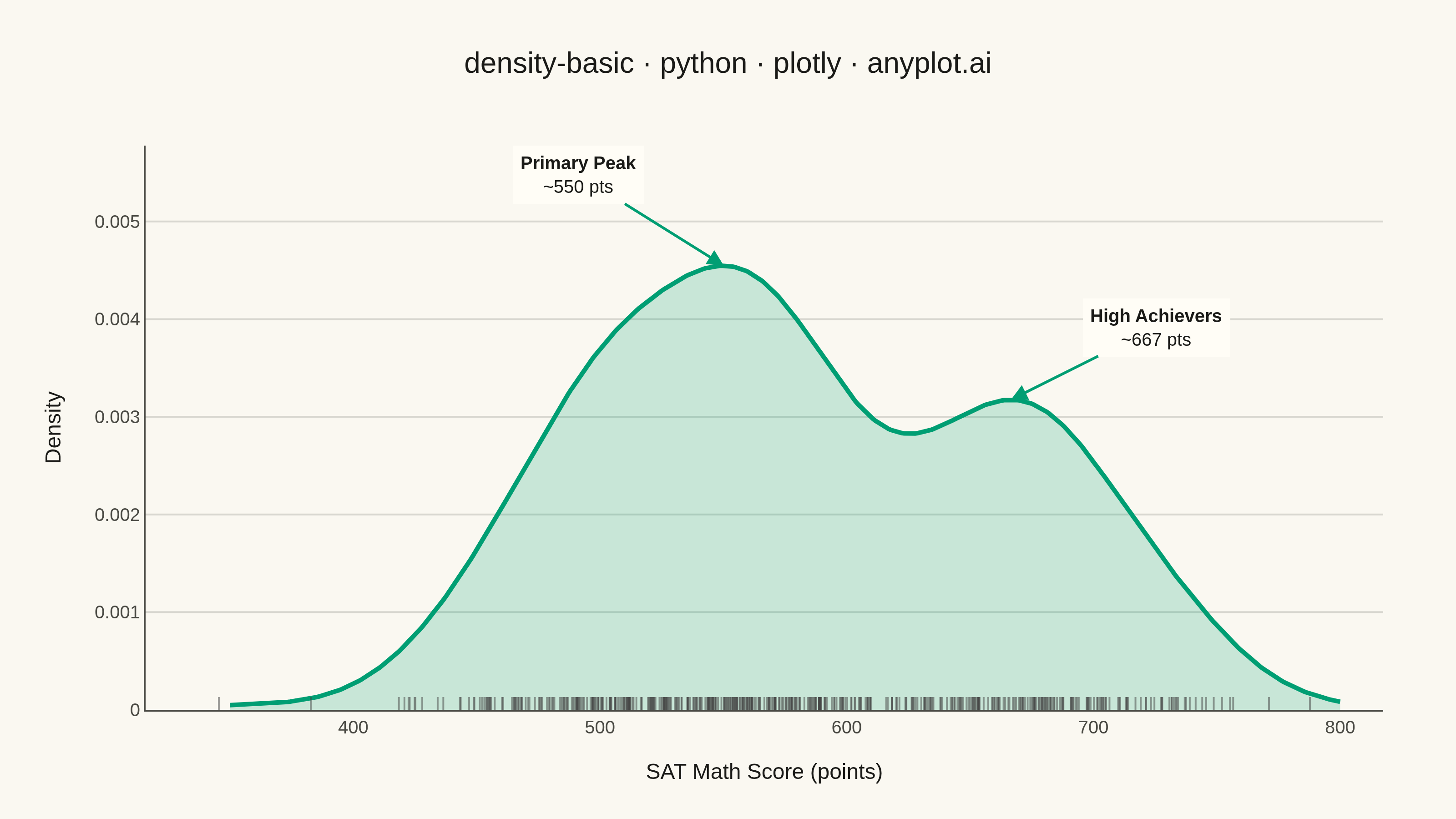
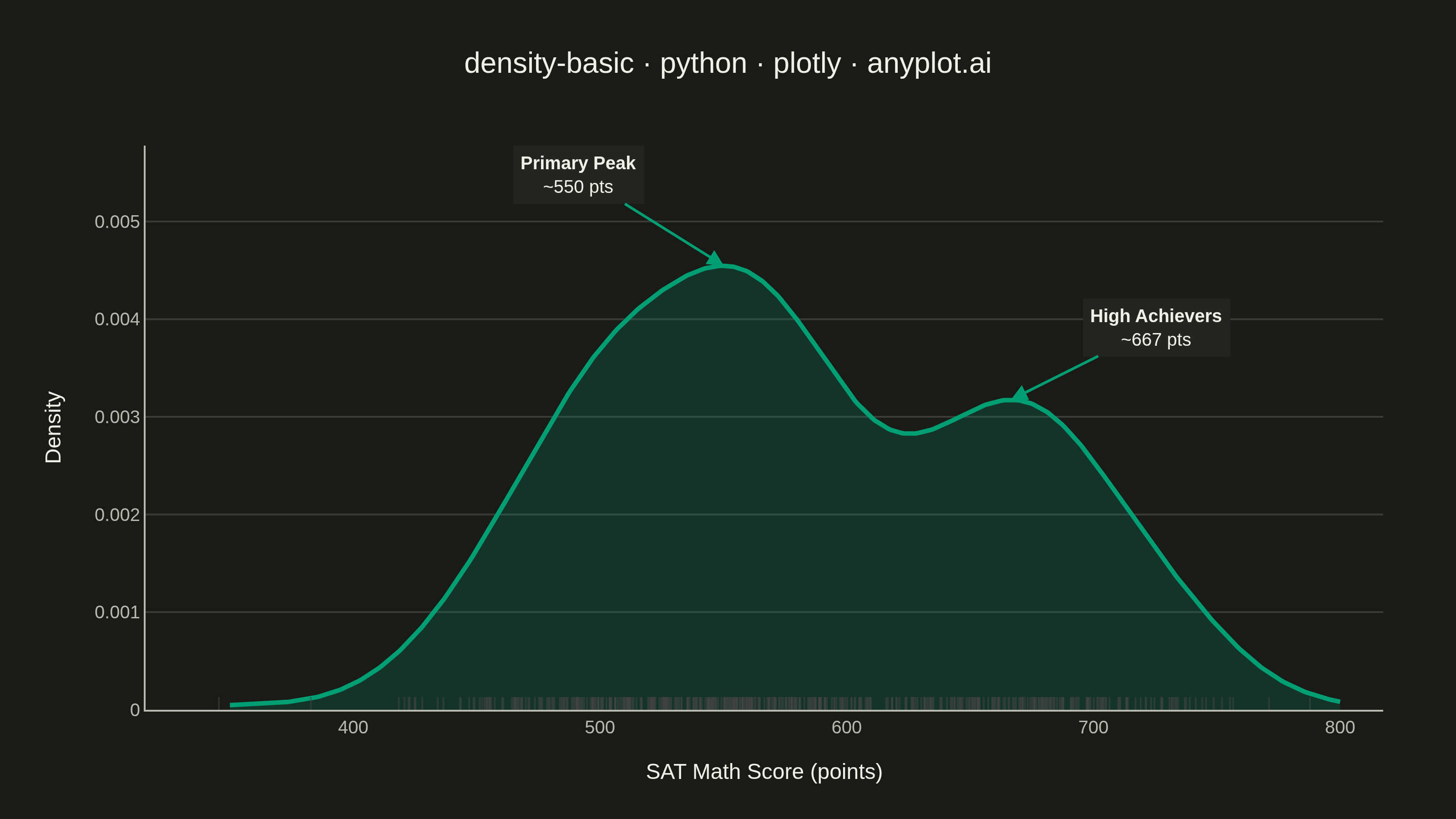
A density plot (also known as Kernel Density Estimation or KDE plot) visualizes the distribution of a continuous variable by smoothing the data into a continuous probability density curve. Unlike histograms which use discrete bins, density plots provide a smooth representation of the underlying distribution, making it easier to identify patterns such as skewness, modality, and overall shape.
""" anyplot.ai
density-basic: Basic Density Plot
Library: plotly 6.7.0 | Python 3.13.13
Quality: 92/100 | Updated: 2026-05-30
"""

import os
import sys


# Remove the script's own directory from sys.path to avoid shadowing the plotly package
sys.path = [p for p in sys.path if os.path.abspath(p) != os.path.dirname(os.path.abspath(__file__))]

import numpy as np
import plotly.graph_objects as go
from scipy.stats import gaussian_kde


THEME = os.getenv("ANYPLOT_THEME", "light")

# Theme-adaptive chrome tokens (see default-style-guide.md)
PAGE_BG = "#FAF8F1" if THEME == "light" else "#1A1A17"
ELEVATED_BG = "#FFFDF6" if THEME == "light" else "#242420"
INK = "#1A1A17" if THEME == "light" else "#F0EFE8"
INK_SOFT = "#4A4A44" if THEME == "light" else "#B8B7B0"
GRID = "rgba(26,26,23,0.15)" if THEME == "light" else "rgba(240,239,232,0.15)"

# Imprint palette — first series is always #009E73
BRAND = "#009E73"
FILL = "rgba(0,158,115,0.2)"

# Data — SAT Math scores with bimodal distribution
np.random.seed(42)
sat_scores = np.concatenate(
    [
        np.random.normal(540, 60, 350),  # main group
        np.random.normal(680, 35, 150),  # high achievers
    ]
)
sat_scores = np.clip(sat_scores, 200, 800)

# KDE via scipy
kde = gaussian_kde(sat_scores)
x_grid = np.linspace(350, 800, 500)
density = kde(x_grid)

# Locate the two peaks (valley near 620)
split = int(500 * (620 - 350) / (800 - 350))
peak1_idx = np.argmax(density[:split])
peak2_idx = split + np.argmax(density[split:])
peak1_x, peak1_y = x_grid[peak1_idx], density[peak1_idx]
peak2_x, peak2_y = x_grid[peak2_idx], density[peak2_idx]

fig = go.Figure()

# KDE curve with filled area
fig.add_trace(
    go.Scatter(
        x=x_grid,
        y=density,
        mode="lines",
        fill="tozeroy",
        fillcolor=FILL,
        line={"color": BRAND, "width": 2.5},
        name="Density",
        hovertemplate="Score: %{x:.0f}<br>Density: %{y:.4f}<extra></extra>",
    )
)

# Rug plot — individual observations as tick marks along x-axis
fig.add_trace(
    go.Scatter(
        x=sat_scores,
        y=np.zeros(len(sat_scores)),
        mode="markers",
        marker={"symbol": "line-ns", "size": 10, "color": INK_SOFT, "opacity": 0.5, "line": {"width": 1}},
        name="Observations",
        hovertemplate="Score: %{x:.0f}<extra></extra>",
    )
)

# Peak annotations highlighting the bimodal structure
for label, px, py, ax, ay in [
    (f"<b>Primary Peak</b><br>~{peak1_x:.0f} pts", peak1_x, peak1_y, -80, -50),
    (f"<b>High Achievers</b><br>~{peak2_x:.0f} pts", peak2_x, peak2_y, 80, -40),
]:
    fig.add_annotation(
        x=px,
        y=py,
        text=label,
        showarrow=True,
        arrowhead=2,
        arrowsize=1.2,
        arrowwidth=1.5,
        arrowcolor=BRAND,
        font={"size": 10, "color": INK},
        ax=ax,
        ay=ay,
        bgcolor=ELEVATED_BG,
        borderpad=4,
        borderwidth=0,
    )

fig.update_layout(
    autosize=False,
    title={
        "text": "density-basic · python · plotly · anyplot.ai",
        "font": {"size": 16, "color": INK},
        "x": 0.5,
        "xanchor": "center",
    },
    xaxis={
        "title": {"text": "SAT Math Score (points)", "font": {"size": 12, "color": INK}},
        "tickfont": {"size": 10, "color": INK_SOFT},
        "showgrid": False,
        "zeroline": False,
        "linecolor": INK_SOFT,
        "showspikes": True,
        "spikemode": "across",
        "spikethickness": 1,
        "spikecolor": "rgba(0,158,115,0.3)",
        "spikedash": "dot",
    },
    yaxis={
        "title": {"text": "Density", "font": {"size": 12, "color": INK}},
        "tickfont": {"size": 10, "color": INK_SOFT},
        "gridcolor": GRID,
        "gridwidth": 1,
        "linecolor": INK_SOFT,
        "zeroline": False,
        "rangemode": "tozero",
    },
    paper_bgcolor=PAGE_BG,
    plot_bgcolor=PAGE_BG,
    font={"color": INK},
    showlegend=False,
    hovermode="x",
    margin={"l": 80, "r": 40, "t": 80, "b": 60},
)

fig.write_image(f"plot-{THEME}.png", width=800, height=450, scale=4)
fig.write_html(f"plot-{THEME}.html", include_plotlyjs="cdn", config={"displayModeBar": True, "scrollZoom": True})
Runnable source as JSON, for any HTTP client: https://api.anyplot.ai/specs/density-basic/plotly/code. Any spec id and library id listed in llms-full.txt fit the same URL shape; every URL below is complete and callable.
{
  "spec_id": "density-basic",
  "language": "python",
  "library": "plotly",
  "page": "https://anyplot.ai/density-basic/python/plotly",
  "hub": "https://anyplot.ai/density-basic",
  "code_json": "https://api.anyplot.ai/specs/density-basic/plotly/code",
  "spec_json": "https://api.anyplot.ai/specs/density-basic",
  "render_light_png": "https://storage.googleapis.com/anyplot-images/plots/density-basic/python/plotly/plot-light.png",
  "render_dark_png": "https://storage.googleapis.com/anyplot-images/plots/density-basic/python/plotly/plot-dark.png",
  "interactive_light_html": "https://storage.googleapis.com/anyplot-images/plots/density-basic/python/plotly/plot-light.html",
  "interactive_dark_html": "https://storage.googleapis.com/anyplot-images/plots/density-basic/python/plotly/plot-dark.html",
  "quality_score": 92.0,
  "license": "MIT",
  "guide": "https://anyplot.ai/llms.txt"
}
Part of Basic Density Plot on anyplot.ai.