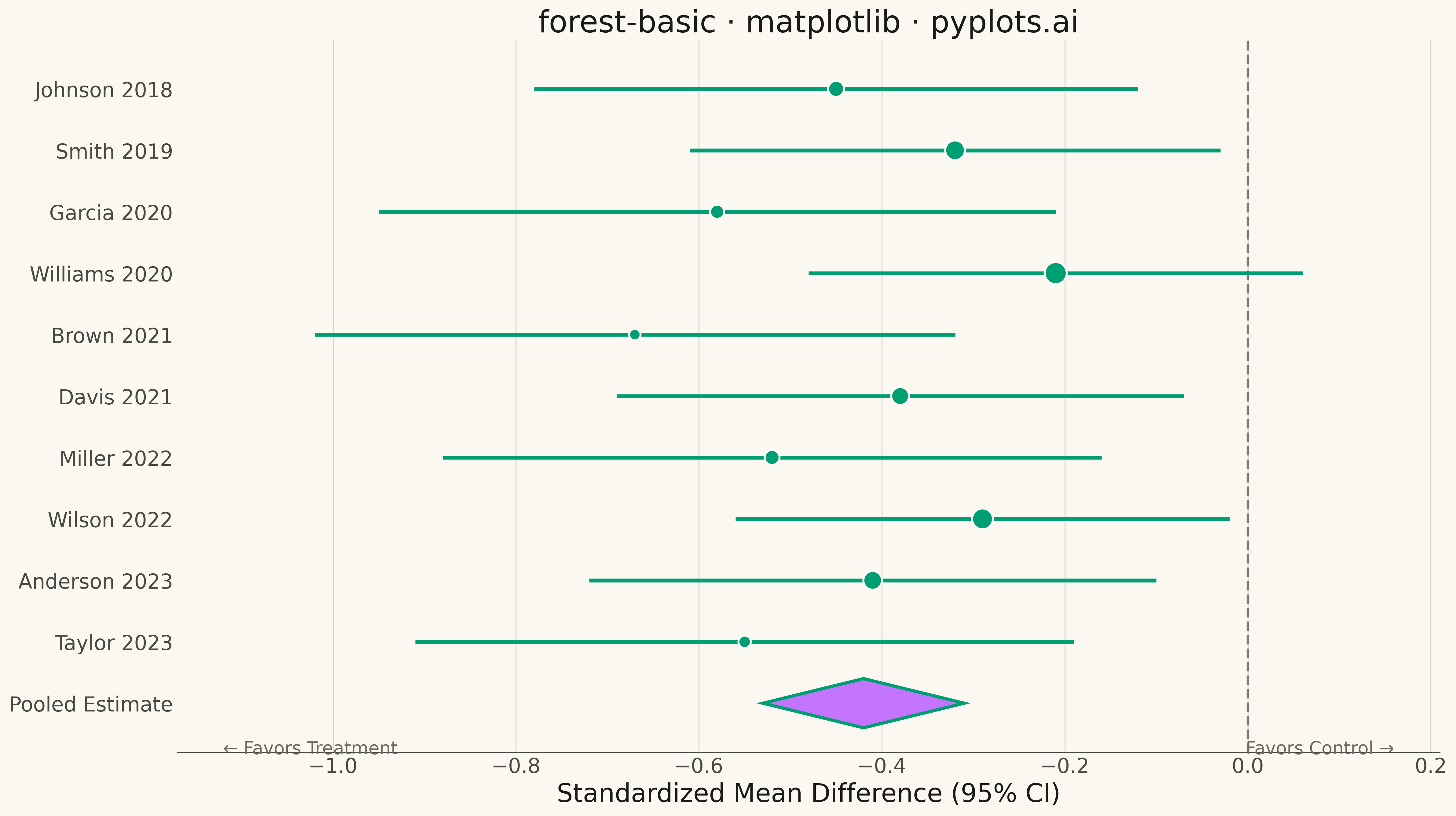
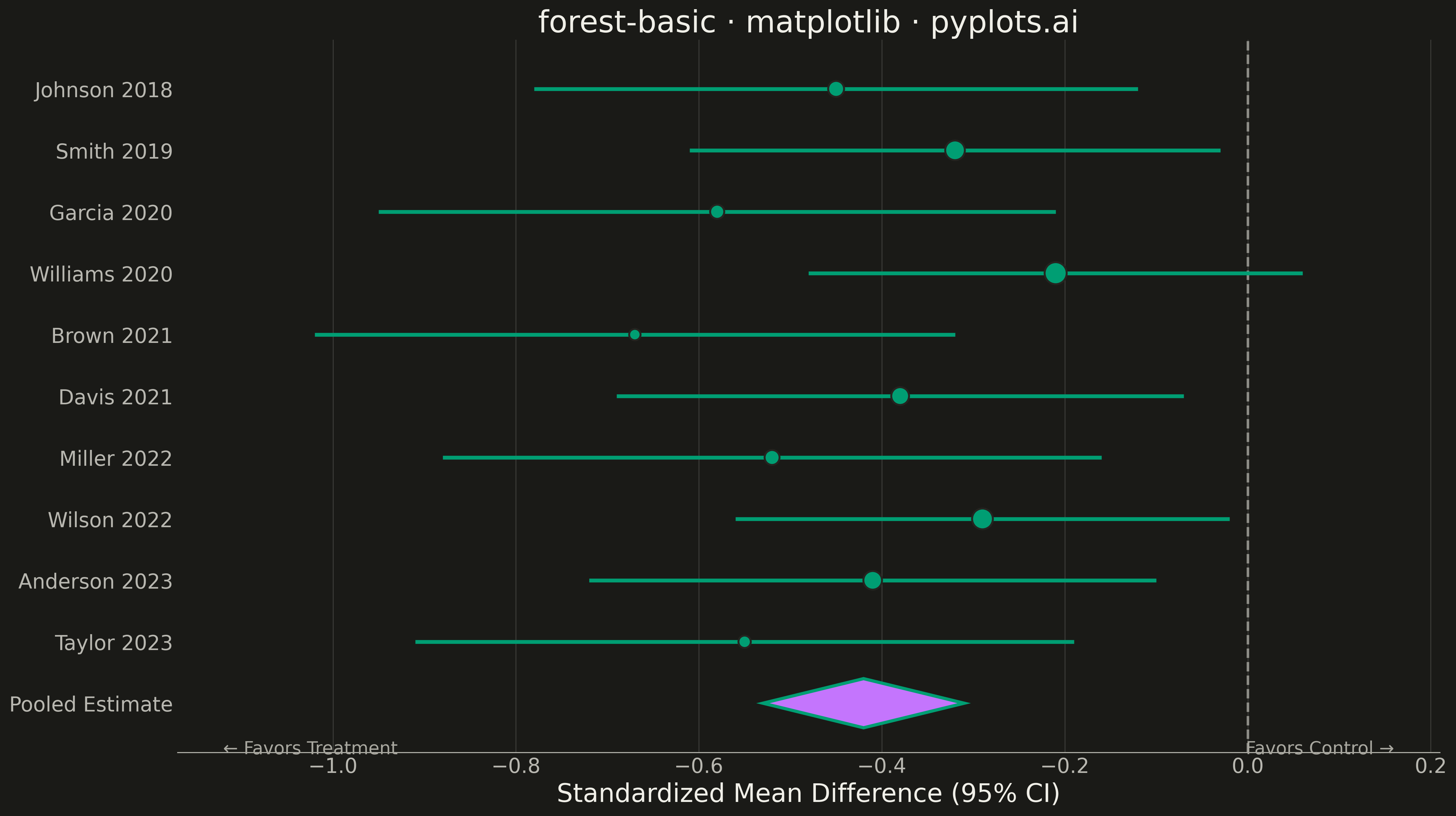
A forest plot displays effect sizes with confidence intervals from multiple studies in a meta-analysis. Each study is represented as a point estimate with horizontal whiskers showing the confidence interval, and a diamond at the bottom shows the pooled estimate. The plot includes a vertical reference line at the null effect (typically 0 or 1), making it easy to assess statistical significance and heterogeneity across studies.
""" anyplot.ai
forest-basic: Meta-Analysis Forest Plot
Library: matplotlib 3.10.9 | Python 3.13.13
Quality: 90/100 | Updated: 2026-05-11
"""

import os

import matplotlib.patches as mpatches
import matplotlib.pyplot as plt
import numpy as np


# Theme configuration
THEME = os.getenv("ANYPLOT_THEME", "light")
PAGE_BG = "#FAF8F1" if THEME == "light" else "#1A1A17"
ELEVATED_BG = "#FFFDF6" if THEME == "light" else "#242420"
INK = "#1A1A17" if THEME == "light" else "#F0EFE8"
INK_SOFT = "#4A4A44" if THEME == "light" else "#B8B7B0"
INK_MUTED = "#6B6A63" if THEME == "light" else "#A8A79F"
RULE = "rgba(26,26,23,0.10)" if THEME == "light" else "rgba(240,239,232,0.10)"

# Okabe-Ito palette
OKABE_ITO_1 = "#009E73"  # Primary data color (brand green)
OKABE_ITO_2 = "#C475FD"  # Secondary

# Data: Meta-analysis of RCTs comparing treatment efficacy (standardized mean difference)
studies = [
    "Johnson 2018",
    "Smith 2019",
    "Garcia 2020",
    "Williams 2020",
    "Brown 2021",
    "Davis 2021",
    "Miller 2022",
    "Wilson 2022",
    "Anderson 2023",
    "Taylor 2023",
]

# Effect sizes (standardized mean difference) and 95% CIs
effect_sizes = np.array([-0.45, -0.32, -0.58, -0.21, -0.67, -0.38, -0.52, -0.29, -0.41, -0.55])
ci_lower = np.array([-0.78, -0.61, -0.95, -0.48, -1.02, -0.69, -0.88, -0.56, -0.72, -0.91])
ci_upper = np.array([-0.12, -0.03, -0.21, 0.06, -0.32, -0.07, -0.16, -0.02, -0.10, -0.19])

# Study weights (based on sample size / inverse variance)
weights = np.array([8.5, 10.2, 7.8, 11.5, 6.9, 9.3, 8.1, 10.8, 9.7, 7.2])

# Pooled estimate (random effects meta-analysis)
pooled_effect = -0.42
pooled_ci_lower = -0.53
pooled_ci_upper = -0.31

# Create figure
fig, ax = plt.subplots(figsize=(16, 9), facecolor=PAGE_BG)
ax.set_facecolor(PAGE_BG)

n_studies = len(studies)
y_positions = np.arange(n_studies, 0, -1)

# Normalize weights for marker sizing (scale between 80 and 300)
weight_normalized = (weights - weights.min()) / (weights.max() - weights.min())
marker_sizes = 80 + weight_normalized * 220

# Plot vertical reference line at null effect (0)
ax.axvline(x=0, color=INK_SOFT, linestyle="--", linewidth=2, alpha=0.7, zorder=1)

# Plot confidence intervals as horizontal lines
for y, lower, upper in zip(y_positions, ci_lower, ci_upper, strict=True):
    ax.hlines(y=y, xmin=lower, xmax=upper, color=OKABE_ITO_1, linewidth=3, zorder=2)

# Plot effect size points
ax.scatter(
    effect_sizes, y_positions, s=marker_sizes, color=OKABE_ITO_1, edgecolors=ELEVATED_BG, linewidths=1.5, zorder=3
)

# Plot pooled estimate as diamond
diamond_y = 0
diamond_height = 0.4

# Create diamond shape using polygon
diamond_vertices = np.array(
    [
        [pooled_effect, diamond_y + diamond_height],
        [pooled_ci_upper, diamond_y],
        [pooled_effect, diamond_y - diamond_height],
        [pooled_ci_lower, diamond_y],
    ]
)
diamond_patch = mpatches.Polygon(
    diamond_vertices, closed=True, facecolor=OKABE_ITO_2, edgecolor=OKABE_ITO_1, linewidth=2.5, zorder=4
)
ax.add_patch(diamond_patch)

# Add study labels on y-axis
ax.set_yticks(list(y_positions) + [0])
ax.set_yticklabels(studies + ["Pooled Estimate"], color=INK_SOFT, fontsize=16)

# Styling
ax.set_xlabel("Standardized Mean Difference (95% CI)", fontsize=20, color=INK)
ax.set_title("forest-basic · matplotlib · pyplots.ai", fontsize=24, color=INK, fontweight="medium")
ax.tick_params(axis="x", labelsize=16, colors=INK_SOFT, length=0)
ax.tick_params(axis="y", length=0)

# Set x-axis limits with padding
x_min = min(ci_lower.min(), pooled_ci_lower) - 0.15
x_max = max(ci_upper.max(), pooled_ci_upper) + 0.15
ax.set_xlim(x_min, x_max)

# Set y-axis limits
ax.set_ylim(-0.8, n_studies + 0.8)

# Add subtle grid for x-axis only
ax.grid(True, axis="x", alpha=0.15, linestyle="-", linewidth=0.8, color=INK, zorder=0)
ax.set_axisbelow(True)

# Add annotation for "Favors Treatment" and "Favors Control"
ax.text(x_min + 0.05, -0.6, "← Favors Treatment", fontsize=14, ha="left", va="top", color=INK_MUTED)
ax.text(x_max - 0.05, -0.6, "Favors Control →", fontsize=14, ha="right", va="top", color=INK_MUTED)

# Style spines
ax.spines["top"].set_visible(False)
ax.spines["right"].set_visible(False)
ax.spines["left"].set_visible(False)
ax.spines["bottom"].set_color(INK_SOFT)

plt.tight_layout()
plt.savefig(f"plot-{THEME}.png", dpi=300, bbox_inches="tight", facecolor=PAGE_BG)
Runnable source as JSON, for any HTTP client: https://api.anyplot.ai/specs/forest-basic/matplotlib/code. Any spec id and library id listed in llms-full.txt fit the same URL shape; every URL below is complete and callable.
{
  "spec_id": "forest-basic",
  "language": "python",
  "library": "matplotlib",
  "page": "https://anyplot.ai/forest-basic/python/matplotlib",
  "hub": "https://anyplot.ai/forest-basic",
  "code_json": "https://api.anyplot.ai/specs/forest-basic/matplotlib/code",
  "spec_json": "https://api.anyplot.ai/specs/forest-basic",
  "render_light_png": "https://storage.googleapis.com/anyplot-images/plots/forest-basic/python/matplotlib/plot-light.png",
  "render_dark_png": "https://storage.googleapis.com/anyplot-images/plots/forest-basic/python/matplotlib/plot-dark.png",
  "quality_score": 90.0,
  "license": "MIT",
  "guide": "https://anyplot.ai/llms.txt"
}
Part of Meta-Analysis Forest Plot on anyplot.ai.