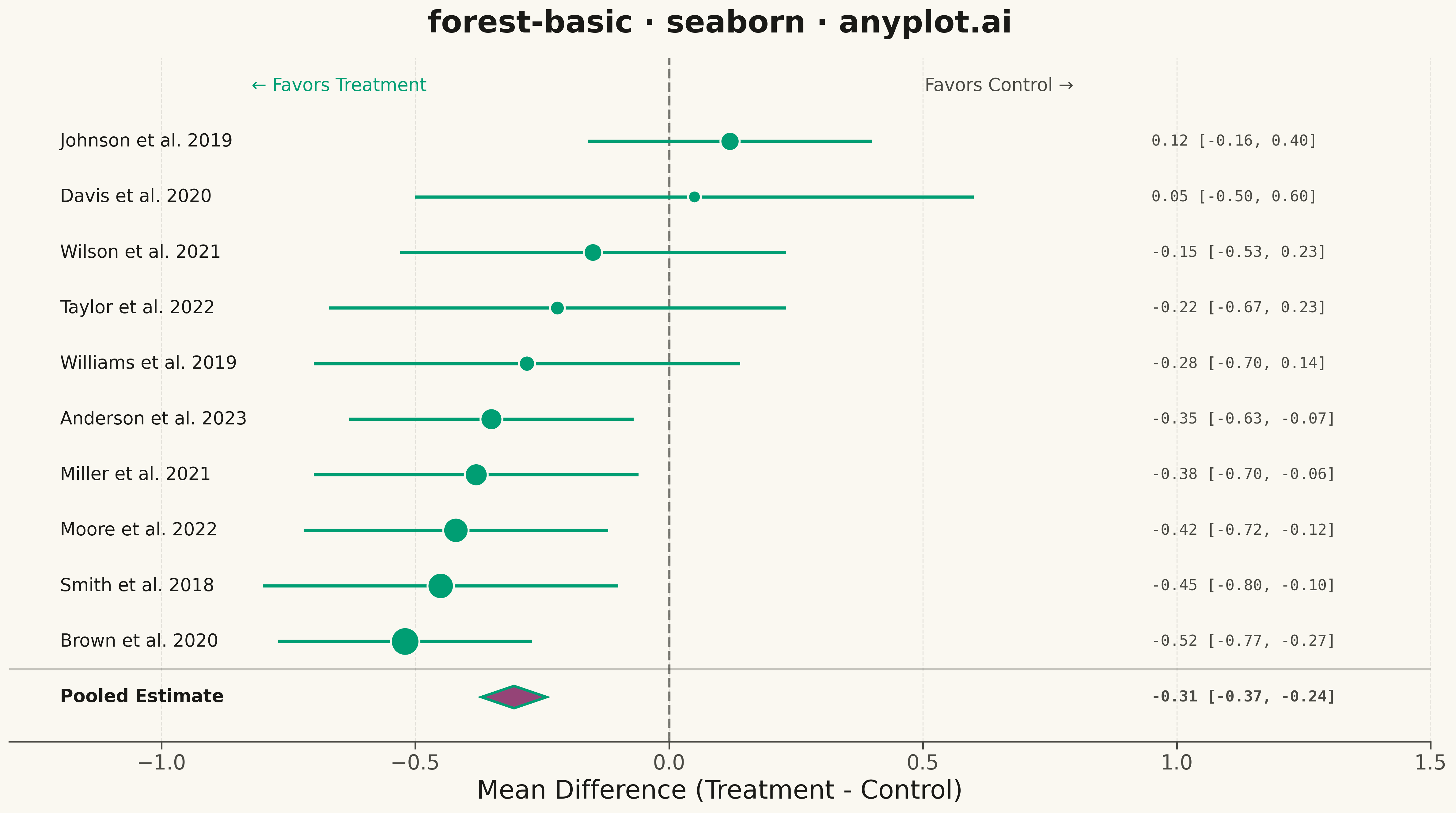
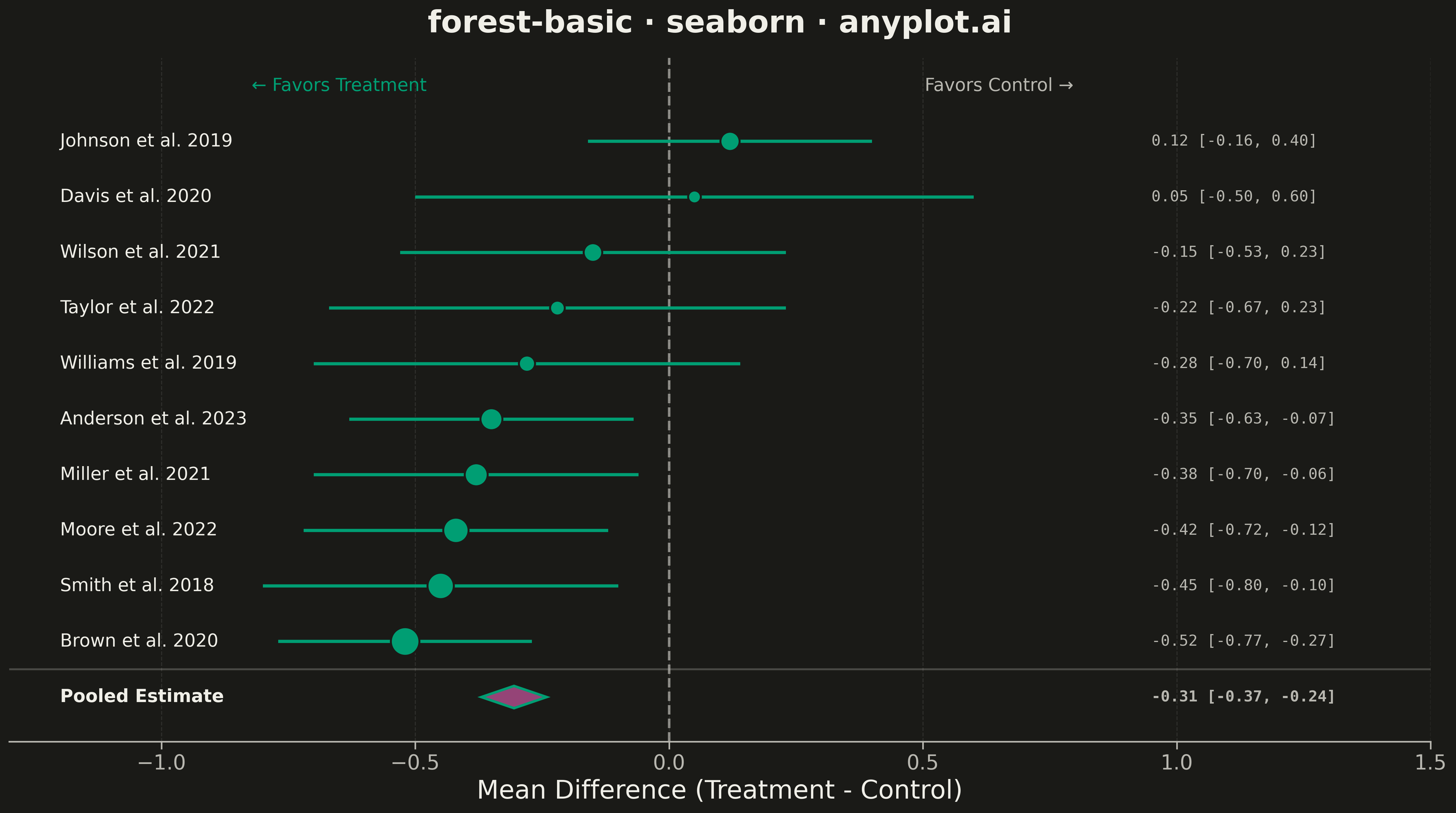
A forest plot displays effect sizes with confidence intervals from multiple studies in a meta-analysis. Each study is represented as a point estimate with horizontal whiskers showing the confidence interval, and a diamond at the bottom shows the pooled estimate. The plot includes a vertical reference line at the null effect (typically 0 or 1), making it easy to assess statistical significance and heterogeneity across studies.
""" anyplot.ai
forest-basic: Meta-Analysis Forest Plot
Library: seaborn 0.13.2 | Python 3.13.13
Quality: 95/100 | Updated: 2026-05-11
"""

import os

import matplotlib.patches as mpatches
import matplotlib.pyplot as plt
import numpy as np
import pandas as pd
import seaborn as sns


# Theme tokens
THEME = os.getenv("ANYPLOT_THEME", "light")
PAGE_BG = "#FAF8F1" if THEME == "light" else "#1A1A17"
ELEVATED_BG = "#FFFDF6" if THEME == "light" else "#242420"
INK = "#1A1A17" if THEME == "light" else "#F0EFE8"
INK_SOFT = "#4A4A44" if THEME == "light" else "#B8B7B0"
BRAND = "#009E73"  # Okabe-Ito position 1

# Configure seaborn theme before creating figure
sns.set_theme(
    style="ticks",
    rc={
        "figure.facecolor": PAGE_BG,
        "axes.facecolor": PAGE_BG,
        "axes.edgecolor": INK_SOFT,
        "axes.labelcolor": INK,
        "text.color": INK,
        "xtick.color": INK_SOFT,
        "ytick.color": INK_SOFT,
        "grid.color": INK,
        "grid.alpha": 0.10,
    },
)

# Data: Meta-analysis of treatment effect (mean difference) from 10 studies
np.random.seed(42)

studies = [
    "Smith et al. 2018",
    "Johnson et al. 2019",
    "Williams et al. 2019",
    "Brown et al. 2020",
    "Davis et al. 2020",
    "Miller et al. 2021",
    "Wilson et al. 2021",
    "Moore et al. 2022",
    "Taylor et al. 2022",
    "Anderson et al. 2023",
]

# Effect sizes (mean differences) - some favor treatment, some favor control
effect_sizes = [-0.45, 0.12, -0.28, -0.52, 0.05, -0.38, -0.15, -0.42, -0.22, -0.35]
ci_widths = [0.35, 0.28, 0.42, 0.25, 0.55, 0.32, 0.38, 0.30, 0.45, 0.28]
ci_lower = [e - w for e, w in zip(effect_sizes, ci_widths, strict=True)]
ci_upper = [e + w for e, w in zip(effect_sizes, ci_widths, strict=True)]
weights = [12.5, 8.2, 6.8, 14.1, 5.5, 10.3, 7.9, 11.8, 6.2, 9.7]

# Calculate pooled estimate (weighted mean)
pooled_effect = np.average(effect_sizes, weights=weights)
pooled_se = np.sqrt(1 / np.sum([w / (ci_w**2) for w, ci_w in zip(weights, ci_widths, strict=True)]))
pooled_ci_lower = pooled_effect - 1.96 * pooled_se
pooled_ci_upper = pooled_effect + 1.96 * pooled_se

df = pd.DataFrame(
    {"study": studies, "effect": effect_sizes, "ci_lower": ci_lower, "ci_upper": ci_upper, "weight": weights}
)

# Sort by effect size
df = df.sort_values("effect", ascending=True).reset_index(drop=True)

# Create figure
fig, ax = plt.subplots(figsize=(16, 9), facecolor=PAGE_BG)
ax.set_facecolor(PAGE_BG)

# Y positions for studies (leave space at bottom for pooled estimate)
y_positions = np.arange(len(df)) + 1.5

# Plot confidence intervals as horizontal lines
for i, (_, row) in enumerate(df.iterrows()):
    ax.hlines(y=y_positions[i], xmin=row["ci_lower"], xmax=row["ci_upper"], color=BRAND, linewidth=2.5, zorder=1)

# Plot point estimates using seaborn
sns.scatterplot(
    data=df,
    x="effect",
    y=y_positions,
    size="weight",
    sizes=(100, 500),
    color=BRAND,
    edgecolor=PAGE_BG,
    linewidth=1.5,
    legend=False,
    ax=ax,
    zorder=2,
)

# Add study labels on the left
for i, (_, row) in enumerate(df.iterrows()):
    ax.text(-1.2, y_positions[i], row["study"], fontsize=14, va="center", ha="left", fontweight="medium", color=INK)

# Add effect size values on the right
for i, (_, row) in enumerate(df.iterrows()):
    ax.text(
        0.95,
        y_positions[i],
        f"{row['effect']:.2f} [{row['ci_lower']:.2f}, {row['ci_upper']:.2f}]",
        fontsize=12,
        va="center",
        ha="left",
        family="monospace",
        color=INK_SOFT,
    )

# Draw pooled estimate diamond
diamond_y = 0.3
diamond_height = 0.4
diamond = mpatches.Polygon(
    [
        [pooled_effect, diamond_y],
        [pooled_ci_lower, diamond_y + diamond_height / 2],
        [pooled_effect, diamond_y + diamond_height],
        [pooled_ci_upper, diamond_y + diamond_height / 2],
    ],
    closed=True,
    facecolor="#954477",
    edgecolor=BRAND,
    linewidth=2,
    zorder=3,
)
ax.add_patch(diamond)

# Add pooled estimate label
ax.text(
    -1.2,
    diamond_y + diamond_height / 2,
    "Pooled Estimate",
    fontsize=14,
    va="center",
    ha="left",
    fontweight="bold",
    color=INK,
)
ax.text(
    0.95,
    diamond_y + diamond_height / 2,
    f"{pooled_effect:.2f} [{pooled_ci_lower:.2f}, {pooled_ci_upper:.2f}]",
    fontsize=12,
    va="center",
    ha="left",
    family="monospace",
    fontweight="bold",
    color=INK_SOFT,
)

# Vertical reference line at null effect (0)
ax.axvline(x=0, color=INK_SOFT, linestyle="--", linewidth=2, zorder=0, alpha=0.7)

# Separator line above pooled estimate
ax.axhline(y=1.0, color=INK_SOFT, linewidth=1.5, zorder=0, alpha=0.3)

# Styling
ax.set_xlim(-1.3, 1.5)
ax.set_ylim(-0.3, len(df) + 2)
ax.set_xlabel("Mean Difference (Treatment - Control)", fontsize=20, color=INK, fontweight="medium")
ax.set_ylabel("")
ax.set_title("forest-basic · seaborn · anyplot.ai", fontsize=24, fontweight="bold", pad=20, color=INK)

# Remove y-axis ticks (study names are shown as text)
ax.set_yticks([])

# Style x-axis ticks
ax.tick_params(axis="x", labelsize=16, colors=INK_SOFT)

# Add annotation for interpretation
ax.text(
    -0.65, len(df) + 1.5, "← Favors Treatment", fontsize=14, ha="center", va="center", color=BRAND, fontweight="medium"
)
ax.text(
    0.65, len(df) + 1.5, "Favors Control →", fontsize=14, ha="center", va="center", color=INK_SOFT, fontweight="medium"
)

# Adjust grid
ax.grid(axis="x", alpha=0.1, linestyle="--", color=INK, linewidth=0.8)
ax.grid(axis="y", visible=False)

# Remove top and right spines
sns.despine(left=True)

plt.tight_layout()
plt.savefig(f"plot-{THEME}.png", dpi=300, bbox_inches="tight", facecolor=PAGE_BG)
Runnable source as JSON, for any HTTP client: https://api.anyplot.ai/specs/forest-basic/seaborn/code. Any spec id and library id listed in llms-full.txt fit the same URL shape; every URL below is complete and callable.
{
  "spec_id": "forest-basic",
  "language": "python",
  "library": "seaborn",
  "page": "https://anyplot.ai/forest-basic/python/seaborn",
  "hub": "https://anyplot.ai/forest-basic",
  "code_json": "https://api.anyplot.ai/specs/forest-basic/seaborn/code",
  "spec_json": "https://api.anyplot.ai/specs/forest-basic",
  "render_light_png": "https://storage.googleapis.com/anyplot-images/plots/forest-basic/python/seaborn/plot-light.png",
  "render_dark_png": "https://storage.googleapis.com/anyplot-images/plots/forest-basic/python/seaborn/plot-dark.png",
  "quality_score": 95.0,
  "license": "MIT",
  "guide": "https://anyplot.ai/llms.txt"
}
Part of Meta-Analysis Forest Plot on anyplot.ai.