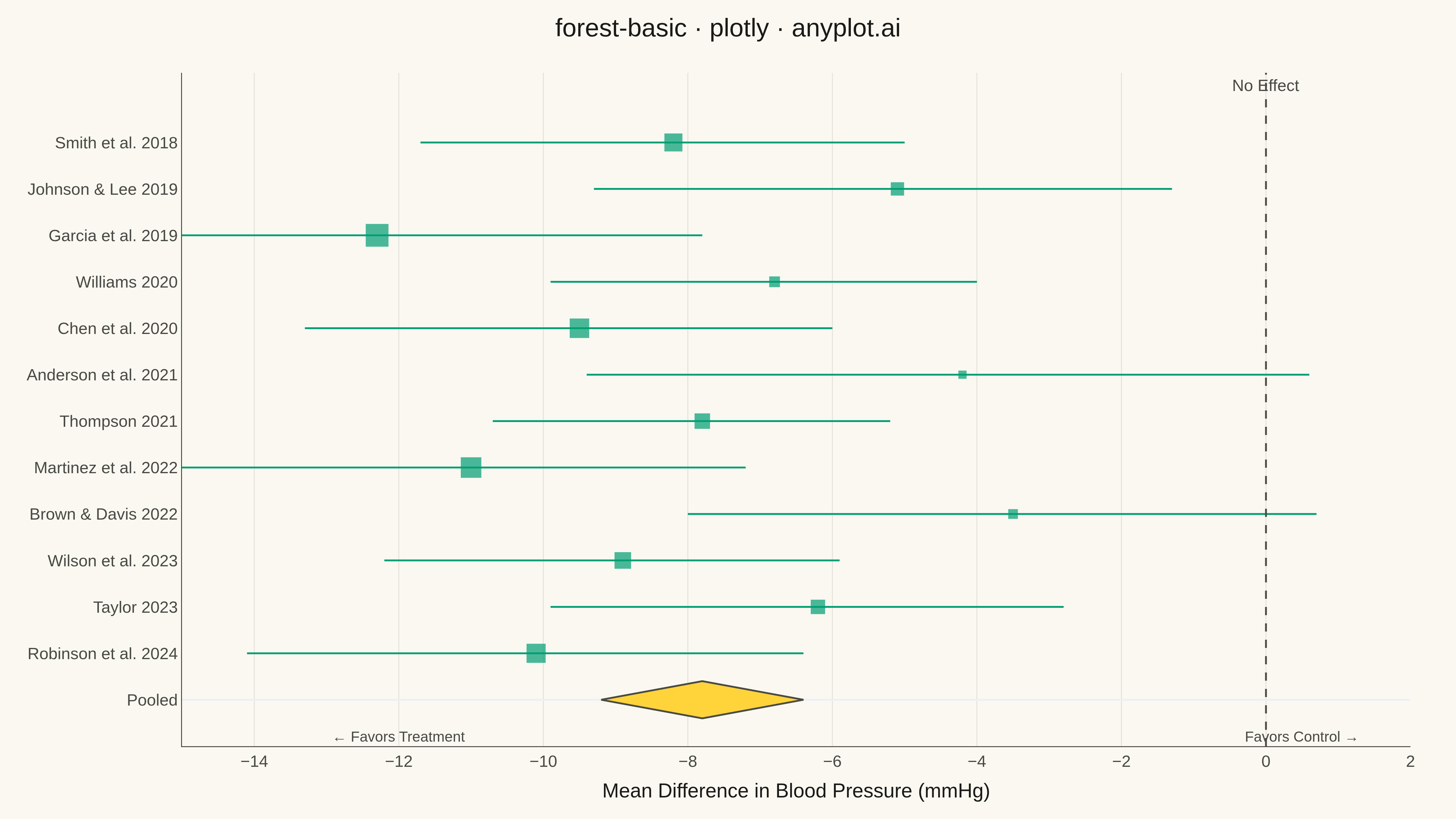
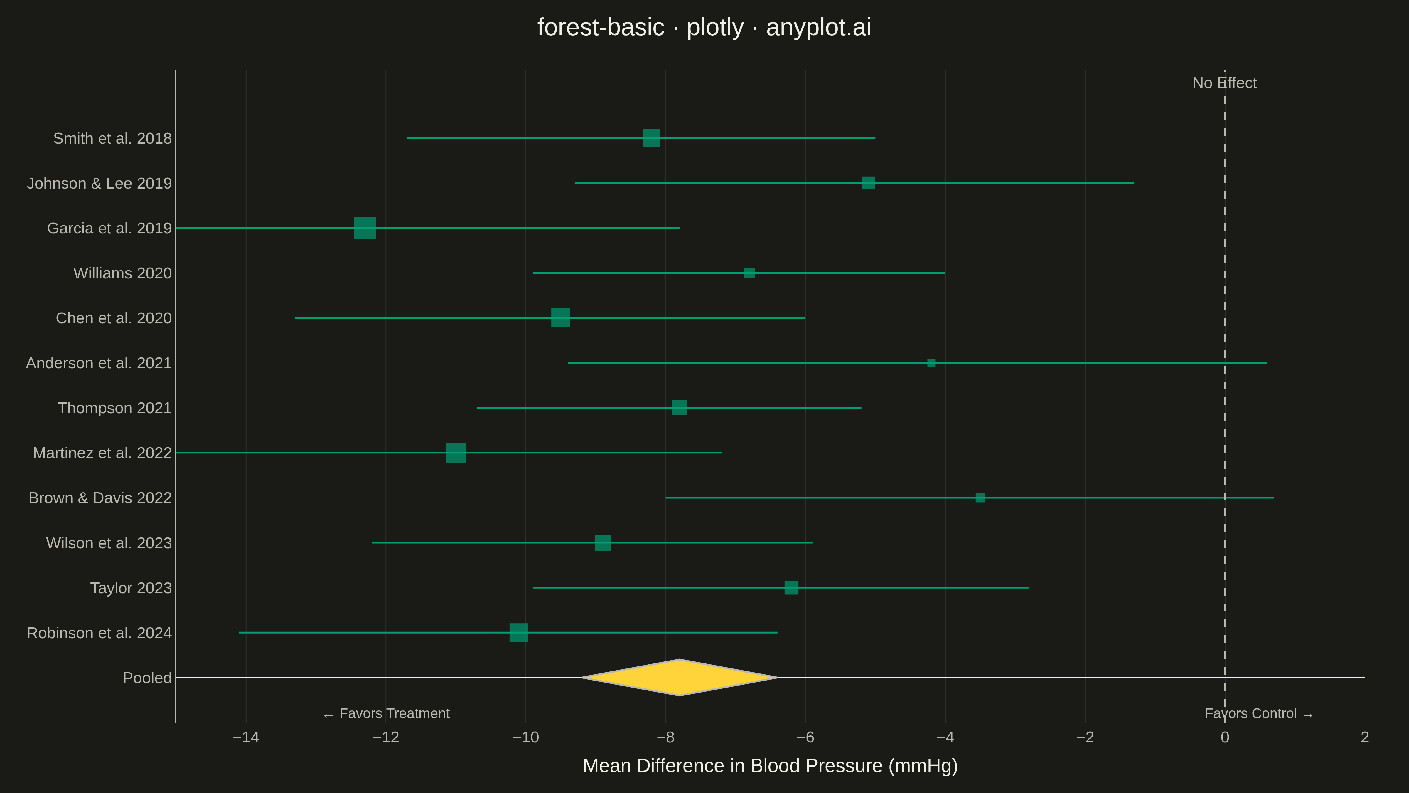
A forest plot displays effect sizes with confidence intervals from multiple studies in a meta-analysis. Each study is represented as a point estimate with horizontal whiskers showing the confidence interval, and a diamond at the bottom shows the pooled estimate. The plot includes a vertical reference line at the null effect (typically 0 or 1), making it easy to assess statistical significance and heterogeneity across studies.
""" anyplot.ai
forest-basic: Meta-Analysis Forest Plot
Library: plotly 6.7.0 | Python 3.13.13
Quality: 83/100 | Updated: 2026-05-11
"""

import numpy as np
import plotly.graph_objects as go


# Data: Meta-analysis of blood pressure reduction trials (mmHg)
np.random.seed(42)

studies = [
    "Smith et al. 2018",
    "Johnson & Lee 2019",
    "Garcia et al. 2019",
    "Williams 2020",
    "Chen et al. 2020",
    "Anderson et al. 2021",
    "Thompson 2021",
    "Martinez et al. 2022",
    "Brown & Davis 2022",
    "Wilson et al. 2023",
    "Taylor 2023",
    "Robinson et al. 2024",
]

# Effect sizes (mean difference in mmHg) and confidence intervals
effect_sizes = np.array([-8.2, -5.1, -12.3, -6.8, -9.5, -4.2, -7.8, -11.0, -3.5, -8.9, -6.2, -10.1])
ci_lower = effect_sizes - np.array([3.5, 4.2, 4.8, 3.1, 3.8, 5.2, 2.9, 4.1, 4.5, 3.3, 3.7, 4.0])
ci_upper = effect_sizes + np.array([3.2, 3.8, 4.5, 2.8, 3.5, 4.8, 2.6, 3.8, 4.2, 3.0, 3.4, 3.7])
weights = np.array([8.5, 7.2, 9.8, 6.5, 8.9, 5.8, 7.8, 9.2, 6.2, 8.1, 7.5, 8.8])

# Pooled estimate (random effects meta-analysis)
pooled_effect = -7.8
pooled_ci_lower = -9.2
pooled_ci_upper = -6.4

# Y positions for studies (reversed for top-to-bottom display)
y_positions = list(range(len(studies), 0, -1))
pooled_y = 0

# Normalize weights for marker sizing (scale 8-24)
weight_normalized = 8 + (weights - weights.min()) / (weights.max() - weights.min()) * 16

# Create figure
fig = go.Figure()

# Add confidence interval lines for each study
for i, (y, lower, upper) in enumerate(zip(y_positions, ci_lower, ci_upper)):
    fig.add_trace(
        go.Scatter(
            x=[lower, upper],
            y=[y, y],
            mode="lines",
            line=dict(color="#306998", width=2),
            showlegend=False,
            hoverinfo="skip",
        )
    )

# Add study point estimates
fig.add_trace(
    go.Scatter(
        x=effect_sizes,
        y=y_positions,
        mode="markers",
        marker=dict(size=weight_normalized, color="#306998", symbol="square", line=dict(color="#1a3d5c", width=1)),
        text=[
            f"{s}<br>Effect: {e:.1f} [{l:.1f}, {u:.1f}]"
            for s, e, l, u in zip(studies, effect_sizes, ci_lower, ci_upper)
        ],
        hovertemplate="%{text}<extra></extra>",
        name="Studies",
        showlegend=False,
    )
)

# Add pooled estimate diamond
diamond_width = (pooled_ci_upper - pooled_ci_lower) / 2
diamond_height = 0.4
fig.add_trace(
    go.Scatter(
        x=[pooled_ci_lower, pooled_effect, pooled_ci_upper, pooled_effect, pooled_ci_lower],
        y=[pooled_y, pooled_y + diamond_height, pooled_y, pooled_y - diamond_height, pooled_y],
        mode="lines",
        fill="toself",
        fillcolor="#FFD43B",
        line=dict(color="#b8960f", width=2),
        name="Pooled Estimate",
        hovertemplate=f"Pooled Effect: {pooled_effect:.1f} [{pooled_ci_lower:.1f}, {pooled_ci_upper:.1f}]<extra></extra>",
        showlegend=False,
    )
)

# Add vertical reference line at null effect (0)
fig.add_vline(x=0, line=dict(color="#666666", width=2, dash="dash"))

# Add annotation for null line
fig.add_annotation(
    x=0, y=len(studies) + 1, text="No Effect", showarrow=False, font=dict(size=18, color="#666666"), yanchor="bottom"
)

# Update layout
fig.update_layout(
    title=dict(text="forest-basic · plotly · pyplots.ai", font=dict(size=28), x=0.5, xanchor="center"),
    xaxis=dict(
        title=dict(text="Mean Difference in Blood Pressure (mmHg)", font=dict(size=22)),
        tickfont=dict(size=18),
        zeroline=False,
        showgrid=True,
        gridcolor="rgba(0,0,0,0.1)",
        gridwidth=1,
        range=[-20, 5],
    ),
    yaxis=dict(
        tickmode="array",
        tickvals=[0] + y_positions,
        ticktext=["Pooled"] + studies,
        tickfont=dict(size=18),
        showgrid=False,
        range=[-1, len(studies) + 1.5],
    ),
    template="plotly_white",
    plot_bgcolor="white",
    paper_bgcolor="white",
    margin=dict(l=200, r=50, t=80, b=80),
    showlegend=False,
)

# Add annotation for "Favors Treatment" and "Favors Control"
fig.add_annotation(
    x=-15, y=-0.8, text="← Favors Treatment", showarrow=False, font=dict(size=16, color="#306998"), xanchor="center"
)

fig.add_annotation(
    x=2.5, y=-0.8, text="Favors Control →", showarrow=False, font=dict(size=16, color="#306998"), xanchor="center"
)

# Save as PNG (4800x2700 via scale)
fig.write_image("plot.png", width=1600, height=900, scale=3)

# Save as HTML for interactivity
fig.write_html("plot.html", include_plotlyjs="cdn")
Runnable source as JSON, for any HTTP client: https://api.anyplot.ai/specs/forest-basic/plotly/code. Any spec id and library id listed in llms-full.txt fit the same URL shape; every URL below is complete and callable.
{
  "spec_id": "forest-basic",
  "language": "python",
  "library": "plotly",
  "page": "https://anyplot.ai/forest-basic/python/plotly",
  "hub": "https://anyplot.ai/forest-basic",
  "code_json": "https://api.anyplot.ai/specs/forest-basic/plotly/code",
  "spec_json": "https://api.anyplot.ai/specs/forest-basic",
  "render_light_png": "https://storage.googleapis.com/anyplot-images/plots/forest-basic/python/plotly/plot-light.png",
  "render_dark_png": "https://storage.googleapis.com/anyplot-images/plots/forest-basic/python/plotly/plot-dark.png",
  "interactive_light_html": "https://storage.googleapis.com/anyplot-images/plots/forest-basic/python/plotly/plot-light.html",
  "interactive_dark_html": "https://storage.googleapis.com/anyplot-images/plots/forest-basic/python/plotly/plot-dark.html",
  "quality_score": 83.0,
  "license": "MIT",
  "guide": "https://anyplot.ai/llms.txt"
}
Part of Meta-Analysis Forest Plot on anyplot.ai.