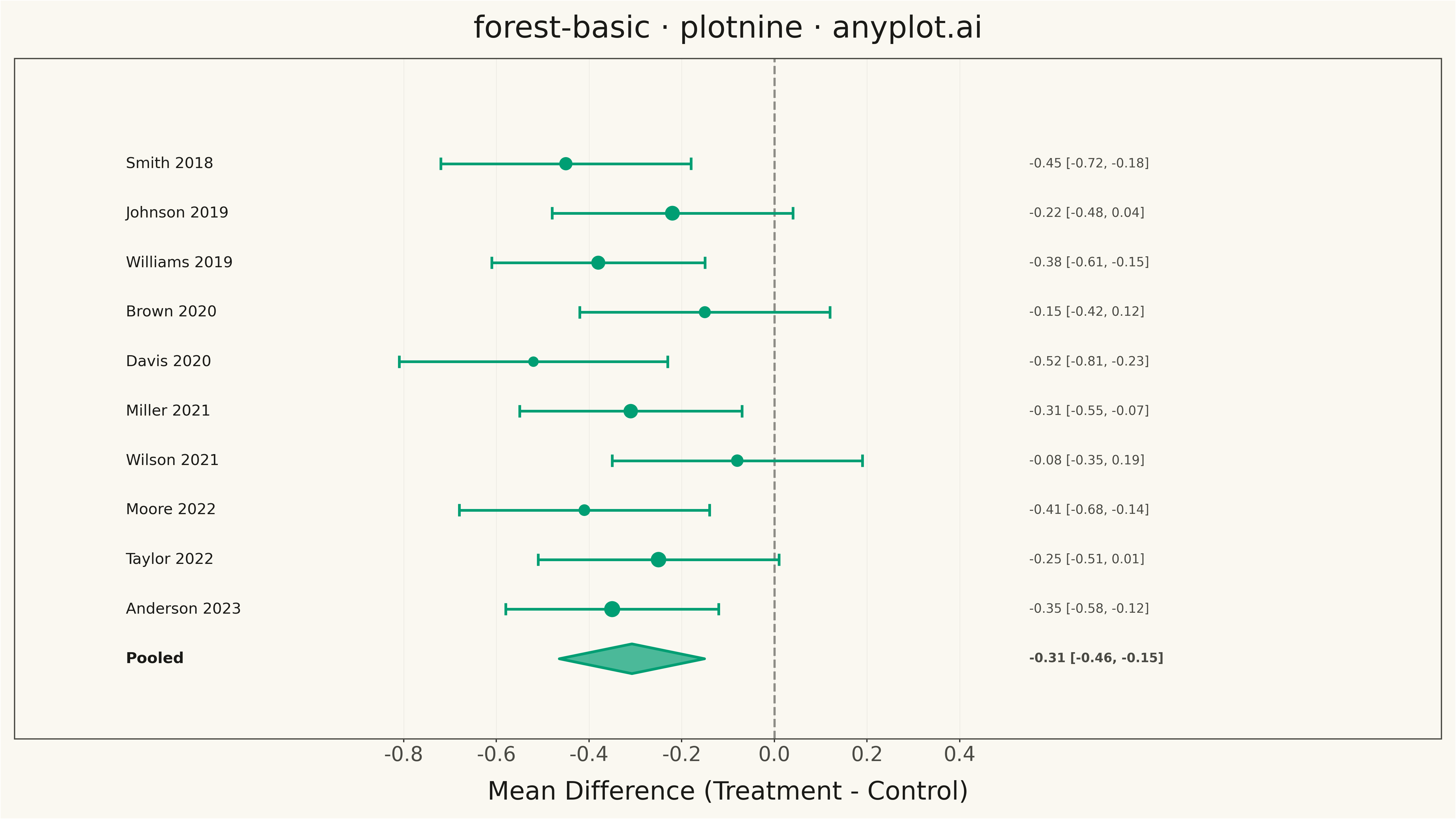
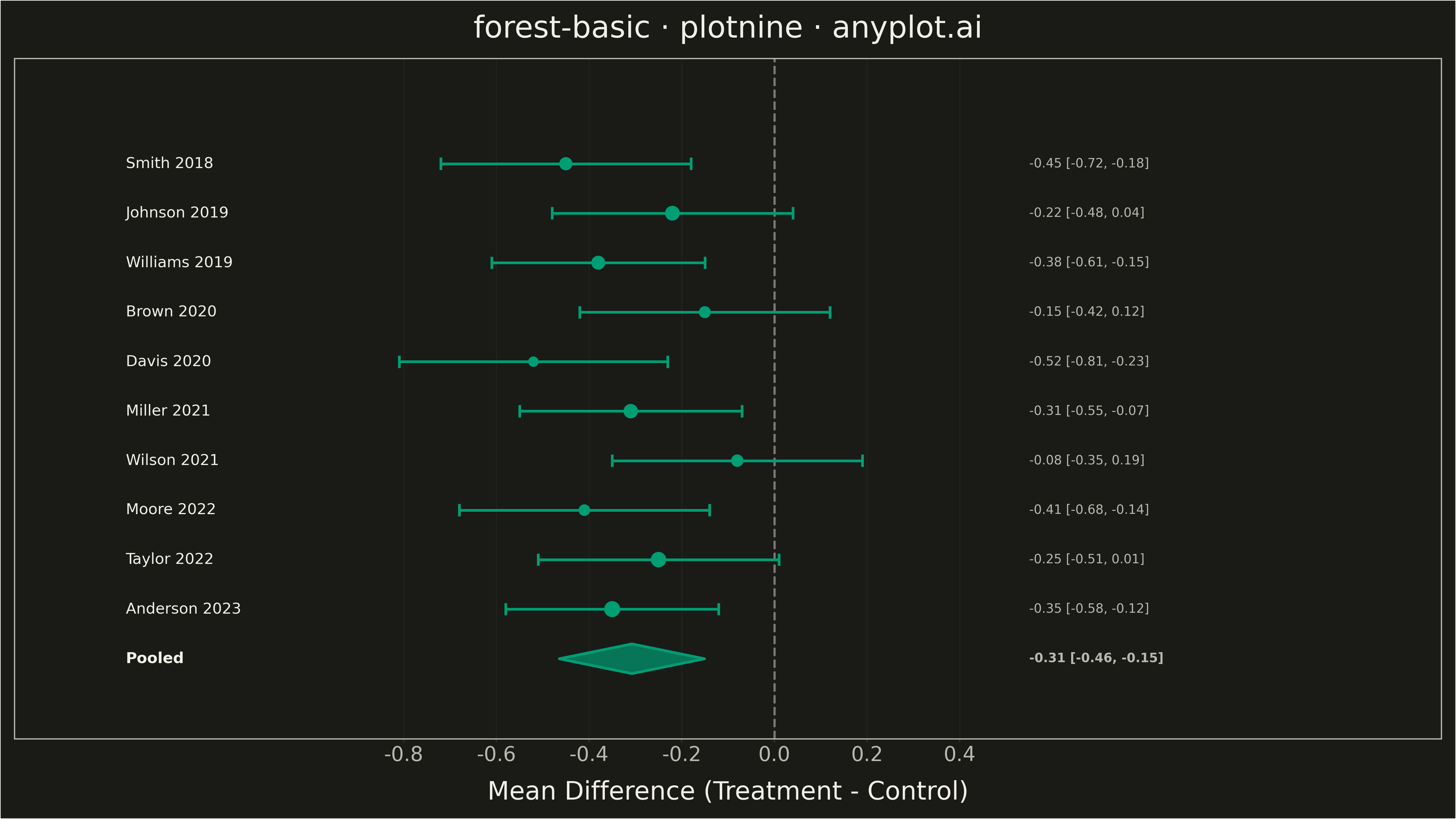
A forest plot displays effect sizes with confidence intervals from multiple studies in a meta-analysis. Each study is represented as a point estimate with horizontal whiskers showing the confidence interval, and a diamond at the bottom shows the pooled estimate. The plot includes a vertical reference line at the null effect (typically 0 or 1), making it easy to assess statistical significance and heterogeneity across studies.
""" anyplot.ai
forest-basic: Meta-Analysis Forest Plot
Library: plotnine 0.15.4 | Python 3.13.13
Quality: 92/100 | Updated: 2026-05-11
"""

import os
import sys


sys.path = [p for p in sys.path if p != "" and "/forest-basic" not in p]

import pandas as pd
from plotnine import (
    aes,
    element_blank,
    element_line,
    element_rect,
    element_text,
    geom_errorbarh,
    geom_point,
    geom_polygon,
    geom_text,
    geom_vline,
    ggplot,
    labs,
    scale_size_identity,
    scale_x_continuous,
    scale_y_continuous,
    theme,
)


# Theme tokens
THEME = os.getenv("ANYPLOT_THEME", "light")
PAGE_BG = "#FAF8F1" if THEME == "light" else "#1A1A17"
INK = "#1A1A17" if THEME == "light" else "#F0EFE8"
INK_SOFT = "#4A4A44" if THEME == "light" else "#B8B7B0"
INK_MUTED = "#6B6A63" if THEME == "light" else "#A8A79F"
BRAND = "#009E73"

# Data: Meta-analysis of RCTs comparing treatment vs control
studies = pd.DataFrame(
    {
        "study": [
            "Smith 2018",
            "Johnson 2019",
            "Williams 2019",
            "Brown 2020",
            "Davis 2020",
            "Miller 2021",
            "Wilson 2021",
            "Moore 2022",
            "Taylor 2022",
            "Anderson 2023",
        ],
        "effect_size": [-0.45, -0.22, -0.38, -0.15, -0.52, -0.31, -0.08, -0.41, -0.25, -0.35],
        "ci_lower": [-0.72, -0.48, -0.61, -0.42, -0.81, -0.55, -0.35, -0.68, -0.51, -0.58],
        "ci_upper": [-0.18, 0.04, -0.15, 0.12, -0.23, -0.07, 0.19, -0.14, 0.01, -0.12],
        "weight": [9.8, 11.2, 10.5, 8.7, 7.3, 10.9, 9.1, 8.4, 11.8, 12.3],
    }
)

# Calculate pooled estimate (weighted mean)
pooled_effect = (studies["effect_size"] * studies["weight"]).sum() / studies["weight"].sum()
pooled_se = 0.08
pooled_lower = pooled_effect - 1.96 * pooled_se
pooled_upper = pooled_effect + 1.96 * pooled_se

# Create y positions (studies listed top to bottom, pooled at bottom)
studies["y_pos"] = range(len(studies), 0, -1)

# Scale marker sizes for visibility (based on weight, scaled for canvas)
studies["marker_size"] = studies["weight"] * 0.5

# Create diamond for pooled estimate
diamond_y = 0
diamond = pd.DataFrame(
    {
        "x": [pooled_lower, pooled_effect, pooled_upper, pooled_effect],
        "y": [diamond_y, diamond_y + 0.3, diamond_y, diamond_y - 0.3],
    }
)

# Create label data for study names and effect sizes
studies["label"] = (
    studies["effect_size"].round(2).astype(str)
    + " ["
    + studies["ci_lower"].round(2).astype(str)
    + ", "
    + studies["ci_upper"].round(2).astype(str)
    + "]"
)

# Fixed positions for text columns
x_left = -1.4
x_right = 0.55

# Add fixed positions to dataframe
studies["x_left"] = x_left
studies["x_right"] = x_right

# Pooled estimate label data
pooled_label_left = pd.DataFrame({"x": [x_left], "y": [diamond_y], "label": ["Pooled"]})
pooled_label_right = pd.DataFrame(
    {"x": [x_right], "y": [diamond_y], "label": [f"{pooled_effect:.2f} [{pooled_lower:.2f}, {pooled_upper:.2f}]"]}
)

# Plot
plot = (
    ggplot()
    + geom_vline(xintercept=0, linetype="dashed", color=INK_SOFT, size=1, alpha=0.6)
    + geom_errorbarh(aes(y="y_pos", xmin="ci_lower", xmax="ci_upper"), data=studies, height=0.25, size=1.2, color=BRAND)
    + geom_point(aes(x="effect_size", y="y_pos", size="marker_size"), data=studies, color=BRAND, fill=BRAND)
    + scale_size_identity()
    + geom_polygon(aes(x="x", y="y"), data=diamond, fill=BRAND, color=BRAND, size=1.2, alpha=0.7)
    + geom_text(aes(x="x_left", y="y_pos", label="study"), data=studies, ha="left", size=12, color=INK)
    + geom_text(aes(x="x_right", y="y_pos", label="label"), data=studies, ha="left", size=10, color=INK_SOFT)
    + geom_text(
        aes(x="x", y="y", label="label"), data=pooled_label_left, ha="left", size=12, fontweight="bold", color=INK
    )
    + geom_text(
        aes(x="x", y="y", label="label"), data=pooled_label_right, ha="left", size=10, fontweight="bold", color=INK_SOFT
    )
    + labs(x="Mean Difference (Treatment - Control)", y="", title="forest-basic · plotnine · anyplot.ai")
    + scale_x_continuous(breaks=[-0.8, -0.6, -0.4, -0.2, 0, 0.2, 0.4], limits=(-1.5, 1.3))
    + scale_y_continuous(breaks=[], limits=(-1, 11.5))
    + theme(
        figure_size=(16, 9),
        panel_background=element_rect(fill=PAGE_BG, color=None),
        plot_background=element_rect(fill=PAGE_BG, color=None),
        panel_grid_major_x=element_line(color=INK, size=0.3, alpha=0.10),
        panel_grid_major_y=element_blank(),
        panel_grid_minor=element_blank(),
        axis_text_x=element_text(size=16, color=INK_SOFT),
        axis_text_y=element_blank(),
        axis_title_x=element_text(size=20, color=INK),
        axis_title_y=element_blank(),
        plot_title=element_text(size=24, ha="center", color=INK),
        axis_ticks_major_y=element_blank(),
        legend_position="none",
        panel_border=element_rect(color=INK_SOFT, fill=None),
    )
)

# Save
plot.save(f"plot-{THEME}.png", dpi=300, verbose=False)
Runnable source as JSON, for any HTTP client: https://api.anyplot.ai/specs/forest-basic/plotnine/code. Any spec id and library id listed in llms-full.txt fit the same URL shape; every URL below is complete and callable.
{
  "spec_id": "forest-basic",
  "language": "python",
  "library": "plotnine",
  "page": "https://anyplot.ai/forest-basic/python/plotnine",
  "hub": "https://anyplot.ai/forest-basic",
  "code_json": "https://api.anyplot.ai/specs/forest-basic/plotnine/code",
  "spec_json": "https://api.anyplot.ai/specs/forest-basic",
  "render_light_png": "https://storage.googleapis.com/anyplot-images/plots/forest-basic/python/plotnine/plot-light.png",
  "render_dark_png": "https://storage.googleapis.com/anyplot-images/plots/forest-basic/python/plotnine/plot-dark.png",
  "quality_score": 92.0,
  "license": "MIT",
  "guide": "https://anyplot.ai/llms.txt"
}
Part of Meta-Analysis Forest Plot on anyplot.ai.