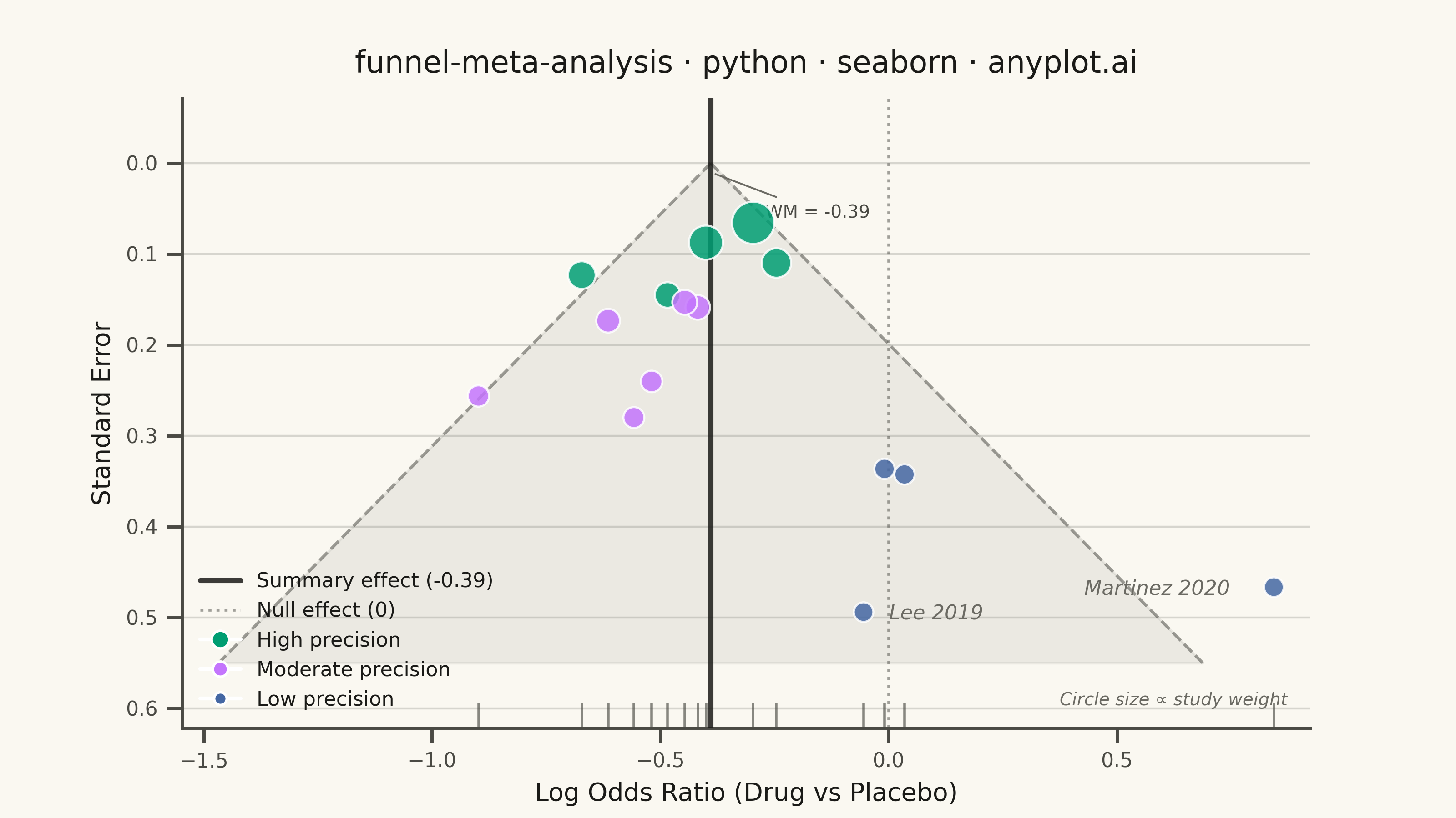
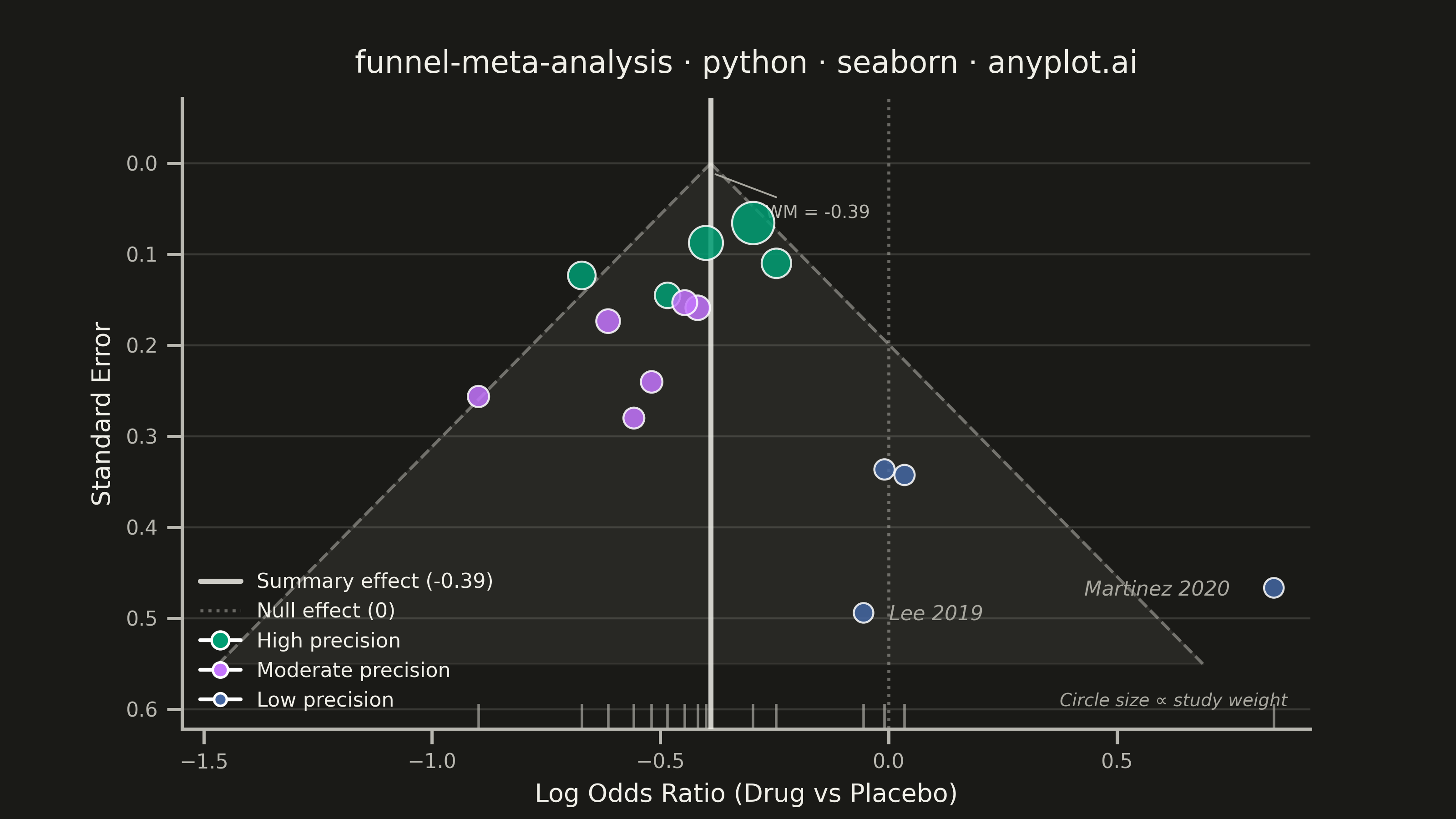
A funnel plot used in meta-analysis to assess publication bias by plotting individual study effect sizes against their precision (typically standard error). Studies scatter around a summary effect line, with pseudo 95% confidence limits forming an inverted funnel shape. In the absence of bias, studies distribute symmetrically around the summary effect; asymmetry suggests publication bias or systematic heterogeneity. This is a standard tool in systematic reviews and Cochrane-style meta-analyses.
""" anyplot.ai
funnel-meta-analysis: Meta-Analysis Funnel Plot for Publication Bias
Library: seaborn 0.13.2 | Python 3.13.13
Quality: 87/100 | Updated: 2026-06-10
"""

import os
import sys


# Remove script directory from sys.path to prevent sibling .py files from
# shadowing installed packages (e.g. matplotlib.py → import matplotlib conflict)
_script_dir = os.path.dirname(os.path.abspath(__file__))
if _script_dir in sys.path:
    sys.path.remove(_script_dir)

import matplotlib.pyplot as plt
import numpy as np
import pandas as pd
import seaborn as sns
from matplotlib.lines import Line2D


# Theme-adaptive chrome tokens
THEME = os.getenv("ANYPLOT_THEME", "light")
PAGE_BG = "#FAF8F1" if THEME == "light" else "#1A1A17"
ELEVATED_BG = "#FFFDF6" if THEME == "light" else "#242420"
INK = "#1A1A17" if THEME == "light" else "#F0EFE8"
INK_SOFT = "#4A4A44" if THEME == "light" else "#B8B7B0"
INK_MUTED = "#6B6A63" if THEME == "light" else "#A8A79F"

# Imprint palette — canonical order, first series always #009E73
IMPRINT_PALETTE = ["#009E73", "#C475FD", "#4467A3", "#BD8233", "#AE3030", "#2ABCCD", "#954477", "#99B314"]

# Seaborn theme with theme-adaptive chrome
sns.set_theme(
    style="ticks",
    rc={
        "figure.facecolor": PAGE_BG,
        "axes.facecolor": PAGE_BG,
        "axes.edgecolor": INK_SOFT,
        "axes.labelcolor": INK,
        "text.color": INK,
        "xtick.color": INK_SOFT,
        "ytick.color": INK_SOFT,
        "grid.color": INK_SOFT,
        "grid.alpha": 0.2,
        "grid.linewidth": 0.6,
        "axes.grid": False,
        "legend.facecolor": ELEVATED_BG,
        "legend.edgecolor": INK_SOFT,
        "font.family": "sans-serif",
    },
)
sns.set_context("notebook", font_scale=1.0)

# Data
np.random.seed(42)

studies = [
    "Adams 2018",
    "Baker 2019",
    "Chen 2017",
    "Diaz 2020",
    "Evans 2016",
    "Fischer 2021",
    "Garcia 2019",
    "Hughes 2018",
    "Ibrahim 2020",
    "Jones 2017",
    "Kim 2021",
    "Lee 2019",
    "Martinez 2020",
    "Novak 2018",
    "O'Brien 2022",
]
n_studies = len(studies)
true_effect = -0.35

std_errors = np.concatenate(
    [np.random.uniform(0.05, 0.15, 5), np.random.uniform(0.15, 0.30, 6), np.random.uniform(0.30, 0.50, 4)]
)
effect_sizes = true_effect + np.random.normal(0, 1, n_studies) * std_errors
effect_sizes[-2] += 0.25
effect_sizes[-1] += 0.30

weights = 1 / std_errors**2
summary_effect = np.average(effect_sizes, weights=weights)

df = pd.DataFrame({"effect_size": effect_sizes, "std_error": std_errors, "study": studies, "weight": weights})

df["precision"] = pd.cut(
    df["std_error"], bins=[0, 0.15, 0.30, 1.0], labels=["High precision", "Moderate precision", "Low precision"]
)

# Plot — landscape 3200×1800 px (hard rule: figsize=(8, 4.5), dpi=400, no bbox_inches='tight')
fig, ax = plt.subplots(figsize=(8, 4.5), dpi=400)

se_range = np.linspace(0, 0.55, 300)
ci_left = summary_effect - 1.96 * se_range
ci_right = summary_effect + 1.96 * se_range

# Pseudo 95% CI funnel region
ax.fill_betweenx(se_range, ci_left, ci_right, color=INK_MUTED, alpha=0.10)
ax.plot(ci_left, se_range, color=INK_SOFT, linewidth=1.2, linestyle="--", alpha=0.5)
ax.plot(ci_right, se_range, color=INK_SOFT, linewidth=1.2, linestyle="--", alpha=0.5)

# Reference lines: summary effect (structural INK neutral) and null effect
ax.axvline(x=summary_effect, color=INK, linewidth=2.0, alpha=0.85, zorder=4)
ax.axvline(x=0, color=INK_SOFT, linewidth=1.2, linestyle=":", alpha=0.5, zorder=3)

# Scatter by precision tier — Imprint palette; high precision → green (semantic: quality/good)
tier_palette = {
    "High precision": IMPRINT_PALETTE[0],
    "Moderate precision": IMPRINT_PALETTE[1],
    "Low precision": IMPRINT_PALETTE[2],
}
sns.scatterplot(
    data=df,
    x="effect_size",
    y="std_error",
    hue="precision",
    size="weight",
    sizes=(60, 280),
    palette=tier_palette,
    edgecolor="white",
    linewidth=0.8,
    alpha=0.85,
    zorder=5,
    ax=ax,
    legend=False,
)

# Seaborn rugplot for marginal effect size distribution — idiomatic seaborn feature
sns.rugplot(data=df, x="effect_size", height=0.04, color=INK_SOFT, alpha=0.65, ax=ax)

# Annotate two most imprecise (lower-right outlier) studies
# Martinez 2020 is rightmost — use left-aligned offset to avoid right canvas edge
outliers = df.nlargest(2, "std_error")
for _, row in outliers.iterrows():
    x_offset = -75 if row["study"] == "Martinez 2020" else 10
    ax.annotate(
        row["study"],
        xy=(row["effect_size"], row["std_error"]),
        xytext=(x_offset, -3),
        textcoords="offset points",
        fontsize=8,
        fontstyle="italic",
        color=INK_MUTED,
    )

# Axis style
ax.invert_yaxis()
ax.set_xlabel("Log Odds Ratio (Drug vs Placebo)", fontsize=10)
ax.set_ylabel("Standard Error", fontsize=10)
ax.set_title(
    "funnel-meta-analysis · python · seaborn · anyplot.ai", fontsize=12, fontweight="medium", pad=10, color=INK
)
ax.tick_params(axis="both", labelsize=8)

# X-axis: asymmetric limits covering the full funnel extent at max SE plus data range
x_min = min(summary_effect - 1.96 * 0.55, df["effect_size"].min()) - 0.08
x_max = max(summary_effect + 1.96 * 0.55, df["effect_size"].max()) + 0.08
ax.set_xlim(x_min, x_max)

sns.despine(ax=ax)

# Y-axis-only grid (style guide preference)
ax.yaxis.grid(True, alpha=0.2, linewidth=0.8, color=INK_SOFT)
ax.xaxis.grid(False)

# Legend
legend_elements = [
    Line2D([0], [0], color=INK, linewidth=2.0, alpha=0.85, label=f"Summary effect ({summary_effect:.2f})"),
    Line2D([0], [0], color=INK_SOFT, linewidth=1.2, linestyle=":", alpha=0.5, label="Null effect (0)"),
    Line2D([0], [0], marker="o", color="w", markerfacecolor=IMPRINT_PALETTE[0], markersize=7, label="High precision"),
    Line2D(
        [0], [0], marker="o", color="w", markerfacecolor=IMPRINT_PALETTE[1], markersize=6, label="Moderate precision"
    ),
    Line2D([0], [0], marker="o", color="w", markerfacecolor=IMPRINT_PALETTE[2], markersize=5, label="Low precision"),
]
ax.legend(handles=legend_elements, fontsize=8, frameon=False, loc="lower left")

# Size encoding note and weighted-mean apex label for information density
ax.text(
    0.98,
    0.03,
    "Circle size ∝ study weight",
    transform=ax.transAxes,
    ha="right",
    va="bottom",
    fontsize=7,
    color=INK_MUTED,
    fontstyle="italic",
)
ax.annotate(
    f"WM = {summary_effect:.2f}",
    xy=(summary_effect, 0.01),
    xytext=(summary_effect + 0.12, 0.06),
    fontsize=7,
    color=INK_SOFT,
    arrowprops={"arrowstyle": "-", "color": INK_MUTED, "lw": 0.7},
)

# Save — no bbox_inches; figsize×dpi produces exact 3200×1800 target
# Use __file__-relative path so script runs correctly from any working directory
output_dir = os.path.dirname(os.path.abspath(__file__))
plt.savefig(os.path.join(output_dir, f"plot-{THEME}.png"), dpi=400, facecolor=PAGE_BG)
plt.close()
Runnable source as JSON, for any HTTP client: https://api.anyplot.ai/specs/funnel-meta-analysis/seaborn/code. Any spec id and library id listed in llms-full.txt fit the same URL shape; every URL below is complete and callable.
{
  "spec_id": "funnel-meta-analysis",
  "language": "python",
  "library": "seaborn",
  "page": "https://anyplot.ai/funnel-meta-analysis/python/seaborn",
  "hub": "https://anyplot.ai/funnel-meta-analysis",
  "code_json": "https://api.anyplot.ai/specs/funnel-meta-analysis/seaborn/code",
  "spec_json": "https://api.anyplot.ai/specs/funnel-meta-analysis",
  "render_light_png": "https://storage.googleapis.com/anyplot-images/plots/funnel-meta-analysis/python/seaborn/plot-light.png",
  "render_dark_png": "https://storage.googleapis.com/anyplot-images/plots/funnel-meta-analysis/python/seaborn/plot-dark.png",
  "quality_score": 87.0,
  "license": "MIT",
  "guide": "https://anyplot.ai/llms.txt"
}
Part of Meta-Analysis Funnel Plot for Publication Bias on anyplot.ai.