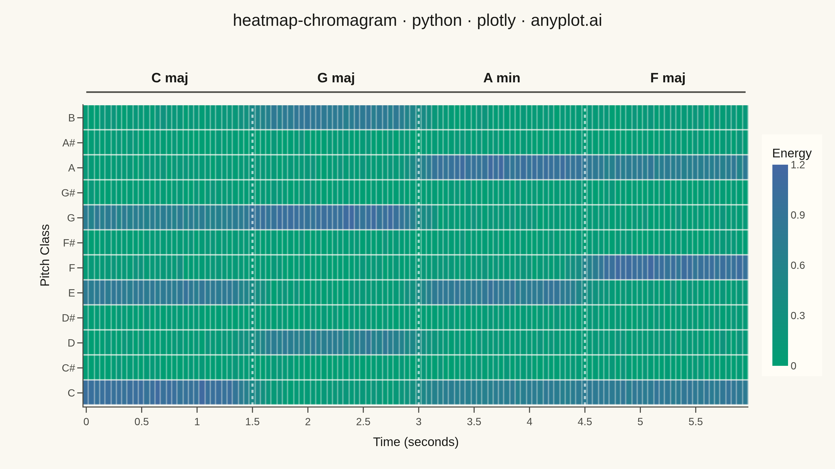
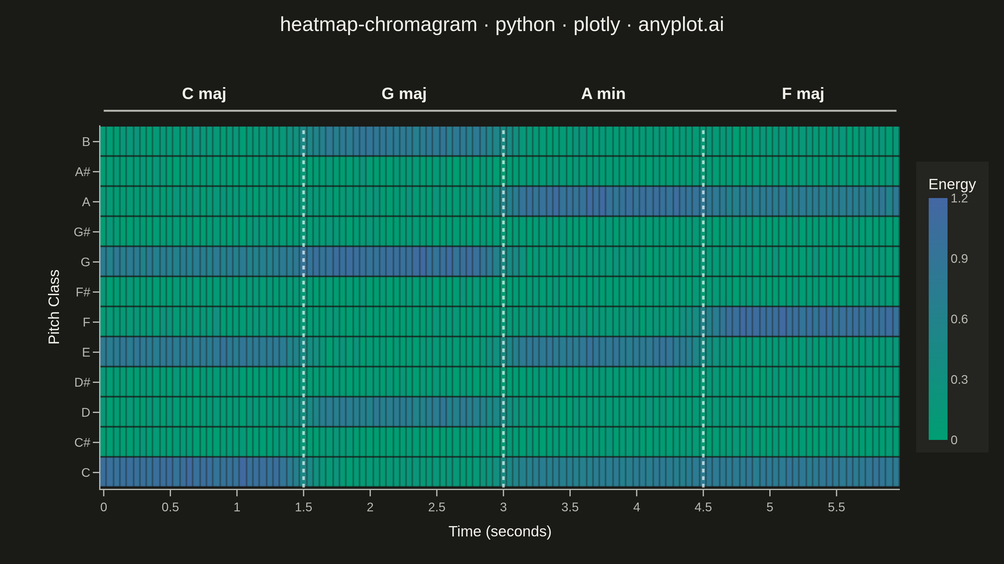
A heatmap-style visualization showing the energy distribution across the 12 pitch classes (C, C#, D, D#, E, F, F#, G, G#, A, A#, B) over time. Each column represents a time frame and each row a pitch class, with color intensity indicating the energy or magnitude at that pitch-time point. Widely used in music information retrieval to analyze harmonic content, detect chords, estimate musical key, and study tonal progressions in audio signals.
""" anyplot.ai
heatmap-chromagram: Music Chromagram (Pitch Class Distribution over Time)
Library: plotly 6.8.0 | Python 3.13.14
Quality: 86/100 | Updated: 2026-06-24
"""

import os

import numpy as np
import plotly.graph_objects as go


# Theme — Imprint palette chrome tokens
THEME = os.getenv("ANYPLOT_THEME", "light")
PAGE_BG = "#FAF8F1" if THEME == "light" else "#1A1A17"
ELEVATED_BG = "#FFFDF6" if THEME == "light" else "#242420"
INK = "#1A1A17" if THEME == "light" else "#F0EFE8"
INK_SOFT = "#4A4A44" if THEME == "light" else "#B8B7B0"

# Imprint sequential colorscale for single-polarity energy data
imprint_seq = [[0.0, "#009E73"], [1.0, "#4467A3"]]

# Data
np.random.seed(42)

pitch_classes = ["C", "C#", "D", "D#", "E", "F", "F#", "G", "G#", "A", "A#", "B"]
n_frames = 120
frame_duration = 0.05
time_frames = np.arange(n_frames) * frame_duration

# Chord profiles (energy distribution across 12 pitch classes)
c_major = np.array([1.0, 0.05, 0.1, 0.05, 0.8, 0.1, 0.05, 0.7, 0.05, 0.1, 0.05, 0.1])
g_major = np.array([0.1, 0.05, 0.7, 0.05, 0.1, 0.05, 0.05, 1.0, 0.05, 0.1, 0.05, 0.8])
a_minor = np.array([0.7, 0.05, 0.1, 0.05, 0.8, 0.1, 0.05, 0.1, 0.05, 1.0, 0.05, 0.1])
f_major = np.array([0.8, 0.05, 0.1, 0.05, 0.1, 1.0, 0.05, 0.1, 0.05, 0.7, 0.05, 0.1])

# Build chromagram with chord progression: C → G → Am → F
chord_names = ["C maj", "G maj", "A min", "F maj"]
chords = [c_major, g_major, a_minor, f_major]
segment_length = n_frames // len(chords)

energy = np.zeros((12, n_frames))
for i, chord in enumerate(chords):
    start = i * segment_length
    end = start + segment_length if i < len(chords) - 1 else n_frames
    for t in range(start, end):
        noise = np.random.normal(0, 0.06, 12)
        energy[:, t] = np.clip(chord + noise, 0, 1.2)

# Smooth transitions between chords
for i in range(1, len(chords)):
    blend_width = 4
    for offset in range(-blend_width, blend_width):
        t = i * segment_length + offset
        if 0 <= t < n_frames:
            alpha = (offset + blend_width) / (2 * blend_width)
            blended = (1 - alpha) * chords[i - 1] + alpha * chords[i]
            noise = np.random.normal(0, 0.04, 12)
            energy[:, t] = np.clip(blended + noise, 0, 1.2)

# Plot
fig = go.Figure(
    data=go.Heatmap(
        z=energy,
        x=np.round(time_frames, 2),
        y=pitch_classes,
        colorscale=imprint_seq,
        zmin=0,
        zmax=1.2,
        colorbar={
            "title": {"text": "Energy", "font": {"size": 12, "color": INK}},
            "tickfont": {"size": 10, "color": INK_SOFT},
            "thickness": 15,
            "len": 0.8,
            "outlinewidth": 0,
            "tickvals": [0, 0.3, 0.6, 0.9, 1.2],
            "bgcolor": ELEVATED_BG,
        },
        hoverongaps=False,
        hovertemplate="<b>%{y}</b> at %{x}s<br>Energy: %{z:.3f}<extra></extra>",
        xgap=0.5,
        ygap=1,
    )
)

# Chord section annotations and separators
# White-tinted separators stay visible against the colored heatmap cells in both themes
sep_color = "rgba(255,255,255,0.65)"
for i in range(len(chords)):
    start_time = i * segment_length * frame_duration
    end_time = (i + 1) * segment_length * frame_duration if i < len(chords) - 1 else n_frames * frame_duration
    mid_time = (start_time + end_time) / 2

    fig.add_annotation(
        x=mid_time,
        y=1.12,
        yref="paper",
        text=f"<b>{chord_names[i]}</b>",
        showarrow=False,
        font={"size": 13, "color": INK},
    )

    if i > 0:
        fig.add_shape(
            type="line",
            x0=i * segment_length * frame_duration,
            x1=i * segment_length * frame_duration,
            y0=-0.5,
            y1=11.5,
            line={"color": sep_color, "width": 2, "dash": "dot"},
        )

# Bracket line connecting chord labels
fig.add_shape(
    type="line",
    x0=0,
    x1=n_frames * frame_duration - frame_duration,
    y0=1.04,
    y1=1.04,
    yref="paper",
    line={"color": INK_SOFT, "width": 1.5},
)

# Layout
fig.update_layout(
    autosize=False,
    title={
        "text": "heatmap-chromagram · python · plotly · anyplot.ai",
        "font": {"size": 16, "color": INK},
        "x": 0.5,
        "xanchor": "center",
        "y": 0.97,
    },
    xaxis={
        "title": {"text": "Time (seconds)", "font": {"size": 12, "color": INK}, "standoff": 10},
        "tickfont": {"size": 10, "color": INK_SOFT},
        "showgrid": False,
        "dtick": 0.5,
        "zeroline": False,
        "showline": True,
        "linecolor": INK_SOFT,
        "linewidth": 1,
        "ticks": "outside",
        "tickcolor": INK_SOFT,
        "ticklen": 5,
    },
    yaxis={
        "title": {"text": "Pitch Class", "font": {"size": 12, "color": INK}, "standoff": 8},
        "tickfont": {"size": 10, "color": INK_SOFT},
        "showgrid": False,
        "categoryorder": "array",
        "categoryarray": pitch_classes,
        "zeroline": False,
        "showline": True,
        "linecolor": INK_SOFT,
        "linewidth": 1,
        "ticks": "outside",
        "tickcolor": INK_SOFT,
        "ticklen": 5,
    },
    template="plotly_white",
    paper_bgcolor=PAGE_BG,
    plot_bgcolor=PAGE_BG,
    margin={"l": 80, "r": 50, "t": 100, "b": 60},
)

# Save
fig.write_image(f"plot-{THEME}.png", width=800, height=450, scale=4)
fig.write_html(f"plot-{THEME}.html", include_plotlyjs="cdn")
Runnable source as JSON, for any HTTP client: https://api.anyplot.ai/specs/heatmap-chromagram/plotly/code. Any spec id and library id listed in llms-full.txt fit the same URL shape; every URL below is complete and callable.
{
  "spec_id": "heatmap-chromagram",
  "language": "python",
  "library": "plotly",
  "page": "https://anyplot.ai/heatmap-chromagram/python/plotly",
  "hub": "https://anyplot.ai/heatmap-chromagram",
  "code_json": "https://api.anyplot.ai/specs/heatmap-chromagram/plotly/code",
  "spec_json": "https://api.anyplot.ai/specs/heatmap-chromagram",
  "render_light_png": "https://storage.googleapis.com/anyplot-images/plots/heatmap-chromagram/python/plotly/plot-light.png",
  "render_dark_png": "https://storage.googleapis.com/anyplot-images/plots/heatmap-chromagram/python/plotly/plot-dark.png",
  "interactive_light_html": "https://storage.googleapis.com/anyplot-images/plots/heatmap-chromagram/python/plotly/plot-light.html",
  "interactive_dark_html": "https://storage.googleapis.com/anyplot-images/plots/heatmap-chromagram/python/plotly/plot-dark.html",
  "quality_score": 86.0,
  "license": "MIT",
  "guide": "https://anyplot.ai/llms.txt"
}
Part of Music Chromagram (Pitch Class Distribution over Time) on anyplot.ai.