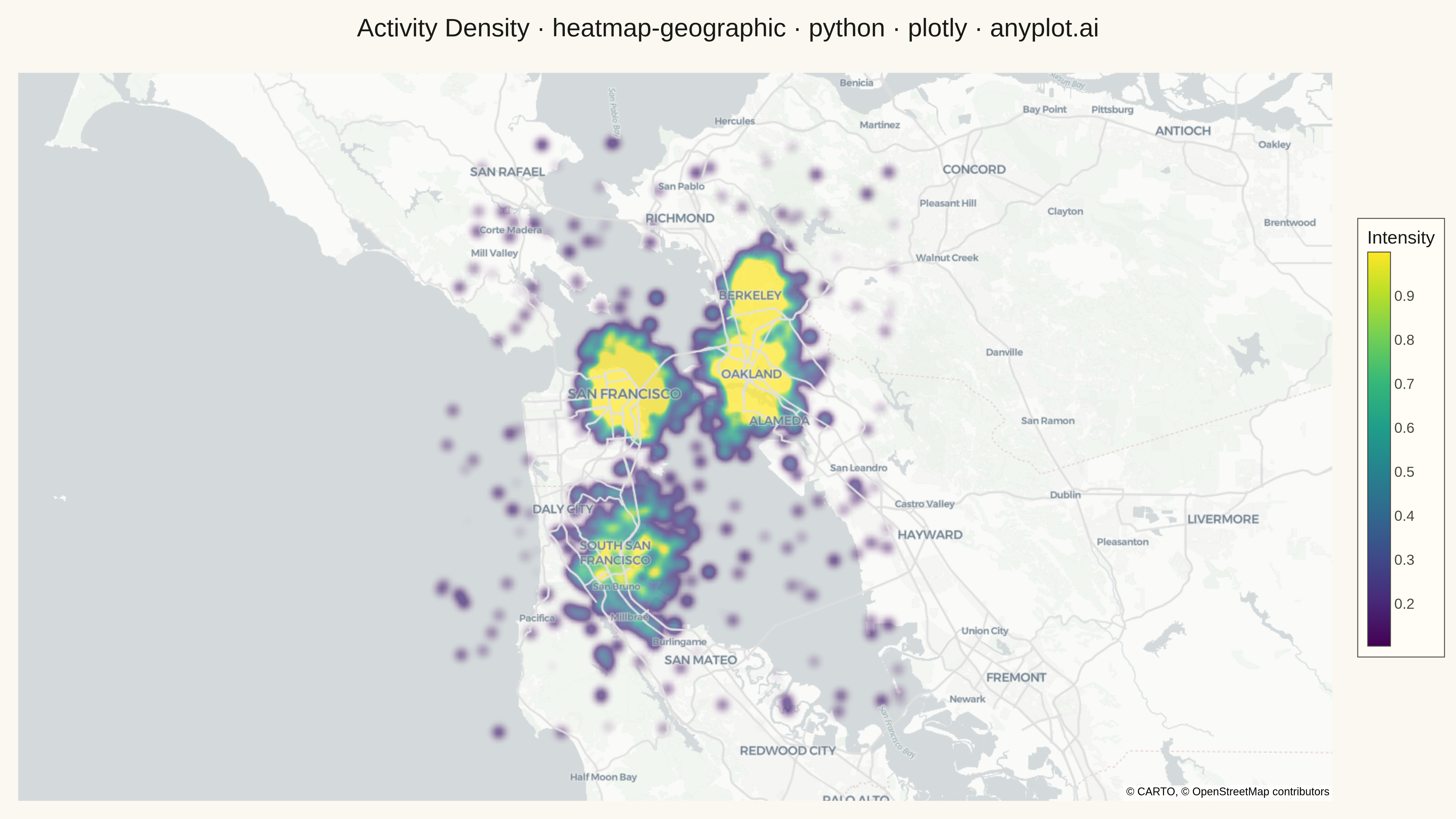
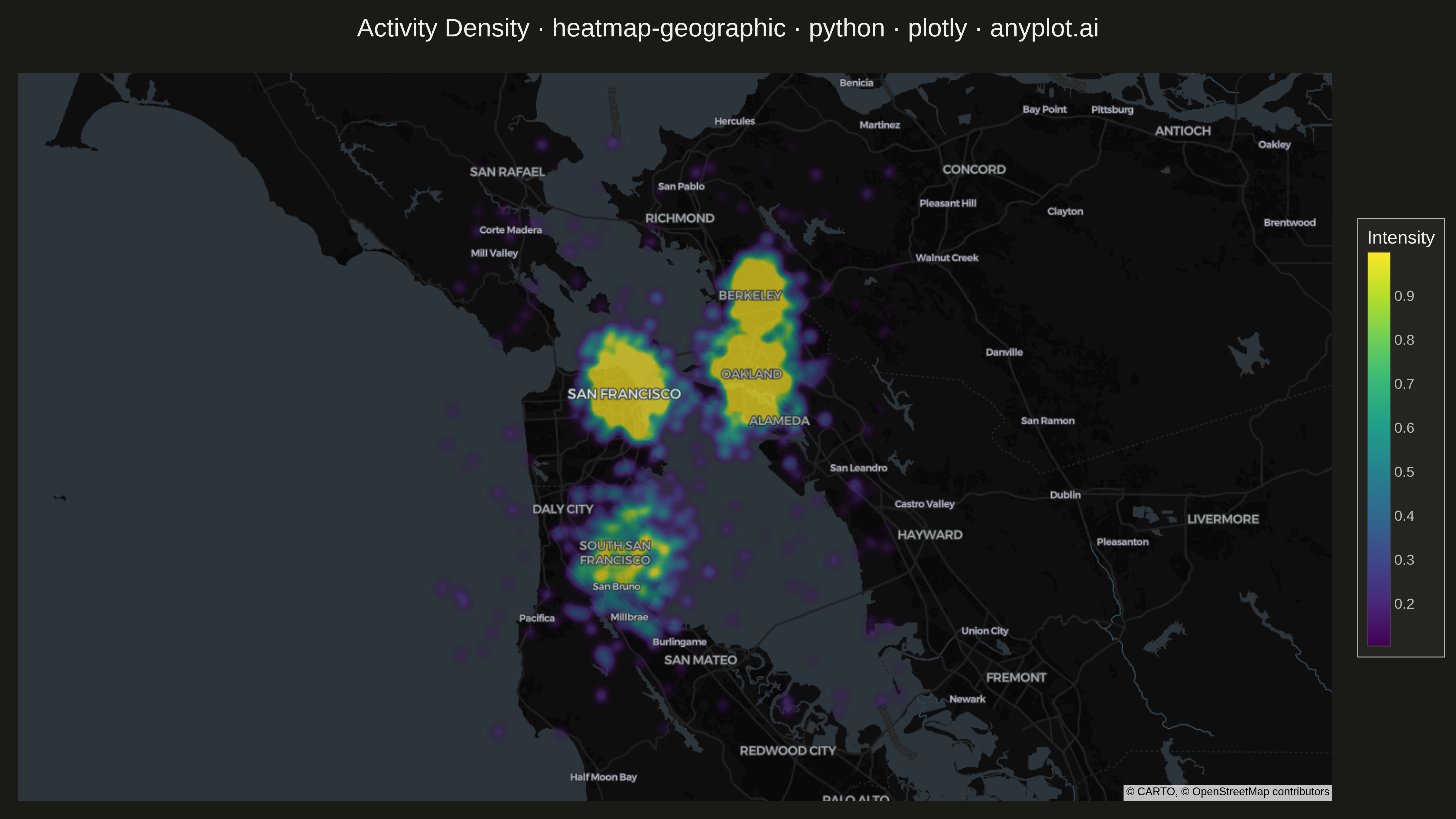
A geographic heatmap visualizes spatial density or intensity values across a map using continuous color gradients. Unlike choropleth maps that color discrete regions, this plot shows smooth density variations computed from point data or gridded values. The color intensity at each location represents the concentration or magnitude of the underlying data, making it ideal for identifying hotspots, clusters, and spatial patterns in geographic data.
""" anyplot.ai
heatmap-geographic: Geographic Heatmap for Spatial Density
Library: plotly 6.7.0 | Python 3.13.13
Quality: 89/100 | Updated: 2026-05-18
"""

import os

import numpy as np
import plotly.graph_objects as go


# Theme tokens
THEME = os.getenv("ANYPLOT_THEME", "light")
PAGE_BG = "#FAF8F1" if THEME == "light" else "#1A1A17"
INK = "#1A1A17" if THEME == "light" else "#F0EFE8"
INK_SOFT = "#4A4A44" if THEME == "light" else "#B8B7B0"
MAP_STYLE = "carto-positron" if THEME == "light" else "carto-darkmatter"

# Data - Activity density around San Francisco Bay Area
np.random.seed(42)

# Hotspot 1: Downtown SF
lat1 = np.random.normal(37.79, 0.02, 400)
lon1 = np.random.normal(-122.40, 0.02, 400)
val1 = np.random.uniform(0.6, 1.0, 400)

# Hotspot 2: Oakland
lat2 = np.random.normal(37.80, 0.025, 350)
lon2 = np.random.normal(-122.27, 0.025, 350)
val2 = np.random.uniform(0.5, 0.9, 350)

# Hotspot 3: Berkeley
lat3 = np.random.normal(37.87, 0.015, 250)
lon3 = np.random.normal(-122.26, 0.015, 250)
val3 = np.random.uniform(0.4, 0.8, 250)

# Hotspot 4: South SF
lat4 = np.random.normal(37.65, 0.03, 300)
lon4 = np.random.normal(-122.40, 0.03, 300)
val4 = np.random.uniform(0.3, 0.7, 300)

# Scattered background points
lat_bg = np.random.uniform(37.5, 38.0, 200)
lon_bg = np.random.uniform(-122.6, -122.1, 200)
val_bg = np.random.uniform(0.1, 0.4, 200)

# Combine all data
latitudes = np.concatenate([lat1, lat2, lat3, lat4, lat_bg])
longitudes = np.concatenate([lon1, lon2, lon3, lon4, lon_bg])
values = np.concatenate([val1, val2, val3, val4, val_bg])

# Plot
fig = go.Figure()

fig.add_trace(
    go.Densitymap(
        lat=latitudes,
        lon=longitudes,
        z=values,
        radius=15,
        colorscale="YlOrRd",
        opacity=0.7,
        showscale=True,
        colorbar={
            "title": {"text": "Intensity", "font": {"size": 20, "color": INK}},
            "tickfont": {"size": 16, "color": INK_SOFT},
            "len": 0.6,
            "thickness": 25,
            "x": 1.02,
        },
        hovertemplate="Lat: %{lat:.4f}<br>Lon: %{lon:.4f}<br>Value: %{z:.2f}<extra></extra>",
    )
)

fig.update_layout(
    title={
        "text": "Activity Density · heatmap-geographic · python · plotly · anyplot.ai",
        "font": {"size": 28, "color": INK},
        "x": 0.5,
        "xanchor": "center",
    },
    map={"style": MAP_STYLE, "center": {"lat": 37.75, "lon": -122.35}, "zoom": 9.5},
    paper_bgcolor=PAGE_BG,
    margin={"l": 20, "r": 100, "t": 80, "b": 20},
)

# Save
fig.write_image(f"plot-{THEME}.png", width=1600, height=900, scale=3)
fig.write_html(f"plot-{THEME}.html", include_plotlyjs="cdn")
Runnable source as JSON, for any HTTP client: https://api.anyplot.ai/specs/heatmap-geographic/plotly/code. Any spec id and library id listed in llms-full.txt fit the same URL shape; every URL below is complete and callable.
{
  "spec_id": "heatmap-geographic",
  "language": "python",
  "library": "plotly",
  "page": "https://anyplot.ai/heatmap-geographic/python/plotly",
  "hub": "https://anyplot.ai/heatmap-geographic",
  "code_json": "https://api.anyplot.ai/specs/heatmap-geographic/plotly/code",
  "spec_json": "https://api.anyplot.ai/specs/heatmap-geographic",
  "render_light_png": "https://storage.googleapis.com/anyplot-images/plots/heatmap-geographic/python/plotly/plot-light.png",
  "render_dark_png": "https://storage.googleapis.com/anyplot-images/plots/heatmap-geographic/python/plotly/plot-dark.png",
  "interactive_light_html": "https://storage.googleapis.com/anyplot-images/plots/heatmap-geographic/python/plotly/plot-light.html",
  "interactive_dark_html": "https://storage.googleapis.com/anyplot-images/plots/heatmap-geographic/python/plotly/plot-dark.html",
  "quality_score": 89.0,
  "license": "MIT",
  "guide": "https://anyplot.ai/llms.txt"
}
Part of Geographic Heatmap for Spatial Density on anyplot.ai.