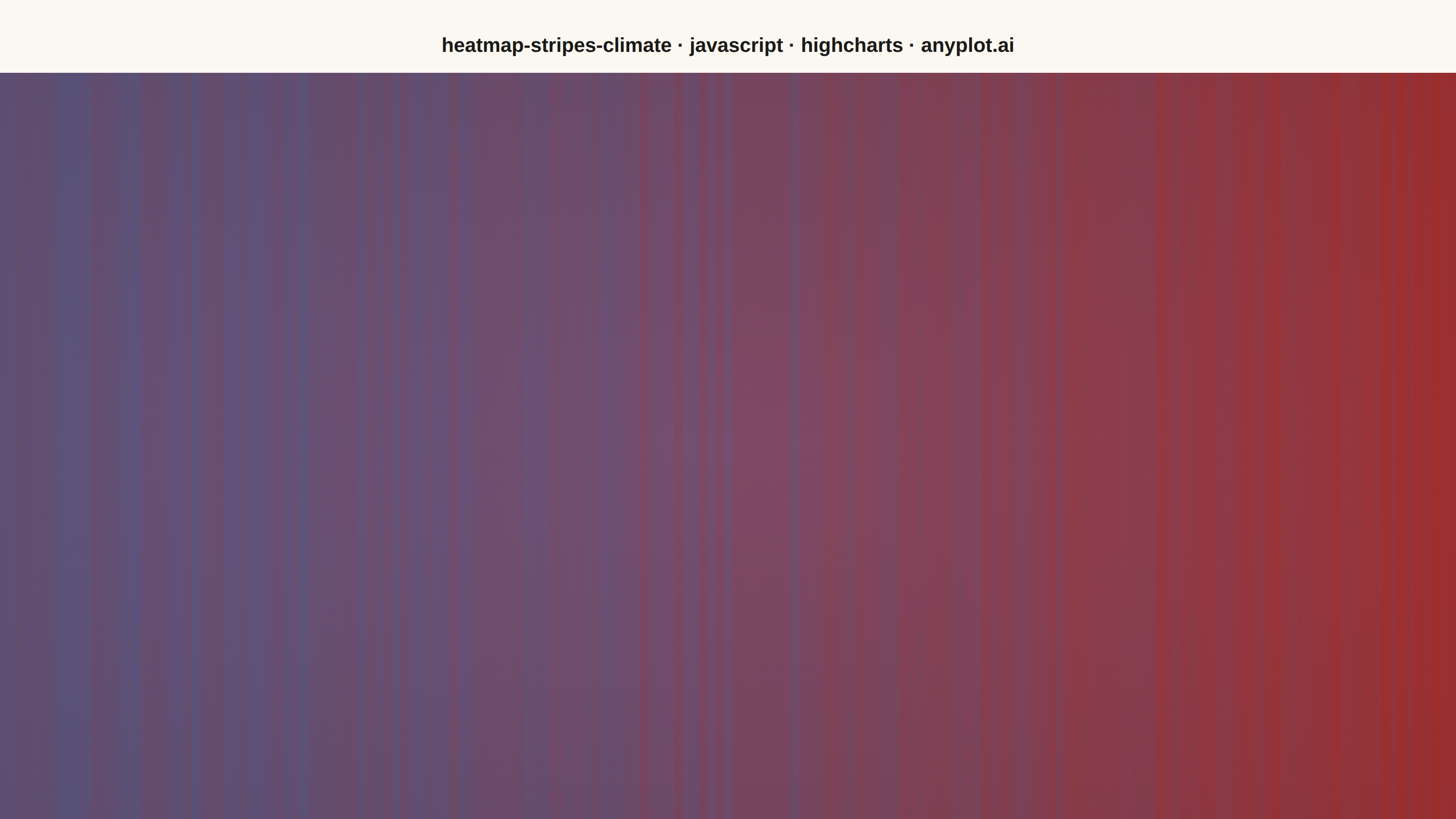
The same plot in 14 other libraries — JavaScript: Chart.js, D3.js, Apache ECharts, MUI X Charts; Python: Altair, Bokeh, lets-plot, Matplotlib, Plotly, plotnine, Pygal, Seaborn; R: ggplot2; Julia: Makie.jl. Compare all 15 side by side: Climate Warming Stripes in Python, R, Julia and JavaScript.
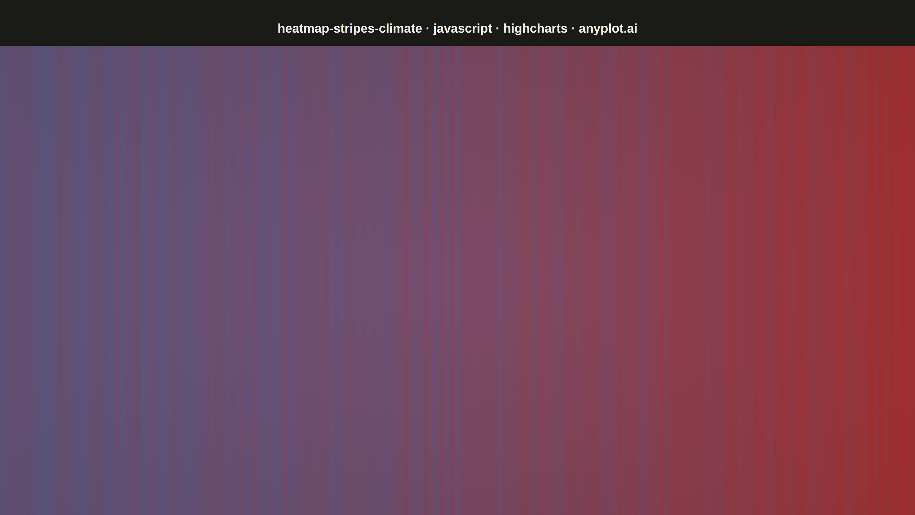
Climate warming stripes (also known as "warming stripes") display temperature anomaly data as a sequence of vertical colored bars, one per year, using a blue-to-red diverging colormap. Created by climate scientist Ed Hawkins, this minimalist visualization strips away axes, labels, and gridlines to communicate long-term warming trends through pure color encoding. The progression from cool blues to warm reds makes temperature change immediately visible at a glance.
// anyplot.ai
// heatmap-stripes-climate: Climate Warming Stripes
// Library: highcharts 12.6.0 | JavaScript 22.23.2
// Quality: 85/100 | Created: 2026-08-25

const t = window.ANYPLOT_TOKENS;

// --- Data (in-memory, deterministic) ----------------------------------------
// Synthetic global-mean temperature anomaly, 1850-2024, relative to a
// 1961-1990 baseline. An accelerating warming trend plus small year-to-year
// noise from a fixed-seed LCG (the browser has no seeded Math.random).
let seed = 42;
const lcgRandom = () => {
  seed = (seed * 1103515245 + 12345) & 0x7fffffff;
  return seed / 0x7fffffff;
};

const startYear = 1850;
const endYear = 2024;
const years = [];
for (let year = startYear; year <= endYear; year += 1) years.push(year);

const anomalies = years.map((year) => {
  const progress = (year - startYear) / (endYear - startYear);
  const trend = -0.45 + 1.65 * Math.pow(progress, 1.8);
  const noise = (lcgRandom() - 0.5) * 0.3;
  return Math.round((trend + noise) * 100) / 100;
});

// Symmetric color scale around zero so equal +/- anomalies match in intensity.
// Domain convention (see style guide "Semantic exception"): cold -> blue,
// warm -> red, so the diverging stops are used in reverse order (t.div is
// [red, neutral, blue]).
const maxAbsAnomaly = Math.max(...anomalies.map(Math.abs));

const rgbToHex = (rgb) =>
  `#${rgb.map((c) => Math.round(c).toString(16).padStart(2, "0")).join("")}`;
const lerpColor = (colorA, colorB, ratio) => {
  const parse = (hex) => [1, 3, 5].map((i) => parseInt(hex.slice(i, i + 2), 16));
  const a = parse(colorA);
  const b = parse(colorB);
  return rgbToHex(a.map((v, i) => v + (b[i] - v) * ratio));
};

// column series has no built-in colorAxis coloring (that composition ships
// only with the heatmap/treemap modules, which are not loaded), so each
// bar's color is computed directly from the diverging Imprint stops.
// The blend anchor is the midpoint of the two poles (t.div[0]/t.div[2]),
// not t.div[1] (the page-background-adaptive midpoint): t.div[1] is
// #FAF8F1 on light / #1A1A17 on dark, so blending toward it would make
// every low/medium-magnitude year render a different color per theme.
// The pole midpoint is theme-independent, so a given anomaly reads as the
// same color in both renders, matching the "data colors are identical,
// only chrome flips" rule.
// Magnitude is floored at 10% so a near-zero anomaly still blends slightly
// toward its pole instead of landing on the exact neutral color (which
// would make that year hard to distinguish from its neighbors).
const MIN_TINT = 0.1;
const neutral = lerpColor(t.div[2], t.div[0], 0.5);
const colorForAnomaly = (value) => {
  const cold = t.div[2];
  const warm = t.div[0];
  const magnitude = Math.max(Math.abs(value) / maxAbsAnomaly, MIN_TINT);
  return value >= 0 ? lerpColor(neutral, warm, magnitude) : lerpColor(neutral, cold, magnitude);
};

const stripes = years.map((year, i) => ({
  x: i,
  y: 1,
  color: colorForAnomaly(anomalies[i]),
}));

// Subtle radial vignette drawn with the SVGRenderer (a genuinely
// Highcharts-distinctive capability, not available via plain CSS on the
// mount node) so the stripe field reads with a touch more depth instead of
// flat edge-to-edge color, without adding any forbidden chrome. Fixed to a
// single ink-based tint (not theme-branched) and confined to the plot box
// (excludes the title band) so it never touches title legibility and never
// breaks the required pixel-identical data colors across themes.
const drawVignette = function () {
  const { plotLeft, plotTop, plotWidth, plotHeight } = this;
  this.renderer
    .rect(plotLeft, plotTop, plotWidth, plotHeight)
    .attr({
      fill: {
        radialGradient: { cx: 0.5, cy: 0.5, r: 0.75 },
        stops: [
          [0, "rgba(26,26,23,0)"],
          [1, "rgba(26,26,23,0.14)"],
        ],
      },
      zIndex: 6,
    })
    .add();
};

// --- Chart -------------------------------------------------------------------
Highcharts.chart("container", {
  chart: {
    type: "column",
    backgroundColor: "transparent",
    animation: false,
    spacing: [40, 0, 0, 0],
    style: { fontFamily: "inherit" },
    events: { load: drawVignette },
  },
  credits: { enabled: false },
  title: {
    text: "heatmap-stripes-climate · javascript · highcharts · anyplot.ai",
    style: { color: t.ink, fontSize: "22px", fontWeight: "600" },
  },
  xAxis: {
    visible: false,
    min: 0,
    max: years.length - 1,
    minPadding: 0,
    maxPadding: 0,
  },
  yAxis: {
    visible: false,
    min: 0,
    max: 1,
    minPadding: 0,
    maxPadding: 0,
  },
  legend: { enabled: false },
  tooltip: { enabled: false },
  plotOptions: {
    series: { animation: false },
    column: {
      pointPadding: 0,
      groupPadding: 0,
      borderWidth: 0,
      borderRadius: 0,
    },
  },
  series: [
    {
      name: "Temperature anomaly (°C)",
      data: stripes,
    },
  ],
});
Runnable source as JSON, for any HTTP client: https://api.anyplot.ai/specs/heatmap-stripes-climate/highcharts/code. Any spec id and library id listed in llms-full.txt fit the same URL shape; every URL below is complete and callable.
{
  "spec_id": "heatmap-stripes-climate",
  "language": "javascript",
  "library": "highcharts",
  "page": "https://anyplot.ai/heatmap-stripes-climate/javascript/highcharts",
  "hub": "https://anyplot.ai/heatmap-stripes-climate",
  "code_json": "https://api.anyplot.ai/specs/heatmap-stripes-climate/highcharts/code",
  "spec_json": "https://api.anyplot.ai/specs/heatmap-stripes-climate",
  "render_light_png": "https://storage.googleapis.com/anyplot-images/plots/heatmap-stripes-climate/javascript/highcharts/plot-light.png",
  "render_dark_png": "https://storage.googleapis.com/anyplot-images/plots/heatmap-stripes-climate/javascript/highcharts/plot-dark.png",
  "interactive_light_html": "https://storage.googleapis.com/anyplot-images/plots/heatmap-stripes-climate/javascript/highcharts/plot-light.html",
  "interactive_dark_html": "https://storage.googleapis.com/anyplot-images/plots/heatmap-stripes-climate/javascript/highcharts/plot-dark.html",
  "quality_score": 85.0,
  "license": "MIT",
  "guide": "https://anyplot.ai/llms.txt"
}
Part of Climate Warming Stripes on anyplot.ai.