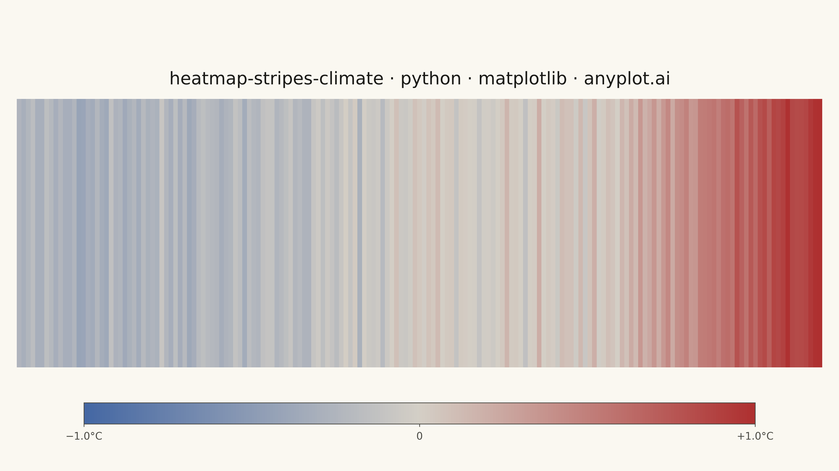
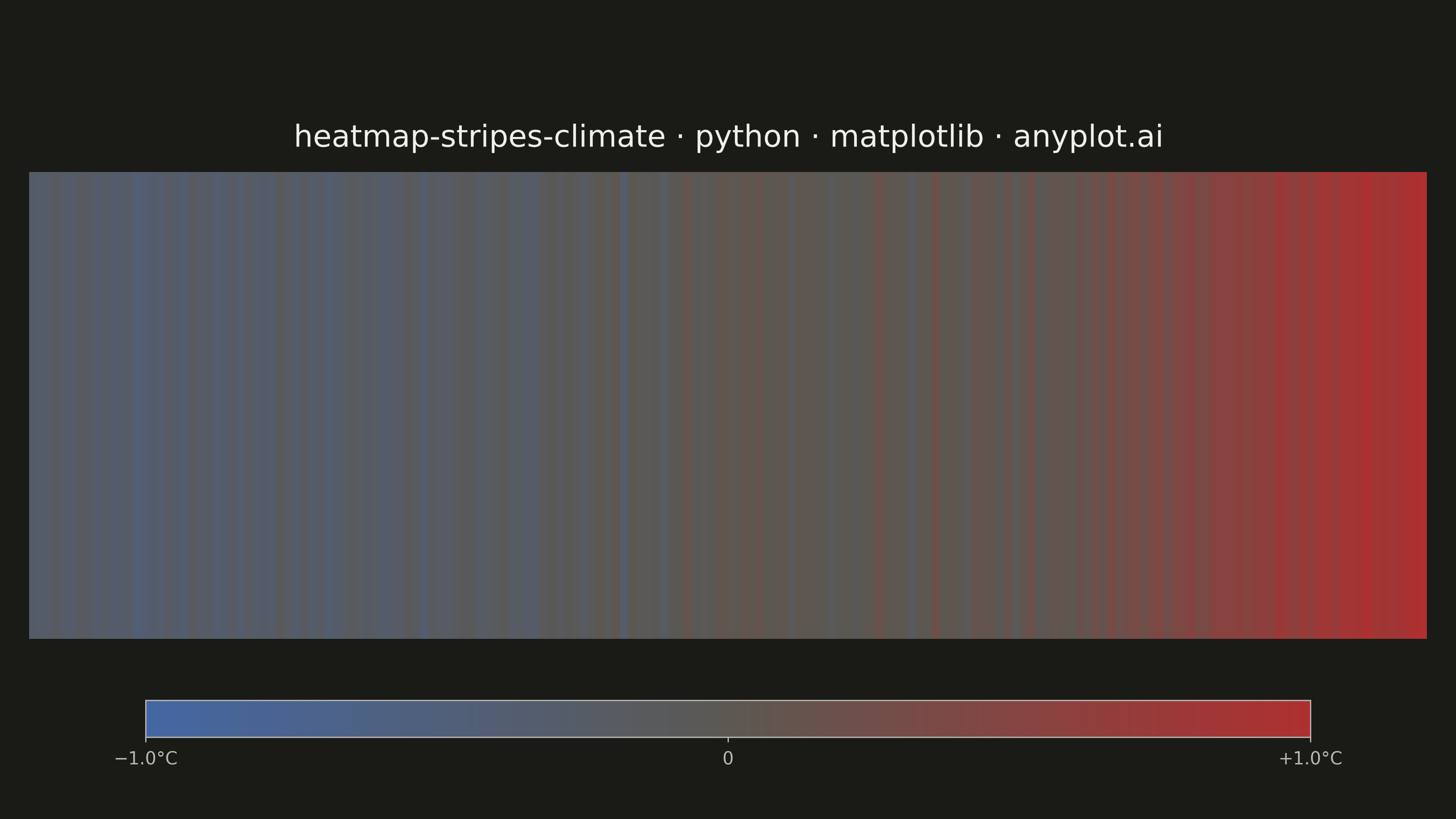
Climate warming stripes (also known as "warming stripes") display temperature anomaly data as a sequence of vertical colored bars, one per year, using a blue-to-red diverging colormap. Created by climate scientist Ed Hawkins, this minimalist visualization strips away axes, labels, and gridlines to communicate long-term warming trends through pure color encoding. The progression from cool blues to warm reds makes temperature change immediately visible at a glance.
""" anyplot.ai
heatmap-stripes-climate: Climate Warming Stripes
Library: matplotlib 3.10.9 | Python 3.13.13
Quality: 92/100 | Updated: 2026-06-02
"""

import os

import matplotlib.patheffects as pe
import matplotlib.pyplot as plt
import numpy as np
from matplotlib.colors import LinearSegmentedColormap, TwoSlopeNorm


# Theme tokens
THEME = os.getenv("ANYPLOT_THEME", "light")
PAGE_BG = "#FAF8F1" if THEME == "light" else "#1A1A17"
INK = "#1A1A17" if THEME == "light" else "#F0EFE8"
INK_SOFT = "#4A4A44" if THEME == "light" else "#B8B7B0"

# Data - synthetic global temperature anomalies (1850-2024) relative to 1961-1990 baseline
np.random.seed(42)
years = np.arange(1850, 2025)
n_years = len(years)

base_trend = np.piecewise(
    years.astype(float),
    [years < 1910, (years >= 1910) & (years < 1945), (years >= 1945) & (years < 1975), years >= 1975],
    [
        lambda y: -0.3 + (y - 1850) * 0.002,
        lambda y: -0.2 + (y - 1910) * 0.008,
        lambda y: 0.0 + (y - 1945) * 0.001,
        lambda y: 0.03 + (y - 1975) * 0.02,
    ],
)
noise = np.random.normal(0, 0.08, n_years)
anomalies = base_trend + noise

# Imprint diverging colormap: blue (cold) -> warm-neutral -> red (warm)
# Lighter dark midpoint (#5C5852) preserves visual separation from near-black background
midpoint = "#D4CFC6" if THEME == "light" else "#5C5852"
imprint_div_r = LinearSegmentedColormap.from_list("imprint_div_r", ["#4467A3", midpoint, "#AE3030"])

vmax = max(abs(anomalies.min()), abs(anomalies.max()))
norm = TwoSlopeNorm(vmin=-vmax, vcenter=0, vmax=vmax)

# Plot - landscape 3200x1800 canvas (figsize=(8, 4.5) at dpi=400)
fig, ax = plt.subplots(figsize=(8, 4.5), dpi=400, facecolor=PAGE_BG)
ax.set_facecolor(PAGE_BG)

# Stripes panel: ~3:1 aspect ratio, raised to leave room below for colorbar scale
ax.set_position([0.02, 0.22, 0.96, 0.57])

stripe_data = anomalies.reshape(1, -1)
img = ax.imshow(
    stripe_data,
    aspect="auto",
    cmap=imprint_div_r,
    norm=norm,
    extent=[years[0] - 0.5, years[-1] + 0.5, 0, 1],
    interpolation="nearest",
)

# Minimal style: no axes, labels, ticks, or gridlines per spec
ax.axis("off")

# Title via ax.set_title — standard positioning contract, sits just above stripe panel
title_str = "heatmap-stripes-climate · python · matplotlib · anyplot.ai"
title_obj = ax.set_title(title_str, fontsize=12, fontweight="medium", color=INK, pad=10)
title_obj.set_path_effects([pe.withStroke(linewidth=3, foreground=PAGE_BG)])

# Temperature anomaly scale — thin horizontal colorbar beneath the stripes
cax = fig.add_axes([0.10, 0.10, 0.80, 0.045])
cbar = fig.colorbar(img, cax=cax, orientation="horizontal")
cbar.set_ticks([-vmax, 0.0, vmax])
cbar.set_ticklabels([f"−{vmax:.1f}°C", "0", f"+{vmax:.1f}°C"])
cbar.ax.tick_params(labelsize=7, colors=INK_SOFT, length=2, width=0.5)
cbar.outline.set_edgecolor(INK_SOFT)
cbar.outline.set_linewidth(0.5)

# Save
plt.savefig(f"plot-{THEME}.png", dpi=400, facecolor=PAGE_BG)
Runnable source as JSON, for any HTTP client: https://api.anyplot.ai/specs/heatmap-stripes-climate/matplotlib/code. Any spec id and library id listed in llms-full.txt fit the same URL shape; every URL below is complete and callable.
{
  "spec_id": "heatmap-stripes-climate",
  "language": "python",
  "library": "matplotlib",
  "page": "https://anyplot.ai/heatmap-stripes-climate/python/matplotlib",
  "hub": "https://anyplot.ai/heatmap-stripes-climate",
  "code_json": "https://api.anyplot.ai/specs/heatmap-stripes-climate/matplotlib/code",
  "spec_json": "https://api.anyplot.ai/specs/heatmap-stripes-climate",
  "render_light_png": "https://storage.googleapis.com/anyplot-images/plots/heatmap-stripes-climate/python/matplotlib/plot-light.png",
  "render_dark_png": "https://storage.googleapis.com/anyplot-images/plots/heatmap-stripes-climate/python/matplotlib/plot-dark.png",
  "quality_score": 92.0,
  "license": "MIT",
  "guide": "https://anyplot.ai/llms.txt"
}
Part of Climate Warming Stripes on anyplot.ai.