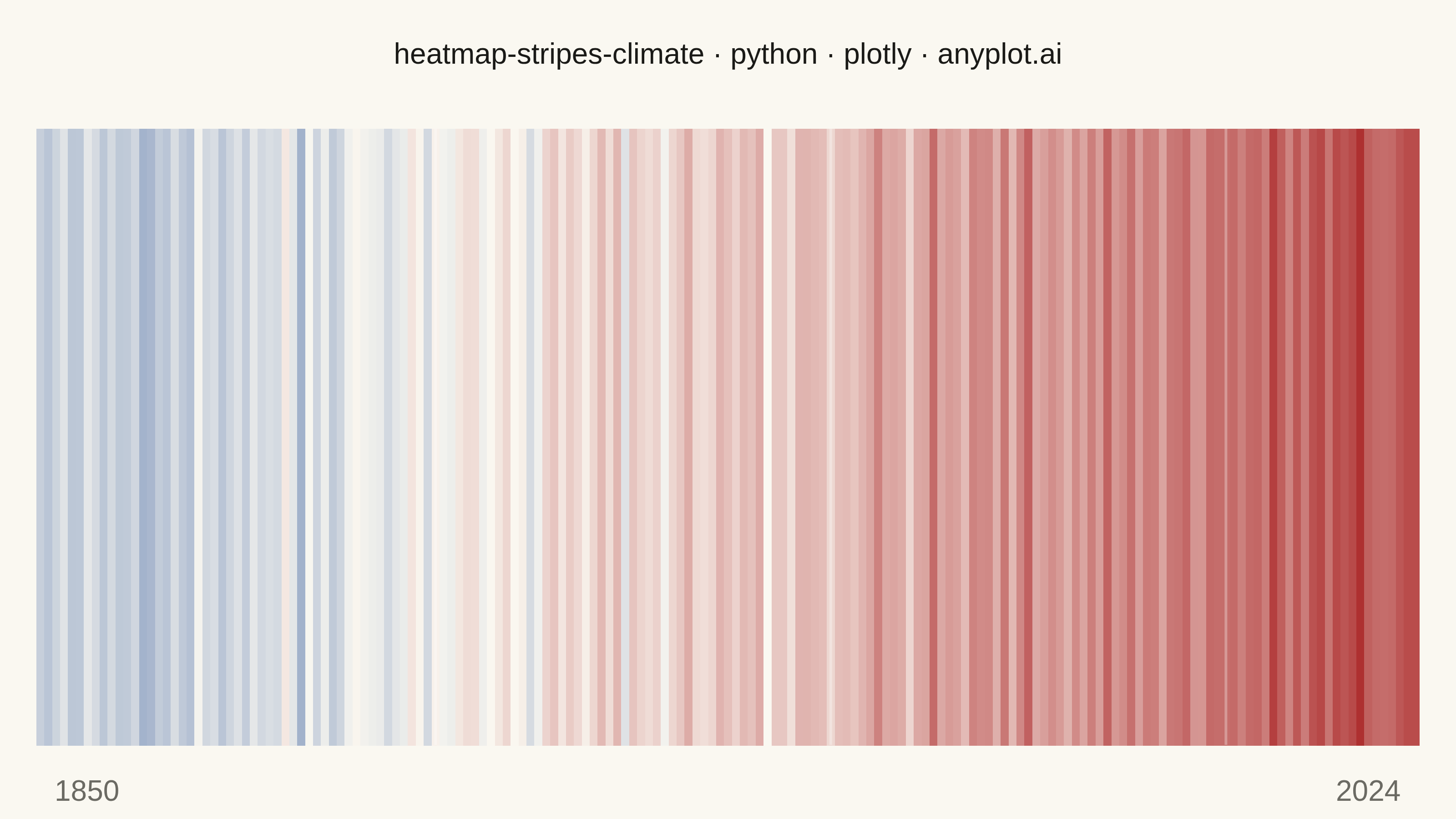
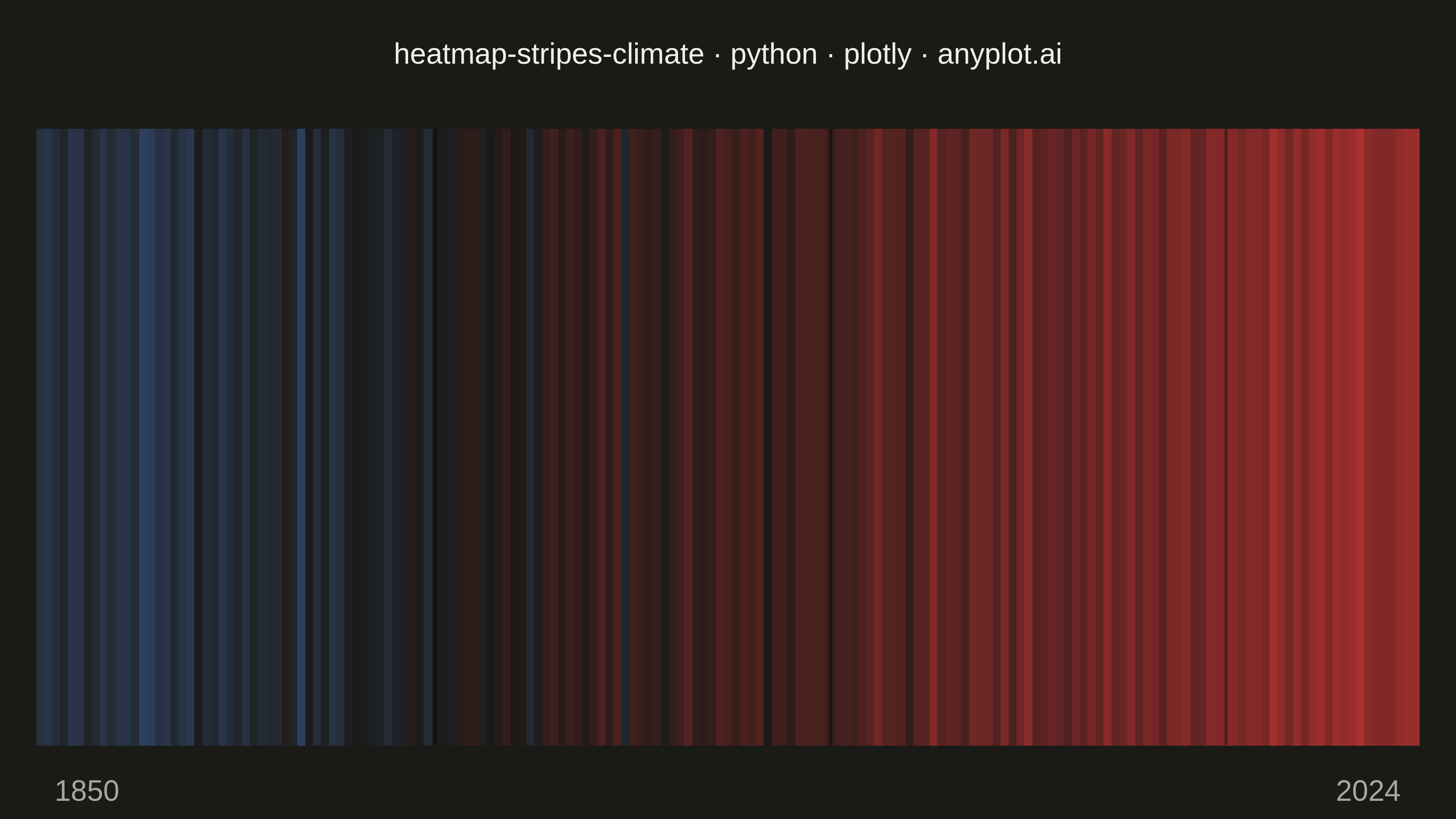
Climate warming stripes (also known as "warming stripes") display temperature anomaly data as a sequence of vertical colored bars, one per year, using a blue-to-red diverging colormap. Created by climate scientist Ed Hawkins, this minimalist visualization strips away axes, labels, and gridlines to communicate long-term warming trends through pure color encoding. The progression from cool blues to warm reds makes temperature change immediately visible at a glance.
""" anyplot.ai
heatmap-stripes-climate: Climate Warming Stripes
Library: plotly 6.7.0 | Python 3.13.13
Quality: 88/100 | Updated: 2026-06-02
"""

import sys


sys.path = sys.path[1:]  # Prevent self-import: script dir is removed so 'import plotly' finds the package

import os

import numpy as np
import plotly.graph_objects as go


# Theme tokens
THEME = os.getenv("ANYPLOT_THEME", "light")
PAGE_BG = "#FAF8F1" if THEME == "light" else "#1A1A17"
ELEVATED_BG = "#FFFDF6" if THEME == "light" else "#242420"
INK = "#1A1A17" if THEME == "light" else "#F0EFE8"
INK_SOFT = "#4A4A44" if THEME == "light" else "#B8B7B0"
INK_MUTED = "#6B6A63" if THEME == "light" else "#A8A79F"

# Data
np.random.seed(42)
years = np.arange(1850, 2025)
n_years = len(years)

trend = np.linspace(-0.35, 0.85, n_years)
noise = np.random.normal(0, 0.12, n_years)

volcanic_events = {1883: -0.25, 1912: -0.15, 1942: -0.20, 1991: -0.15}
volcanic_dips = np.zeros(n_years)
for year, dip in volcanic_events.items():
    volcanic_dips[year - years[0]] = dip

anomalies = trend + noise + volcanic_dips
vmax = max(abs(anomalies.min()), abs(anomalies.max()))

# Colorscale: imprint_div diverging (reversed: cold=blue at zmin, warm=red at zmax)
# Midpoint is PAGE_BG so near-zero bars blend with the page surface (theme-adaptive)
colorscale = [
    [0.0, "#4467A3"],  # cool / negative anomaly → Imprint blue
    [0.5, PAGE_BG],  # neutral / zero anomaly  → theme-adaptive page surface
    [1.0, "#AE3030"],  # warm / positive anomaly → Imprint matte red
]

# Hover labels per bar
labels = np.where(
    anomalies > 0.3,
    "Strong warming",
    np.where(anomalies > 0, "Warm", np.where(anomalies > -0.3, "Cool", "Strong cooling")),
)

# Plot — warming stripes heatmap
fig = go.Figure(
    data=go.Heatmap(
        z=[anomalies],
        x=years,
        y=[""],
        colorscale=colorscale,
        zmin=-vmax,
        zmax=vmax,
        showscale=False,
        xgap=0,
        ygap=0,
        customdata=[np.column_stack([labels])],
        hovertemplate="<b>%{x}</b><br>Anomaly: %{z:+.2f} °C<br>%{customdata[0]}<extra></extra>",
    )
)

# Subtle decade markers (semi-transparent, adapts to theme)
decade_color = "rgba(255,255,255,0.30)" if THEME == "light" else "rgba(0,0,0,0.40)"
for decade in [1900, 1950, 2000]:
    fig.add_shape(type="line", x0=decade, x1=decade, y0=-0.5, y1=0.5, line={"color": decade_color, "width": 1.5})

# Start / end year labels (theme-adaptive ink)
for x_pos, anchor, label in [(0.01, "left", "1850"), (0.99, "right", "2024")]:
    fig.add_annotation(
        x=x_pos,
        y=-0.04,
        text=label,
        showarrow=False,
        font={"size": 16, "color": INK_MUTED},
        xanchor=anchor,
        yanchor="top",
        xref="paper",
        yref="paper",
    )

title_text = "heatmap-stripes-climate · python · plotly · anyplot.ai"
fig.update_layout(
    autosize=False,
    title={"text": title_text, "font": {"size": 16, "color": INK}, "x": 0.5, "xanchor": "center"},
    paper_bgcolor=PAGE_BG,
    plot_bgcolor=PAGE_BG,
    font={"color": INK},
    xaxis={"showgrid": False, "showticklabels": False, "zeroline": False, "showline": False, "range": [1849.5, 2024.5]},
    yaxis={"showgrid": False, "showticklabels": False, "zeroline": False, "showline": False, "fixedrange": True},
    margin={"l": 20, "r": 20, "t": 70, "b": 40},
    showlegend=False,
)

# Save — landscape 3200×1800 canvas
fig.write_image(f"plot-{THEME}.png", width=800, height=450, scale=4)
fig.write_html(
    f"plot-{THEME}.html",
    include_plotlyjs="cdn",
    config={"displayModeBar": False, "scrollZoom": False, "staticPlot": False},
)
Runnable source as JSON, for any HTTP client: https://api.anyplot.ai/specs/heatmap-stripes-climate/plotly/code. Any spec id and library id listed in llms-full.txt fit the same URL shape; every URL below is complete and callable.
{
  "spec_id": "heatmap-stripes-climate",
  "language": "python",
  "library": "plotly",
  "page": "https://anyplot.ai/heatmap-stripes-climate/python/plotly",
  "hub": "https://anyplot.ai/heatmap-stripes-climate",
  "code_json": "https://api.anyplot.ai/specs/heatmap-stripes-climate/plotly/code",
  "spec_json": "https://api.anyplot.ai/specs/heatmap-stripes-climate",
  "render_light_png": "https://storage.googleapis.com/anyplot-images/plots/heatmap-stripes-climate/python/plotly/plot-light.png",
  "render_dark_png": "https://storage.googleapis.com/anyplot-images/plots/heatmap-stripes-climate/python/plotly/plot-dark.png",
  "interactive_light_html": "https://storage.googleapis.com/anyplot-images/plots/heatmap-stripes-climate/python/plotly/plot-light.html",
  "interactive_dark_html": "https://storage.googleapis.com/anyplot-images/plots/heatmap-stripes-climate/python/plotly/plot-dark.html",
  "quality_score": 88.0,
  "license": "MIT",
  "guide": "https://anyplot.ai/llms.txt"
}
Part of Climate Warming Stripes on anyplot.ai.