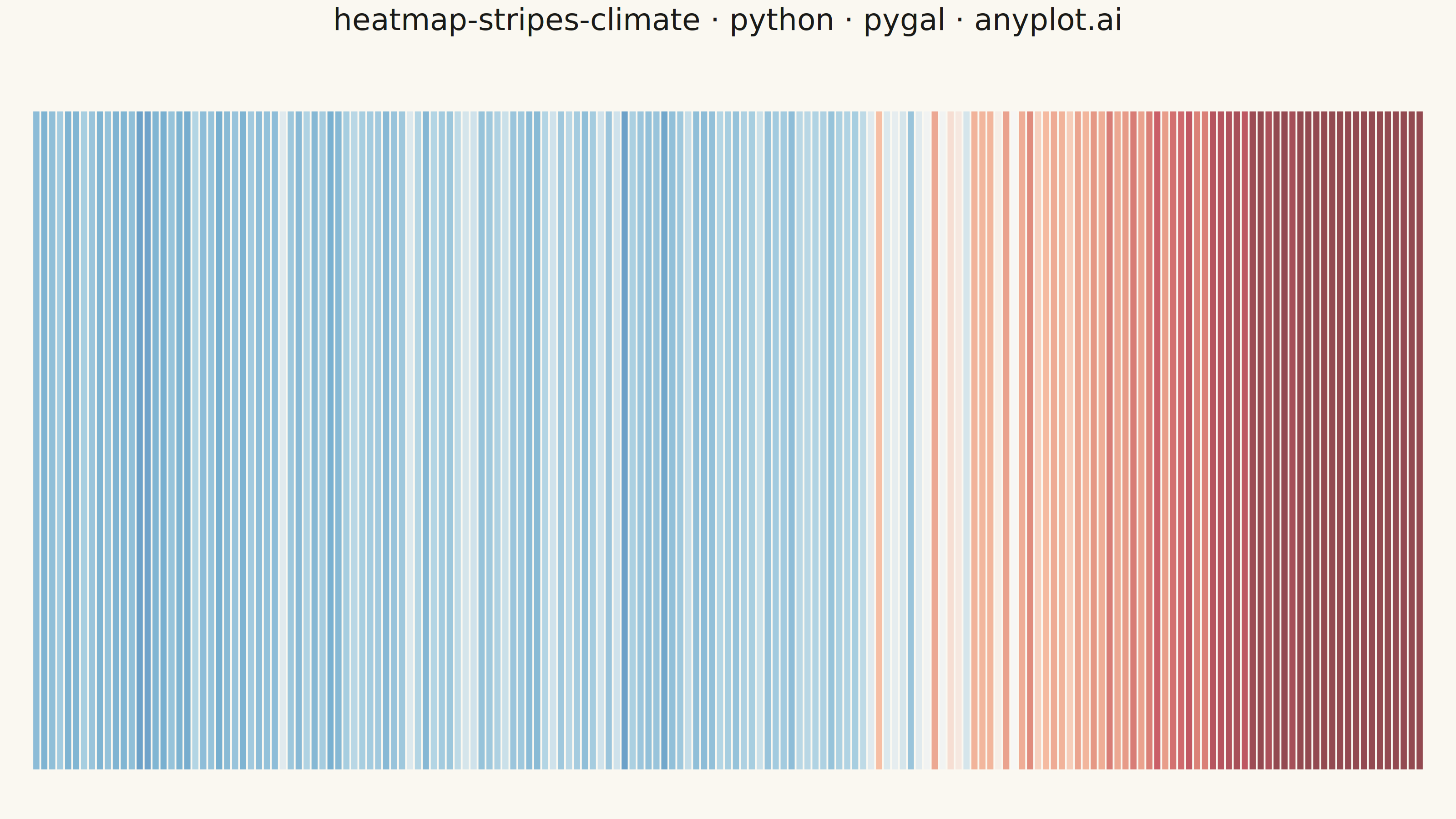
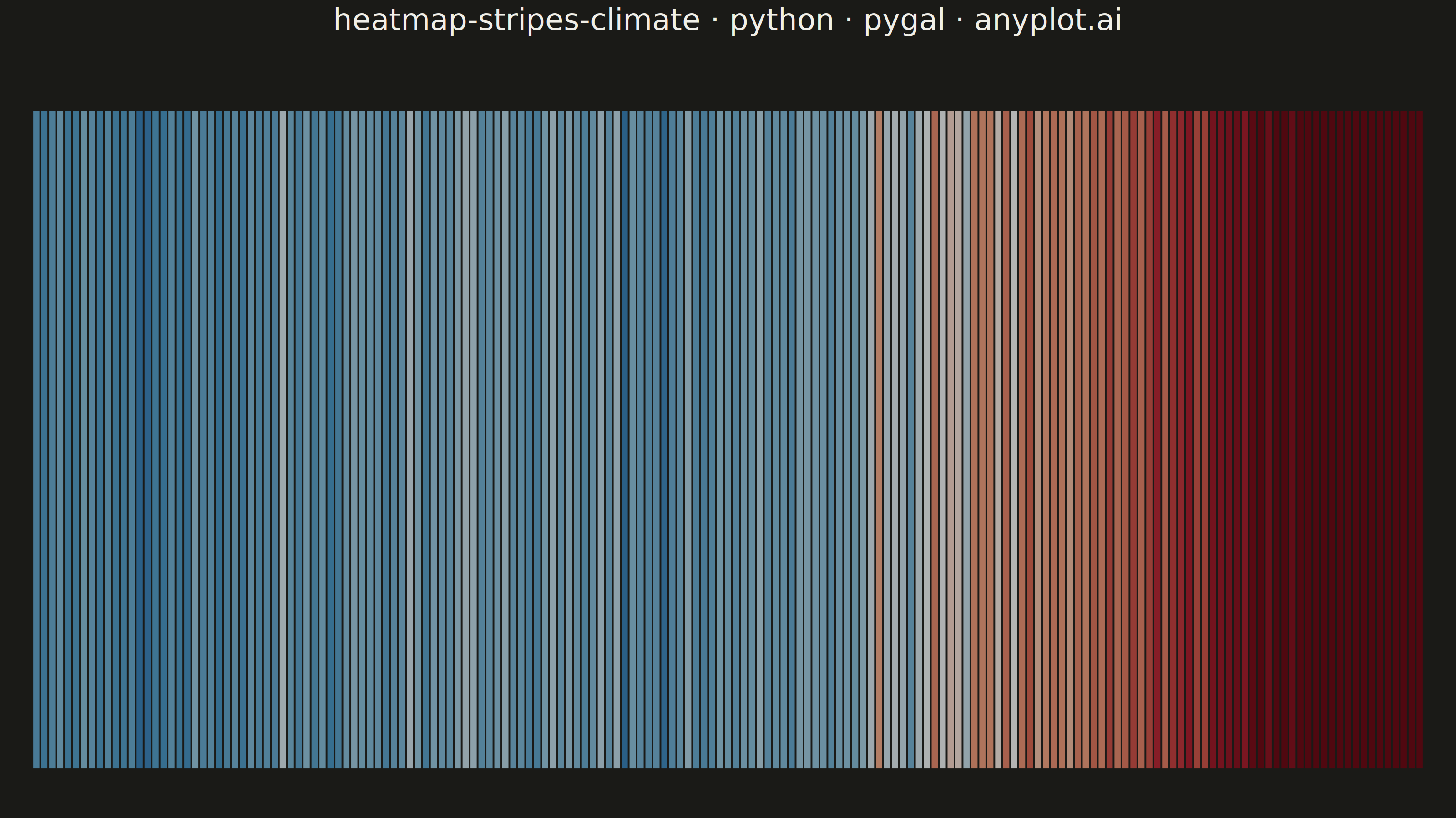
Climate warming stripes (also known as "warming stripes") display temperature anomaly data as a sequence of vertical colored bars, one per year, using a blue-to-red diverging colormap. Created by climate scientist Ed Hawkins, this minimalist visualization strips away axes, labels, and gridlines to communicate long-term warming trends through pure color encoding. The progression from cool blues to warm reds makes temperature change immediately visible at a glance.
""" anyplot.ai
heatmap-stripes-climate: Climate Warming Stripes
Library: pygal 3.1.0 | Python 3.13.13
Quality: 87/100 | Updated: 2026-06-02
"""

import importlib
import os
import sys

import numpy as np


# Defer pygal import to avoid self-shadowing (this file is named pygal.py)
_here = sys.path.pop(0)
pygal = importlib.import_module("pygal")
Style = importlib.import_module("pygal.style").Style
cairosvg = importlib.import_module("cairosvg")
sys.path.insert(0, _here)

# Theme tokens
THEME = os.getenv("ANYPLOT_THEME", "light")
PAGE_BG = "#FAF8F1" if THEME == "light" else "#1A1A17"
INK = "#1A1A17" if THEME == "light" else "#F0EFE8"
INK_MUTED = "#6B6A63" if THEME == "light" else "#A8A79F"

# Data - Simulated global temperature anomalies (relative to 1961-1990 baseline)
np.random.seed(42)
years = list(range(1850, 2025))
n_years = len(years)

base_trend = np.concatenate(
    [
        np.linspace(-0.35, -0.15, 50),
        np.linspace(-0.15, -0.25, 30),
        np.linspace(-0.25, -0.05, 30),
        np.linspace(-0.05, 0.30, 25),
        np.linspace(0.30, 1.20, 40),
    ]
)
noise = np.random.normal(0, 0.10, n_years)
anomalies = np.round(base_trend + noise, 2)

# Color scale symmetric around zero
vmax = float(np.percentile(np.abs(anomalies), 90))
vmin = -vmax

# Diverging blue-to-red color stops (Ed Hawkins warming stripes palette — semantic exception to Imprint continuous cmaps)
COLOR_STOPS = [
    (0.00, (8, 48, 107)),
    (0.12, (33, 102, 172)),
    (0.25, (67, 147, 195)),
    (0.42, (146, 197, 222)),
    (0.50, (245, 245, 245)),
    (0.58, (244, 165, 130)),
    (0.75, (214, 96, 77)),
    (0.88, (178, 24, 43)),
    (1.00, (103, 0, 13)),
]

bar_colors = []
for a in anomalies:
    t = max(0.0, min(1.0, (a - vmin) / (vmax - vmin)))
    r, g, b = COLOR_STOPS[-1][1]
    for k in range(len(COLOR_STOPS) - 1):
        t0, c0 = COLOR_STOPS[k]
        t1, c1 = COLOR_STOPS[k + 1]
        if t <= t1:
            f = (t - t0) / (t1 - t0) if t1 > t0 else 0
            r = int(c0[0] + (c1[0] - c0[0]) * f)
            g = int(c0[1] + (c1[1] - c0[1]) * f)
            b = int(c0[2] + (c1[2] - c0[2]) * f)
            break
    bar_colors.append(f"#{r:02x}{g:02x}{b:02x}")

# Title — mandatory format; scale fontsize if longer than 67-char baseline
title = "heatmap-stripes-climate · python · pygal · anyplot.ai"
title_font_size = max(44, round(66 * min(1.0, 67 / len(title))))

# Pygal style with theme-adaptive chrome
custom_style = Style(
    background=PAGE_BG,
    plot_background=PAGE_BG,
    foreground=INK,
    foreground_strong=INK,
    foreground_subtle=INK_MUTED,
    colors=("#009E73",),
    title_font_size=title_font_size,
    label_font_size=56,
    major_label_font_size=44,
    value_font_size=36,
    legend_font_size=44,
    font_family="sans-serif",
    stroke_width=0,
)

# Shared chart parameters (avoids duplicating config between PNG and HTML)
_base = {
    "width": 3200,
    "height": 1800,
    "style": custom_style,
    "title": title,
    "show_legend": False,
    "show_y_guides": False,
    "show_x_guides": False,
    "show_y_labels": False,
    "margin": 0,
    "margin_top": 150,
    "margin_left": 10,
    "margin_right": 10,
    "spacing": 0,
    "print_values": False,
    "range": (0, 1),
    "stroke": False,
    "truncate_label": -1,
}

# PNG — no x-axis labels per spec (pure data visualization, no axes/labels/gridlines)
chart = pygal.Bar(**_base, show_x_labels=False, margin_bottom=80)
chart.add("Temperature Anomaly", [{"value": 1, "color": bar_colors[i]} for i in range(n_years)])
cairosvg.svg2png(bytestring=chart.render(), write_to=f"plot-{THEME}.png")

# Interactive HTML — year/anomaly tooltips leverage pygal SVG interactivity
html_chart = pygal.Bar(**_base, show_x_labels=True, margin_bottom=140)
html_chart.x_labels = [str(y) for y in years]
html_chart.x_labels_major = [str(y) for y in years if y % 25 == 0]
html_chart.show_minor_x_labels = False
html_chart.add(
    "Temperature Anomaly",
    [{"value": 1, "color": bar_colors[i], "label": f"{years[i]}: {anomalies[i]:+.2f}°C"} for i in range(n_years)],
)

html_content = f"""<!DOCTYPE html>
<html>
<head>
    <meta charset="utf-8">
    <title>heatmap-stripes-climate - python - pygal - anyplot.ai</title>
    <style>
        body {{ margin: 0; display: flex; justify-content: center; align-items: center;
               min-height: 100vh; background: {PAGE_BG}; }}
        .chart {{ max-width: 100%; height: auto; }}
    </style>
</head>
<body>
    <figure class="chart">
        {html_chart.render(is_unicode=True)}
    </figure>
</body>
</html>
"""

with open(f"plot-{THEME}.html", "w", encoding="utf-8") as fout:
    fout.write(html_content)
Runnable source as JSON, for any HTTP client: https://api.anyplot.ai/specs/heatmap-stripes-climate/pygal/code. Any spec id and library id listed in llms-full.txt fit the same URL shape; every URL below is complete and callable.
{
  "spec_id": "heatmap-stripes-climate",
  "language": "python",
  "library": "pygal",
  "page": "https://anyplot.ai/heatmap-stripes-climate/python/pygal",
  "hub": "https://anyplot.ai/heatmap-stripes-climate",
  "code_json": "https://api.anyplot.ai/specs/heatmap-stripes-climate/pygal/code",
  "spec_json": "https://api.anyplot.ai/specs/heatmap-stripes-climate",
  "render_light_png": "https://storage.googleapis.com/anyplot-images/plots/heatmap-stripes-climate/python/pygal/plot-light.png",
  "render_dark_png": "https://storage.googleapis.com/anyplot-images/plots/heatmap-stripes-climate/python/pygal/plot-dark.png",
  "interactive_light_html": "https://storage.googleapis.com/anyplot-images/plots/heatmap-stripes-climate/python/pygal/plot-light.html",
  "interactive_dark_html": "https://storage.googleapis.com/anyplot-images/plots/heatmap-stripes-climate/python/pygal/plot-dark.html",
  "quality_score": 87.0,
  "license": "MIT",
  "guide": "https://anyplot.ai/llms.txt"
}
Part of Climate Warming Stripes on anyplot.ai.