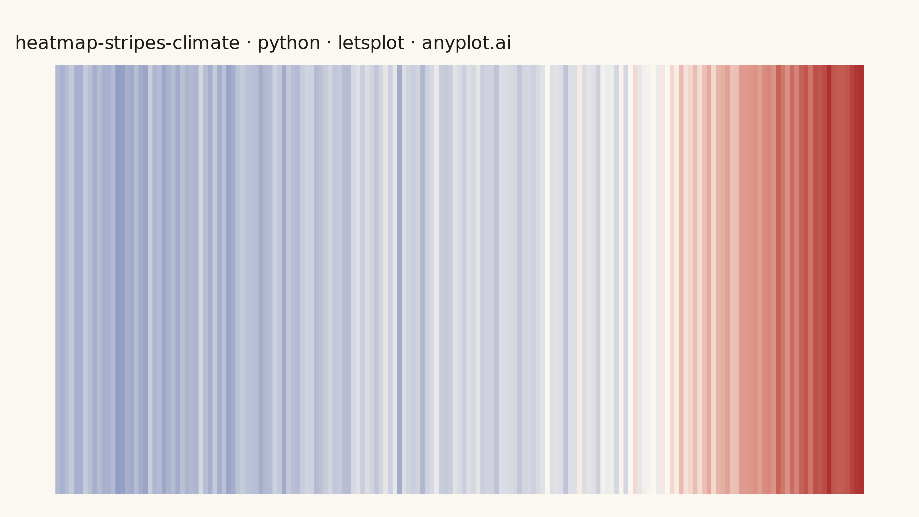
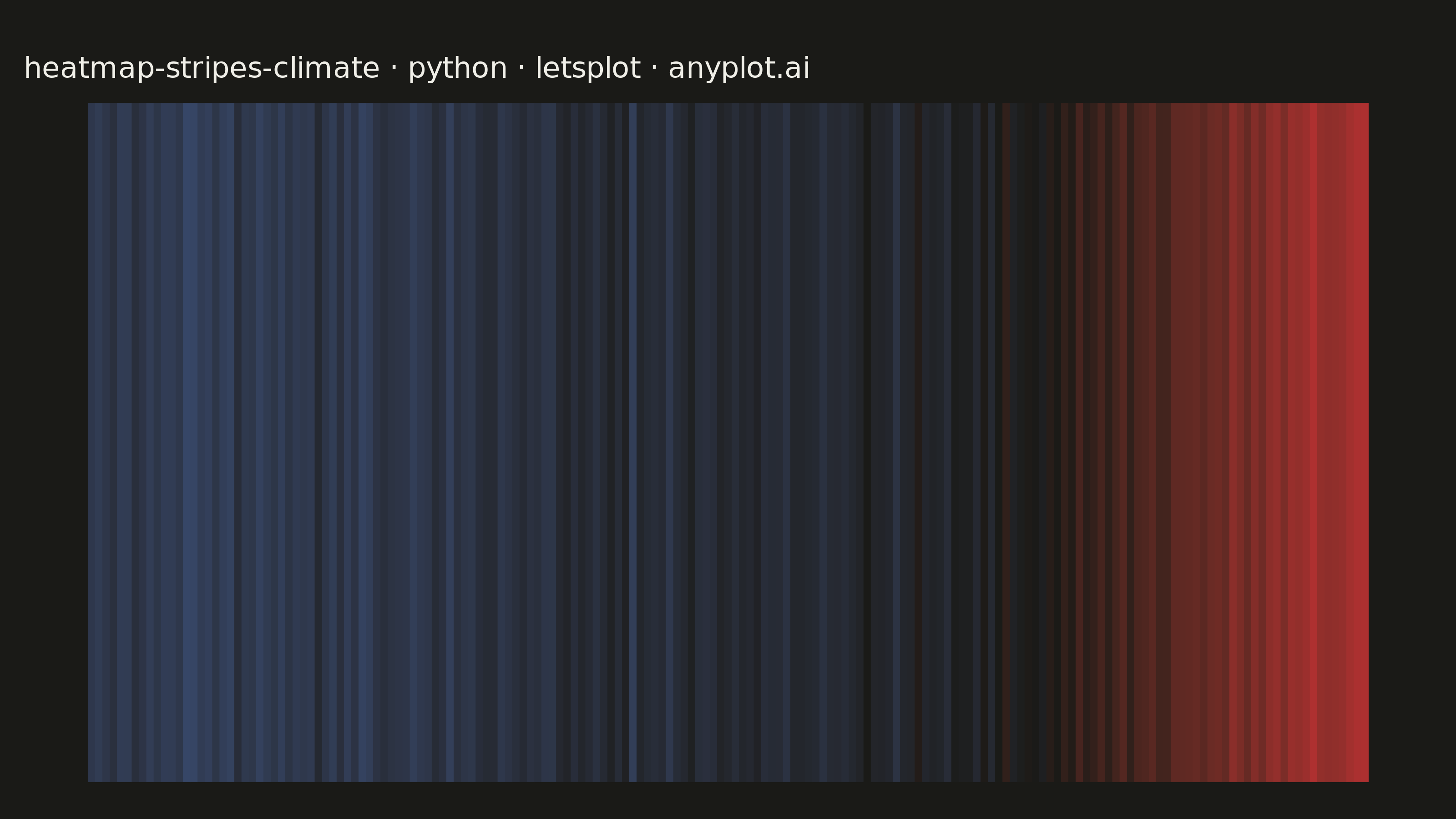
Climate warming stripes (also known as "warming stripes") display temperature anomaly data as a sequence of vertical colored bars, one per year, using a blue-to-red diverging colormap. Created by climate scientist Ed Hawkins, this minimalist visualization strips away axes, labels, and gridlines to communicate long-term warming trends through pure color encoding. The progression from cool blues to warm reds makes temperature change immediately visible at a glance.
""" anyplot.ai
heatmap-stripes-climate: Climate Warming Stripes
Library: letsplot 4.10.1 | Python 3.13.13
Quality: 87/100 | Updated: 2026-06-02
"""

import os

import numpy as np
import pandas as pd
from lets_plot import (
    LetsPlot,
    aes,
    element_rect,
    element_text,
    geom_tile,
    ggplot,
    ggsize,
    labs,
    layer_tooltips,
    scale_fill_gradient2,
    theme,
    theme_void,
)
from lets_plot.export import ggsave


LetsPlot.setup_html()

# Theme tokens
THEME = os.getenv("ANYPLOT_THEME", "light")
PAGE_BG = "#FAF8F1" if THEME == "light" else "#1A1A17"
INK = "#1A1A17" if THEME == "light" else "#F0EFE8"

# Data - synthetic global temperature anomalies (1850-2024) relative to 1961-1990 baseline
np.random.seed(42)
years = np.arange(1850, 2025)
n_years = len(years)

baseline_trend = np.where(
    years < 1910,
    -0.3 + (years - 1850) * 0.002,
    np.where(years < 1970, -0.15 + (years - 1910) * 0.002, -0.03 + (years - 1970) * 0.018),
)
noise = np.random.normal(0, 0.08, n_years)
anomalies = baseline_trend + noise

baseline_mask = (years >= 1961) & (years <= 1990)
anomalies = anomalies - anomalies[baseline_mask].mean()

df = pd.DataFrame({"year": years, "anomaly": np.round(anomalies, 3), "row": "temp"})

vmax = max(abs(df["anomaly"].min()), abs(df["anomaly"].max()))

# Title fontsize — scale linearly from 16px baseline at 67 chars
title = "heatmap-stripes-climate · python · letsplot · anyplot.ai"
n = len(title)
ratio = 67 / n if n > 67 else 1.0
title_fontsize = max(11, round(16 * ratio))

# Plot - warming stripes: pure color, no axes, no legend
plot = (
    ggplot(df, aes(x="year", y="row", fill="anomaly"))
    + geom_tile(
        width=1.0,
        height=10.0,
        tooltips=layer_tooltips().line("Year: @year").line("Anomaly: @anomaly °C").format("@anomaly", ".3f"),
    )
    + scale_fill_gradient2(low="#4467A3", mid=PAGE_BG, high="#AE3030", midpoint=0, limits=[-vmax, vmax], name="")
    + labs(title=title)
    + theme_void()
    + theme(
        plot_title=element_text(size=title_fontsize, color=INK),
        legend_position="none",
        plot_background=element_rect(fill=PAGE_BG, color=PAGE_BG),
        panel_background=element_rect(fill=PAGE_BG, color=PAGE_BG),
        plot_margin=[30, 10, 10, 10],
    )
    + ggsize(800, 450)
)

# Save
ggsave(plot, f"plot-{THEME}.png", path=".", scale=4)
ggsave(plot, f"plot-{THEME}.html", path=".")
Runnable source as JSON, for any HTTP client: https://api.anyplot.ai/specs/heatmap-stripes-climate/letsplot/code. Any spec id and library id listed in llms-full.txt fit the same URL shape; every URL below is complete and callable.
{
  "spec_id": "heatmap-stripes-climate",
  "language": "python",
  "library": "letsplot",
  "page": "https://anyplot.ai/heatmap-stripes-climate/python/letsplot",
  "hub": "https://anyplot.ai/heatmap-stripes-climate",
  "code_json": "https://api.anyplot.ai/specs/heatmap-stripes-climate/letsplot/code",
  "spec_json": "https://api.anyplot.ai/specs/heatmap-stripes-climate",
  "render_light_png": "https://storage.googleapis.com/anyplot-images/plots/heatmap-stripes-climate/python/letsplot/plot-light.png",
  "render_dark_png": "https://storage.googleapis.com/anyplot-images/plots/heatmap-stripes-climate/python/letsplot/plot-dark.png",
  "interactive_light_html": "https://storage.googleapis.com/anyplot-images/plots/heatmap-stripes-climate/python/letsplot/plot-light.html",
  "interactive_dark_html": "https://storage.googleapis.com/anyplot-images/plots/heatmap-stripes-climate/python/letsplot/plot-dark.html",
  "quality_score": 87.0,
  "license": "MIT",
  "guide": "https://anyplot.ai/llms.txt"
}
Part of Climate Warming Stripes on anyplot.ai.