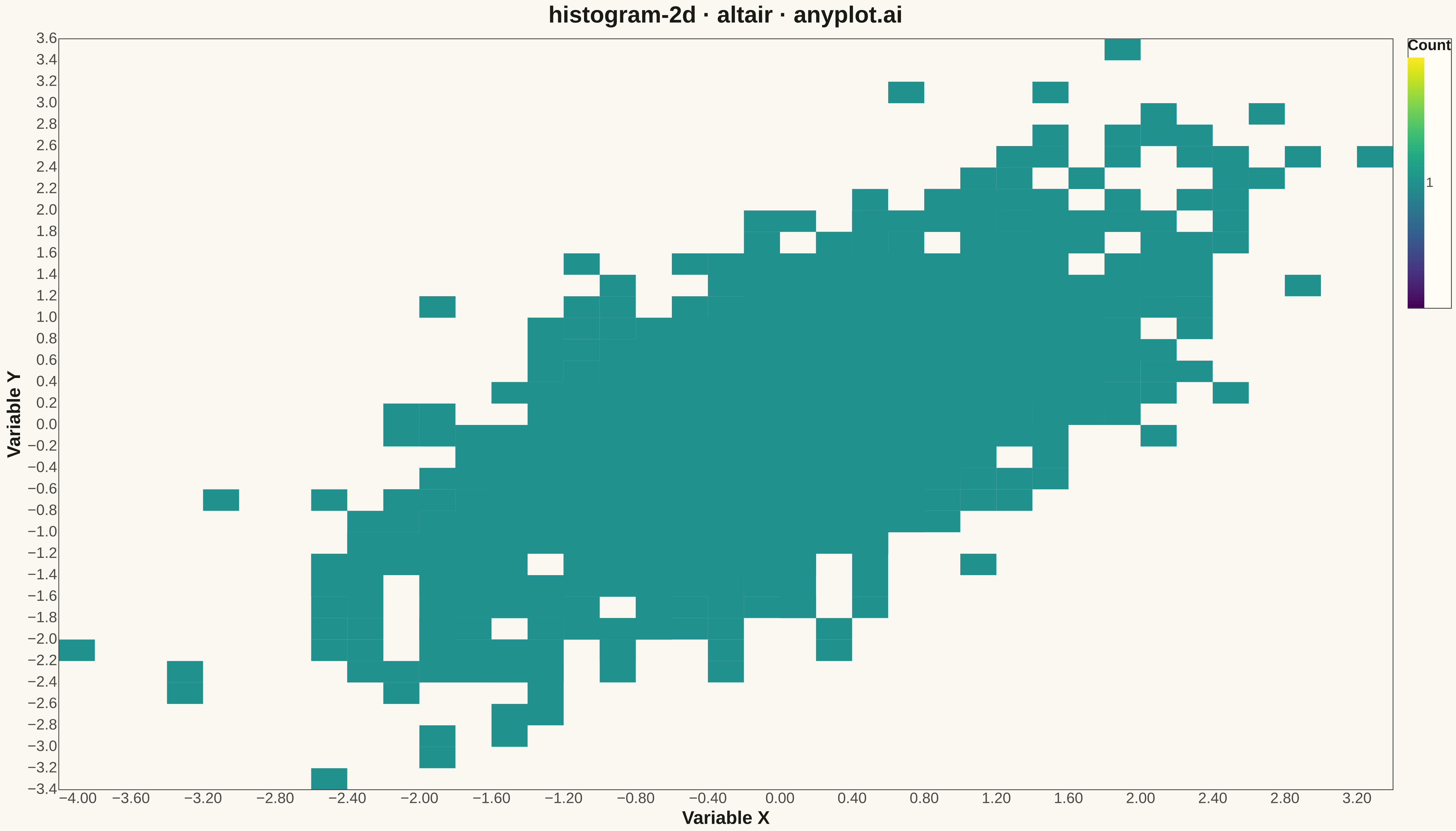
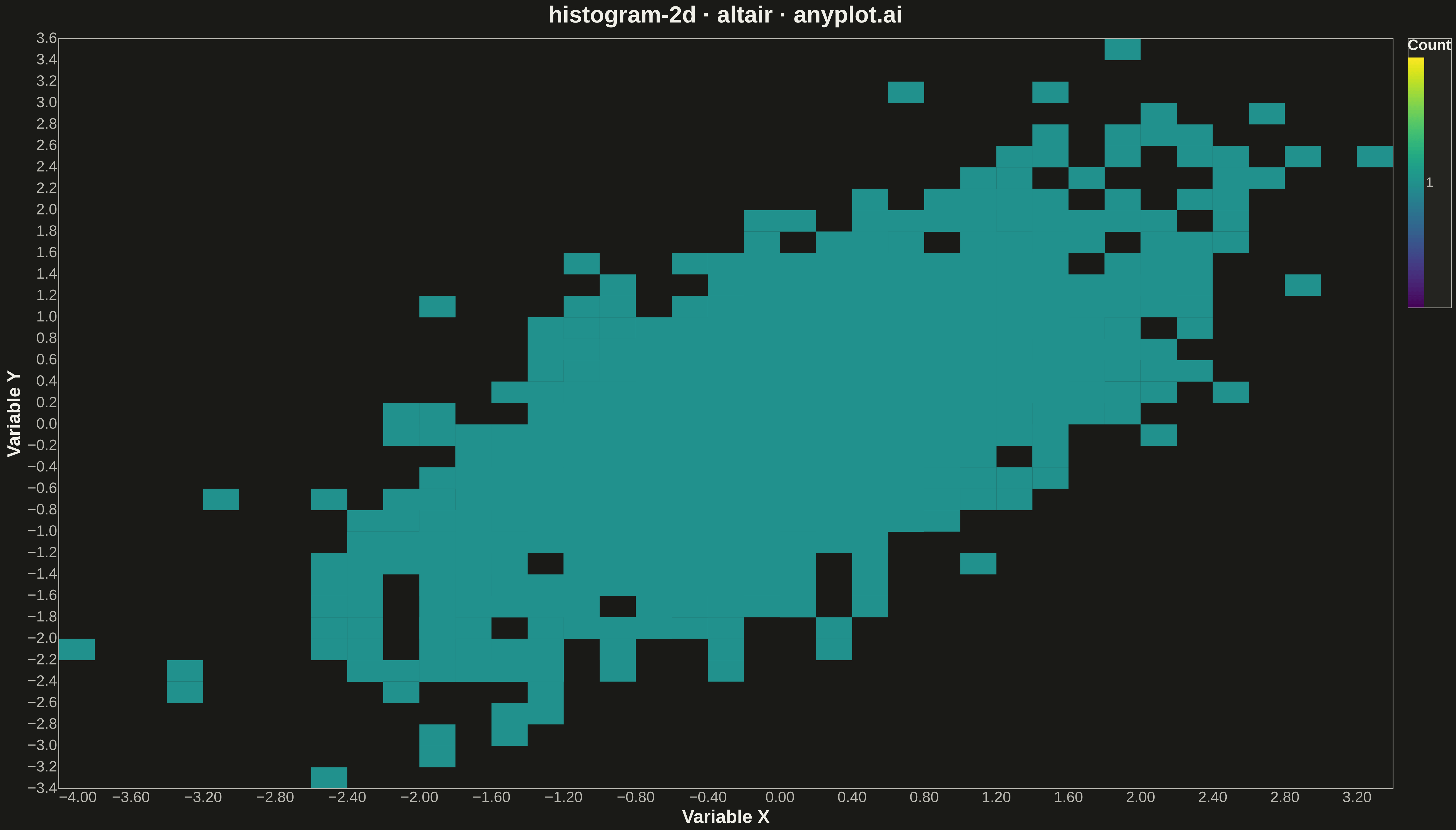
A two-dimensional histogram that displays the joint distribution of two continuous variables as a heatmap with rectangular bins. Each bin's color intensity represents the frequency or count of data points falling within that region, making it ideal for revealing density patterns, clusters, and correlations in bivariate data. Unlike scatter plots that can become cluttered with large datasets, 2D histograms effectively summarize point density.
""" anyplot.ai
histogram-2d: 2D Histogram Heatmap
Library: altair 6.1.0 | Python 3.13.13
Quality: 82/100 | Updated: 2026-05-08
"""

import os

import altair as alt
import numpy as np
import pandas as pd


# Theme tokens
THEME = os.getenv("ANYPLOT_THEME", "light")
PAGE_BG = "#FAF8F1" if THEME == "light" else "#1A1A17"
ELEVATED_BG = "#FFFDF6" if THEME == "light" else "#242420"
INK = "#1A1A17" if THEME == "light" else "#F0EFE8"
INK_SOFT = "#4A4A44" if THEME == "light" else "#B8B7B0"

# Data: Bivariate normal distribution with correlation
np.random.seed(42)
n_points = 2000
mean = [0, 0]
cov = [[1, 0.7], [0.7, 1]]
data = np.random.multivariate_normal(mean, cov, n_points)
df = pd.DataFrame({"x": data[:, 0], "y": data[:, 1]})

# Create 2D histogram heatmap using mark_rect with binning
chart = (
    alt.Chart(df)
    .mark_rect()
    .encode(
        x=alt.X("x:Q", bin=alt.Bin(maxbins=40), title="Variable X"),
        y=alt.Y("y:Q", bin=alt.Bin(maxbins=40), title="Variable Y"),
        color=alt.Color(
            "count():Q",
            scale=alt.Scale(scheme="viridis"),
            title="Count",
            legend=alt.Legend(
                titleFontSize=18,
                labelFontSize=16,
                gradientLength=300,
                gradientThickness=20,
                fillColor=ELEVATED_BG,
                strokeColor=INK_SOFT,
            ),
        ),
        tooltip=[
            alt.Tooltip("x:Q", format=".2f", title="X Range"),
            alt.Tooltip("y:Q", format=".2f", title="Y Range"),
            alt.Tooltip("count():Q", title="Bin Count"),
        ],
    )
    .properties(
        width=1600,
        height=900,
        title=alt.Title("histogram-2d · altair · anyplot.ai", fontSize=28, anchor="middle"),
        background=PAGE_BG,
    )
    .configure_axis(
        labelFontSize=18,
        titleFontSize=22,
        tickSize=0,
        domainColor=INK_SOFT,
        labelColor=INK_SOFT,
        titleColor=INK,
        gridColor=INK,
        gridOpacity=0.0,
    )
    .configure_view(fill=PAGE_BG, stroke=INK_SOFT, strokeWidth=1)
    .configure_title(color=INK, fontSize=28)
    .configure_legend(fillColor=ELEVATED_BG, strokeColor=INK_SOFT, labelColor=INK_SOFT, titleColor=INK)
)

# Save as PNG and HTML with theme suffix
chart.save(f"plot-{THEME}.png", scale_factor=3.0)
chart.save(f"plot-{THEME}.html")
Runnable source as JSON, for any HTTP client: https://api.anyplot.ai/specs/histogram-2d/altair/code. Any spec id and library id listed in llms-full.txt fit the same URL shape; every URL below is complete and callable.
{
  "spec_id": "histogram-2d",
  "language": "python",
  "library": "altair",
  "page": "https://anyplot.ai/histogram-2d/python/altair",
  "hub": "https://anyplot.ai/histogram-2d",
  "code_json": "https://api.anyplot.ai/specs/histogram-2d/altair/code",
  "spec_json": "https://api.anyplot.ai/specs/histogram-2d",
  "render_light_png": "https://storage.googleapis.com/anyplot-images/plots/histogram-2d/python/altair/plot-light.png",
  "render_dark_png": "https://storage.googleapis.com/anyplot-images/plots/histogram-2d/python/altair/plot-dark.png",
  "interactive_light_html": "https://storage.googleapis.com/anyplot-images/plots/histogram-2d/python/altair/plot-light.html",
  "interactive_dark_html": "https://storage.googleapis.com/anyplot-images/plots/histogram-2d/python/altair/plot-dark.html",
  "quality_score": 82.0,
  "license": "MIT",
  "guide": "https://anyplot.ai/llms.txt"
}
Part of 2D Histogram Heatmap on anyplot.ai.