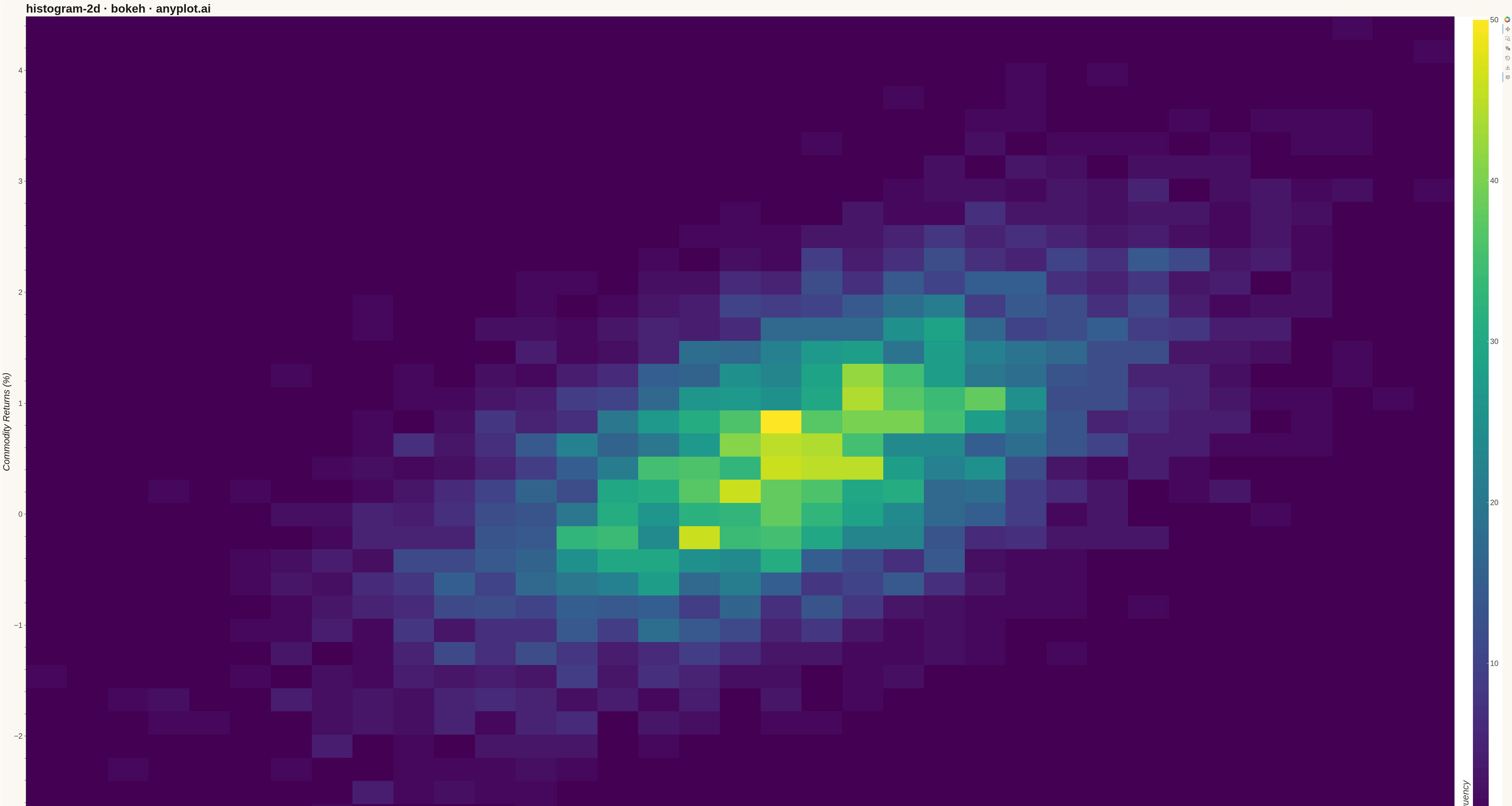
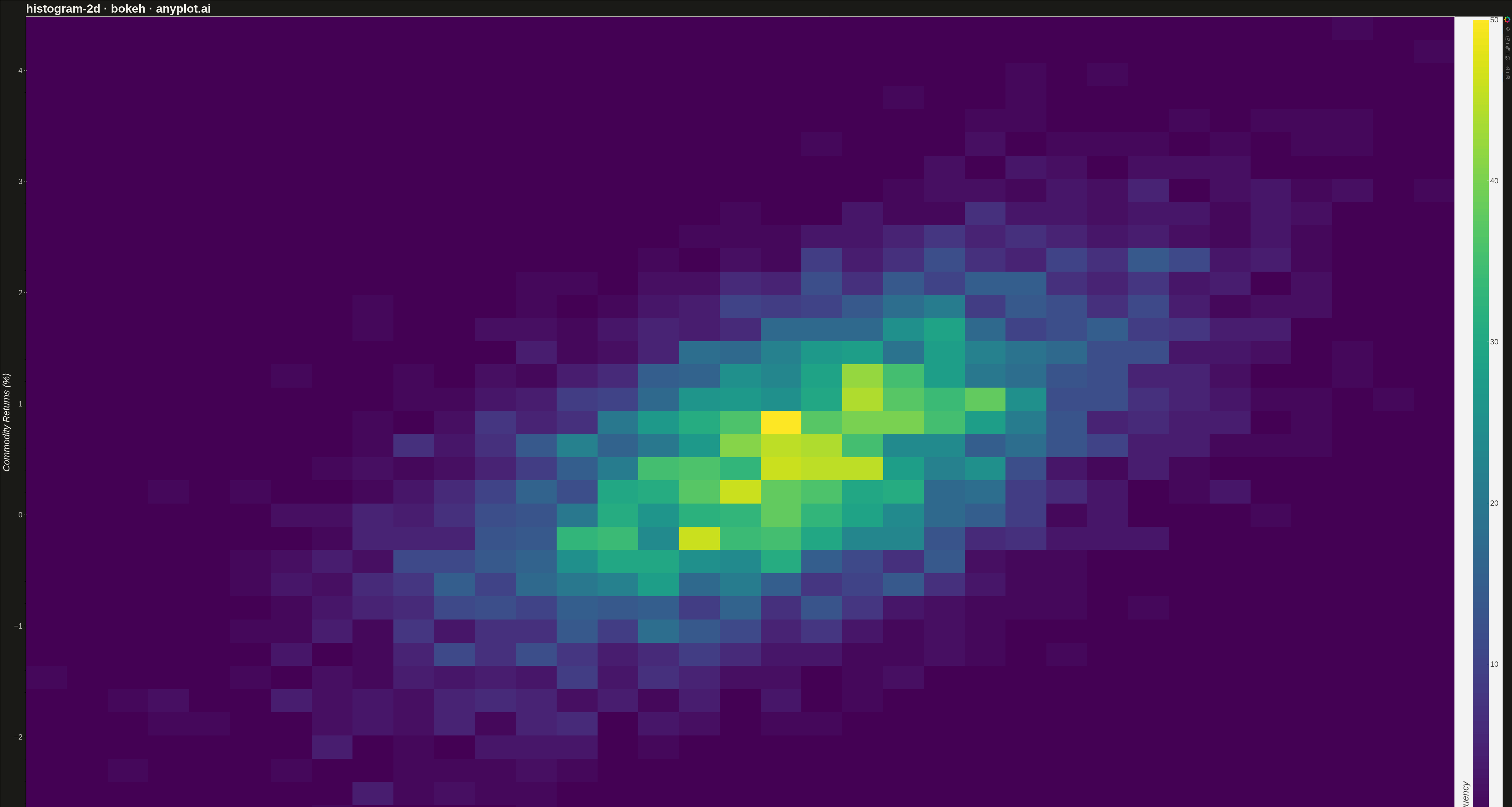
A two-dimensional histogram that displays the joint distribution of two continuous variables as a heatmap with rectangular bins. Each bin's color intensity represents the frequency or count of data points falling within that region, making it ideal for revealing density patterns, clusters, and correlations in bivariate data. Unlike scatter plots that can become cluttered with large datasets, 2D histograms effectively summarize point density.
""" anyplot.ai
histogram-2d: 2D Histogram Heatmap
Library: bokeh 3.9.0 | Python 3.13.13
Quality: 88/100 | Updated: 2026-05-08
"""

import os
import time
from pathlib import Path

import numpy as np
from bokeh.io import output_file, save
from bokeh.models import ColorBar, HoverTool, LinearColorMapper
from bokeh.palettes import Viridis256
from bokeh.plotting import figure
from selenium import webdriver
from selenium.webdriver.chrome.options import Options


# Theme tokens
THEME = os.getenv("ANYPLOT_THEME", "light")
PAGE_BG = "#FAF8F1" if THEME == "light" else "#1A1A17"
ELEVATED_BG = "#FFFDF6" if THEME == "light" else "#242420"
INK = "#1A1A17" if THEME == "light" else "#F0EFE8"
INK_SOFT = "#4A4A44" if THEME == "light" else "#B8B7B0"

# Data - bivariate normal distribution of asset returns
np.random.seed(42)
n_points = 5000
mean = [0.5, 0.5]
cov = [[1, 0.6], [0.6, 1]]  # Correlation of 0.6
data = np.random.multivariate_normal(mean, cov, n_points)
returns_asset1 = data[:, 0]  # Daily returns (%) for Tech stocks
returns_asset2 = data[:, 1]  # Daily returns (%) for Commodities

# Compute 2D histogram
bins = 35
hist, x_edges, y_edges = np.histogram2d(returns_asset1, returns_asset2, bins=bins)

# Create plot
p = figure(
    width=4800,
    height=2700,
    title="histogram-2d · bokeh · anyplot.ai",
    x_axis_label="Tech Stock Returns (%)",
    y_axis_label="Commodity Returns (%)",
    x_range=(x_edges[0], x_edges[-1]),
    y_range=(y_edges[0], y_edges[-1]),
    toolbar_location="right",
    tools="pan,wheel_zoom,box_zoom,reset,save",
)

# Color mapper for heatmap
color_mapper = LinearColorMapper(palette=Viridis256, low=0, high=hist.max())

# Create image glyph
p.image(
    image=[hist.T],
    x=x_edges[0],
    y=y_edges[0],
    dw=x_edges[-1] - x_edges[0],
    dh=y_edges[-1] - y_edges[0],
    color_mapper=color_mapper,
)

# Add HoverTool for interactivity
hover = HoverTool(tooltips=[("Count", "@image")])
p.add_tools(hover)

# Add color bar
color_bar = ColorBar(
    color_mapper=color_mapper,
    width=50,
    location=(0, 0),
    title="Frequency",
    title_text_font_size="22pt",
    major_label_text_font_size="18pt",
    title_standoff=15,
)
p.add_layout(color_bar, "right")

# Text sizing for 4800x2700 canvas
p.title.text_font_size = "28pt"
p.xaxis.axis_label_text_font_size = "22pt"
p.yaxis.axis_label_text_font_size = "22pt"
p.xaxis.major_label_text_font_size = "18pt"
p.yaxis.major_label_text_font_size = "18pt"

# Theme-adaptive chrome styling
p.background_fill_color = PAGE_BG
p.border_fill_color = PAGE_BG
p.outline_line_color = INK_SOFT

p.title.text_color = INK
p.xaxis.axis_label_text_color = INK
p.yaxis.axis_label_text_color = INK
p.xaxis.major_label_text_color = INK_SOFT
p.yaxis.major_label_text_color = INK_SOFT
p.xaxis.axis_line_color = INK_SOFT
p.yaxis.axis_line_color = INK_SOFT
p.xaxis.major_tick_line_color = INK_SOFT
p.yaxis.major_tick_line_color = INK_SOFT

p.xgrid.grid_line_alpha = 0.0
p.ygrid.grid_line_alpha = 0.0

# Save HTML
output_file(f"plot-{THEME}.html")
save(p)

# Screenshot with Selenium
W, H = 4800, 2700
opts = Options()
for arg in (
    "--headless=new",
    "--no-sandbox",
    "--disable-dev-shm-usage",
    "--disable-gpu",
    f"--window-size={W},{H}",
    "--hide-scrollbars",
):
    opts.add_argument(arg)
driver = webdriver.Chrome(options=opts)
driver.set_window_size(W, H)
driver.get(f"file://{Path(f'plot-{THEME}.html').resolve()}")
time.sleep(3)
driver.save_screenshot(f"plot-{THEME}.png")
driver.quit()
Runnable source as JSON, for any HTTP client: https://api.anyplot.ai/specs/histogram-2d/bokeh/code. Any spec id and library id listed in llms-full.txt fit the same URL shape; every URL below is complete and callable.
{
  "spec_id": "histogram-2d",
  "language": "python",
  "library": "bokeh",
  "page": "https://anyplot.ai/histogram-2d/python/bokeh",
  "hub": "https://anyplot.ai/histogram-2d",
  "code_json": "https://api.anyplot.ai/specs/histogram-2d/bokeh/code",
  "spec_json": "https://api.anyplot.ai/specs/histogram-2d",
  "render_light_png": "https://storage.googleapis.com/anyplot-images/plots/histogram-2d/python/bokeh/plot-light.png",
  "render_dark_png": "https://storage.googleapis.com/anyplot-images/plots/histogram-2d/python/bokeh/plot-dark.png",
  "interactive_light_html": "https://storage.googleapis.com/anyplot-images/plots/histogram-2d/python/bokeh/plot-light.html",
  "interactive_dark_html": "https://storage.googleapis.com/anyplot-images/plots/histogram-2d/python/bokeh/plot-dark.html",
  "quality_score": 88.0,
  "license": "MIT",
  "guide": "https://anyplot.ai/llms.txt"
}
Part of 2D Histogram Heatmap on anyplot.ai.