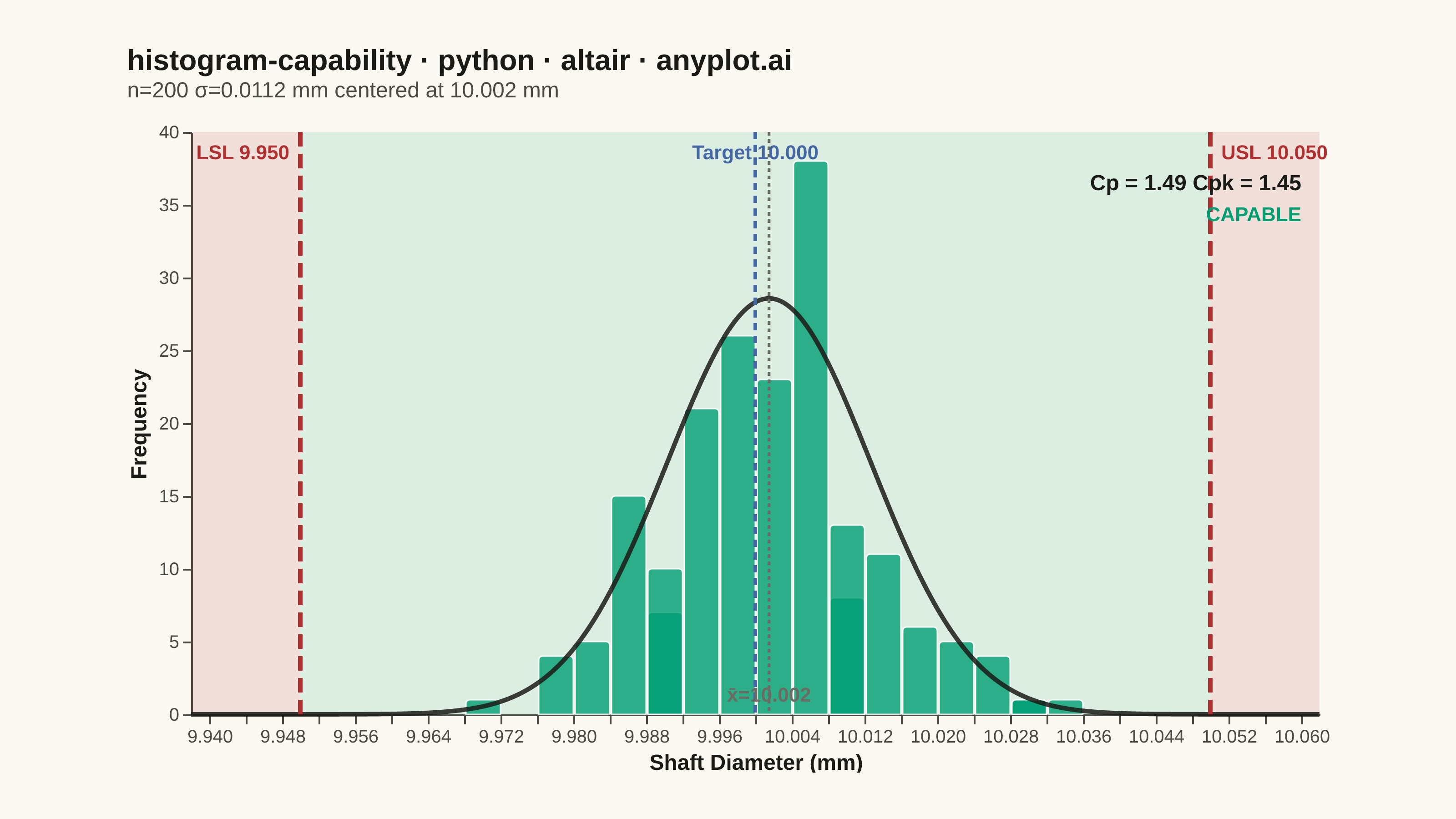
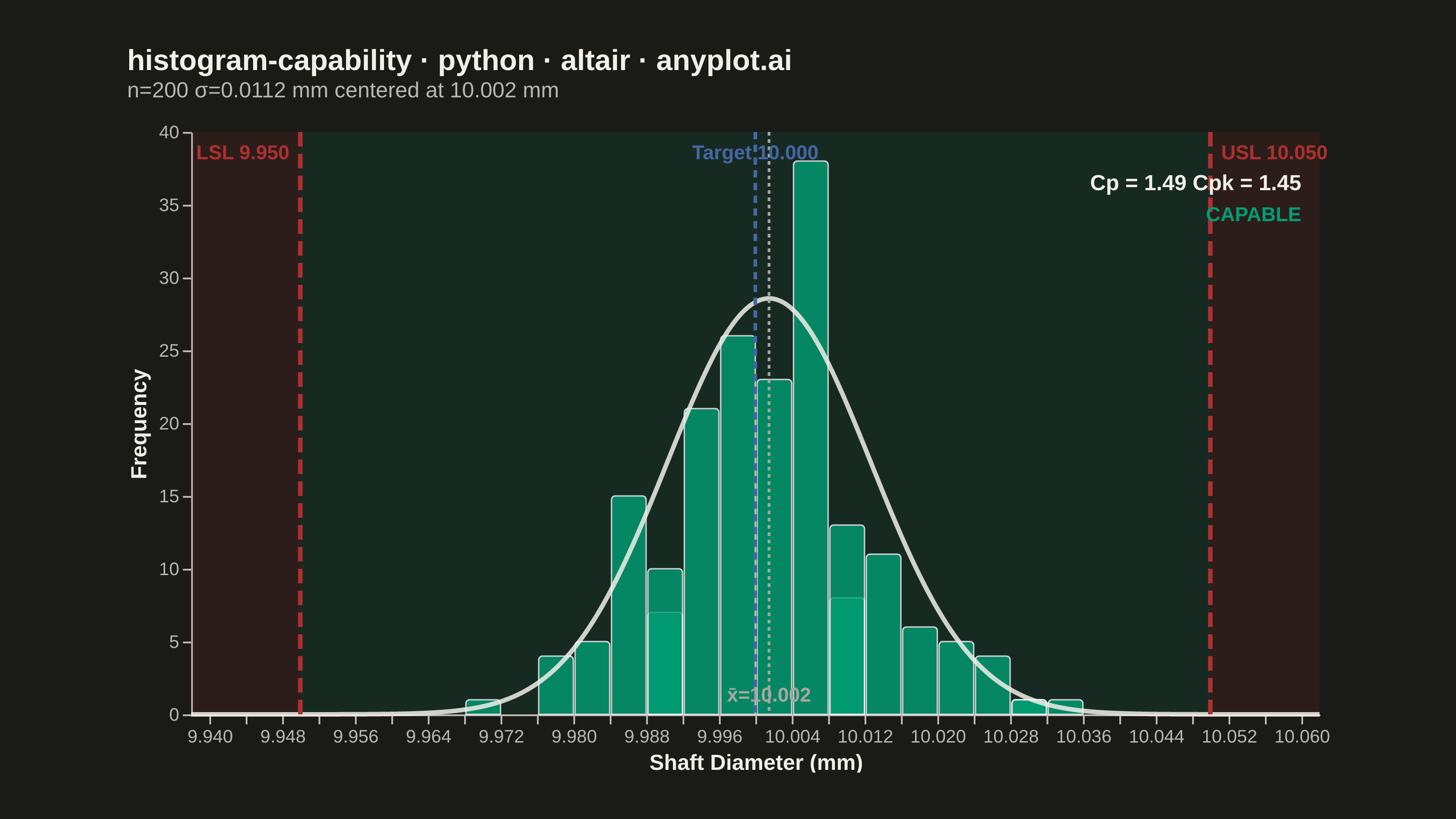
A process capability plot displays a histogram of measured process data overlaid with a fitted normal distribution curve and vertical lines for specification limits (LSL, USL) and target value. Capability indices (Cp, Cpk) are annotated on the plot to quantify how well the process meets specifications. This is a standard tool in quality engineering and Six Sigma for assessing whether a manufacturing or production process is capable of consistently producing output within tolerance.
""" anyplot.ai
histogram-capability: Process Capability Plot with Specification Limits
Library: altair 6.2.1 | Python 3.13.14
Quality: 92/100 | Updated: 2026-06-20
"""

import os
import sys


# Prevent self-import: this script is named altair.py; drop its directory from
# sys.path so `import altair` resolves to the installed package, not this file.
_here = os.path.dirname(os.path.abspath(__file__))
sys.path = [p for p in sys.path if os.path.realpath(p or ".") != os.path.realpath(_here)]

import altair as alt
import numpy as np
import pandas as pd
from PIL import Image
from scipy import stats


THEME = os.getenv("ANYPLOT_THEME", "light")
PAGE_BG = "#FAF8F1" if THEME == "light" else "#1A1A17"
INK = "#1A1A17" if THEME == "light" else "#F0EFE8"
INK_SOFT = "#4A4A44" if THEME == "light" else "#B8B7B0"
INK_MUTED = "#6B6A63" if THEME == "light" else "#A8A79F"

# Imprint palette — semantic roles
BRAND = "#009E73"  # histogram bars (brand green)
COLOR_LIMIT = "#AE3030"  # LSL/USL lines (semantic: out-of-spec = bad/red)
COLOR_TARGET = "#4467A3"  # target / nominal line (blue)

# Data
np.random.seed(42)
n_measurements = 200
target = 10.00
lsl = 9.95
usl = 10.05
measurements = np.random.normal(loc=10.002, scale=0.012, size=n_measurements)

mean_val = measurements.mean()
sigma = measurements.std(ddof=1)
cp = (usl - lsl) / (6 * sigma)
cpk = min((usl - mean_val) / (3 * sigma), (mean_val - lsl) / (3 * sigma))

df = pd.DataFrame({"diameter": measurements})

x_lo, x_hi = lsl - 0.012, usl + 0.012
x_scale = alt.Scale(domain=[x_lo, x_hi])
bin_step = 0.004

# Background zones (out-of-spec / in-spec)
zone_df = pd.DataFrame({"x": [x_lo, lsl, usl], "x2": [lsl, usl, x_hi], "zone": ["oos", "spec", "oos"]})
zones = (
    alt.Chart(zone_df)
    .mark_rect(opacity=0.12)
    .encode(
        x=alt.X("x:Q", scale=x_scale),
        x2="x2:Q",
        color=alt.Color("zone:N", scale=alt.Scale(domain=["oos", "spec"], range=[COLOR_LIMIT, BRAND]), legend=None),
    )
)

# Idiomatic histogram — mark_bar with built-in bin transform
hover = alt.selection_point(on="pointerover", empty=False)
histogram = (
    alt.Chart(df)
    .mark_bar(stroke="white", strokeWidth=0.8, cornerRadiusTopLeft=2, cornerRadiusTopRight=2)
    .add_params(hover)
    .encode(
        x=alt.X(
            "diameter:Q", bin=alt.Bin(step=bin_step, extent=[x_lo, x_hi]), title="Shaft Diameter (mm)", scale=x_scale
        ),
        y=alt.Y("count():Q", title="Frequency"),
        color=alt.value(BRAND),
        opacity=alt.condition(hover, alt.value(1.0), alt.value(0.80)),
        tooltip=[alt.Tooltip("diameter:Q", bin=True, title="Range"), alt.Tooltip("count():Q", title="Count")],
    )
)

# Fitted normal distribution curve
x_curve = np.linspace(x_lo, x_hi, 300)
y_curve = stats.norm.pdf(x_curve, mean_val, sigma) * n_measurements * bin_step
curve_df = pd.DataFrame({"x": x_curve, "y": y_curve})
curve = (
    alt.Chart(curve_df)
    .mark_line(color=INK, strokeWidth=2.5, opacity=0.85, interpolate="monotone")
    .encode(x=alt.X("x:Q", scale=x_scale), y="y:Q")
)

# Specification limit lines (LSL / USL)
spec_rules = (
    alt.Chart(pd.DataFrame({"value": [lsl, usl]}))
    .mark_rule(color=COLOR_LIMIT, strokeWidth=2.5, strokeDash=[8, 4])
    .encode(x=alt.X("value:Q", scale=x_scale))
)

# Target line
target_rule = (
    alt.Chart(pd.DataFrame({"value": [target]}))
    .mark_rule(color=COLOR_TARGET, strokeWidth=2.0, strokeDash=[4, 3])
    .encode(x=alt.X("value:Q", scale=x_scale))
)

# Mean line
mean_rule = (
    alt.Chart(pd.DataFrame({"value": [mean_val]}))
    .mark_rule(color=INK_MUTED, strokeWidth=1.5, strokeDash=[2, 2])
    .encode(x=alt.X("value:Q", scale=x_scale))
)

# Spec limit and target labels (near top of plot area)
lsl_label = (
    alt.Chart(pd.DataFrame({"v": [lsl], "t": ["LSL 9.950"]}))
    .mark_text(align="right", dx=-6, fontSize=11, fontWeight="bold", color=COLOR_LIMIT)
    .encode(x=alt.X("v:Q", scale=x_scale), y=alt.value(12), text="t:N")
)
usl_label = (
    alt.Chart(pd.DataFrame({"v": [usl], "t": ["USL 10.050"]}))
    .mark_text(align="left", dx=6, fontSize=11, fontWeight="bold", color=COLOR_LIMIT)
    .encode(x=alt.X("v:Q", scale=x_scale), y=alt.value(12), text="t:N")
)
target_label = (
    alt.Chart(pd.DataFrame({"v": [target], "t": ["Target 10.000"]}))
    .mark_text(align="center", fontSize=11, fontWeight="bold", color=COLOR_TARGET)
    .encode(x=alt.X("v:Q", scale=x_scale), y=alt.value(12), text="t:N")
)

# Capability indices and status annotation (top-right)
status = "CAPABLE" if cpk >= 1.33 else "NOT CAPABLE"
status_color = BRAND if cpk >= 1.33 else COLOR_LIMIT
annot_df = pd.DataFrame({"x": [x_hi - 0.002]})
cap_text = (
    alt.Chart(annot_df)
    .mark_text(align="right", fontSize=12, fontWeight="bold", color=INK)
    .encode(x=alt.X("x:Q", scale=x_scale), y=alt.value(28), text=alt.value(f"Cp = {cp:.2f}   Cpk = {cpk:.2f}"))
)
status_text = (
    alt.Chart(annot_df)
    .mark_text(align="right", fontSize=11, fontWeight="bold", color=status_color)
    .encode(x=alt.X("x:Q", scale=x_scale), y=alt.value(46), text=alt.value(status))
)

# Mean value label (near bottom of plot)
mean_label = (
    alt.Chart(pd.DataFrame({"v": [mean_val]}))
    .mark_text(align="center", baseline="top", dy=4, fontSize=11, fontWeight="bold", color=INK_MUTED)
    .encode(x=alt.X("v:Q", scale=x_scale), y=alt.value(300), text=alt.value(f"x̄={mean_val:.3f}"))
)

# Compose
title_str = "histogram-capability · python · altair · anyplot.ai"
n_chars = len(title_str)
ratio = 67 / n_chars if n_chars > 67 else 1.0
title_fontsize = max(11, round(16 * ratio))

chart = (
    alt.layer(
        zones,
        histogram,
        curve,
        spec_rules,
        target_rule,
        mean_rule,
        lsl_label,
        usl_label,
        target_label,
        cap_text,
        status_text,
        mean_label,
    )
    .properties(
        width=620,
        height=320,
        background=PAGE_BG,
        padding={"left": 0, "right": 0, "top": 0, "bottom": 0},
        title=alt.Title(
            title_str,
            fontSize=title_fontsize,
            fontWeight="bold",
            anchor="start",
            color=INK,
            offset=12,
            subtitle=f"n={n_measurements}   σ={sigma:.4f} mm   centered at {mean_val:.3f} mm",
            subtitleFontSize=12,
            subtitleColor=INK_SOFT,
        ),
    )
    .configure_axis(
        labelFontSize=10,
        titleFontSize=12,
        titleColor=INK,
        labelColor=INK_SOFT,
        grid=False,
        domainColor=INK_SOFT,
        tickColor=INK_SOFT,
    )
    .configure_view(fill=PAGE_BG, strokeWidth=0)
    .configure_title(color=INK)
    .configure_legend(disable=True)
)

# Save — canonical 3200 × 1800 landscape with PIL padding
TW, TH = 3200, 1800
chart.save(f"plot-{THEME}.png", scale_factor=4.0)
_img = Image.open(f"plot-{THEME}.png").convert("RGB")
_w, _h = _img.size
if _w > TW or _h > TH:
    raise SystemExit(
        f"altair vl-convert produced {_w}×{_h}, exceeds target {TW}×{TH}. "
        f"Shrink chart .properties(width=, height=) values and re-render."
    )
if _w < TW or _h < TH:
    _canvas = Image.new("RGB", (TW, TH), PAGE_BG)
    _canvas.paste(_img, ((TW - _w) // 2, (TH - _h) // 2))
    _canvas.save(f"plot-{THEME}.png")

chart.save(f"plot-{THEME}.html")
Runnable source as JSON, for any HTTP client: https://api.anyplot.ai/specs/histogram-capability/altair/code. Any spec id and library id listed in llms-full.txt fit the same URL shape; every URL below is complete and callable.
{
  "spec_id": "histogram-capability",
  "language": "python",
  "library": "altair",
  "page": "https://anyplot.ai/histogram-capability/python/altair",
  "hub": "https://anyplot.ai/histogram-capability",
  "code_json": "https://api.anyplot.ai/specs/histogram-capability/altair/code",
  "spec_json": "https://api.anyplot.ai/specs/histogram-capability",
  "render_light_png": "https://storage.googleapis.com/anyplot-images/plots/histogram-capability/python/altair/plot-light.png",
  "render_dark_png": "https://storage.googleapis.com/anyplot-images/plots/histogram-capability/python/altair/plot-dark.png",
  "interactive_light_html": "https://storage.googleapis.com/anyplot-images/plots/histogram-capability/python/altair/plot-light.html",
  "interactive_dark_html": "https://storage.googleapis.com/anyplot-images/plots/histogram-capability/python/altair/plot-dark.html",
  "quality_score": 92.0,
  "license": "MIT",
  "guide": "https://anyplot.ai/llms.txt"
}
Part of Process Capability Plot with Specification Limits on anyplot.ai.