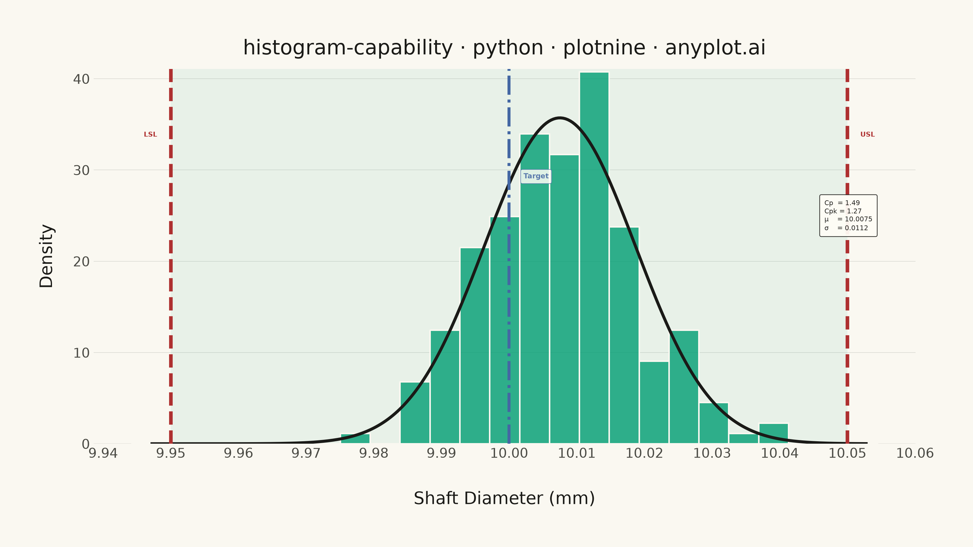
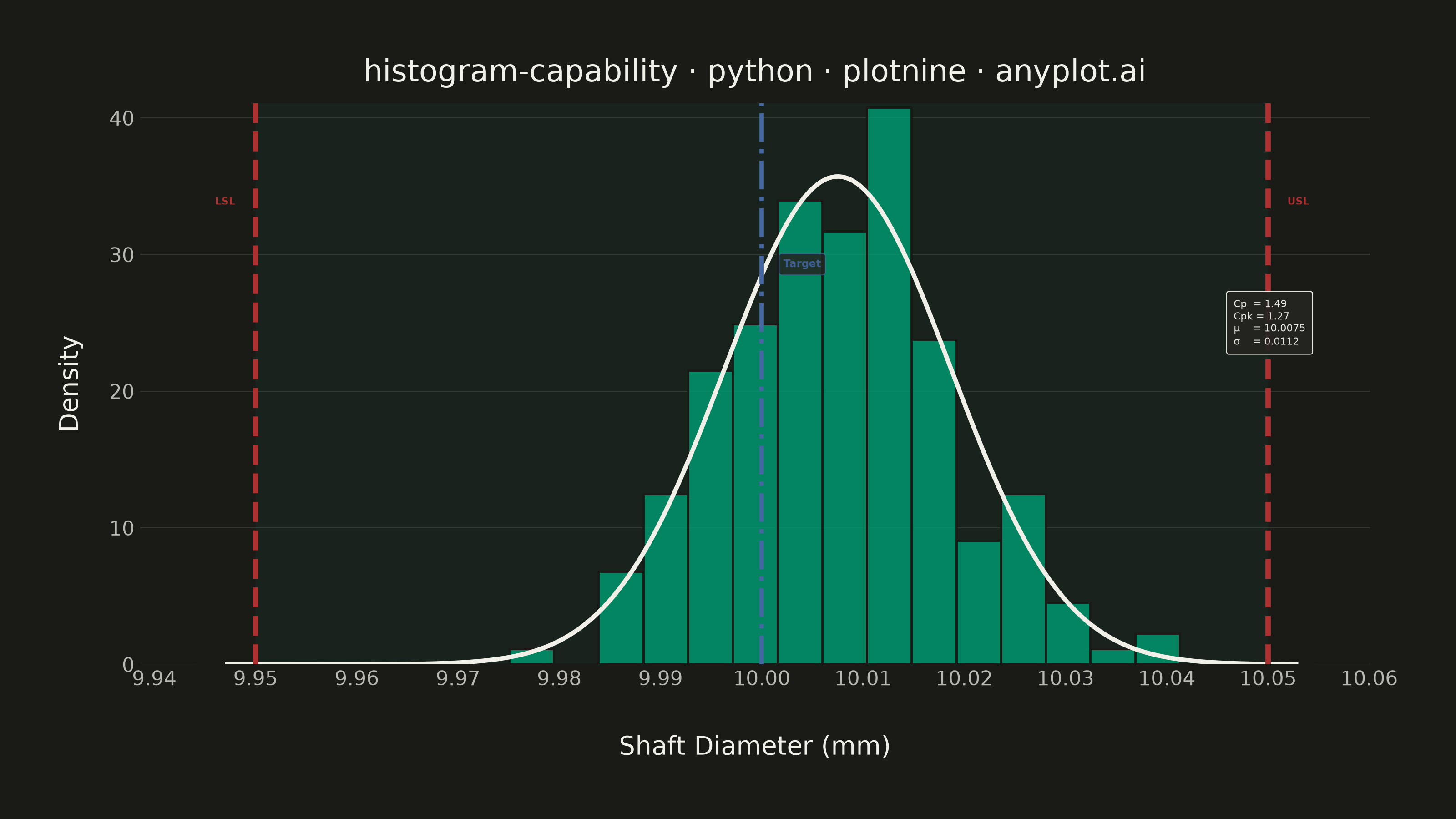
A process capability plot displays a histogram of measured process data overlaid with a fitted normal distribution curve and vertical lines for specification limits (LSL, USL) and target value. Capability indices (Cp, Cpk) are annotated on the plot to quantify how well the process meets specifications. This is a standard tool in quality engineering and Six Sigma for assessing whether a manufacturing or production process is capable of consistently producing output within tolerance.
""" anyplot.ai
histogram-capability: Process Capability Plot with Specification Limits
Library: plotnine 0.15.7 | Python 3.13.14
Quality: 88/100 | Updated: 2026-06-20
"""

import os
import sys


# Prevent this file from shadowing the plotnine library (same filename as the lib)
_script_dir = os.path.dirname(os.path.abspath(__file__))
sys.path = [p for p in sys.path if os.path.abspath(p or ".") != _script_dir]

import numpy as np
import pandas as pd
from plotnine import (
    aes,
    after_stat,
    annotate,
    coord_cartesian,
    element_blank,
    element_line,
    element_rect,
    element_text,
    geom_histogram,
    geom_rect,
    geom_vline,
    ggplot,
    labs,
    scale_x_continuous,
    scale_y_continuous,
    stat_function,
    theme,
    theme_minimal,
)
from scipy import stats


# Theme tokens
THEME = os.getenv("ANYPLOT_THEME", "light")
PAGE_BG = "#FAF8F1" if THEME == "light" else "#1A1A17"
ELEVATED_BG = "#FFFDF6" if THEME == "light" else "#242420"
INK = "#1A1A17" if THEME == "light" else "#F0EFE8"
INK_SOFT = "#4A4A44" if THEME == "light" else "#B8B7B0"

# Imprint palette (theme-independent data colors)
IMPRINT_PALETTE = ["#009E73", "#C475FD", "#4467A3", "#BD8233", "#AE3030", "#2ABCCD", "#954477", "#99B314"]
BRAND = IMPRINT_PALETTE[0]  # #009E73 — first series: histogram bars
BLUE = IMPRINT_PALETTE[2]  # #4467A3 — target line
RED = IMPRINT_PALETTE[4]  # #AE3030 — LSL/USL limits (semantic error anchor)

# Data — shaft diameter measurements (mm)
np.random.seed(42)
target = 10.00
lsl = 9.95
usl = 10.05
# Mean slightly above target to illustrate Cp vs Cpk difference
measurements = np.random.normal(loc=10.008, scale=0.012, size=200)

# Capability indices
mean_val = np.mean(measurements)
sigma = np.std(measurements, ddof=1)
cp = (usl - lsl) / (6 * sigma)
cpk = min((usl - mean_val) / (3 * sigma), (mean_val - lsl) / (3 * sigma))

df = pd.DataFrame({"diameter": measurements})

# Fitted normal PDF
norm_pdf = lambda x: stats.norm.pdf(x, mean_val, sigma)
peak_density = norm_pdf(mean_val)

# Specification zone — ymax set very high so the top edge is clipped by the panel,
# eliminating the abrupt visual boundary from the previous implementation
spec_zone = pd.DataFrame({"xmin": [lsl], "xmax": [usl], "ymin": [0.0], "ymax": [peak_density * 3.0]})

# Capability statistics box label
stats_label = f"Cp  = {cp:.2f}\nCpk = {cpk:.2f}\nμ    = {mean_val:.4f}\nσ    = {sigma:.4f}"

# Title fontsize — scale linearly off 67-char baseline
title = "histogram-capability · python · plotnine · anyplot.ai"
n = len(title)
ratio = 67 / n if n > 67 else 1.0
title_size = max(8, round(12 * ratio))

# Plot
plot = (
    ggplot(df, aes(x="diameter"))
    # Spec zone shading (extends beyond visible y range to avoid abrupt upper edge)
    + geom_rect(
        aes(xmin="xmin", xmax="xmax", ymin="ymin", ymax="ymax"),
        data=spec_zone,
        fill=BRAND,
        alpha=0.07,
        inherit_aes=False,
    )
    # Histogram bars (density scale)
    + geom_histogram(aes(y=after_stat("density")), bins=25, fill=BRAND, color=PAGE_BG, alpha=0.8)
    # Fitted normal distribution curve
    + stat_function(fun=norm_pdf, color=INK, size=1.0, n=300)
    # Specification limit lines
    + geom_vline(xintercept=lsl, linetype="dashed", color=RED, size=1.2)
    + geom_vline(xintercept=usl, linetype="dashed", color=RED, size=1.2)
    # Target line
    + geom_vline(xintercept=target, linetype="dashdot", color=BLUE, size=1.0)
    # Limit labels
    + annotate("text", x=lsl - 0.003, y=peak_density * 0.95, label="LSL", size=4.0, color=RED, fontweight="bold")
    + annotate("text", x=usl + 0.003, y=peak_density * 0.95, label="USL", size=4.0, color=RED, fontweight="bold")
    + annotate(
        "label",
        x=target + 0.004,
        y=peak_density * 0.82,
        label="Target",
        size=4.2,
        color=BLUE,
        fontweight="bold",
        fill=ELEVATED_BG,
        alpha=0.85,
        label_size=0.3,
        label_padding=0.4,
    )
    # Capability statistics box (theme-adaptive fill and text color)
    + annotate(
        "label",
        x=mean_val + 3.5 * sigma,
        y=peak_density * 0.70,
        label=stats_label,
        size=4.0,
        color=INK,
        ha="left",
        fill=ELEVATED_BG,
        alpha=0.95,
        label_padding=0.7,
        label_size=0.4,
    )
    + labs(x="Shaft Diameter (mm)", y="Density", title=title)
    + scale_x_continuous(breaks=np.round(np.arange(9.94, 10.07, 0.01), 2).tolist())
    + scale_y_continuous(expand=(0, 0, 0, 0))
    # Clip y-axis to data range; spec zone extends to ymax*3 so it fills the panel
    # without a visible upper boundary edge
    + coord_cartesian(ylim=(0, peak_density * 1.15))
    + theme_minimal()
    + theme(
        figure_size=(8, 4.5),
        text=element_text(size=7, color=INK),
        axis_title=element_text(size=10, color=INK),
        axis_text=element_text(size=8, color=INK_SOFT),
        axis_title_x=element_text(margin={"t": 10}),
        axis_title_y=element_text(margin={"r": 10}),
        plot_title=element_text(size=title_size, color=INK),
        legend_text=element_text(size=8, color=INK_SOFT),
        plot_background=element_rect(fill=PAGE_BG, color=PAGE_BG),
        panel_background=element_rect(fill=PAGE_BG),
        panel_border=element_blank(),
        panel_grid_major_x=element_blank(),
        panel_grid_minor=element_blank(),
        panel_grid_major_y=element_line(color=INK, size=0.3, alpha=0.15),
        plot_margin=0.04,
    )
)

# Save
plot.save(f"plot-{THEME}.png", dpi=400, width=8, height=4.5, units="in", verbose=False)
Runnable source as JSON, for any HTTP client: https://api.anyplot.ai/specs/histogram-capability/plotnine/code. Any spec id and library id listed in llms-full.txt fit the same URL shape; every URL below is complete and callable.
{
  "spec_id": "histogram-capability",
  "language": "python",
  "library": "plotnine",
  "page": "https://anyplot.ai/histogram-capability/python/plotnine",
  "hub": "https://anyplot.ai/histogram-capability",
  "code_json": "https://api.anyplot.ai/specs/histogram-capability/plotnine/code",
  "spec_json": "https://api.anyplot.ai/specs/histogram-capability",
  "render_light_png": "https://storage.googleapis.com/anyplot-images/plots/histogram-capability/python/plotnine/plot-light.png",
  "render_dark_png": "https://storage.googleapis.com/anyplot-images/plots/histogram-capability/python/plotnine/plot-dark.png",
  "quality_score": 88.0,
  "license": "MIT",
  "guide": "https://anyplot.ai/llms.txt"
}
Part of Process Capability Plot with Specification Limits on anyplot.ai.