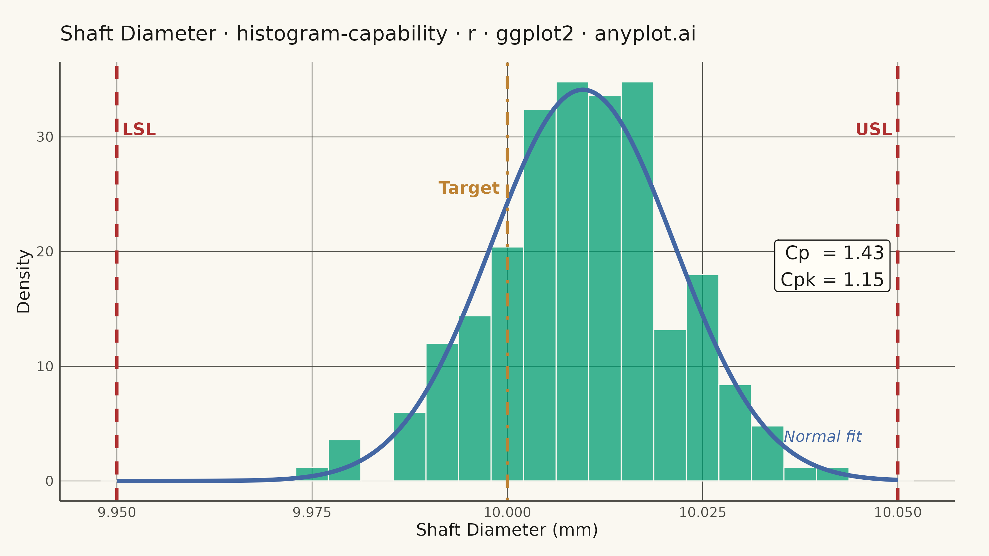
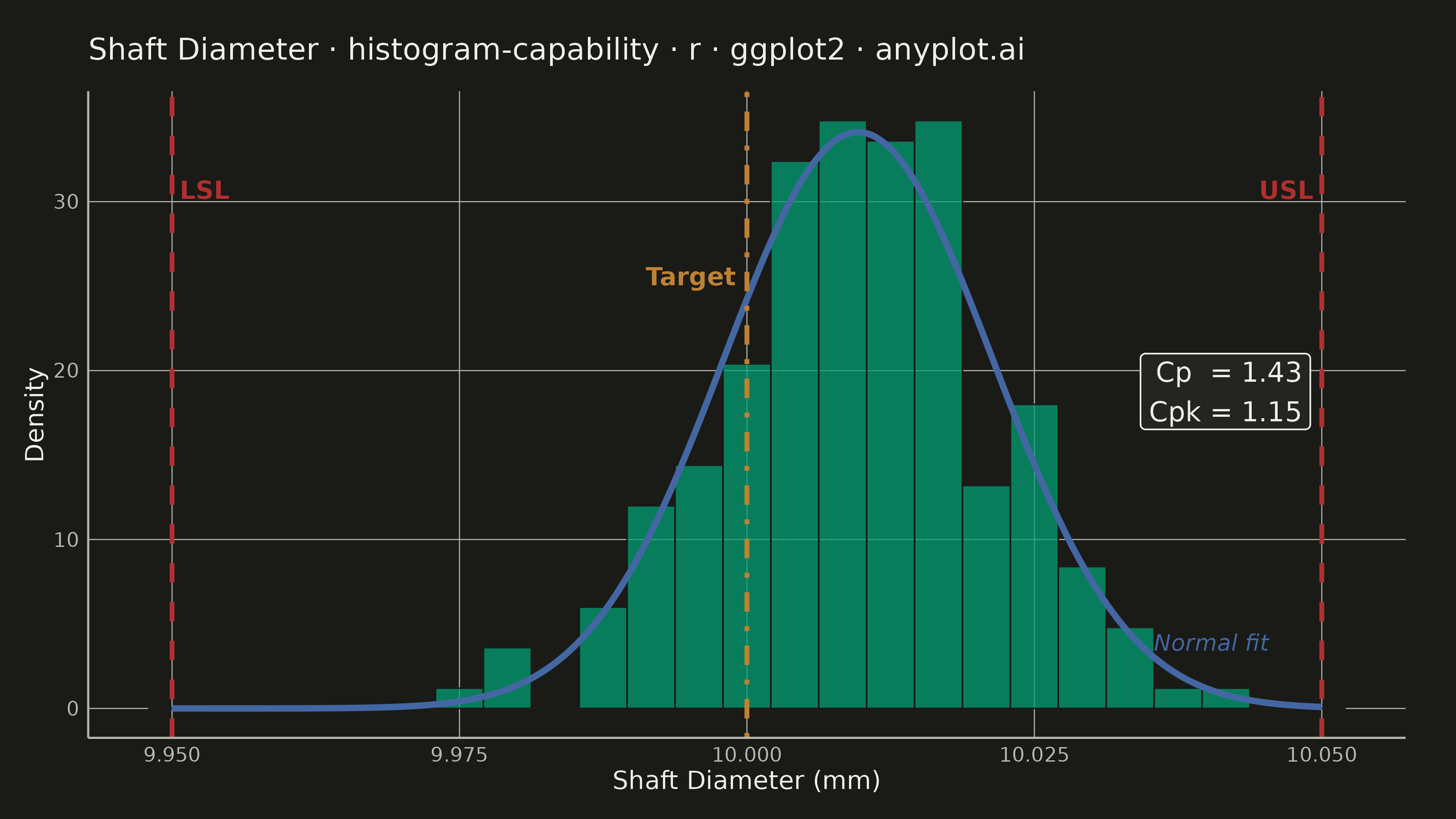
A process capability plot displays a histogram of measured process data overlaid with a fitted normal distribution curve and vertical lines for specification limits (LSL, USL) and target value. Capability indices (Cp, Cpk) are annotated on the plot to quantify how well the process meets specifications. This is a standard tool in quality engineering and Six Sigma for assessing whether a manufacturing or production process is capable of consistently producing output within tolerance.
#' anyplot.ai
#' histogram-capability: Process Capability Plot with Specification Limits
#' Library: ggplot2 3.5.1 | R 4.4.1
#' Quality: 91/100 | Created: 2026-06-20

library(ggplot2)
library(ragg)

set.seed(42)

# Theme tokens (Imprint palette — see prompts/default-style-guide.md)
THEME       <- Sys.getenv("ANYPLOT_THEME", "light")
PAGE_BG     <- if (THEME == "light") "#FAF8F1" else "#1A1A17"
ELEVATED_BG <- if (THEME == "light") "#FFFDF6" else "#242420"
INK         <- if (THEME == "light") "#1A1A17" else "#F0EFE8"
INK_SOFT    <- if (THEME == "light") "#4A4A44" else "#B8B7B0"

IMPRINT_PALETTE <- c(
  "#009E73",  # 1 — brand green  (histogram bars)
  "#C475FD",  # 2 — lavender
  "#4467A3",  # 3 — blue         (normal distribution curve)
  "#BD8233",  # 4 — ochre        (target line)
  "#AE3030",  # 5 — matte red    (LSL / USL spec limits)
  "#2ABCCD",  # 6 — cyan
  "#954477",  # 7 — rose
  "#99B314"   # 8 — lime
)

# Process parameters — shaft diameter (mm), slightly off-centre mean
LSL    <- 9.95
USL    <- 10.05
TARGET <- 10.00
N      <- 200
MU     <- 10.01
SIGMA  <- 0.012

# Generate synthetic measurements
measurements <- rnorm(N, mean = MU, sd = SIGMA)

# Capability indices computed from sample statistics
mu_hat    <- mean(measurements)
sigma_hat <- sd(measurements)
Cp  <- (USL - LSL) / (6 * sigma_hat)
Cpk <- min(
  (USL - mu_hat) / (3 * sigma_hat),
  (mu_hat - LSL) / (3 * sigma_hat)
)

# Peak of the fitted normal curve (used for annotation y-positioning)
max_dens <- dnorm(mu_hat, mean = mu_hat, sd = sigma_hat)

df <- data.frame(x = measurements)

p <- ggplot(df, aes(x = x)) +
  # Histogram bars scaled to probability density
  geom_histogram(
    aes(y = after_stat(density)),
    bins      = 25,
    fill      = IMPRINT_PALETTE[1],
    color     = PAGE_BG,
    alpha     = 0.75,
    linewidth = 0.3
  ) +
  # Fitted normal distribution overlay
  stat_function(
    fun       = dnorm,
    args      = list(mean = mu_hat, sd = sigma_hat),
    color     = IMPRINT_PALETTE[3],
    linewidth = 1.2,
    n         = 512
  ) +
  # Specification limit lines (LSL and USL — semantic red for limits)
  geom_vline(
    xintercept = c(LSL, USL),
    color      = IMPRINT_PALETTE[5],
    linetype   = "dashed",
    linewidth  = 0.9
  ) +
  # Target / nominal value line
  geom_vline(
    xintercept = TARGET,
    color      = IMPRINT_PALETTE[4],
    linetype   = "dotdash",
    linewidth  = 0.9
  ) +
  # LSL label — positioned to the right of the line (low-density tail)
  annotate("text",
    x = LSL, y = max_dens * 0.90,
    label = "LSL", color = IMPRINT_PALETTE[5],
    hjust = -0.15, size = 3.5, fontface = "bold"
  ) +
  # USL label — positioned to the left of the line
  annotate("text",
    x = USL, y = max_dens * 0.90,
    label = "USL", color = IMPRINT_PALETTE[5],
    hjust = 1.15, size = 3.5, fontface = "bold"
  ) +
  # Target label — positioned to the left of the line
  annotate("text",
    x = TARGET, y = max_dens * 0.75,
    label = "Target", color = IMPRINT_PALETTE[4],
    hjust = 1.12, size = 3.5, fontface = "bold"
  ) +
  # Normal fit label — inline on the curve at the right tail
  annotate("text",
    x = mu_hat + 2.2 * sigma_hat, y = dnorm(mu_hat + 2.2 * sigma_hat, mu_hat, sigma_hat),
    label = "Normal fit", color = IMPRINT_PALETTE[3],
    hjust = 0, vjust = -0.4, size = 3.2, fontface = "italic"
  ) +
  # Cp / Cpk annotation box in the upper-right region
  annotate("label",
    x          = USL - 0.001,
    y          = max_dens * 0.55,
    label      = sprintf("Cp  = %.2f\nCpk = %.2f", Cp, Cpk),
    color      = INK,
    fill       = ELEVATED_BG,
    hjust      = 1,
    label.size = 0.3,
    size       = 3.8
  ) +
  labs(
    title = "Shaft Diameter · histogram-capability · r · ggplot2 · anyplot.ai",
    x     = "Shaft Diameter (mm)",
    y     = "Density"
  ) +
  theme_minimal(base_size = 8) +
  theme(
    plot.background  = element_rect(fill = PAGE_BG,   color = PAGE_BG),
    panel.background = element_rect(fill = PAGE_BG,   color = NA),
    panel.grid.major = element_line(color = INK_SOFT, linewidth = 0.2),
    panel.grid.minor = element_blank(),
    panel.border     = element_blank(),
    axis.line        = element_line(color = INK_SOFT, linewidth = 0.4),
    axis.title       = element_text(color = INK,      size = 10),
    axis.text        = element_text(color = INK_SOFT, size = 8),
    plot.title       = element_text(color = INK,      size = 12,
                                    margin = margin(b = 10)),
    plot.margin      = margin(t = 15, r = 20, b = 10, l = 10)
  )

ggsave(
  filename = sprintf("plot-%s.png", THEME),
  plot     = p,
  device   = ragg::agg_png,
  width    = 8,
  height   = 4.5,
  units    = "in",
  dpi      = 400
)
Runnable source as JSON, for any HTTP client: https://api.anyplot.ai/specs/histogram-capability/ggplot2/code. Any spec id and library id listed in llms-full.txt fit the same URL shape; every URL below is complete and callable.
{
  "spec_id": "histogram-capability",
  "language": "r",
  "library": "ggplot2",
  "page": "https://anyplot.ai/histogram-capability/r/ggplot2",
  "hub": "https://anyplot.ai/histogram-capability",
  "code_json": "https://api.anyplot.ai/specs/histogram-capability/ggplot2/code",
  "spec_json": "https://api.anyplot.ai/specs/histogram-capability",
  "render_light_png": "https://storage.googleapis.com/anyplot-images/plots/histogram-capability/r/ggplot2/plot-light.png",
  "render_dark_png": "https://storage.googleapis.com/anyplot-images/plots/histogram-capability/r/ggplot2/plot-dark.png",
  "quality_score": 91.0,
  "license": "MIT",
  "guide": "https://anyplot.ai/llms.txt"
}
Part of Process Capability Plot with Specification Limits on anyplot.ai.