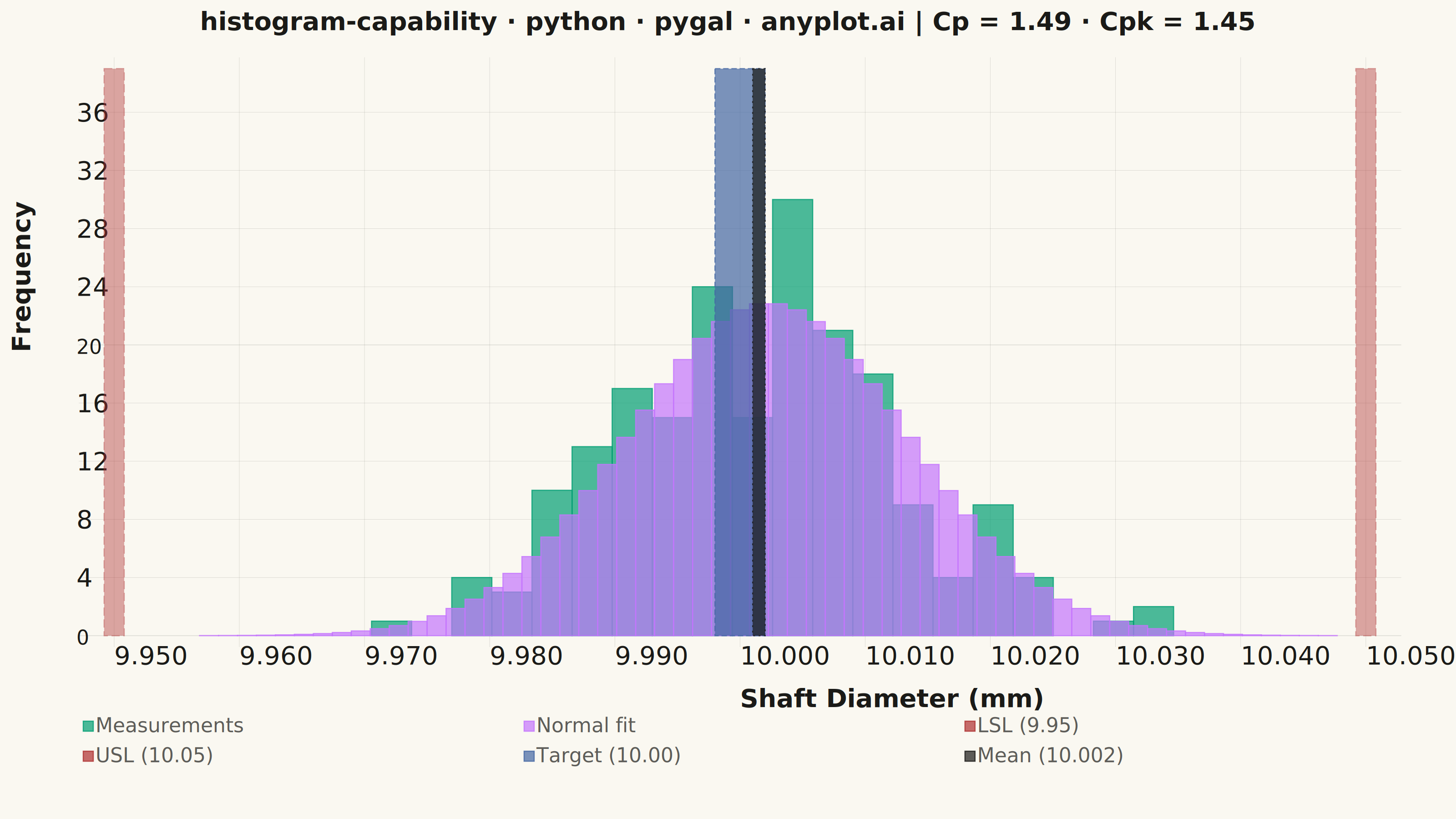
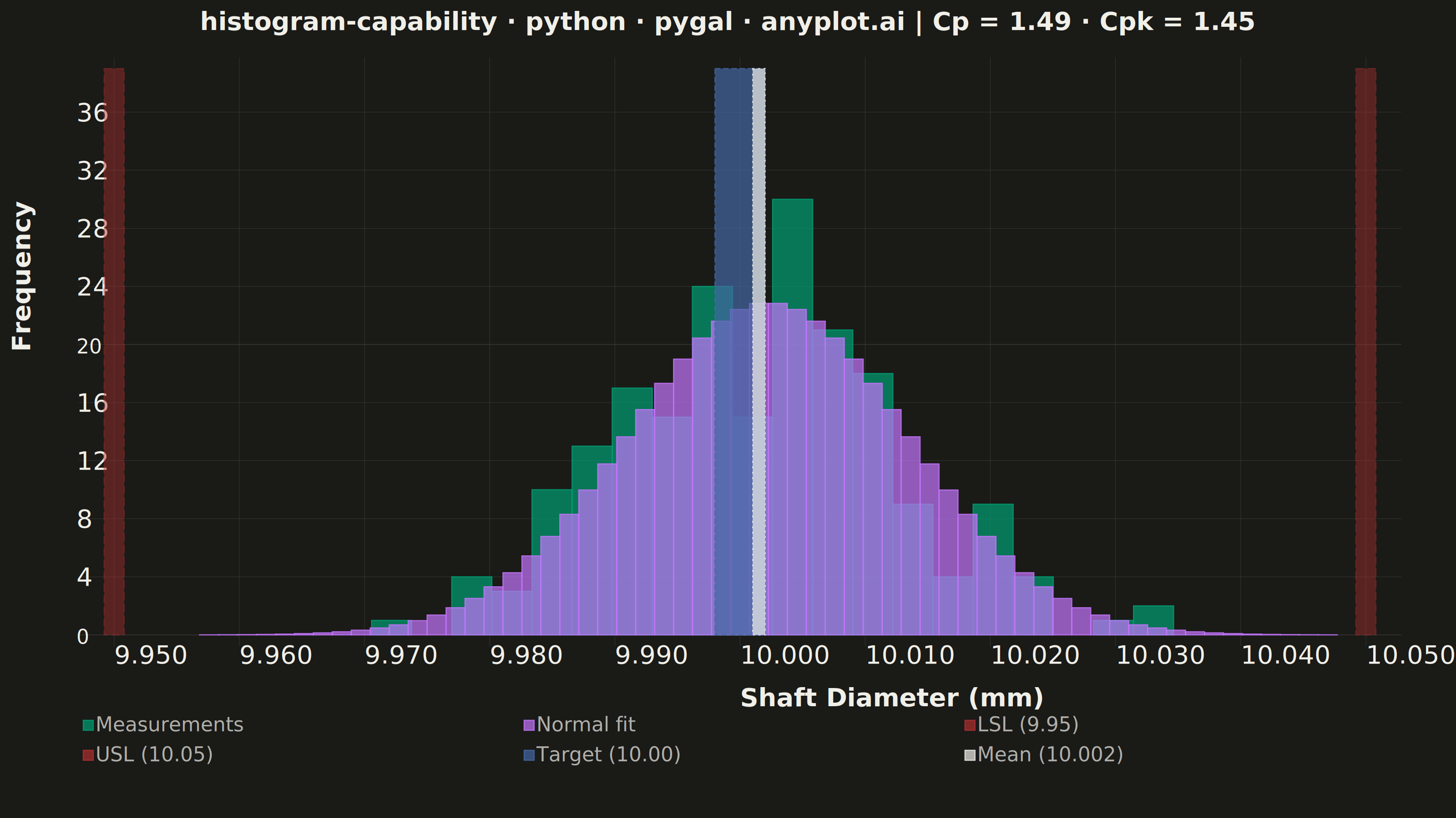
A process capability plot displays a histogram of measured process data overlaid with a fitted normal distribution curve and vertical lines for specification limits (LSL, USL) and target value. Capability indices (Cp, Cpk) are annotated on the plot to quantify how well the process meets specifications. This is a standard tool in quality engineering and Six Sigma for assessing whether a manufacturing or production process is capable of consistently producing output within tolerance.
""" anyplot.ai
histogram-capability: Process Capability Plot with Specification Limits
Library: pygal 3.1.3 | Python 3.13.14
Quality: 82/100 | Updated: 2026-06-20
"""

import os
import sys


# Script filename shadows the installed `pygal` package when run as `python pygal.py`;
# dropping the script directory from sys.path lets the real package resolve.
sys.path.pop(0)

import numpy as np
import pygal
from pygal.style import Style
from scipy import stats


# Theme tokens — Imprint palette, theme-adaptive chrome
THEME = os.getenv("ANYPLOT_THEME", "light")
PAGE_BG = "#FAF8F1" if THEME == "light" else "#1A1A17"
INK = "#1A1A17" if THEME == "light" else "#F0EFE8"
INK_MUTED = "#6B6A63" if THEME == "light" else "#A8A79F"

# Data — shaft diameter measurements (mm)
np.random.seed(42)
lsl = 9.95
usl = 10.05
target = 10.00
measurements = np.random.normal(loc=10.002, scale=0.012, size=200)

# Statistics
mean = np.mean(measurements)
sigma = np.std(measurements, ddof=1)
cp = (usl - lsl) / (6 * sigma)
cpk = min((usl - mean) / (3 * sigma), (mean - lsl) / (3 * sigma))

# Histogram bins
n_bins = 20
counts, bin_edges = np.histogram(measurements, bins=n_bins)
bin_width = bin_edges[1] - bin_edges[0]

# Normal distribution curve — scaled to match histogram frequency axis
n_curve_pts = 60
x_curve = np.linspace(mean - 4 * sigma, mean + 4 * sigma, n_curve_pts)
y_curve = stats.norm.pdf(x_curve, mean, sigma) * len(measurements) * bin_width
dx_curve = x_curve[1] - x_curve[0]

# Title — scale font size to prevent overflow (67-char baseline → font size 66)
title = f"histogram-capability · python · pygal · anyplot.ai  |  Cp = {cp:.2f}  ·  Cpk = {cpk:.2f}"
n = len(title)
title_font_size = max(44, round(66 * 67 / n)) if n > 67 else 66

# Style — Imprint palette with semantic color mapping:
#   series 1: measurements histogram → brand green #009E73 (always first series)
#   series 2: normal fit curve → lavender #C475FD
#   series 3+4: LSL/USL spec limits → semantic red #AE3030 (danger/out-of-spec boundary)
#   series 5: target nominal → blue #4467A3
#   series 6: process mean → ink neutral (theme-adaptive)
custom_style = Style(
    background=PAGE_BG,
    plot_background=PAGE_BG,
    foreground=INK,
    foreground_strong=INK,
    foreground_subtle=INK_MUTED,
    colors=("#009E73", "#C475FD", "#AE3030", "#AE3030", "#4467A3", INK),
    title_font_size=title_font_size,
    label_font_size=56,
    major_label_font_size=44,
    legend_font_size=44,
    value_font_size=36,
    stroke_width=2.5,
    font_family="'Segoe UI', Roboto, 'Helvetica Neue', Arial, sans-serif",
)

y_ceil = float(max(counts) * 1.3)

chart = pygal.Histogram(
    width=3200,
    height=1800,
    style=custom_style,
    title=title,
    x_title="Shaft Diameter (mm)",
    y_title="Frequency",
    show_legend=True,
    legend_at_bottom=True,
    legend_box_size=22,
    show_y_guides=True,
    show_x_guides=False,
    truncate_label=-1,
    truncate_legend=-1,
    margin_top=60,
    margin_right=120,
    margin_bottom=60,
    margin_left=30,
    x_value_formatter=lambda x: f"{x:.3f}",
    y_value_formatter=lambda y: f"{y:.0f}",
    xrange=(lsl - 3 * sigma, usl + 3 * sigma),
    range=(0, y_ceil),
    css=[
        "file://style.css",
        f"inline:.plot .background {{ fill: {PAGE_BG} !important; stroke: none !important; }}",
        f"inline:.graph > .background {{ fill: {PAGE_BG} !important; stroke: none !important; }}",
        "inline:.axis .guides .line { stroke-width: 0.8px; opacity: 0.25; }",
        "inline:.axis.x > path.line { stroke: none !important; }",
        "inline:.axis.y > path.line { stroke: none !important; }",
        "inline:text.title { font-weight: 600 !important; }",
        "inline:text.plot_title { text-anchor: middle; }",
        f"inline:.legends text {{ fill: {INK} !important; }}",
        "inline:.serie-2 { opacity: 0.6 !important; }",
        "inline:.serie-3 { opacity: 0.6 !important; }",
    ],
    js=[],
)

# Histogram bars — native pygal.Histogram format: (height, start, end)
hist_data = [(float(counts[i]), float(bin_edges[i]), float(bin_edges[i + 1])) for i in range(len(counts))]
chart.add("Measurements", hist_data)

# Normal distribution curve — rendered as histogram bars for a smooth bell-curve envelope
curve_data = [(float(y), float(x), float(x + dx_curve)) for x, y in zip(x_curve, y_curve, strict=True)]
chart.add("Normal fit", curve_data, stroke_style={"width": 3, "linecap": "round"})

# Specification limit lines — very thin bars rendered as dashed vertical boundaries
spec_lw = 0.0008  # LSL/USL (thin, opacity 0.6 via CSS)
target_lw = 0.0020  # Target wider so it stands apart from Mean despite near-identical x
mean_lw = 0.0005  # Mean narrower for clear visual separation from Target
chart.add(
    "LSL (9.95)", [(y_ceil, float(lsl - spec_lw), float(lsl + spec_lw))], stroke_style={"width": 8, "dasharray": "18,8"}
)
chart.add(
    "USL (10.05)",
    [(y_ceil, float(usl - spec_lw), float(usl + spec_lw))],
    stroke_style={"width": 8, "dasharray": "18,8"},
)

# Target and mean reference lines — different widths so they're distinguishable at x≈10.000
chart.add(
    "Target (10.00)",
    [(y_ceil, float(target - target_lw), float(target + target_lw))],
    stroke_style={"width": 6, "dasharray": "12,6"},
)
chart.add(
    f"Mean ({mean:.3f})",
    [(y_ceil, float(mean - mean_lw), float(mean + mean_lw))],
    stroke_style={"width": 4, "dasharray": "4,8"},
)

# Save
chart.render_to_png(f"plot-{THEME}.png")
with open(f"plot-{THEME}.html", "wb") as f:
    f.write(chart.render())
Runnable source as JSON, for any HTTP client: https://api.anyplot.ai/specs/histogram-capability/pygal/code. Any spec id and library id listed in llms-full.txt fit the same URL shape; every URL below is complete and callable.
{
  "spec_id": "histogram-capability",
  "language": "python",
  "library": "pygal",
  "page": "https://anyplot.ai/histogram-capability/python/pygal",
  "hub": "https://anyplot.ai/histogram-capability",
  "code_json": "https://api.anyplot.ai/specs/histogram-capability/pygal/code",
  "spec_json": "https://api.anyplot.ai/specs/histogram-capability",
  "render_light_png": "https://storage.googleapis.com/anyplot-images/plots/histogram-capability/python/pygal/plot-light.png",
  "render_dark_png": "https://storage.googleapis.com/anyplot-images/plots/histogram-capability/python/pygal/plot-dark.png",
  "interactive_light_html": "https://storage.googleapis.com/anyplot-images/plots/histogram-capability/python/pygal/plot-light.html",
  "interactive_dark_html": "https://storage.googleapis.com/anyplot-images/plots/histogram-capability/python/pygal/plot-dark.html",
  "quality_score": 82.0,
  "license": "MIT",
  "guide": "https://anyplot.ai/llms.txt"
}
Part of Process Capability Plot with Specification Limits on anyplot.ai.